Why Hipster Attitudes Can Ruin Interaction Design
Overwhelmingly, humans avoid challenging their long-standing beliefs, tastes and opinions. We prefer something we know instead of seeking new experiences.
Even in the modern age with constant new stimuli, we like to follow the same well-worn paths and draw the same conclusions regardless of fact.
I dislike pop music.
I’m not the first to say it and I won’t be the last. For me, pop music is the embodiment of all that’s formulaic and lazy. It’s like being spoon-fed slightly different variations of the same mac and cheese recipe every time you sit down to eat. Boring, repetitive, easy.
I’m opinionated. I’m probably a hipster.
That being said, this kind of selfish thinking is something that greatly inhibits a product designer to craft useful and meaningful mouse interactions. Stepping outside of our personal biases to facilitate a truly tailored interaction is what’s known as empathetic design.
With Postcards Email Builder you can create and edit email templates online without any coding skills! Includes more than 100 components to help you create custom emails templates faster than ever before.
Free Email BuilderFree Email TemplatesThe easiest and most common way for a designer to fail to build empathy is by dismissing users’ viewpoints on a moral or intellectual objection.
1. Identify Users’ Motivations
Designer Knows Best
Building empathy is hard. The human brain loves to follow friction-less paths to the easiest answers but simply believing that our personal biases are right all the time is just the easiest way to fail.
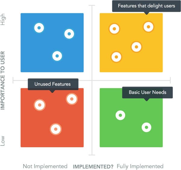
Some companies have taken to using the Kano model to help them understand how to build products.
The Kano model allows us to map user needs and weigh those needs by importance
Discovering what users think is, of course, important, “what” is quantitative and allows us to categorize users’ needs into feature sets. That being said, I’d value the qualitative “Why is that important?” as a more useful tool in the quest for great interaction.
Asking “why” allows us access to the behavioral and motivational aspects of our user’s psyche. In turn, we’re able to design solutions laterally as opposed to thinking only in features or having our solutions colored by personal bias.
With Startup App and Slides App you can build unlimited websites using the online website editor which includes ready-made designed and coded elements, templates and themes.
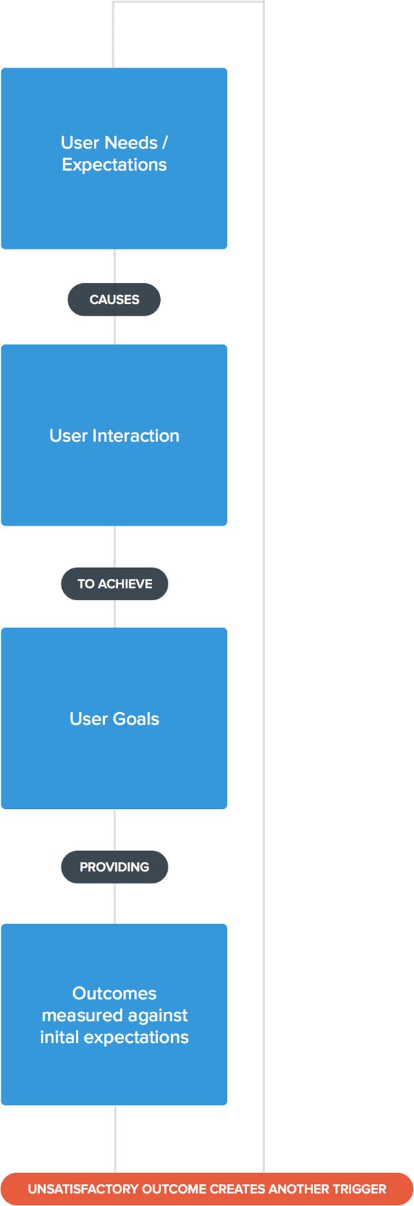
Try Startup App Try Slides AppOther ProductsThe basic model of user motivation
2. Dig Deeper into Context
Step Outside of Your Bias
Humans are an incredibly pragmatic species. We’re able to assess situations and let our emotions color our interactions with the world. The conclusion that our brain draws from these emotionally charged situations is known as context. As computing becomes even more ubiquitous, some UX thinkers have even argued for a move away from task-oriented UX toward contextual UX.
User experiences require context and they are changed by context. — Paul Olyslager
Context Colored Example
It’s rush hour and there’s a huge queue [contextual factor] at the subway ticket machine. This pressurized [emotional factor] situation forces people to make mistakes when interfacing with the machine. The result is a selection that doesn’t satisfy user goals. The designers objective here should be to think about the implementation of context-aware mechanisms to limit the chances of an unsatisfactory interaction.
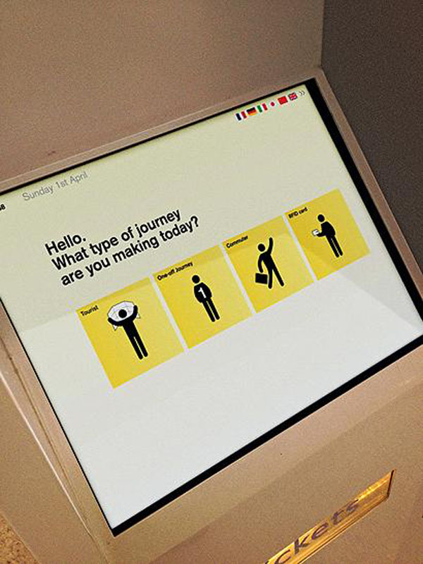
This redesign attempts to humanize ticket vending language in order to obtain which type of ticket to dispense. Peak, Off-peak, Single or Return.
It’s my belief that the best interaction design considers these kinds of contexts. Let’s not just examine the user’s goals, but let’s try to gain insight into the user’s state of mind.
3. Consider the Emotional Effects of Context
Break Down Context to Build Empathy
When designing interactions, consider the inputs and outputs for a user and examine their preconceptions.
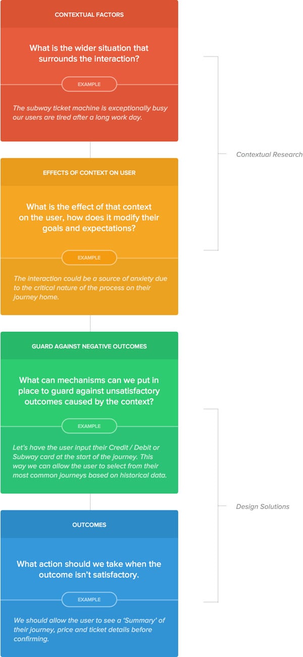
The contextual design model
At what point during the user’s day does this interaction occur?
The persona is a much maligned advertising technique but loose-persona thinking helps us to understand the wider context around the user’s life. Using this technique can help us to understand the user’s hesitations, fears and expected outcomes that surround the interaction.

Scenario One: The Airbnb user has just landed in the host city.
- How long has the user spent traveling?
- How far is the apartment from airport?
- Is the user a native speaker in this host city?
We know the context now how can we design around it?
- We know the user has landed should we push Google Maps to their phone with their Airbnb apartment directions pre-loaded?
- Should we use local maps data to help our user find an ATM or a Taxi stand?
4. Rewire Interactions to Avoid Unsatisfactory Outcomes
How can we actively avoid interactions that cause unnecessary user anxiety?
What is the effect of outside events on user mentality and how does this change our user behavior?

Scenario Two: The Uber driver was unable to pick up our user at the specified map marker.
As a result, our user had to walk a couple more blocks to get to the taxi.
Rather than dumping this unsatisfactory outcome on the user at the end of the interaction, let’s make use of the vast amounts of data that Uber posses. Specifically, why don’t we warn the user that the current spot has a lower than average number of pickups.
Let’s go further and suggest the perfect pick-up spot for our user which we can determine through the use of data.
It’s this kind of thinking that doesn’t just allow for better interaction design but also the identification of market and product opportunities.
5. Consider Physical Surroundings
Digital design often lives inside Sketch or Photoshop and we rarely consider the physical surroundings during which interaction takes place. In an increasingly mobile world, it’s now more important than ever to consider the relationship between the use of our product and the tangible world around the user.
In the last 10 years, we’ve seen an increasing trend for technology companies to shoehorn more micro-chips and LCD displays into their products.
As our ambient environments get smarter, maybe in the future we’ll be designing physical and environmental experiences as opposed to the digital experiences that we craft today.
Futurism aside, we should take account of this ambient physical context today too. In 2011, Smartphones were linked to 25 percent of all car crashes in the U.S. In other words, a specific negative effect that was caused by technology.
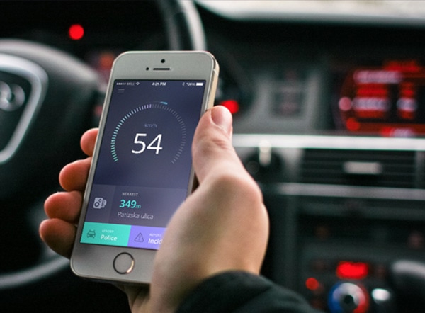
How can we make notifications and attention-grabbing mechanisms that are smart and context aware? As designers, we should feel empowered to respond to environmental contexts to not just create seamless interactions but in some cases save lives.
6. Play to Motivational Drivers of Users
Why do we do what we do?
Motivation is the psychological driver behind the strategic selection of goals and questioning the users motivation helps us to understand the origin and often the cause of specific user behaviors.
When designing for interaction, Designers should ask: Why do users want to undertake the interaction in the first place? and What are the possible set of circumstances that lead the user to exhibit such behavior. Understanding this motivation allows us to unpick user behaviors, craft better interactions and optimize to achieve both user and business goals.
7. Hard-Wire Empathy into Products
Spend the extra effort and resources to proportionally to create delight.
While considering context is key to designing great user interactions, hard-wiring empathy into our design is the holy grail.
Consider the Apple Magic Mouse
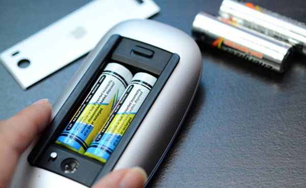
The Magic Mouse is an elegantly simple product that combines aesthetic value with usability and contains a great example of empathetic design.
Both battery cells are inserted the same way, as opposed to the traditional method where both cells must be placed at opposites in order to complete the circuit. This allows the user to focus less on setup and more on getting value from the device.
If we unpack the design here, it’s clear that Apple designers chose to create custom circuits and engineer a method to step outside of constraints. Whilst it’s important to note the extra resources that may have been used here, the same principles can and should be applied to the digital design medium.
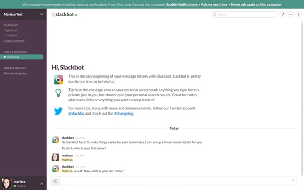
Consider Slack’s on-boarding and the extra development that will have gone into the fine-tuning of this interaction.
It’s a well-known fact that humans respond to stimuli when the source of that stimulus comes from another human. Slack made great use of this by on-boarding users to their product with the lovable Slackbot. While undoubtedly spending development resources, this human characterization automatically makes our users more willing to engage with the product.
Apple’s Magic Mouse and Slack’s Onboarding are perfect examples of incurring extra effort by hard-wiring empathetic solutions into a product that ultimately provide the user with added value.
Injecting Empathy
Take always to create more empathetic experiences
- Understand users’ emotional and physical contexts.
- Map out the effects of those contexts on users’ abilities to interact with products.
- Introduce mechanisms to break down and normalize those contextual effects.
- Ensure fallbacks like error messages, validation states and confirmation screens exist.
- Go above and beyond by breaking constraints or spending more effort to build empathy.
Closing
I can’t understand why people listen to pop music.
It is acutely because of the designers ability to observe, listen and understand the motivations of other humans, that so many exceptional digital products exist. We’re able to understand unique correlations between the mindset of a person and their interactions with products.
Exercising this connection between context and behavior allows us to think more like users and ultimately provide an experience less likely to be colored with bias.
Regardless of our opinions, understanding why people exhibit behavior and stepping out of our espresso drinking, beard-tending designer mindset is the key to designing empathetic experiences.
