10 Ways to Supercharge Your Design Learning
I started learning design in 2007, and a lot has changed since then. Now we have thousands of communities available, tutorial sites, remarkable individuals sharing their knowledge and dozens of opportunities to learn and earn as a designer.
Today, I’d like to share some of the techniques and methods I’ve used to learn design. I keep learning new things every day and some of the examples below are based on my personal experience trying, failing, building and succeeding.
Show Up Everyday
Developing a habit of learning is a key to establishing a consistent learning routine that will allow you to supercharge your learning experience and maximize the outcomes of the effort you put in.
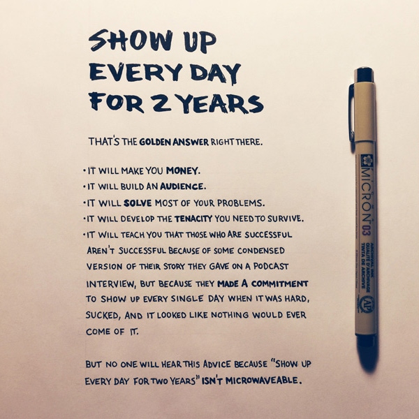
Allocate time daily to learn design and have it every day for the time you want to keep studying, whether it’s a month or half a year. Sean McCabe suggests showing up for two years to achieve the following:
- Make money
- Build an audience
- Solve most of your problems
- Develop the tenacity needed to survive in this world
To maximize learning, spread it across your routine so you have time allocated just for learning and don’t push it too much at once, your brain needs rest to cope with the information you put in.
With Postcards Email Builder you can create and edit email templates online without any coding skills! Includes more than 100 components to help you create custom emails templates faster than ever before.
Free Email BuilderFree Email Templates1 Percent Rule
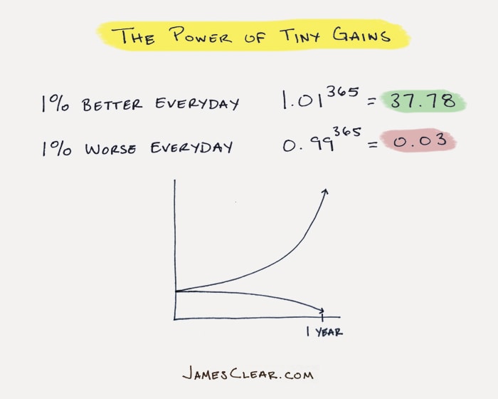
Practicing every day is what makes you better. The trick is to really commit to learning, set aside some time and show up consistently every day. Just think about simple math, showing up 60 minutes a day for a month is 60 minutes x 30 days = 1,800 min or 30 hours, which is quite a lot of time to learn something. According to James Clear, becoming better just by 1 percent every day will make a huge impact on your progress in just a year, see the graph below to better understand the power you can use to supercharge your learning.
Instead of practicing the same thing over and over again, try to learn something new to use the advantage of tiny gains.
Apply the 80/20 Rule
Learning everything is not smart, learning what works and produces results is smart.
The Pareto principle (also known as the 80–20 rule) states that, for many events, roughly 80 percent of the effects come from 20 percent of the causes. Same goes with learning design, you can learn about tracking, kerning, typeface anatomy, different measurement units but it won’t make you a great designer and will take too long. There will always be things to spend time and energy on, the key here is to focus on things that will really benefit you and maximize the outcomes.
Think about the end goal, if you want to become a mobile designer, learn about the mobile industry, mobile design principles, people’s behavior and habits instead of learning every single thing about design that doesn’t necessarily apply to mobile design.
Adopt Learning Habits
To develop a habit you need a trigger, a consistent routine and a reward. You can start learning the first thing in the morning with a cup of coffee which can be your trigger, then study for 30 minutes (for example) and have a reward that pleases you, such as a favorite TV show or piece of cake. Make it pleasurable and desirable and the whole process will be more enjoyable.
Take Up a Challenge
Take up a challenge and publicly commit to a certain period of time to create and show up every day. It can be as simple as 30-day sketching challenge or as complex and hard 365 photo everyday challenge. In late 2013 I took on a 30 day writing and publishing on Medium challenge where I was writing about anything and publishing for one month. I’ve seen enormous growth in my confidence, idea explanation abilities and a boost in willpower management.
With Pulsetic you’ll be instantly notified the moment your website, API, or server becomes unavailable. Monitor uptime from multiple global locations and respond to incidents before your users are affected.
Create beautiful status pages in minutes to keep customers informed during outages and build trust with transparent communication.
Start Monitoring for FreeSimply think of what you want to learn, pick a duration and deliverables and let everyone know that you are committing.
Teach
The best way to really learn something is to teach it. “But I am not ready, I don’t know a thing.”That might be true, but knowing something is more than nothing and you should be teaching others about your craft. By teaching, you focus on the essence of the design and try to understand and explain it in the simplest way possible. It improves your analytical thinking and forces you to make connections with different theories and personal experience. Start a log, daily journal or a YouTube channel and start journaling your process for other people.
Work On a Side Project
Allocate some time and work on your passion with a side project that excites you and does not constrain you too much. Side projects will let you experiment with things and achieve much more progress as you will be enjoying it and just playing with it. I teamed up Paula Borowska in late 2013 and started working on the Mobile Design Book that was released last year. It was a fun way to really dive deeper into the mobile design and have some fun producing the book and improving numerous of skills while writing it.
Break Things Down
Mark Zuckerberg, co-founder and CEO of Facebook, believes that you need to experience breaking things to move forward.
“Moving fast enables us to build more things and learn faster. However, as most companies grow, they slow down too much because they’re more afraid of making mistakes than they are of losing opportunities by moving too slowly. We have a saying: ‘Move fast and break things.’ The idea is that if you never break anything, you’re probably not moving fast enough.”
To really understand the design process you need to break it down to the smallest pieces and get to the essentials and then try to recreate it your way. Design community is incredibly friendly and open to sharing the what’s, how’s and why’s of design. You can download free project files for image editing software like Adobe Photoshop, Sketch, Illustrator or any other.
When you’re trying to break things down, look at the big picture and then take it detail by detail, developing analytical thinking will allow you to be more organized and structured in your future work. Take an example you want to recreate and do everything to mimic it so you get to understand how it was built, other than that download free files and analyze the structure, techniques used and rules applied.
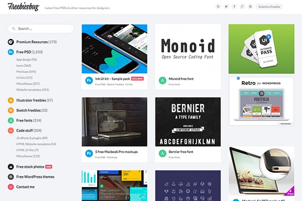
Check Freebiesbug, Dribbble Freebies, Despreneur’s Freebie Pouches to find great design files to play with for free.
Experiment
Set yourself free. Get into a mindset that everything you create is an experiment. This simple shift will help you to take criticism easier and be more courageous to try new things while not being afraid of failing. If you treat your work as an experiment you can’t be wrong because experiment succeeds or fails, not you.
“I have not failed. I’ve just found 10,000 ways that won’t work.” – Thomas A. Edison
As a designer, it is important to regularly invest in yourself by playing around with the technology and tools you use. There are already many initiatives which showcase what is possible and without these experiments, design wouldn’t be progressing so quickly.
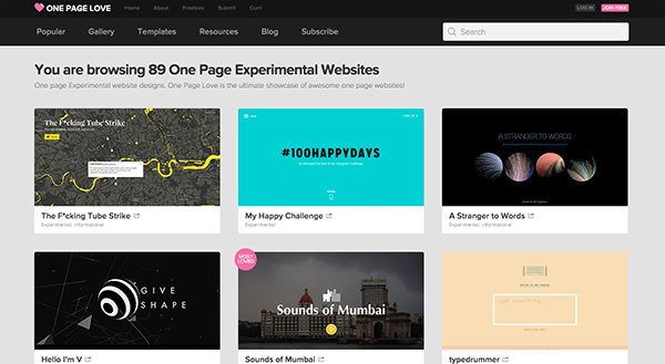
Check out a gallery of Experimental Websites, browse through Behance’s experimental work to get some inspiration and courage to try something unorthodox.
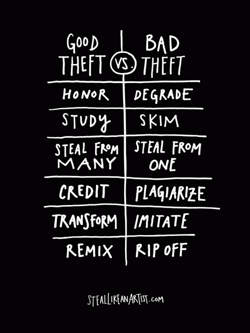
“Steal Like an Artist”
Everything is a remix. You’re a mashup of everything you consume so if you surround yourself with things you want to absorb you eventually become more creative. You shouldn’t be ashamed of stealing great ideas, but there is a right way to steal; Austin Kleon wrote a book about it.
You have a unique set of values that filter your thoughts, experiences and ideas that come in and then you produce something of your own. So if you study different designers and their work you filter everything and produce work that is authentic and reflects you and your perspective.
“In the end, merely imitating your heroes is not flattering them. Transforming their work into something of your own is how you flatter them. Adding something to the world that only you can add.”
Below are some of the main principles on how to steal like an artist.
Conclusion
I really hope this article inspired you to pursue a career in design and encouraged you to learn it on your own. As you can see there is a lot to do with your routines, dedication and psychology, but I can assure you that investing your time and applying these principles will definitely take you to the next level in whichever design direction you choose.