4 Ways to Improve Usability and User Experience by Decluttering Designs
We often speak about decluttering in the sense of physical stuff like closets or storage. But, we can also speak about decluttering designs too. Decluttering can help improve usability and the user experience on websites.
Here are four tips for decluttering you designs.
1. Shorten the Copy
Dating back to 1997, Nielsen Norman Group conducted a study to learn how users read on the web. I’m sure you know that they don’t read. Instead, most people scan the pages. Yet, there are plenty of websites filled with unnecessary words. Unfortunately, copy that is messy or indirect is common. You can clean up the content of a website by removing the amount of words on the screen.
Remove unnecessary words. Shorten run-on-sentences and remove redundant sentences, too. Always have one idea per paragraph. It’s a good form of writing and it’s better for those readers who scan. Finally, and this is true especially of long-form content, use the inverted pyramid structure. Start with the conclusion and add more detail as the content gets longer.
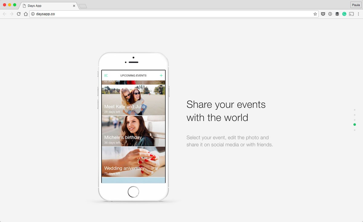
This is one of my favorite apps, Days. It’s an app for counting down days until an event. The app’s landing page has very little copy per section. The above screenshot is from a single section of the landing page. Notice the super short copy. It look good and reads even better.
With Postcards Email Builder you can create and edit email templates online without any coding skills! Includes more than 100 components to help you create custom emails templates faster than ever before.
Free Email BuilderFree Email Templates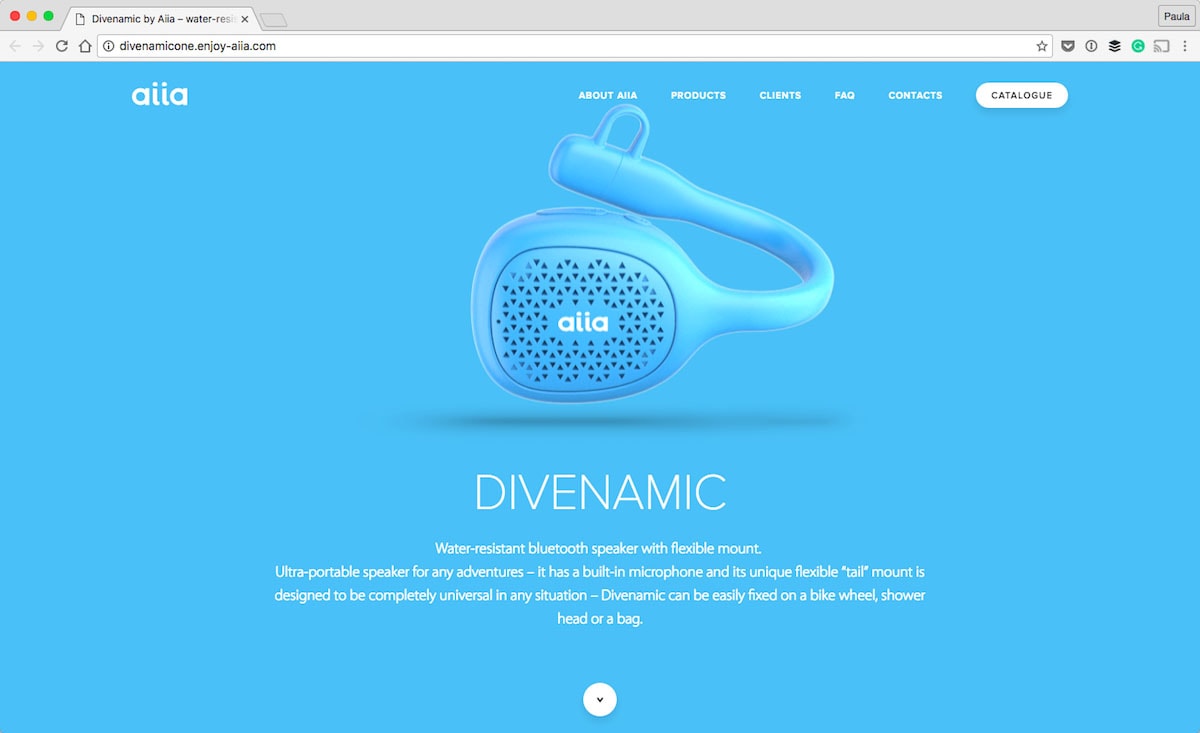
Aiia is a waterproof speaker and its landing page is fantastic. Despite a scroll oddity, I am in love with the page’s cleanliness. The limited copy is a fantastic way to get the main idea across to users without getting lost in mountains of words.
2. Remove Visual Decoration
When it comes to visuals, sometimes we want to throw in an extra element just to make things pretty. We all want the design to look good. And although those intentions are good, the execution can become too much. That’s why I’m a big proponent of removing any decorations that are not necessary. The great thing about decorations is that they don’t hurt the user experience if you remove them.
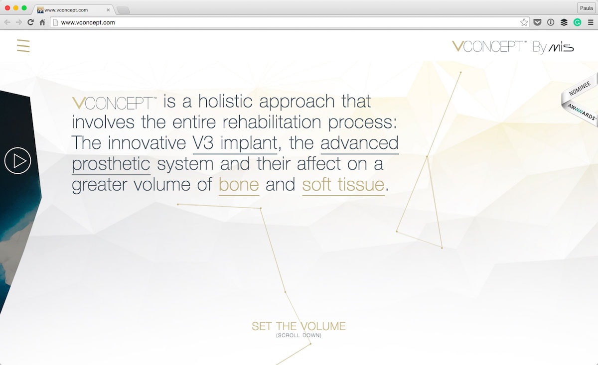
I’d like to compare two websites. VConcept (above) and Born (below). VConcept has less content on the page but it’s much harder to digest. All of the decorations on the VConcept page get in the way. There is a triangular pattern background and a moving line background. The copy has three different styles – plain text copy, underline and gold underlined text. Not to mention that the logo is in that paragraph as well. It’s just too much.
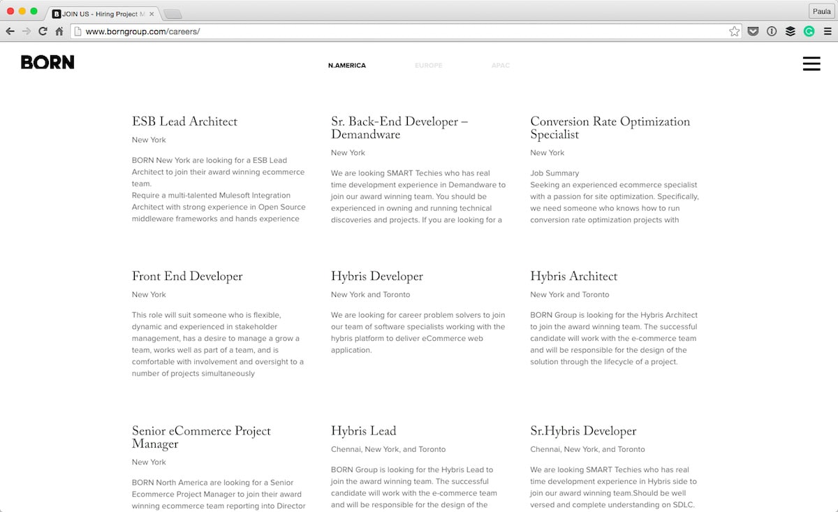
On the other hand is Born’s career page. Yes, it has a lot more text but it works because there are no decorations to distract. Imagine if those job posts were boxed in with a single-pixel border. The information would be much harder to scan.
3. Reuse Design Elements
Consolidate and reuse repetitive elements. For instance, when there are many colors, fonts or style variations it will get messy. Reuse design elements to keep things consistent; consistency makes for a clean design. There are rules of thumb such as “don’t use more than two or three fonts” for this specific reason. The same goes for colors and elements, too. If you have a newsletter capture at the bottom of pages, make sure it looks the same on all pages. Inconsistency could lead to some serious confusion.
With Pulsetic you’ll be instantly notified the moment your website, API, or server becomes unavailable. Monitor uptime from multiple global locations and respond to incidents before your users are affected.
Create beautiful status pages in minutes to keep customers informed during outages and build trust with transparent communication.
Start Monitoring for Free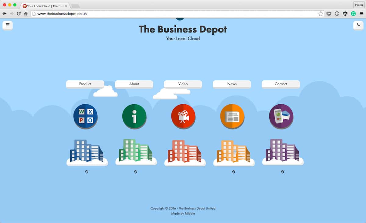
Let’s discuss the color choices made by The Business Depot. They are an IT cloud product for enterprise customers which explains the cheeky web design. Between the home page, the product page and the contact page, they use too many various shades of the rainbow. On the home page, the colors are primary. They even look like they mean something for each page. But, once you click through you realize they don’t actually mean anything because the color changes depending on what page you’re on. For instance, when you go to the about page the colors are pastel. Yet, when you head to the contact page, they are vibrant and strong. Keeping the color consistent would improve the quality of the design.
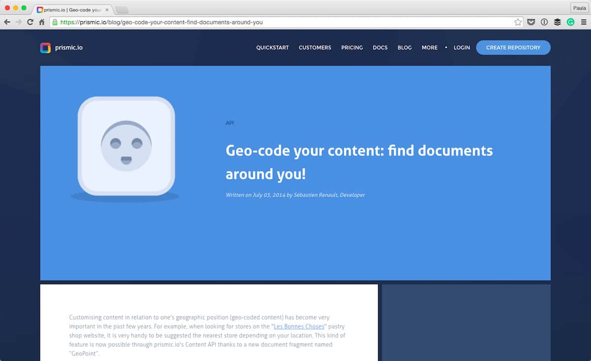
Prismic uses too many colors, specifically on the blog. They color code blog posts. That can be a dangerous game, but the overall color scheme is cohesive. Better yet, on the post from the screenshot, the colors become monochromatic. The post uses other shades of blue to keep things familiar. If everything on this page was a different color, it would be a visual nightmare. I’d like to point out that the blue in the hero is the same from the logo and CTA button. Consistency makes things look cleaner.
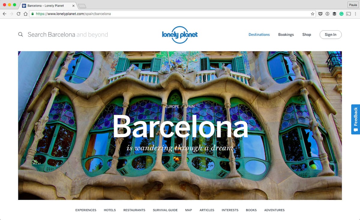
I’ve always been a fan of Lonely Planet. The current design style is fantastic because they reuse similar design elements. Each city’s page uses the same template which makes things familiar. Lonely Planet has a lot of content so using a template makes it easy on readers.
4. Always Have a Single User Goal in Mind
The last bit of advice I have about decluttering is to understand the purpose or goal of a given page. It’s best if you frame the goal from a user perspective. An example of a user goal is to register for a free trial, learn about a specific recipe or sign up for a newsletter. If you’re designing a new page or website, double check what the goal is and make sure nothing gets in the way.
Always have a single and clear goal to aim for. This will help you remove things that distract from it. For example, if you want the user to download a sample chapter of a book, don’t promote another book over the chapter. Showcase the download button front and center. Repeat the CTA a few times if it’s a long page. And, remove everything that does not help the user download the sample.
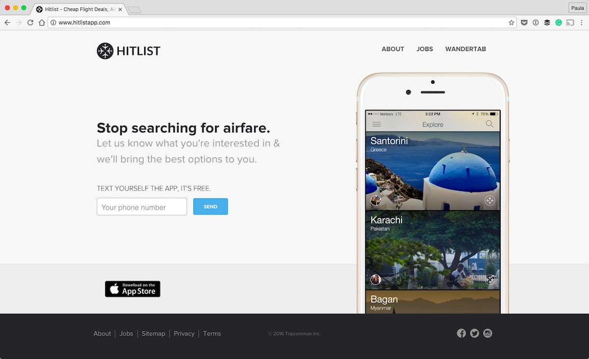
Let’s take a look at the landing page for the mobile traveling app Hitlist. The obvious thing a user can do is to download the app. There are a few different ways of doing that. A user can enter a phone number to get a text link or click the App Store button. Of course, a user can click other links also. The main focus of the page is not obstructed by something else.
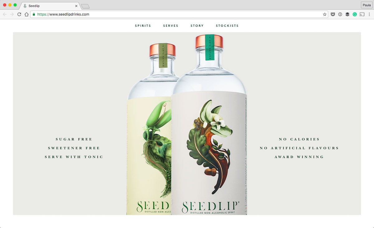
Speedlip is a nonalcoholic spirit. I am in love with the visual style of the website. I like how the homepage doesn’t pull the user in too many directions. The whole page has only four CTAs. Two of them are to buy a bottle and the rest are for more information to further convince the user to buy Speedlip. It’s okay to have more than one CTA as long as they don’t compete with one another.
Conclusion
In this post, I’ve described four ways to declutter your web designs. By doing so, I hope it will improve the user experience and usability of your website. Decluttering a design is not that hard and can greatly improve how users interact with your site. After all, usability and user experience go hand in hand and how a website looks impacts both.