Primer on Types of Navigation in Mobile Apps
Navigation patterns can vary, even when it comes to prototyping mobile application interfaces. Even though they may seem to impose tight restrictions, because of small sizes and necessity to compactly arrange lots of data, there are a variety of options.
Once there was really only one style considered — the trendy and widely-used vertical navigation, aka side menu. However, there are others that can enhance a user experience, making exploration of your app a piece of cake.
Lets’ start our discussion with a standard list-based navigation that is commonly used among mobile app creators. The solution suggests displaying links one by one, letting users follow a regular flow from top to bottom.
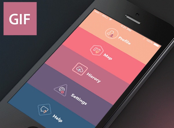
GIF Aimation by Sergey Valiukh is only a concept, but perfectly reflects a utility of a list-based navigation. The combination of colors with refined line-style icons and somewhat bold typography allows users to easily navigate through the app and not feel discomfort, which can be caused by a small screen.
With Postcards Email Builder you can create and edit email templates online without any coding skills! Includes more than 100 components to help you create custom emails templates faster than ever before.
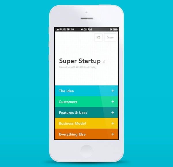
Free Email BuilderFree Email TemplatesElevatr by Fueled is a stylish app that helps entrepreneurs get organized as well as keep a track of business meetings. The home screen features a rainbow-style menu that clearly demonstrates items of a control panel line by line. The canvas, inspired by a graph paper, goes perfectly with this kind of menu.
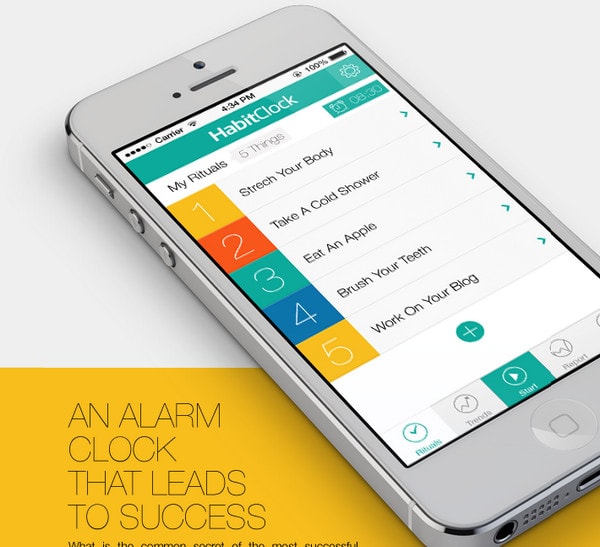
HabitClock App by Kutan URAL is a simple and visually-appealing app that designed to help you with your morning routine. Though the screen features top and bottom control panels, the list-based navigation — which also serves as an excellent notification tool — is a centerpiece that grabs attention.
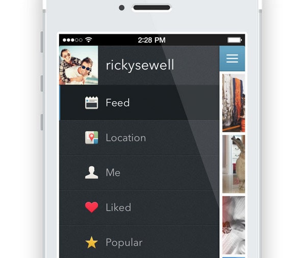
Instagrab for iOS by Davis Yeung features a horizontal stripe layout that is a popular choice among majority of designers when it comes to displaying a set of links placed on a basic slide-out menu. Usually each item is supplied with a tiny intelligible icon that nicely distinguishes each link.
A grid-style navigation that takes up the whole screen helps put emphasis on navigation, making it clear and obvious. Such an approach can be also useful when you need to display numerous links, then a set of equal cells effectively isolates items one from another.
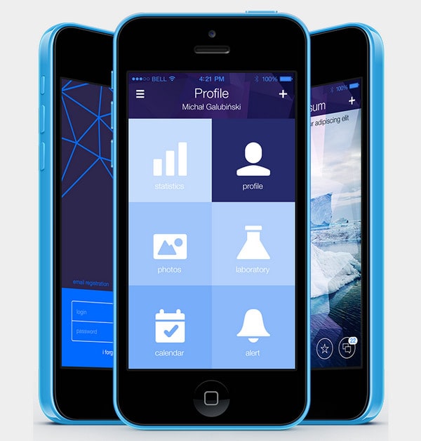
Vectra, branding by Michal Galubinski and thoke design has navigation that is hard not to notice. The designer not only stretches a menu with six links to a full screen, but also leverages huge plain icons that are obvious for a better part of online audience.
With Pulsetic you’ll be instantly notified the moment your website, API, or server becomes unavailable. Monitor uptime from multiple global locations and respond to incidents before your users are affected.
Create beautiful status pages in minutes to keep customers informed during outages and build trust with transparent communication.
Start Monitoring for Free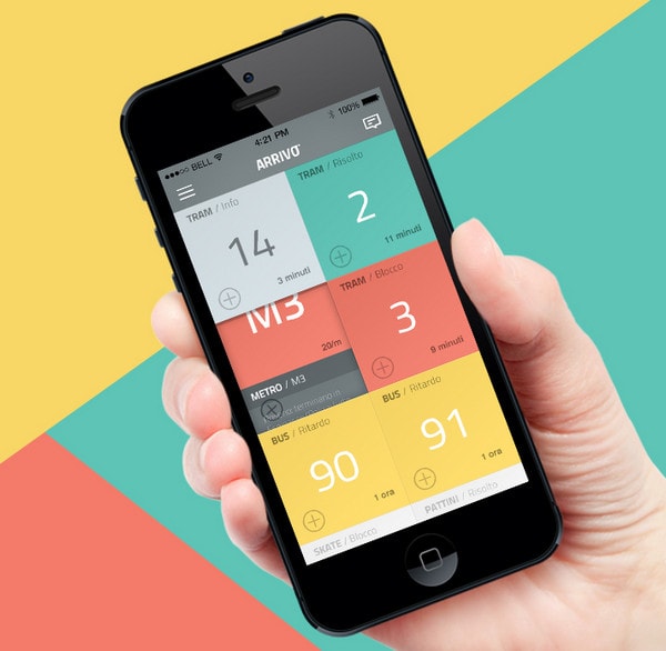
Arrivo Mobile App by Marco La Mantia & Simone Lippolis skillfully organizes a bunch of data into a rigid rectangular grid. Each cell plays a functional role; since it not only displays data, but also lets you modify it via a small control panel that slides out from the bottom. Also the color choice is quite wise, since intensely hued backdrops helps to effectively allocate content and distinguish cells.
Abracadabra App by Sergey Valiukh is certainly made with a retro style in mind that gives the app a magnificent vintage appeal. Here, the designer capably splits the screen into six equal cells that are really easy to navigate. Flat-style icons combine with bold casual type that are aimed to contribute to usability.
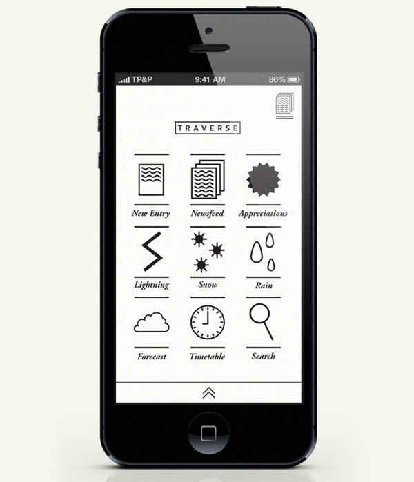
T R A V E R S E by Willis is a sketch style that runs through every functional screen. The app is based on a light monochrome background and outline graphics, thus the main menu that doesn’t have any visible separators is managed to keep things in order and let users to explore the app quite easily and handy.
Bottom menus serve mainly as navigation aids that are inherent to inner functional sections or separate widgets.
Badoo concept by Jakub Antalík has navigation that is placed at the bottom of the screen. It also includes an extendable menu where each item has its own control panel.
Animated sliding tab bar by Virgil Pana puts forward a perfect solution for highly informative applications that include a lot of statistics or present data via charts and graphs and remain clutter-free. The normal-sized menu nicely slides out from the bottom of the screen and displays a small control center.
Since we are accustomed to explore mobile screens top-down, placement at the top of a screen comes with certain advantages. Tab bars and standalone icons for control centers are the leading representatives of such arrangements.
Horner by Cüneyt ŞEN includes navigation that is hidden, yet it nicely comes out from the top. It stands in a sharp contrast to the overall composition thanks to bright coloring and relatively huge icons.
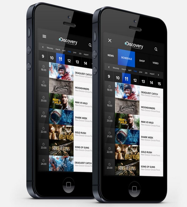
Discovery Channel by Enes Danış locates all basic and secondary navigation on the top in order to not confuse users with a constantly shifting location.
Air flow calculation app for Bettertec by HAMZAQUE Designs skillfully employs tab bars that predominantly take up the header. Moreover, they are made in black hue that contrasts with a white tone used for the rest of the screen.
Shario App by MING Labs&Pierrick Calvez has a clean vector-style concept that reveals an app in action. The whole navigation occurs via several buttons that are placed on the top.
Expanding menus are a real treasure for designers that deal with highly informative apps or prefer building neat tightly-packed interface designs. This solution allows placing a menu icon anywhere you want, yet it is quite often found in the top-left corner.
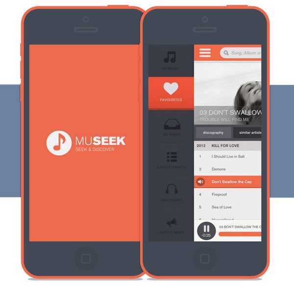
MuSeek by Al Power is a music-oriented app, and has to provide an owner with lots of visual data: album covers, descriptions, song titles, tracklists etc., so there is no extra room for a full screen menu. In this case, a small icon in the left-top corner smoothly reveals a relatively huge menu is a kind of a lifebuoy.
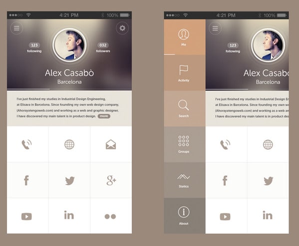
Univit UI by Mohammed Alyousfi & Àlex Casabò is a refined flat-style app that uses a standard slide out menu that becomes accessible through a simple swipe. The menu relies on intelligible trendy contour-style icons that are much larger than respective titles. Such approach allows naturally working the menu into the composition, and at the same time, offering a better user experience.
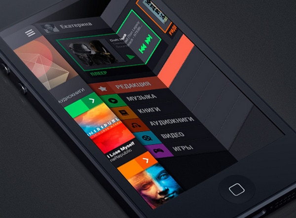
SVOY app design by Alexandre Efimov is based on a garish color palette that effectively works with a dark canvas. The designer makes the menu extendable from the left side. It is also spiced up with eye-catching and realistic unfolded animation.
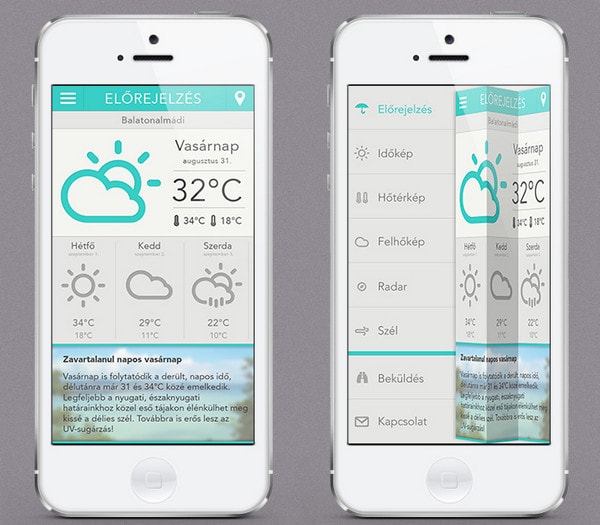
Időkép by Attila Szabó is another crisp variation on an expanding menu that leverages a fantastic effect of “pulling back curtains” in order to reveal itself. It takes up almost an entire screen.
Conclusion
Every solution has its own pros and cons, that is why every project suggests its own type of navigation that will effectively cope with its task and contribute to user experience.