Eye-Catching Mobile App Interfaces with Sleek Gradient Effect
With iOS 7 we took a fresh look at gradient effect that, to be honest, is one of the simplest embellishments in designers’ toolkit. It has numerous variations that can either liven up or, vice versa, ruin the design, crucially depending on opted colors and overall theme. Besides, like most decorative tools, it also undergoes changes depending on current trends.
A present-day’s dominant trend is a smooth and gentle neon-like gradient that is usually paired with a light, almost luminous, text and simple, easy-to-understand glyphs that are regularly bolstered by low opacity layers. Such an exquisite combination naturally adds a note of refinement and subtlety to any UI.
Today we are going to talk not only about this type of gradient – that is, undoubtedly, quite popular – but also about another basic and wide-spread approach of applying the gradient. The method involves the use of a gradient more as a differentiation tool, the principal purpose of which is supporting content in a visual manner.
In the beginning, let’s inspect remarkable mobile app interfaces based on the hot trendy gradients.
Gradient Effect in Mobile App
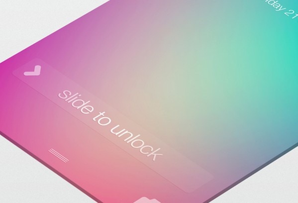
iOS7 Lockscreen by Michael Shanks opens our collection with its magnificent sleek gradient-based interface. The minimalistic screen includes only essential information that is executed by means of elegant light type and highlighted with the help of subtle shadows and semi-transparent stripe.
With Postcards Email Builder you can create and edit email templates online without any coding skills! Includes more than 100 components to help you create custom emails templates faster than ever before.
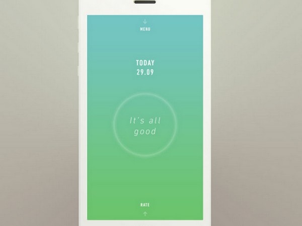
Free Email BuilderFree Email TemplatesSense by Tommy Borgen. The designer also takes a minimal approach with its UI. The screen looks simple but truly delicate. The slightly blurred outline circle in the centre beautifully cooperates with narrow subtle typography in it and goes nicely with a flowing background.
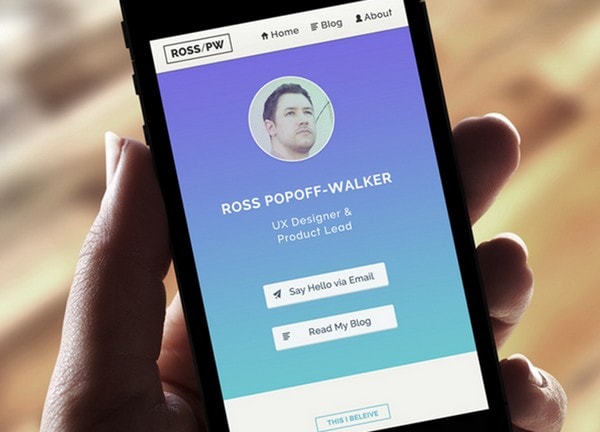
Personal Site Idea v1.1 by Ross Popoff-Walker. The designer makes use of marvelous splash of colors borrowed from a daybreak gradient. The background serves as a firm base for white graphics and letterings that favorably stands out from it. A lot of white-space as well as light grey solid color header and footer – that includes most of the navigation – beautifully complete the theme.
Screens by Yasser Achachi look absolutely amazing and attention-grabbing. The prodigious kaleidoscope of colors that are implemented to the background in cooperation with light font, regular pixel-perfect icons, translucent stripes and colorful boxes ably manages to craft truly breathtaking interfaces.
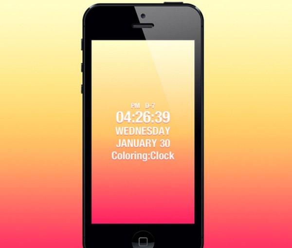
Coloring Clock by Kyung Min Kim features a hot flaming gradient canvas that is supported by matching block of bold text and a lot of free space. The delicate and organic color palette naturally sets the screen off. You can also specify your favorite gradient theme, giving the UI your own personal touch.
With Pulsetic you’ll be instantly notified the moment your website, API, or server becomes unavailable. Monitor uptime from multiple global locations and respond to incidents before your users are affected.
Create beautiful status pages in minutes to keep customers informed during outages and build trust with transparent communication.
Start Monitoring for FreeInstasave iPhone App by chirag dave – uijunction demonstrates a wonderful radial gradient image that plays the role of a solid background for side menu. The designer uses a lighter part of the background for laying emphasis on navigation, which is represented through tiny delicate glyphs and slim type.
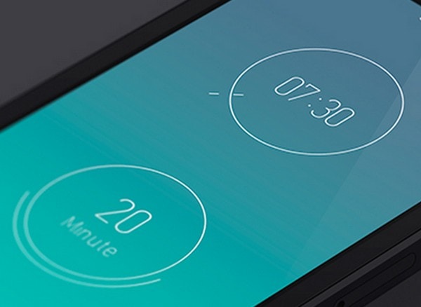
Beam Day (concept clock) by Vladimir. Here, the background is aimed to clearly highlight an exility of graphical components. Ultra-narrow outline circles and thin typography complement each other perfectly.
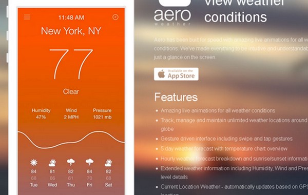
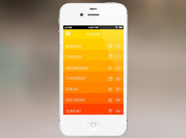
Aero Weather by Alex Patrascu. Here, the clean bright gradient naturally brings the eye to the weather forecast that includes a whole deal of helpful information. The light casual font is perfectly coupled with a background and makes the data look legible.
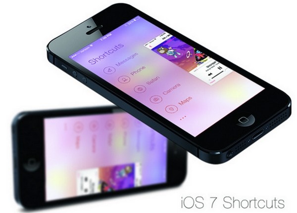
iOS 7 Shortcuts Menu by Gaétan Pautler. Although the designer doesn’t actually use a traditional gradient, since a backdrop image is a heavily blurred picture with a lopsided touch, the background for shortcut menu, nonetheless, has a barely noticeable descending gradient from blue to pinkish creamy.
Gradient Effect as Reinforcement Medium
This part of the collection is dedicated to app interfaces that use gradient effect as reinforcement medium.
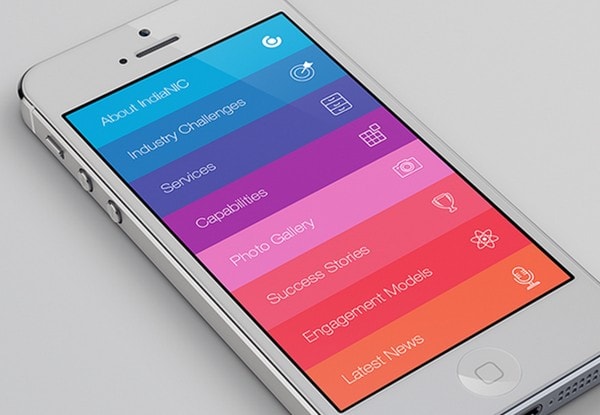
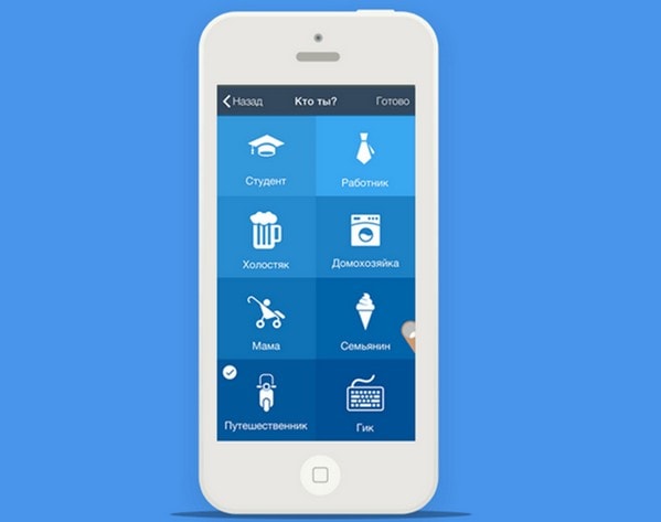
IndiaNIC App by Keyuri Bosmia has a lovely rainbow touch. The designer skillfully colorizes menu in garish hues in order to clearly set each menu item apart. On the whole, the concept looks vibrant and cheerful.
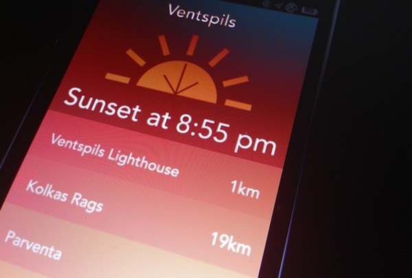
SunFun App by Andrus Valulis. This UI, on the contrary, is based on a more smooth and natural gradient effect. Since the app is dedicated to displaying sunset and sunrise data, it’s not surprising that the designer employs warm colors to support the theme.
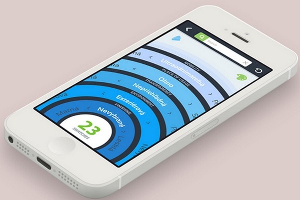
Flat Style Color Wheel by Frantisek Krivda. Unlike the previous example, the UI utilizes a cold color scheme that eventually flows into neutral white. As a result, the interface looks more sharp, strong and serious. The curvy lines of vibrant functional circles add a note of sleekness.
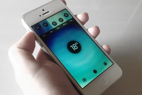
Haze Rays theme by Franz (Taptanium) is another concept that strongly relies on a crisp, chilling color palette. The radial gradient naturally focuses users’ attention on the center of the screen and easily livens up the key data.
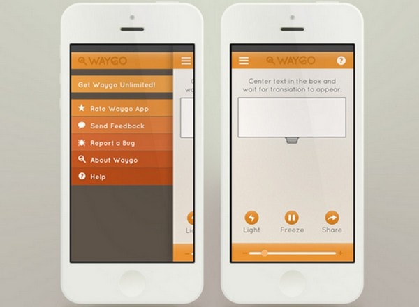
Waygo App V2 by Carrie Phillips. The designer employs a warm vivid gradient theme, made in fresh shades of orange, to brighten up the menu section. The color choice matches the main color scheme perfectly, and nicely reinforces the theme.
Bird app GIF by Rustem Ramadanov features a well-organized and legible tile layout that capably pinpoints categories via sleek color differentiation. The designer makes use of well-tried and modest blue and white colors combo.
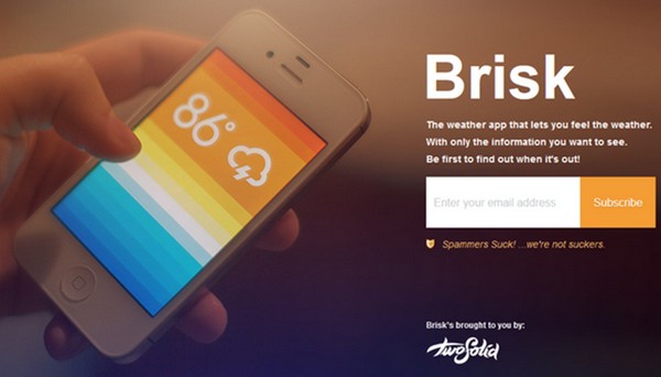
Brisk by Eddie Lobanovskiy. The interface exhibits a comprehensive gradient that features various shades from tropical orange to arctic blue. Here, the background plays more functional role rather than decorative, each color helps to graphically support temperature indicator.
Goo App by Nick Murphy is based on a stunning pastel coloring. The soft gradient beautifully interacts with content, giving the UI a gentle and dulcet appeal.
“Giftboard” by Maria Bratchikova. The designer ably distinguishes categories via various tones of red that give the UI an amiable, slightly sentimental touch. This small gradient helps both to underline and unite categories together.

Weather app UI by Amine Mounazil is another app in our collection that utilizes the power of color to visually support data representation. As usual, the higher temperature – the more deep and saturated warm shade is used.
Reflection
Designers wisely make use of various gradient effects starting from fluid polished canvases, which flow without interruptions and ending with rough inconsistent backgrounds that are visually broken into stripes.
They leverage this vibrant embellishment not only as a blunt decoration but also as a tool for reinforcing the chosen theme.