Mood Boards for Product Designers
Most designers know that wireframing and prototyping are essential parts of the design process. Without prototyping, your chances of creating good design are almost nil. To craft a proper prototype, designers need to spend time ideating. Designers have a lot of different tools and techniques that help them during that brainstorming process. One tool that makes it the process of ideation most effective is mood boarding.
A mood board is a tool that helps designers find the right direction for designs and create a solid foundation for the emotional experience they want to create.
From this article, you’ll find what this tool is all about and how it can be used most effectively.
What is a Mood Board?
A mood board is a collection of textures and images related to design and used as a reference point.
Mood boards can be used for different needs. Here are a few typical examples of mood boards:
- Brand book/logo (help to find brand/icon style)
- UI design (help to find and define visual principles)
- Content strategy
- Motion and interaction
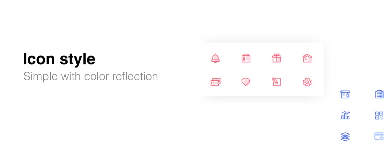
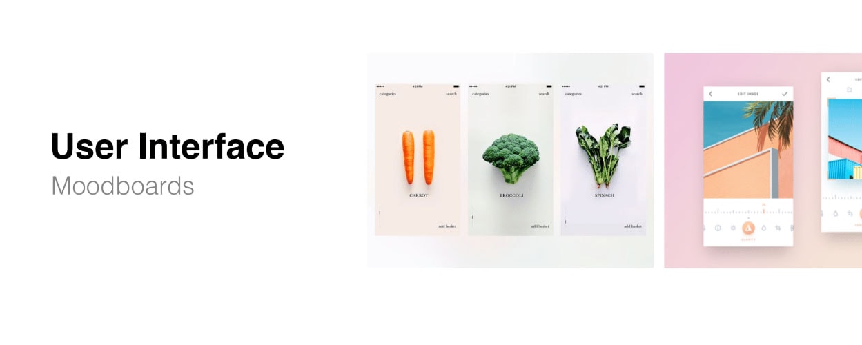
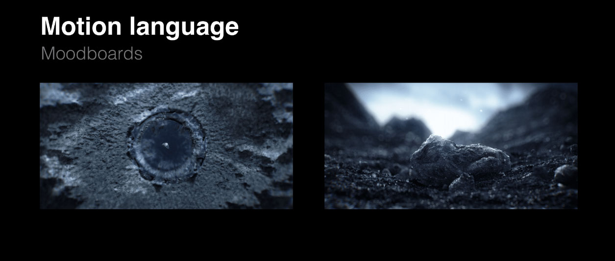
What Mood Boards Help Designers Do
Get Inspiration
Mood boards are all about inspiration.
With Postcards Email Builder you can create and edit email templates online without any coding skills! Includes more than 100 components to help you create custom emails templates faster than ever before.
Free Email BuilderFree Email TemplatesMood boards help designers find something beautiful and implement it in their work. For example, icon designers collect different shapes to figure out what form of icons they want to use.
Mood boards serve as inspiration for clients. They help clients get a sense of design, and it’s a great tool to get design direction buy-in from clients.
Convey an Idea
When designers try to convey an idea, sometimes it can be hard to communicate verbally. Words are not enough. Designers need to show something.
Mood boards help designers explain and illustrate “why” they make a particular design decision to peers and stakeholders. When asked, “Why do we need this specific shape in our UI?” you can show them a mood board, so your design decision becomes clear.
It’s vital to mention that for a mood board to convey an idea, it should contain examples of something that people use, not just abstract concepts. These might be examples from different industries. Only in when used in this manner will a mood board act as proof that the design direction will be successful.
8 Tips for Creating and Working with Mood Boards
Creating mood boards can be hard. Fortunately, we have a few tips and tricks to make this process easier for you.
1. Aim for a genuine emotional response
Think about emotions you want to convey when presenting a mood board to stakeholders. Before selecting a first image/texture for your mood board, try to imagine what would evoke an emotive response.
Tip: When you show a mood board, the goal is for people to respond with words like “Great” or “Good stuff” with a genuine reaction. Watch the facial expressions of those you’re showing it to. This will give you a sense of whether or not a board is doing its job.
With Pulsetic you’ll be instantly notified the moment your website, API, or server becomes unavailable. Monitor uptime from multiple global locations and respond to incidents before your users are affected.
Create beautiful status pages in minutes to keep customers informed during outages and build trust with transparent communication.
Start Monitoring for Free2. Ensure mood boards work holistically with each other
When a design team is responsible for creating a whole product design strategy (all parts of a product), it’s vital to set a clear direction for all mood boards to make them work holistically. This will help create a solid foundation for your future design before you start pushing the pixels. Mood boards that work holistically with each other help designers to create a big picture – it becomes evident for everybody what emotions a team wants to convey in a product they create.
3. Mood boards are tools for reference; only refer to something you can achieve
When you show mood boards, you set expectations. When stakeholders see polished mood boards, they believe that a final design will have the same level of craftsmanship. If delivery differs greatly from the quality of the mood board, you risk losing a client’s trust. Do not reference something that you are not capable of performing because it can set you up for failure.
4. Look beyond the digital world
When it comes to creating mood boards, all too often designers search for inspiration online. Of course, Google can give you a lot of great images but it just one source.
Don’t limit yourself to a digital medium. Take inspiration from nature. If you like photography, use colors from your favorite shot in your design product.
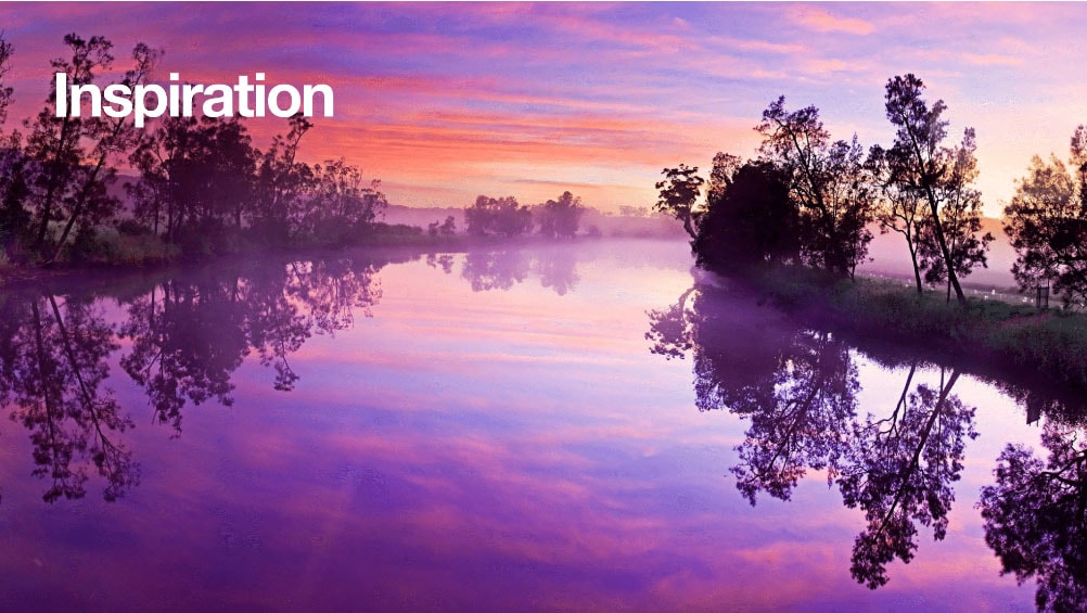
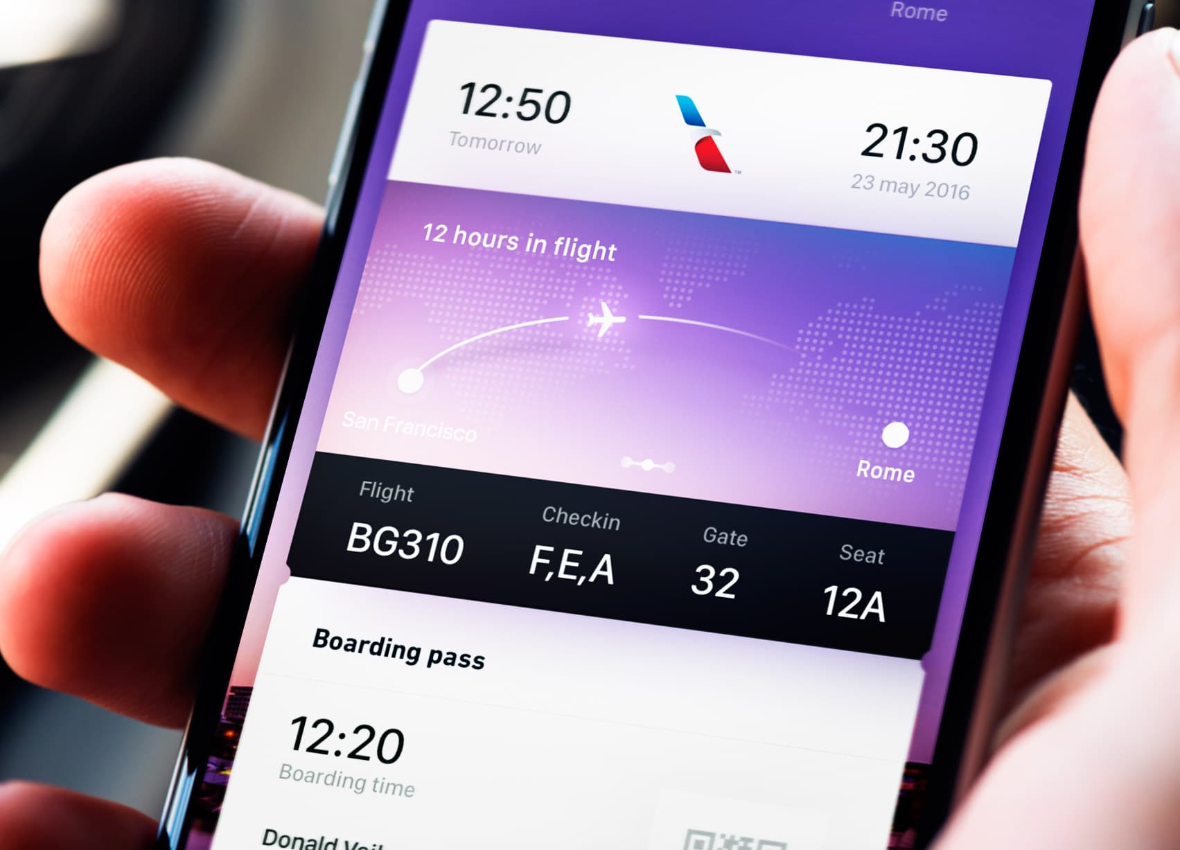
Mood board by Gleb Kuznetsov.
Paper press is another excellent source of inspiration – books and magazines can be a source for that perfect image.
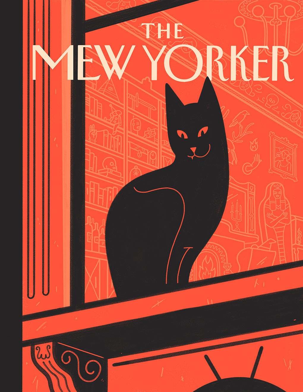
Cover pitch by Jack Dylan. Courtesy of the artist.
5. Curate your collection
Be careful not to make this mistake: Collecting too many images/textures in mood boards. More images is not always better. A greater the number of images can result in fewer chances that people will comprehend the information. Why? Because a user’s attention is limited and it’s relatively easy to overwhelm people with too much information. Information overload makes the message more difficult to ascertain.
The primary goal of using mood boards is not in entertaining but solving a particular problem. That’s why not all images and textures deserve to be on a mood board. When creating a mood board, think more like curator rather than a collector. When I create a mood board, I combine up to 1,000 images but only include the 10 most powerful and consistent visual references.
Tip: It can be overwhelming to prepare mood boards. You go through thousands of visual examples, and at the end of the day, you might face a situation when it’s hard to separate a good example from a bad one. When you work with a massive amount of information, it’s normal to feel overwhelmed. That’s why it so important to have a moment of relaxation during the process of gathering information.
This is how it works for me:
- Collect images for a few days (say, 1,000)
- Switch to different activities and relax
- Remove half of the images in my collection
- Repeat steps 2 and 3 until I have only 30-40 images remaining
- Carefully analyze the images and keep just 1 percent of the original set
The goal is to have images that help you convey an emotional feeling that is consistent.
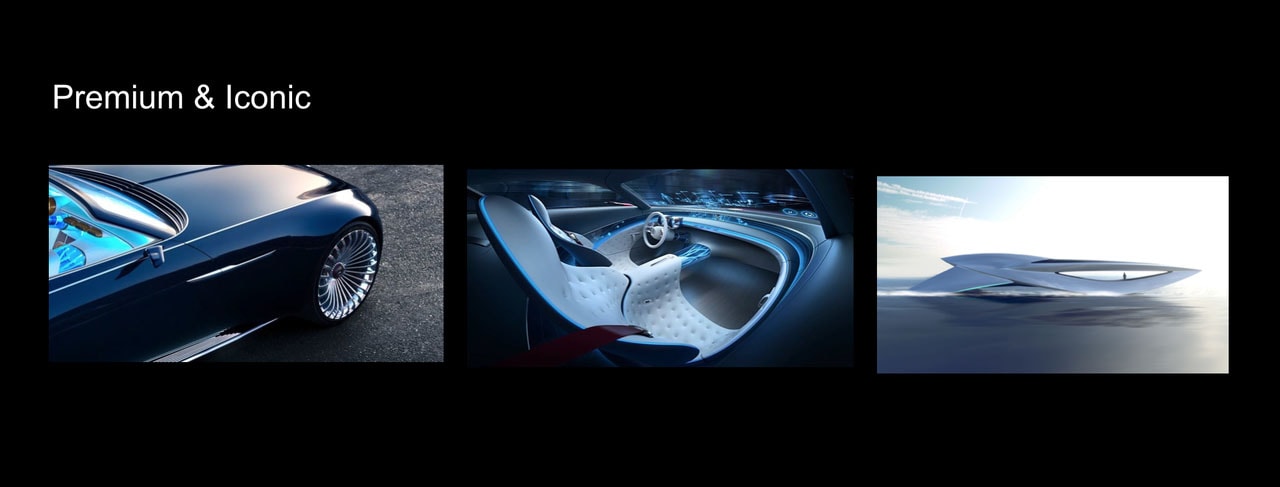
After combining nearly 1,000 images, I leave only 10 of the most powerful and consistent visual references on my mood board.
6. Choose the right format
Depending on the type of project, you can produce an offline or online mood board. The formats require different approaches.
The offline format is perfect when team members work in the same physical space, and it’s possible to meet with stakeholders in person. The benefit of the offline format is that you have an opportunity to describe what you mean in person. Clients can ask questions and hear your opinions.
An online format is the only possible option if you have a remote or distributed team. In this case, it’s required to spend extra time to make a mood board clear for all team members so get a sense of the information you provide without comments. Feel free to add a few words to a board to describe ideas.
7. Give prominence to the key message
No matter what format you choose, it’s important to select an image (or images) that will be a foundation for your design. There’s a simple trick you can use – play with the size of objects to direct the eye. Larger objects (images/textures) capture more attention than smaller ones. Smaller objects can complement larger ones.
Using this approach, you can direct viewers to the most important details of your future design, and they’ll have all the required information in a glance.
8. Collect the best images/textures from mood boards for future projects
Mood boards shouldn’t just be for pitches. Consider using mood boards for your future projects. Use Pinterest to save examples. A benefit of using Pinterest is that you can distribute work according to sections on specific “boards.”
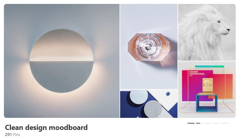
Mood board by Gleb Kuznetsov.
Helpful Digital Tools for Creating Mood Boards
The great thing about mood boarding is that you don’t need to use any special tools. All you need is a whiteboard in your workspace. But you can also use digital tools to make it easier to convey ideas.
1. Pinterest
Pinterest is a must-have tool for designers. Pinterest allows you to create mood boards using resources from all over the web. Pinterest also provides access to a rich collection of existing mood boards – everything from kitchen ideas to high-tech devices. Having access to all this information is an excellent opportunity for designers to find inspiration.
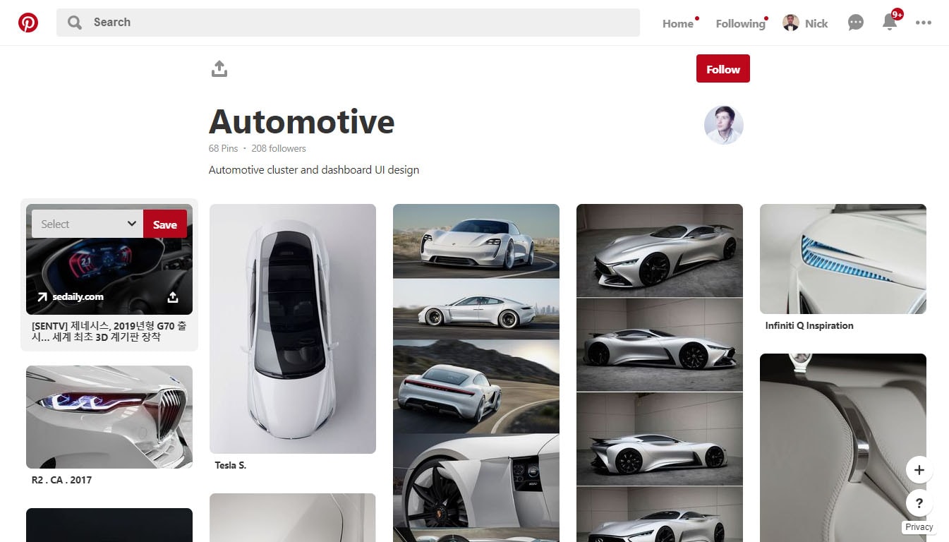
Pinterest is a great place to find inspiration. Automotive moodboard by Gleb Kuznetsov.
2. The Matboard
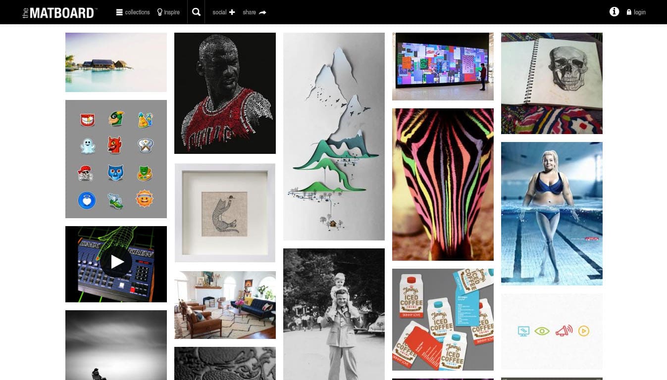
The Matboard provides access to a curated collection of images created by photographers, filmmakers and commercial directors.
3. Canva
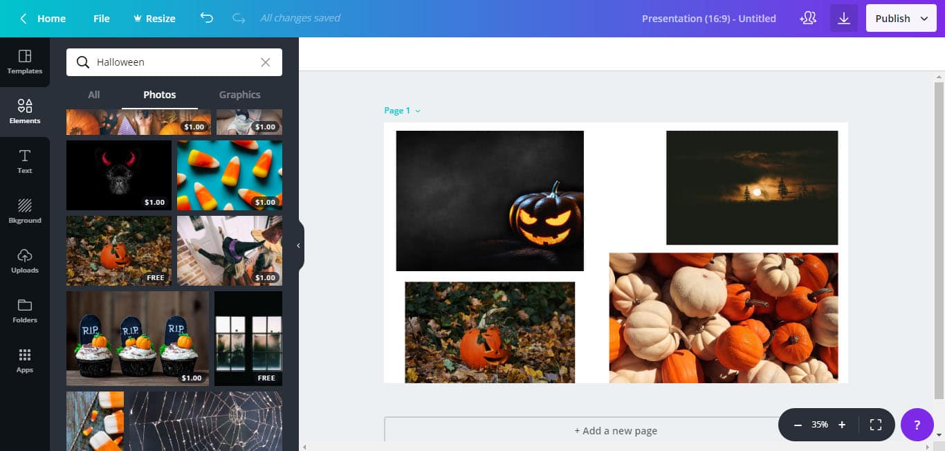
Canva is a great tool for creating online mood boards. It has a drag and drop editor and allows anyone to create amazing mood boards in minutes. Canva also has a library of images; this feature can save you a lot of time (no need to browse the web to find the right image).
4. Evernote
While the majority of Evernote’s users use the app for notetaking, it’s possible to use it for creating mood boards.
5. Mural
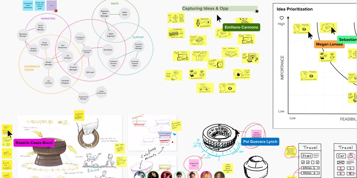
Mural is an excellent tool when you need to craft a mood board with a team. Mural creates a shared digital space where teams can collaborate on ideas.
Conclusion
The process of creating mood boards shouldn’t be boring. It should be fun. Every creative person needs inspiration, and creating mood boards can be a useful habit for designers.

![The Short History of Web Design [Infographic]](https://designmodo.com/wp-content/uploads/2018/11/The-History-of-Website-Building-404x263.png)