Motion Design in Digital Experiences of the Future
When designers create products, they tell stories to users. Designers have a lot of tools to make a story more interesting. Motion design is one of the most powerful tools designers have. The true power of motion can be seen in mobile experiences. A mobile app without motion is just a sequence of independent screens. But when designers introduce motion, something magical happens – a design comes alive – an app becomes an interactive story that can engage users.
Today we explore the concept of motion design in the interfaces of the future with Artificial Intelligence (AI) assistants.
Building the Future of Artificial Intelligence
AI assistant is a common attribute of many modern cars and smartphones. In simple terms, it’s a system that helps users solve everyday tasks such as ordering a pizza or setting a target destination. The process of interaction with a system looks pretty obvious – users activate the system and provide a command (in most cases, via voice), the system proceeds a request and replies with details.
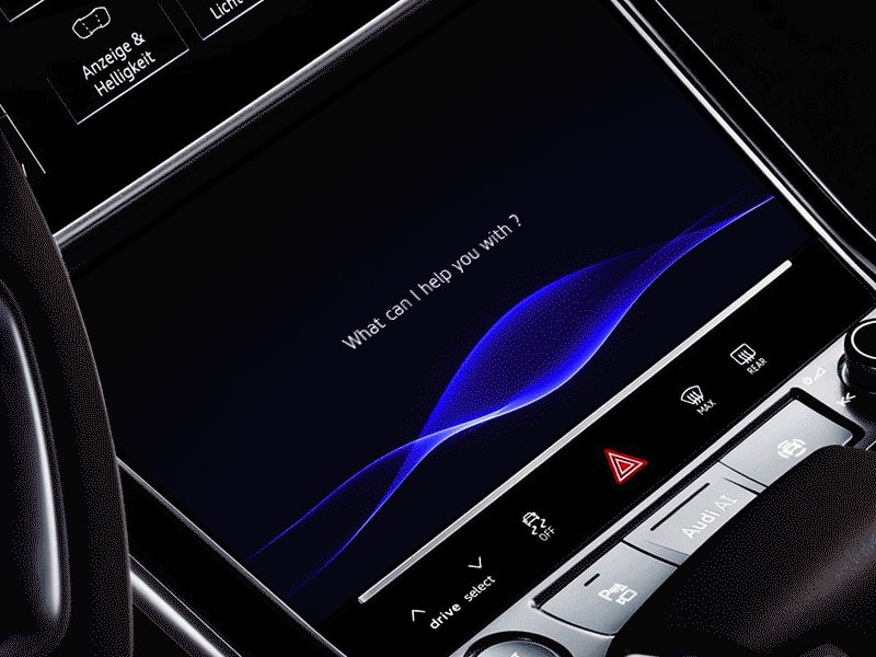
Automotive AI visual design by Gleb Kuznetsov.
The current state of AI design has two major downsides:
- The feedback provided by a system is not very informative. It’s not clear how a system handles your request or what exactly happens with the information.
- Feedback that the system provides doesn’t convey emotion. It is robotic. When a user interacts with such a system, it feels giving commands to a computer. The only difference from a traditional GUI is that you use a different medium for the command (voice vs. keyboard input).
Designers are attempting to solve these problems and make machines look and feel alive.
With Postcards Email Builder you can create and edit email templates online without any coding skills! Includes more than 100 components to help you create custom emails templates faster than ever before.
Free Email BuilderFree Email TemplatesHere is how we can achieve this with motion:
VUI That Builds Trust
The future state of AI systems will prioritize VUI that builds trust. Trust helps to build a bridge between a person and machine. If trust is absent, users will be unlikely to interact with a system. One of the most important aspects of building trust is giving users the sense of control. Visibility of system status and user control and freedom — 2 of the 10 Usability Heuristics for User Interface Design coined by Jakob Nielsen are still applicable to VUI design.
But what does it mean in the context of an AI system? The system should react to a user request with appropriate feedback. This feedback should give users a full understanding of what the system is doing.
Visual Feedback on User Input
Without clear visual or audio feedback from a system, users can only on guess when they interact with a system. Visual feedback lets the user know the current state of a system — it acts as an acknowledgment that system received the request and is processing it.
When it comes to designing visual feedback for AI systems, designers have a lot of options to choose from. In the most basic way, feedback might be something as simple as a state change from a blank screen to something more meaningful. But it’s possible to achieve much better results by incorporating unique branding properties into visual feedback. Below you can see a concept of the Rokid AI voice assistant. Animated effects reflect the nature of the brand and engage users interacting with the product.
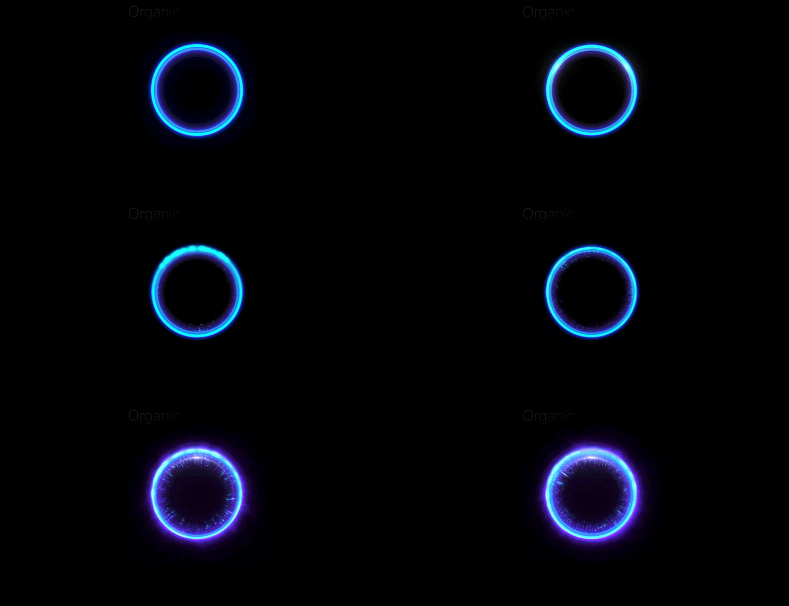
Artificial Intelligence UI design for Rokid.
But as users, we not only want to know that a system got our request, we also want to feel that the system understood us. This feeling plays a key role in establishing a greater level of trust.
It’s possible to achieve a deeply immersive experience using dynamic visual communication. Let’s see how it works in practice; motion can be used to confirm actions. Note the “Voice recognition” example from the Rokid case study. Visual feedback makes it makes it evident when the system hears the user because the sound wave becomes visible only when the user provides a command. The second example is “System GUI.” Notice the circle makes a horizontal movement to denote a “No” response.
With Pulsetic you’ll be instantly notified the moment your website, API, or server becomes unavailable. Monitor uptime from multiple global locations and respond to incidents before your users are affected.
Create beautiful status pages in minutes to keep customers informed during outages and build trust with transparent communication.
Start Monitoring for Free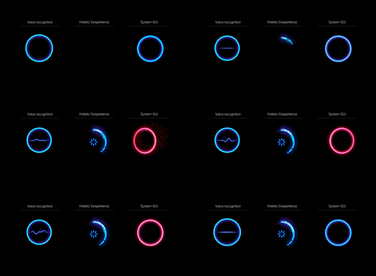
Motion can reinforce the actions a user is performing. Illustrations from Rokid Alien system UI.
Clarity for State Changes
State changes in UI often involve hard cuts by default — users see only the two states — a first screen that accepts user input and a second screen with results. Hard cuts make state changes difficult to follow and increase cognitive load (extra brain power to create a connection between the two states).
It’s possible to solve a problem of hard cuts and make the experience much more user-friendly by introducing inbetweening to generate intermediate frames between the states. The goal is to make the first screen evolve smoothly into the second. Motion plays a key role in this process — it keeps users engaged with a guided focus between views.
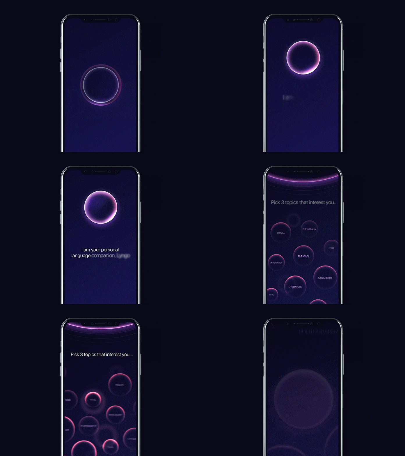
Personal AI assistant motion by Gleb Kuznetsov.
Process of Doing (POD)
When users interact with an AI assistant they usually go through three states — making a request, waiting for the results and reading results that the system delivers.
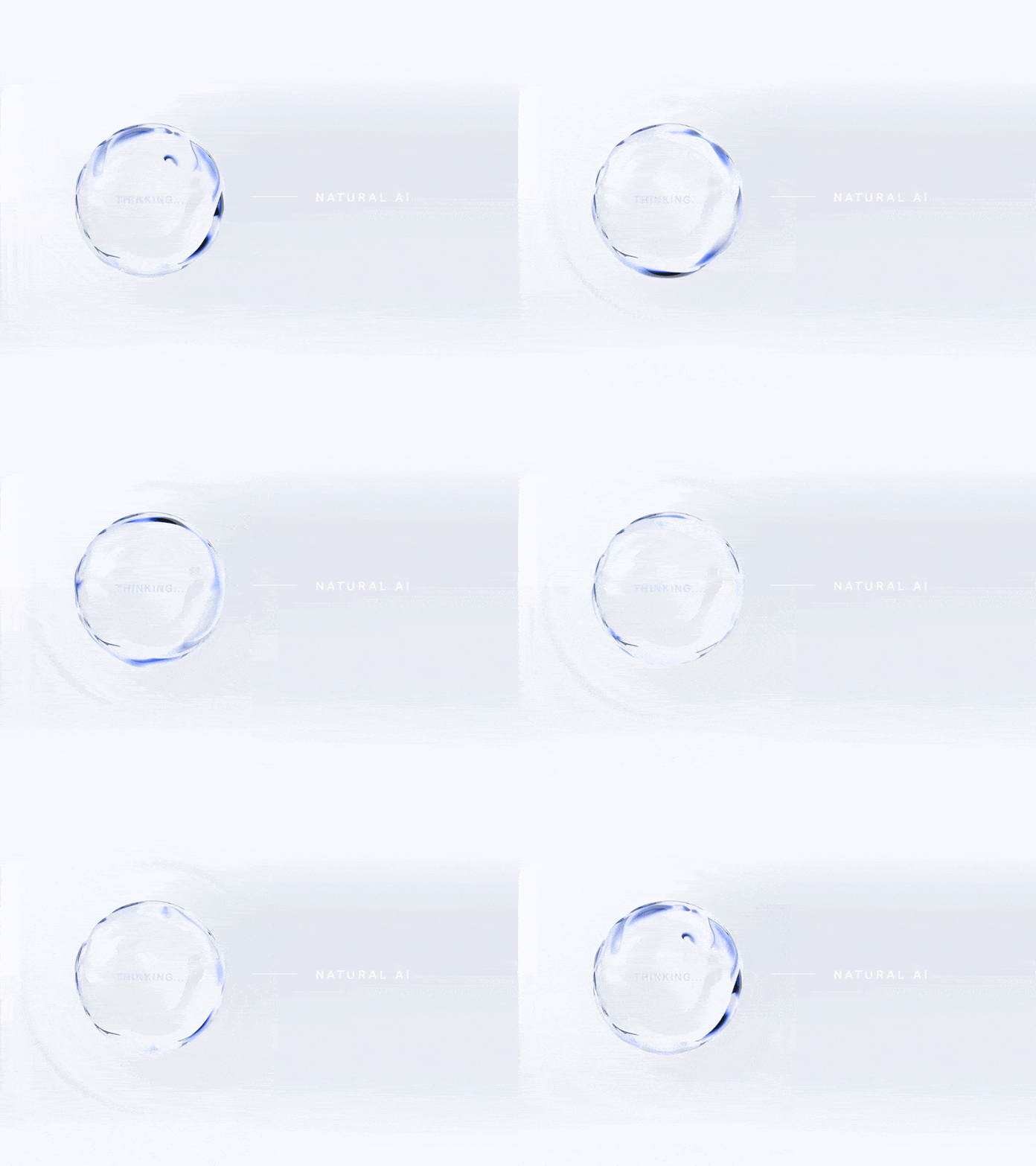
The system is proceeding user request and show this animated effect. Image: Gleb Kuznetsov.
Most users want to know what happens after they submit a command and before they see results. This information can help users understand whether or not the system recognized the original intent.
The concept of POD (process of doing) helps designers achieve this goal. Motion design fills the comprehension gap by giving the user a clue as to what’s about to happen. Here is how it works:
- When a user sends a request to the system, the system simplifies the process of what it does right now and shows this information to the user.
- A POD isn’t a loading animation; it doesn’t just state the fact that users have to wait while a system is doing something, it provides valuable information of what the system does.
How can I design a POD for my product?
Unfortunately, there’s no universal answer to this question. The nature of the product dictates the solution. Designers need to put themselves in the user’s shoes and think of what a user will do in a particular situation (what a user journey look like will be when they complete the operation manually). For example, a POD for a command for pulling out a file from Dropbox might look like searching for a file in Dropbox storage.
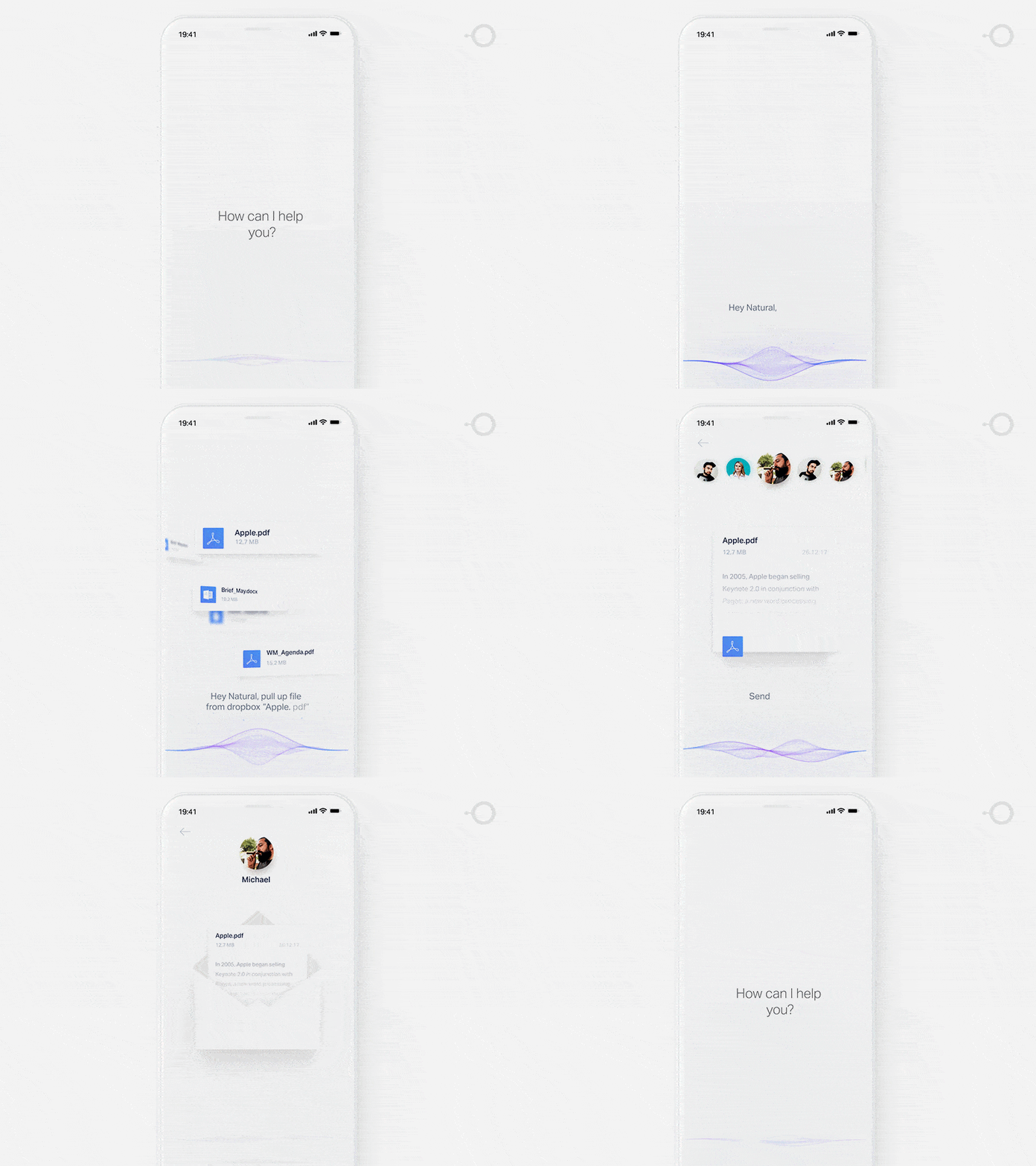
POD for pulling out files form Dropbox for Brain.ai. Image: Gleb Kuznetsov.
Interface that Conveys Personality
Many designers fall into the trap of creating a product that feels the same as every other product in a category. When a user interacts with such products, you can’t tell the difference between them. As a result, it’s relatively easy to confuse one product with another.
Motion can help designers solve this problem. By injecting subtle motion into a design, designers make users feel like they are interacting with something that has a personality.
Reinforce the Power of Small Details
“The details are not the details. They make the design.”
This timeless quote from Charle Eames reminds us that each detail in a product has an impact on how users perceive it. Simple attention to detail is often what signals users that the people who create product care about them. Even small things like an icon can play a significant role in user experience.
When designers spend time to create unique icons for a project, users notice and it makes the experience more memorable. By pairing excellent icon design with motion, it’s possible to create a truly delightful user experience.
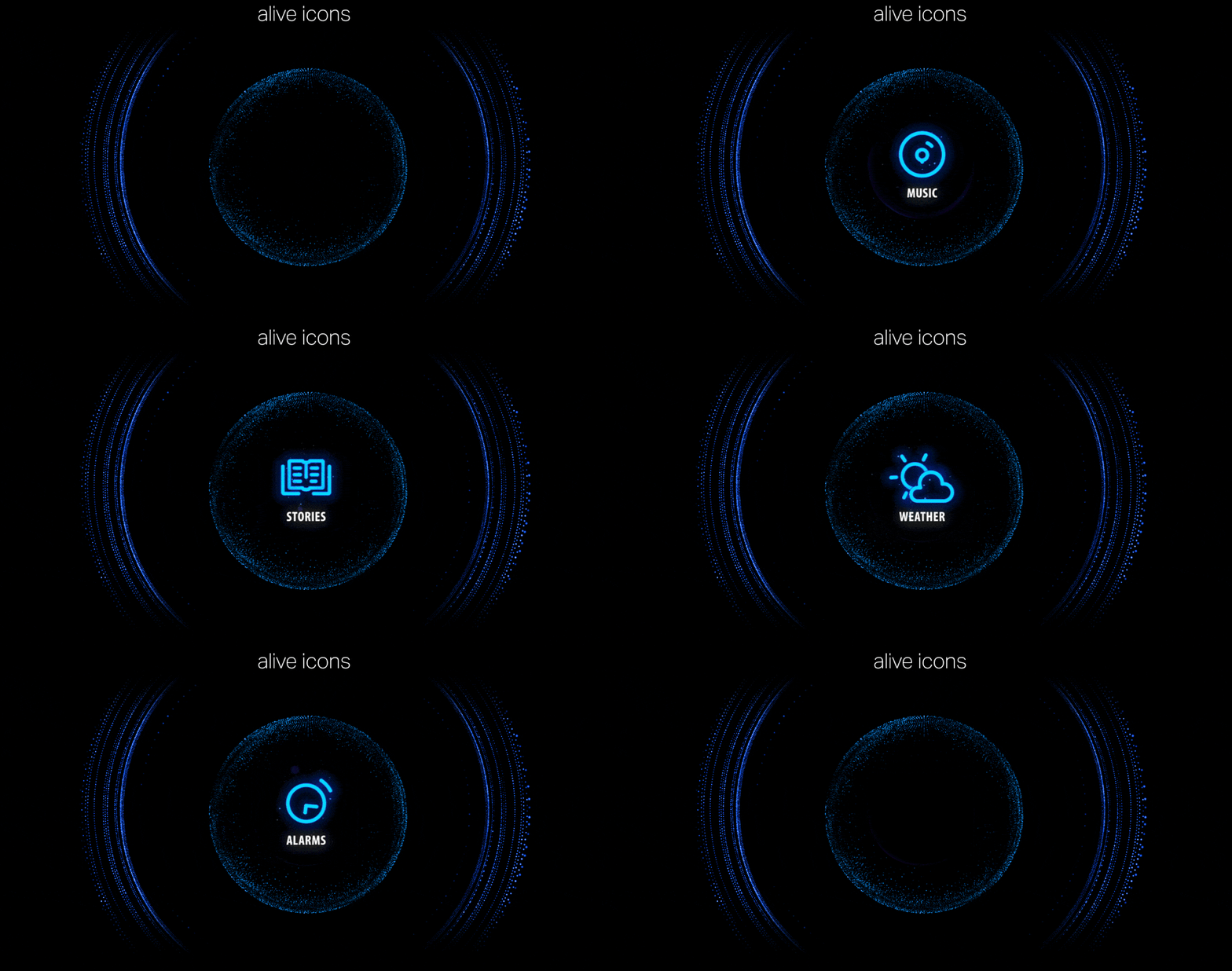
Icon morphing animation for Rokid AI voice assistant
Motion Language
Motion can add a new level of depth to interaction design. For every command users send to an AI assistant, there is a story that follows and good motion-based design helps designers tell it efficiently. The language we use to tell stories can be deeply connected with the emotions we want to convey for our users. What do we want users to feel? Do we want to entertain them and create a sense of fun or do we want to convey a feeling of sophistication? The nature of a product will help us find an appropriate language.
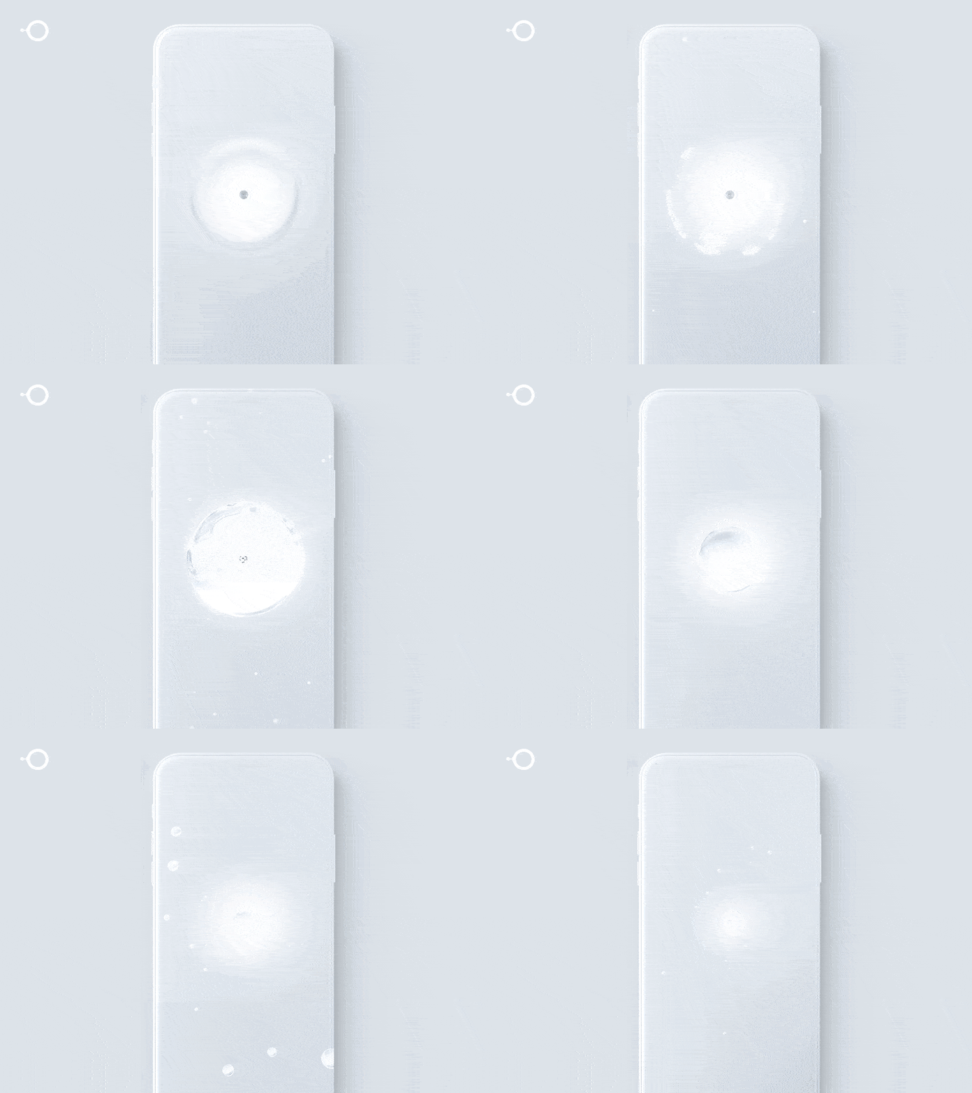
Visual Design design for the future of mobile interaction by Gleb Kuznetsov for Brain.ai.
AI That Feels Human
What makes an interface feel human? When it comes to AI assistance, two properties play a crucial role in how people perceive interfaces – voice and motion. A voice is part of the persona, and it shapes identity. Once we’ve associated a voice with something, it becomes part of its identity. And we experience emotions when we interact with such an interface, just like with real people. Motion can reinforce this feeling.
In the video 103EX, Rolls-Royce demonstrates how to give an artificial intelligence a soul. Thanks to motion, The Spirit of Ecstasy (the bonnet ornament on Rolls-Royce cars) becomes more than a decorative element. It becomes a natural part of the experience, a functional element that future drivers will associate with the car.

Designers can apply the same principles to their work. For example, if your product has a mascot, it’s possible to make it an integral part of a product design by adding finding a right tone, voice and rich motion effects.
Conclusion
Motion is absolutely critical to the design of the future. It helps designers to solve fundamental problems and develop trust between a machine and user to humanize interfaces.

