Pocket your music: Good Examples of Music-related Mobile App Designs
In a world of mobile applications music-related programs occupy one of a leading position. They are definitely one of the most sought after. One of the main reasons for such popularity is that you not only become a happy owner of tech-savvy extension, but you can also get pleasure of truly advanced and exquisite background for your music satisfaction.
Intense competition effectively stimulates designers on creating something out-of-the-box. Generally they prefer to recreate interfaces that strongly resemble accustomed music-oriented devices which surround us in everyday life. Designers easily breathe virtual life into forgotten radios, retro record-players or modern synthesizer, utilizing them as a concept for mobile music app interfaces that look simply astonishing.
In our showcase you will find fresh lively examples of music mobile app interfaces that have stylish, competent and refined appearance.
Mobile Music App Designs
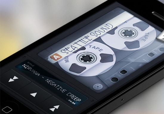
MixTape – iOS Music App by Marco Nenzi features realistic tape-themed background and old-style computer font in order to recreate a feeling of 80’s.
New Music App by Amit Rai looks vibrant and sophisticated. Warm photo background and light almost transparent widgets add to application outward neatness and delicacy.
With Postcards Email Builder you can create and edit email templates online without any coding skills! Includes more than 100 components to help you create custom emails templates faster than ever before.
Free Email BuilderFree Email Templates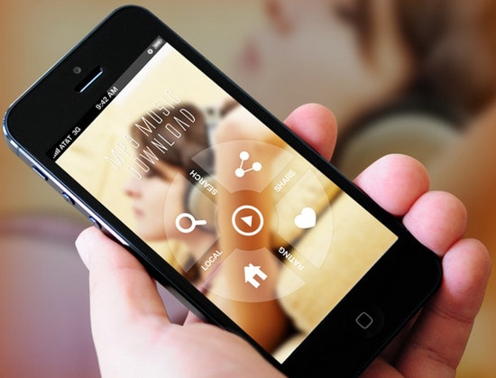
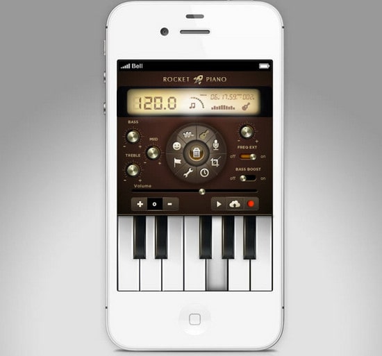
Rocket Piano UI design & concept for app by Isabel Aracama is a musician-oriented app that gives great opportunities for those who adores playing the piano. UI looks truly advanced and skeuomorphic.
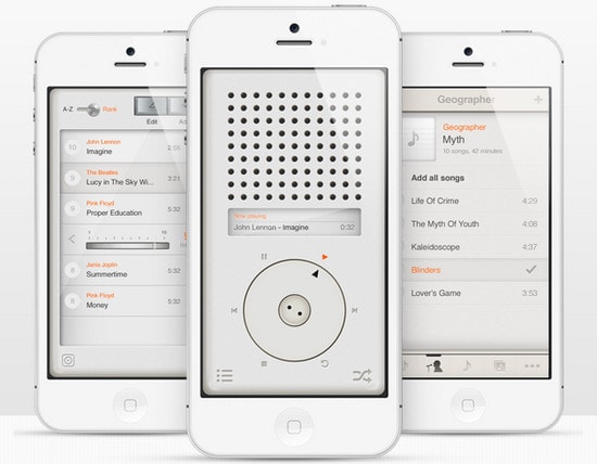
T3 Player App has highly-detailed light grey interface that radiates simplicity and cleanness. Comprehensive interface is able to provide a great deal of advanced controls.
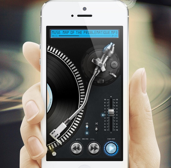
Turntable Player iPhone App Concept by Ivan Gapeev has a top notch design that charms users with exceptional graphic-driven DJs’ stuff, including amazing metal knobs, illustrated turntable and much more.
FlatPlayer by Ehsan Rahimi utilizes trendy flat style by freeing interface from superfluous effects and unnecessary skeuomorphism. On the whole, app looks elegant.
With Pulsetic you’ll be instantly notified the moment your website, API, or server becomes unavailable. Monitor uptime from multiple global locations and respond to incidents before your users are affected.
Create beautiful status pages in minutes to keep customers informed during outages and build trust with transparent communication.
Start Monitoring for Free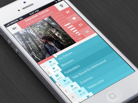
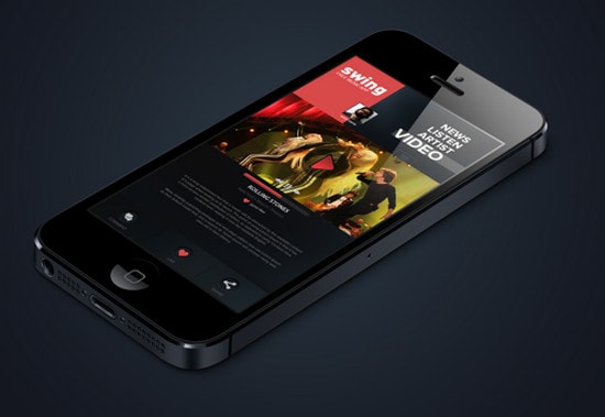
iPhone Music App. Concept by Enes Danış uses dark theme and magazine-inspired layout where every element gets its own place in the grid.
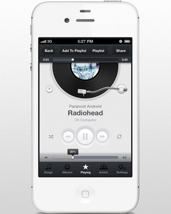
Music App UI (iPhone) by Piotr Kwiatkowski boasts of nice work on details, featuring light circular buttons, charming turntable and harmonious color scheme.
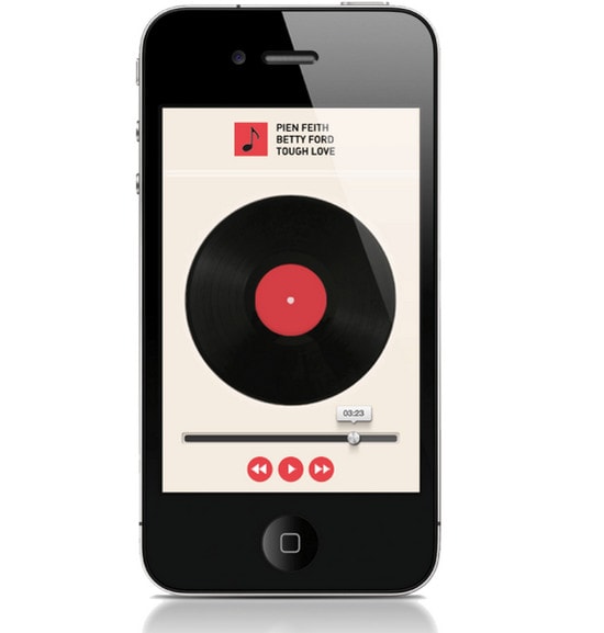
MUSIC APP by Roy van Laar skillfully blends together flat controls and skeuomorphic loading bar. All in all, application looks harmonious with slight retro touch.
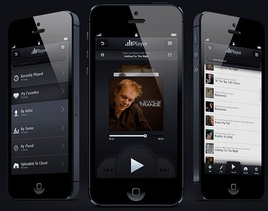
Player – Music Player App by Ilya Boruhov looks truly refined and accurate. Clean interface, subtle details and wonderfully incorporated shadows easily distinguish app interface from others.
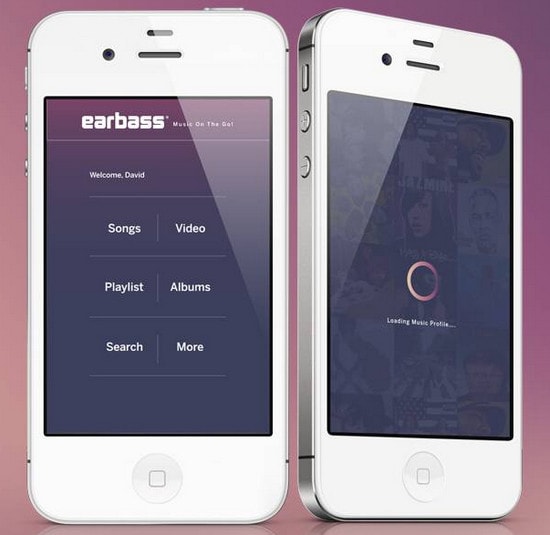
Earbass – Music On The Go! by Quintavious Shephard ably mix together monochromatic vivid background, grid-based layout, bold soft typography and vibrant components with subtle gradient.
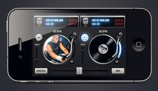
Carl Cox by Jonas Eriksson has a lively professional vibe. App allows you to feel as a real music creator, providing beautifully executed DJ’s tools.
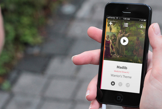
Moodsnap by Tom Junker fully relies on your emotional state and recreates appropriate background for your current mood, featuring photo-based background and couple of essential controls.
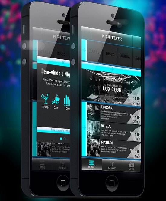
NightFever app by Michael Nunes establishes slightly glamorous nightclub atmosphere by means of dark color scheme and flickering neon-like user interface elements.
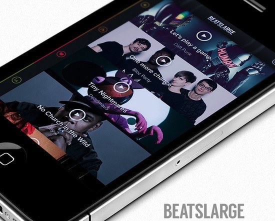
BeatsLarge iPhone Concept by Jonathan Kelley has a ravishing photo-based stripe layout where each song is furnished with image, distinctive title, “Play” button and specific color code.
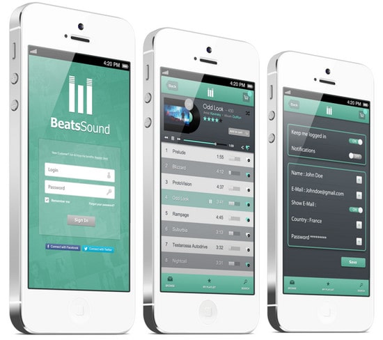
SoundBeats – Believe Your Ears by Florent Hancquart glows with freshness and originality that are primarily achieved due to skillfully chosen color scheme.
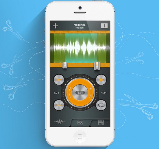
Ringtonium 3 represents comprehensive interface for those who wants to create their own ringtones. Metallic knobs and buttons have a lively glaring vibe.
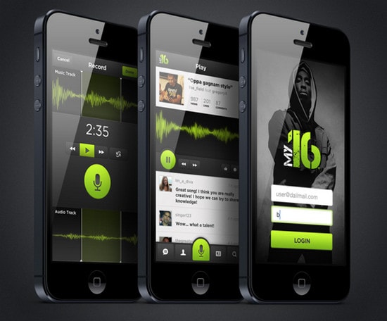
My16 – iPhone App by Maria Helena Cunha beautifully combines together greenish components and dark elements thus the first ones look as a bright spots with slight hip-hop touch.
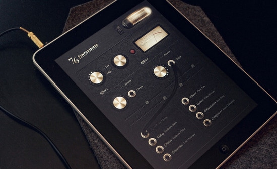
76 Synthesizer Concept by Jonas Eriksson looks truly advanced and professional with capably made synthesizer-inspired interface. All elements are accurate and plausible.
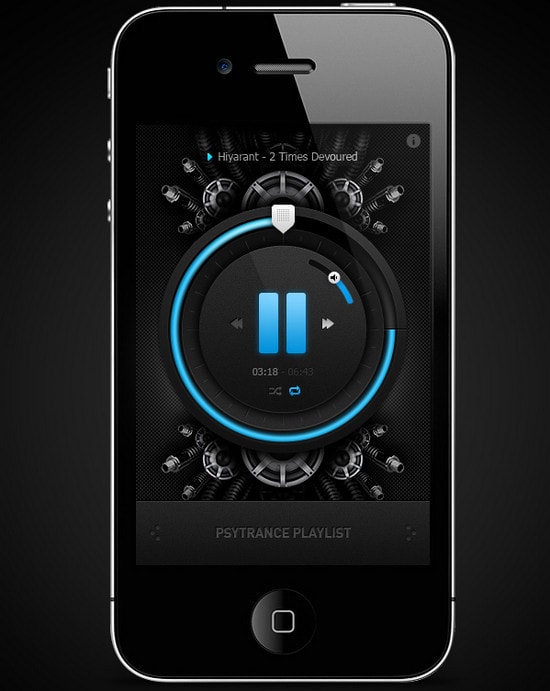
Music Player App by Emile Rohlandt includes exceptional gear-themed background with wonderfully injected luminous blue graphics that instantly strike users’ eye.
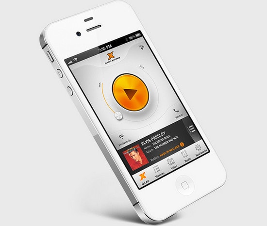
Radio Express iOS app by Martin Schurdak has a light interface with a yellow as a secondary color that brings a note of optimism and cheerfulness.
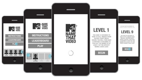
MTV Mobile & App concept by Andrew Couldwell takes on minimal approach, utilizing two-color scale. Due to a large amount of white space, plain graphics and regular typography, interface looks clean and fresh.
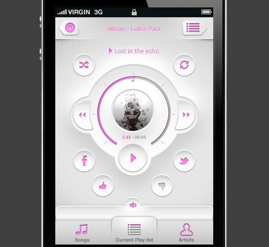
Music Player Application by Ernest Gerber conveys a soft and warm experience with refined buttons, light grey background, subtle gradients and bright pink accents.
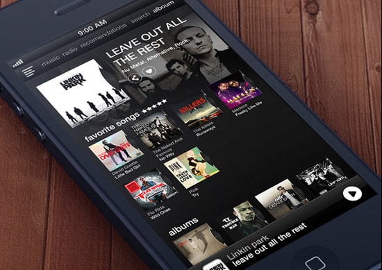
Music App Interface by Alex Bender uses grid-based layout, showcasing albums and songs in a well-organized manner. Dark color scheme in conjunction with slightly glossy gradients and clear outlined components look simply zingy.
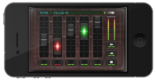
RITMO FREE MUSIC APP by PromoBeat Smartphone Apps introduces professional interface with wonderfully visualized settings that easily enchant users with glowing knobs and amazing backlight.
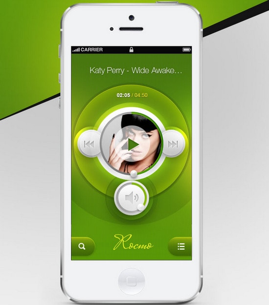
Rocmo Music App by Jeet Sean gets the feel of nature from its green interface that prettily intertwined with light controls, circular elements and smooth shapes.
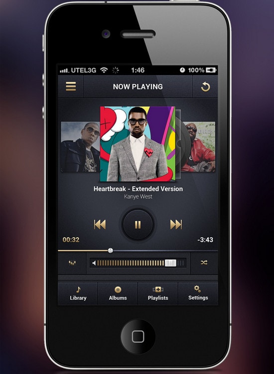
iOS Music Player App by Dmitriy Haraberush keeps things simple and open. Dark interface which is diluted by gold elements has a nice musical vibe.
Interphono – iPhone app by Abraham Vivas is marked by amazing slightly unpredictable interlacement of colors. Huge monochrome blocks, which radiate modern flat style, look vivid and saucy.
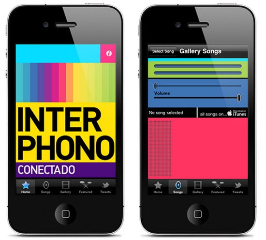
Less Than Four days by Abraham Vivas uses a great deal of rough textures and abstract glim-inspired images.
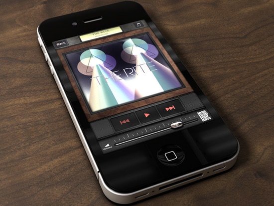
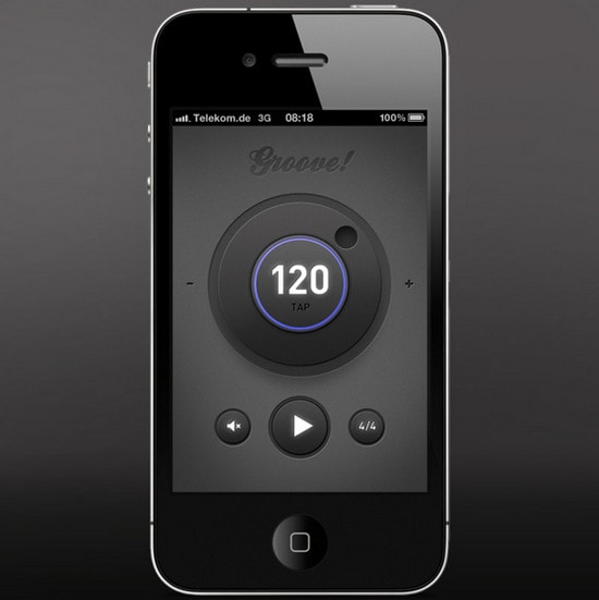
Groove! Simple metronome App by Tom Reinert closes our collection with its minimal dark interface that includes only several basic controls.
Reflection
Generally designers refer to minimal approach that in most cases pays off. By and large successful free music application interfaces need not only great technical side, but also distinguishable rather simplified intuitive controls that should grab users’ attention by means of skillful and high-detailed execution.
What’s your favorite music application? Does it have pleasant interface? What do you think about interfaces in our collection? Do they look out-of-the-box?
You may also want to look at:
Free Music Players for Website and Blog
