New Apple Look Doesn’t Fully Embrace Flat Design
The web was full of speculation in the weeks and days leading to WWDC 2013 – iOS 7 would be flat.
I’m glad I did not jump on that train.
Apple will not employ a completely flat design scheme with the iOS upgrade; it just touches on it.
The company did all but ditch the skeuomorphic look that has been almost a trademark of the brand since the release of the first iPhones in 2007.
Why iOS 7 is Not Really Flat
Apple is still using gradients and shadows in the design – two elements not characteristic of flat design.
With Postcards Email Builder you can create and edit email templates online without any coding skills! Includes more than 100 components to help you create custom emails templates faster than ever before.
Free Email BuilderFree Email TemplatesApple did go a long way toward flattening the design scheme with the removal of beveled edges and multiple gradients within each element, but it still stresses components and parts that create some 3D effects and depth.
Could you say it is almost flat? Maybe.
For now, I am just calling the new iOS “flatter.”
The New iOS
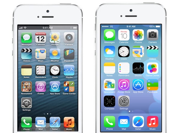
Apple is taking on a new approach with the design of iOS 7, which was announced at WWDC this week. The interface is sleeker, flatter and more typography driven than in the past.
Apple eliminated a lot of tricks with this design outline.
The icons are sleeker. The sharp curves and shiny look of each button has been replaced with flatter icons. The images within each icon are larger and look less like images and more like drawings. All of the beveling and shadowing that Apple design has been associated with is gone.
Color has been simplified – primarily in the use of subtle gradients, rather than multiple layers of gradients and shadows.
With Pulsetic you’ll be instantly notified the moment your website, API, or server becomes unavailable. Monitor uptime from multiple global locations and respond to incidents before your users are affected.
Create beautiful status pages in minutes to keep customers informed during outages and build trust with transparent communication.
Start Monitoring for FreeThe mirror effect for home icons is gone and has been replaces by a box that outlines icons. All of the hairline borders have disappeared as well, making buttons sharper and clearer.
Backgrounds have lost their depth in favor of flatter schemes.
Text is streamlined – featuring the familiar typeface Helvetica Neue Ultra Light and without the shadows that type in earlier versions of the Apple operating system had.
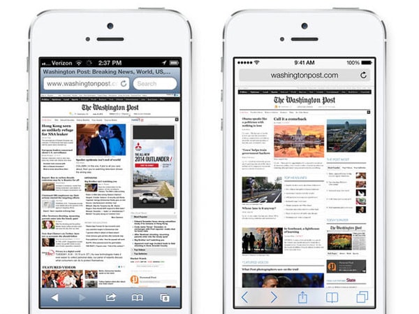
One of the places where users will really see changes is within Safari. The new interface is much more polished and breaks away from the style of a desktop website. The header includes only a simple website address and menu tools feature a line-style look.
In addition to changes you see right away, iOS includes some design changes that are more subtle (especially outside the design/development community) related to the user interface. A new “dramatic” type system automatically adjusts weight, letter spacing and leading by font size and includes support for text styles.
Apple is pushing transparent effects with iOS 7 – is this the design trend everyone will be talking about next? Navigation bars, tools, tab bars and other navigation elements all include some degree of transparency. (This will have an impact on app designers for sure.)
What It Means for Designers
Apple is allowing developers to preview new tools.
Central to the design is the company’s guidelines for iOS 7, which are three-fold: deference, clarity and depth as they relate to the user interface and experience.
The good news? Designers can better integrate flat-designed items into the overall Apple interface. There is no necessity to create a skeuomorphic-style icon for apps.
The bad news? Apple all but says you should start over from scratch when creating apps for iOS 7. And since it will be here “sometime this fall,” it is time to start thinking about that now.
Designers and developers with an Apple Developer account can sign in and view the complete Apple Transition Guide. The guide is designed to give you all the ins and outs of the new design, includes best practices and details transition support. Apple is also allowing developers early access to other software and releases.
Quick Analysis
At first glance the look of the new iOS seems very different. And Apple has been promoting it that way as well.
“iOS 7 is the biggest change to iOS since the introduction of iPhone, It’s packed with tons of new features, and a stunning new user interface.” Apple CEO Tim Cook said at WWDC this week.
But really this is more of a design tweak than full scale upgrade. Yes, Apple has waved goodbye to skeuomorphism, but it is not wholly jumping on board with flat design either. I really expected something a little more dramatic and different, although I am not quite sure what it would have been. (So who am I to judge, right?)
Visually, it is one of those design upgrades that could have been rolled out in phases without fanfare. How the complete package works, including the user interface, still remains to be seen.
Overall look: It’s clean and recognizable. I did not question that I was seeing an iPhone when the first images flashed across cyberspace. The icons seem bigger because of the lack of embellishment and the sharp color is nice.
Typography: Helvetica Neue Ultra Light is clean and sharp. But it could cause some problems if your eyesight is not keen. The font is lighter because of the thin stroke and could be difficult to read against certain backgrounds. Even in the prototypes, messages are a little difficult to read because of the weight of the typeface. It’s also one of those typefaces that you see everywhere. I’m a little disappointed that Apple didn’t look a little further outside the box here.
Color: The palette has more pep to it. Colors are brighter and sharper, but thankfully they did not change too much. The iTunes icon is still a magenta hue and the App Store is blue. (Major changes there would have led to quite the visual conundrum.) There also seems to be a greater use of both white and black in icons.
Top 3 Visual Changes: Getting rid of the mirrored effect for home icons, removing all of the outlines, additional white space and an updated Safari interface.
Bottom 3 Visual Changes: Typeface can be hard to read, some of the icons are overly cheesy (if you had never seen the previous Safari icon would you know what this one is supposed to be?) and many of the icons look a lot alike (such as notes and reminders).