Create Interest with a Novelty Typeface
Novelty typefaces are everywhere.
They are some of the most commonly found free font available for download and can be fun and interesting.
But will a novelty font work for your next project?
Maybe.
Proceed with caution.
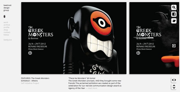
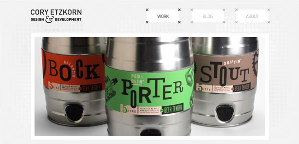
Novelty typefaces can be the most difficult to use. But when used sparingly and to match the context of a project, they can work wonderfully. A novelty font is considered to be any typeface that does not fall into one of the major categories of type – serif, sans serif, Old English, script or cursive.
With Postcards Email Builder you can create and edit email templates online without any coding skills! Includes more than 100 components to help you create custom emails templates faster than ever before.
Free Email BuilderFree Email TemplatesHistorically, in both web and print design, novelty typefaces were most commonly used in association with holidays or themed-event information. (You all know the spooky, thick-stroked, sharp-edged typefaces that are used for haunted houses and other Halloween-themed design projects, or the light lines and curls associated with Valentine’s Day.)
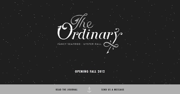
More commonly, though designers are using novelty typefaces to create a sense of branding or visual focus point. It might be part of a logo or in the big words used for display above the scroll.
Keep in mind a few things when using novelty typefaces to ensure that your design stays clean and does not get too laden with unusual fonts – number, size, weight and mood.
Select One Typeface
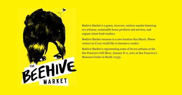
One novelty typeface per project is enough.
Don’t go over this limit. Experimenting with novelty typefaces can be fun and addicting, but resist the urge to use more than one.
With Startup App and Slides App you can build unlimited websites using the online website editor which includes ready-made designed and coded elements, templates and themes.
Try Startup App Try Slides AppOther ProductsOne unusual typeface has impact and visual interest. It will bring a reader into the design. But these fonts can sometimes be difficult to read, so use them in moderation.
Novelty typefaces don’t mix well. They are moody and distinctive and trying to match them as you would other typefaces – say a serif and sans serif – can get in the way of your design. Two novelty typefaces will compete with each other, making it difficult for your audience to know where to look.
Remember, the goal in using a novelty typeface is to create visual interest and contrast.
Give it Size and Space
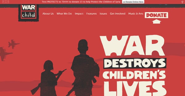
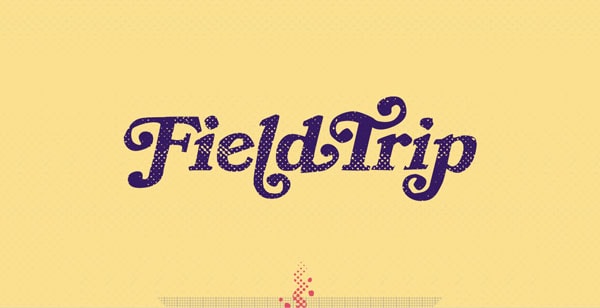
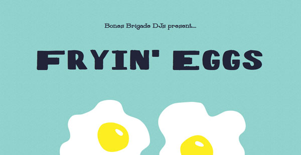
By nature novelty typefaces are created more as artwork than lettering, making them more difficult to read than the average typeface. With that in mind, go larger with novelty typefaces than you might with other fonts. Give the words more room to breathe without being crunched into tight spaces by other objects, images or text.
Also keep the number of words or letters used in the novelty typeface to a minimum. The goal is to create text that is visually interesting and also readable. If letters are indistinguishable or words are not making sense, consider another typeface.
Novelty fonts should never be used for large blocks of text or as the default style for body copy. Readability should always be a priority when selecting fonts for your site.
Create a Mood
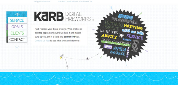
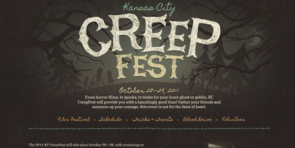
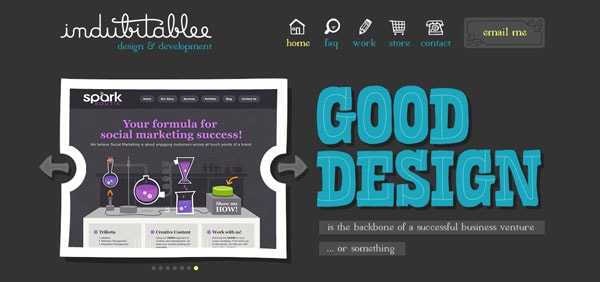
Be aware of the mood that your typeface creates. Novelty typefaces, because of their nature and sometimes extreme design, create instant emotion. These typefaces can be charming and cute, playful or whimsical, dark and moody or even just plain annoying.
Lighter strokes and lettering with curls and rounded curves create a lighter tone.
Thick strokes with heavy lines or sharp or jagged edges tend to be darker and even threatening.
Whimsical strokes that are not perfectly straight can feel more lighthearted and childlike, whereas perfectly perpendicular lines are much more rigid.
Pairing Other Typefaces
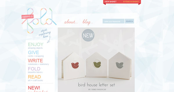
You will have to use another font (or two) for the rest of almost any design project when working with novelty typefaces. The key is to keep it simple.
Consider using a standard, simple sans serif font for body copy and other elements on the page. Some serif styles may also pair well with a novelty typeface depending on the mood you are trying to create.
When combining typefaces, consider the size and shape of the novelty font when making other font selections. Combining too many thin, compressed typefaces will feel tight and a little tense. Pairing a curly novelty typeface with a slab serif can feel chaotic and off balance.
To create harmony, choose fonts with similar letter shapes – think round or oval – and slants.
If a feeling of chaos or disarray is your goal, choose typefaces that have opposing letter shapes and slants.
Doing it Well
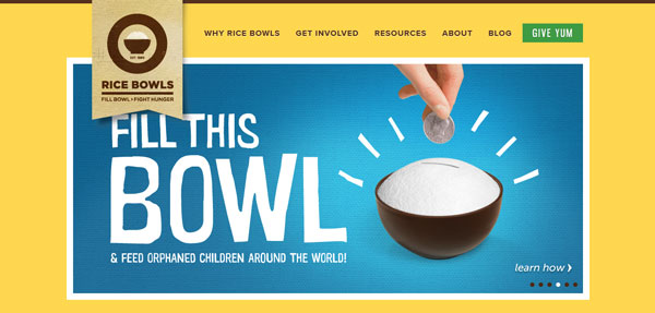
Rice Bowls: The words are simple and understandable while the font is light and fun. The combination makes for a simple presentation with an almost-childlike feeling.
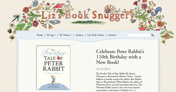
Liz’ Book Snuggery: Handwritten fonts are especially popular right now. This take on the style is fresh and fun and the mood goes great with the topic of children’s books.
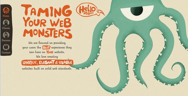
Hello Studios: The spatial relationships here between the lettering and image are great. The choice to use a fun, light font with the illustration to set a playful mood is an excellent one and you are immediately drawn into the site.
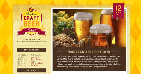
Maryland Craft Beer Festival: The use of a novelty font in this logo is elegant and simple. The edges on each letter and unexpected but work great with the overall theme and feel of the site. Using a simple novelty typeface for a logo is a great way to experiment with and effectively use this typography style.
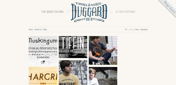
Duggard: The vintage apparel seller appeals to your sense of “vintage” with novelty typeface used for their logo. It creates a mood of age and edge.
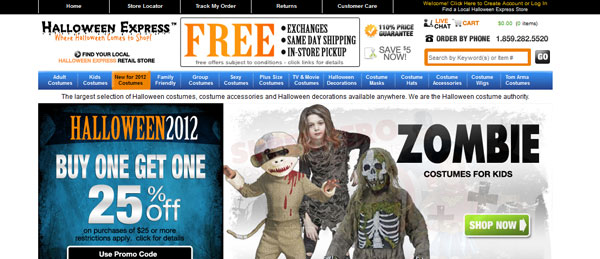
Halloween Express: Ok, there are a lot of novelty typefaces here (despite what I suggested above), but this site is trying to create a mood of chaos and fear and excitement as you shop for a costume. And the typefaces do it. Also note the company logo in the top corner. Lovely use of a novelty font.
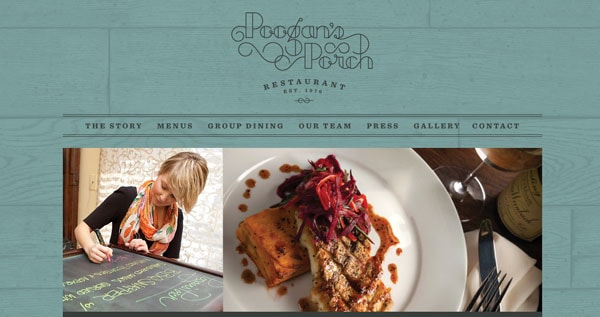
Poogan’s Porch: The nature of the novelty font in this logo is what many people imagine when they hear “novelty typeface.” It is odd, interesting and beautiful. It is only used once on the website and is allowed space to breathe.
