Colour of the Year in the Web – Pantone Emerald 17-5641
Pantone colour of the year for 2013 is Emerald 17-5641. It is a very cool and relaxing colour but is anything short of rich. It is to be described as “Lively. Radiant. Lush… A color of elegance and beauty that enhances our sense of well-being, balance and harmony.“ I must say that this description is spot on.
To celebrate this year’s awesome colour I’ve gathered a collection of website that use this hue very well in their design. I hope these find you well in inspiring and aweing you.
Kin
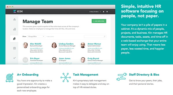
Emerald is part of Kin’s brand so it is obvious for them to use this gorgeous colour all over their website. As you can clearly see, they are not shy about it either as this emerald colour is used to highlight whole sections as well as accents here and there – such as icons or buttons. This colour clearly works for them as a strong reinforcement of their brand and identity.
Under the weather
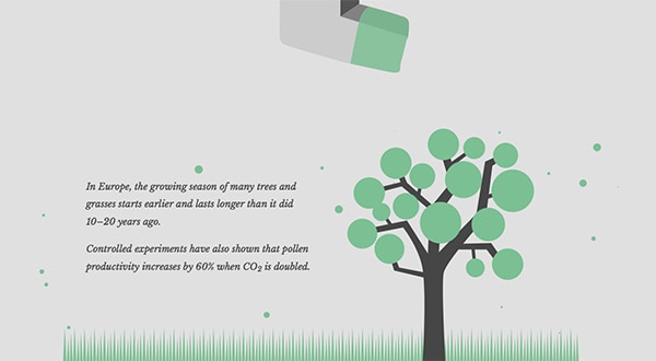
Under the weather is an amazing website that is dedicated to climate change awareness. They do use four different colours to divide their sections, however the light emerald is by for the most spectacular. It is a great – and obvious – choice as it goes along their over all purpose of environment, greenery, plants and life. It acts as a supporting colour in the gray graphics which provides for perfect balance.
With Postcards Email Builder you can create and edit email templates online without any coding skills! Includes more than 100 components to help you create custom emails templates faster than ever before.
Free Email BuilderFree Email TemplatesFlat UI Presentation
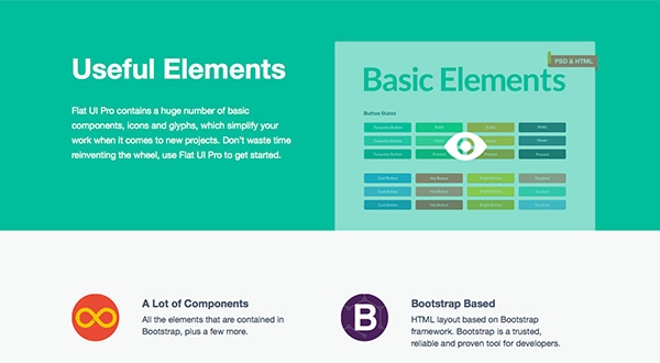
Of course one of the very first interfaces I though of was our very own Flat UI. The emerald colour is a big staple of the UI kit’s identity too. Emerald is used everywhere, form the buttons to the links to the actual UI elements in the kit as well. I must say that this colour looks really good on flat interfaces – which would explain why it is picked so after for those.
Involvio
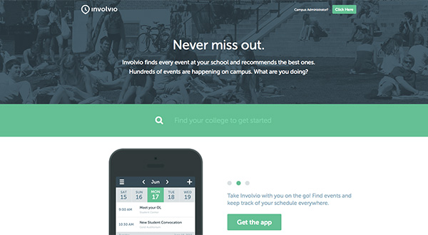
This website is dominated by emerald. As you scroll through their home page this colour is used everywhere as an accent, to point things out, to highlight something else. It is all over; but don’t get me wrong that’s fantastic. This colour is a big part of their identity and having it in so many different places reinforces their brand.
Cocoon Studio
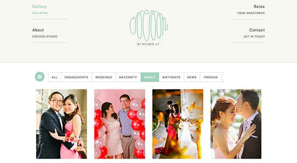
Unlike the previous site in this post, Cocoon Studio uses emerald very lightly. It is obvious that this colour is a big part of their website just as it is obvious that emerald is their accent colour. However, I think this totally make sense for this site’s over all design, which is minimalism. Therefore, it only makes sense to use a bold hue in small amounts as well.
Vintage Hope
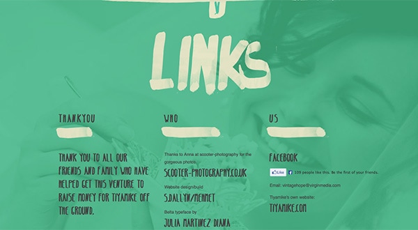
This website’s design is taking on a bold approach by having a full screen background as well as offsetting it with a bold emerald hue. I think that this is an amazing design choice which is working perfectly for this website. It is very minimal and clean when it comes to content which is why they can go wild with the background.
With Startup App and Slides App you can build unlimited websites using the online website editor which includes ready-made designed and coded elements, templates and themes.
Try Startup App Try Slides AppOther ProductsPositionly
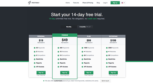
Positionly uses emerald all over their website in a decent amount. In their pricing section, the emerald hue is used clearly to indicate which of their four pricing plans are the most amazing, pointing people towards its direction specifically. The emerald hue is kept consistent too as the buttons are the same colour as other emerald parts like the checkbox icons.
Vtcreative
vtcreative’s website is a work of art – its simplicity is just stunning. And although this design is very minimalistic, clean and simple it does take on a wild approach of using this emerald colour as emphasis in different sections of their site. They don’t use it as another highlighting tool – they use it to call out for attentions where they feel attention should be given. It’s bloody brilliant.
F.e.w.
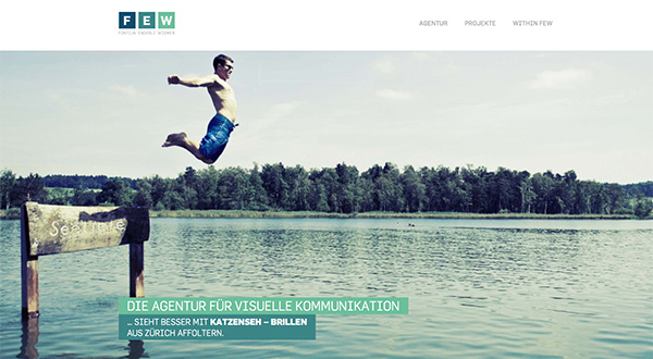
As you can see this website has a few different hues in its palette (no pun intended at all!). They are using one blue-green hue and two emerald hues, one light and one dark. I think the harmony of those three is amazing – they compliment each other exceptionally well. I find the choice of imagery on the site splendid too – and blending in well – as it too has that green/emerald hue to it.
Design Embraced
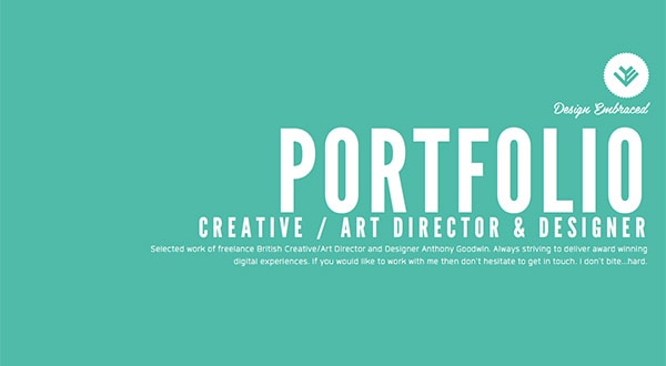
Talk about a ballsy portfolio…. It uses vivid and bold hues in order to accent various sections; it is a marvelous idea, which works great for its intended purpose. Against the vivid emerald hue, the white typography looks very elegant and crisp too. The bold backgrounds are fantastic way to bring attention to the content.
Dubbel Frisss
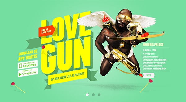
As you can see in the screenshot, the backgrounds vary by product but does this red-pink cranberry juice look amazing against the emerald background, or what? The contrast between the pink and the emerald hues is so strong – its fantastic – it brings out the product to full attention.
Bianchi café cycles
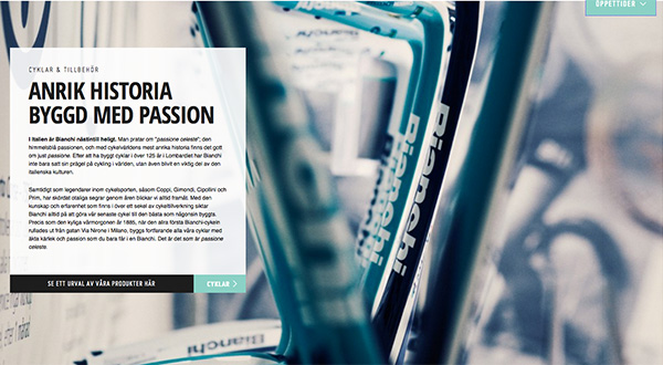
Unlike the remainder of the site, this one uses emerald in bitsy amounts; there is nothing wrong with that. However, combined with the amazing photography, and the black and white colour scheme this emerald hue stand out greatly even in small amounts. The photograph is a big part of this design, but its light hues match the colour scheme and therefore do not take over.
High on Pixels
Obviously Emerald is the accent in this design; it is used to highlight specific elements as well as guide you to the call to action itself. It is sprinkled here and there and it is working fantastically. Because this colour scheme is very limited, against the white and black the emerald shines very brightly even though it is present in small amounts.