Retina Ready Images and Responsive Web Design
I want you to clearly understand what Retina Display is. In the simplest of terms, it means a high definition display, that’s it. Also, Apple products are not excusive to this type of display. Retina Display is simply Apple’s term for is but other phones, tablets and monitors too have higher quality displays. But, because these displays are being widely implemented and used, it is more than ever important to create websites and apps that support these displays.
With that said, let me explain to you why Retina ready images and Responsive Web Design go hand in hand and how to create such images for Responsive Web Design.
What does Retina mean?
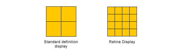
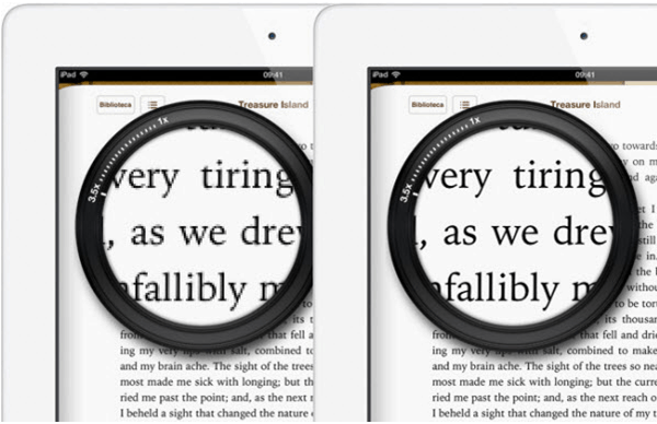
Retina Display is Apple’s brand name term which refers to a liquid crystal display that displays pixels at higher density. A simple visualization will explain this concept well so take a look at the image below which compares the pixels between Retina and a standard definition display. In Retina Displays, you get double the pixels in the same amount of space as you would with a traditional display. This is why icons or text on an iPad 2 looks blurrier then on iPad 3.
The dilemma
Designer and developers now have to accommodate different types of displays. This means two things: users with Retina Displays will either have badly displayed images on designs that did not include Retina support or the designs that do support Retina, the users will enjoy a high quality, crisp imagery that we all crave and love.
With Postcards Email Builder you can create and edit email templates online without any coding skills! Includes more than 100 components to help you create custom emails templates faster than ever before.
Free Email BuilderFree Email TemplatesWhy is Retina important in Responsive Web Design?
The answer to this question is actually very simple: a lot of newest mobile Apple devices have Retina displays (and the new upcoming ones will too) therefore when creating a responsive website you also need to accommodate Retina images into them for the best display. The best display also means the best experience.
How to create Retina-ready images in Responsive Web Design?
There are various tool and methods out there. I will discuss only a few mostly because they best accommodate the responsive aspect of this problem.
SVG, FTW!
I am sure you are familiar with SVG image format. Shame if you are not…! But let’s recap anyhow. SVG is an image format for vector graphics that allows those vectors to scale up or down in size without losing their shape. Because vectors are composed of a fixed shape instead of pixels, they can be manipulated in many ways and still have their shape be kept intact and sharp. Unfortunately, raster images – which are JPG, PNG, or GIF – cannot do that.
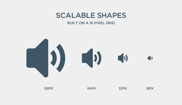
Because of the unique ability to resize flawlessly, SVG is a great format to use in Responsive Web Design. No matter the screen size, the image will resize accordingly and look great on any phone, tablet or monitor. This is also true for Retina displays as the SVG image will resize for the pixel density and stay the same shape. You should always use a SVG if you can as it will solve this dilemma for you.
Photographs and Raster Images
I understand that not all images can be a SVG format especially if they are a photo or are already a raster image. There is a possible solution to this issue which is to use image at twice its desired size and display it at 50% of those dimensions. What I mean is that if you have a photo in a website that is 150px wide by 150px tall, use an image that is actually 300px x 300px in size but still display it at 150px x 150px. This way, on a Retina Display the image will show nice and sharp.
There are many ways to have 2x images implemented into your website via HTML, CSS or JS. I will not go into detail about them here but I will show you just the basic methods.
First, if you have an image that is the size of 300px x 300px, in your HTML you can simply declare the height and width of the image to be 150px.
<img src="myIMG.png" height="150" width="150">
Additionally, you can change an image’s width and height in CSS by either declaring the image to be 50% of its size or literally defining for it to be half if you know what half is.
With Pulsetic you’ll be instantly notified the moment your website, API, or server becomes unavailable. Monitor uptime from multiple global locations and respond to incidents before your users are affected.
Create beautiful status pages in minutes to keep customers informed during outages and build trust with transparent communication.
Start Monitoring for Free
img{
      width: 50%;
      height: 50%;
}

.box img{
      width: 150px;
      height: 150px;
}
Lastly, if the image you want to downsize is a background, this is the code to do the trick:
.box{
      background-image: url(myIMG.png);
	  background-size: 150px 150px;
}
There is a big downside with this method. First, you cannot have a double sized image unless you have access to a bigger image. Obviously, blowing one up and using it isn’t the way to go at all! Additionally, if your website had many images or even some images that are just big in size, the load time can be greatly affected by having to load these now giant file. This is an especially big bummer as many mobile devices use crappy connections whether it is a low Wi-Fi bandwidth or low or slow cell phone service.
But there are ways to fix it too.
Media Queries
When creating a CSS media query you are able to specify more than just device widths or heights. The following code is a sure way to detect if the device has Retina Display. This works best when the images you use on your site are backgrounds of divs so that in the media query you just change the image with the one that is double in size. This way, the big images are only loaded for the Retina Display devices.
@media
only screen and (-webkit-min-device-pixel-ratio: 2),
only screen and (   min--moz-device-pixel-ratio: 2),
only screen and (     -o-min-device-pixel-ratio: 2/1),
only screen and (        min-device-pixel-ratio: 2),
only screen and (                min-resolution: 192dpi),
only screen and (                min-resolution: 2dppx) {

  /* Retina replacement CSS here */

}
Retina.js
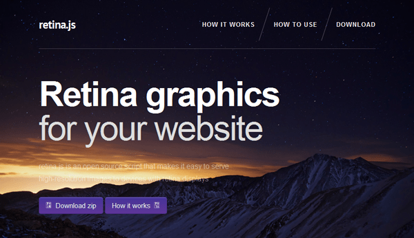
If you don’t fancy the media query solution that is perfectly fine. There is a JavaScript plug in to solve this issue! “retina.js is an open source script that makes it easy to serve high-resolution images to devices with retina displays.” How this plug in works is that when you have two images, one of the intended/original size and the other one double that size, retina.js detects when there is a Retina Display being used and changes the images accordingly. It is very simple to work with and I suggest checking it out. All you have do is to make sure that you name your images accordingly to work with the plug in.
Icons
Thanks to @font-face and fonts that are made up of icons instead of letters, you are welcome to utilize them instead of images. I very well support this method for two reasons. First, fonts are great at scaling in a similar way that SVG do, therefore they not only scale to different screen sizes but also to different resolutions such as Retina.
Also, currently @font-face browser support is very high and is only growing. Most current browsers – mobile and desktop – support @font-face which allows many users to see your icon fonts perfectly. To learn more about @font-face check out this snazzy article: What is @font-face and how to use it in CSS.