The Economist Redesign Does It Right
It’s been decades since one of the oldest news magazines in the world has looked different. That all changed in October when The Economist launched a redesign that freshens up the look of the news and makes it easier to read.
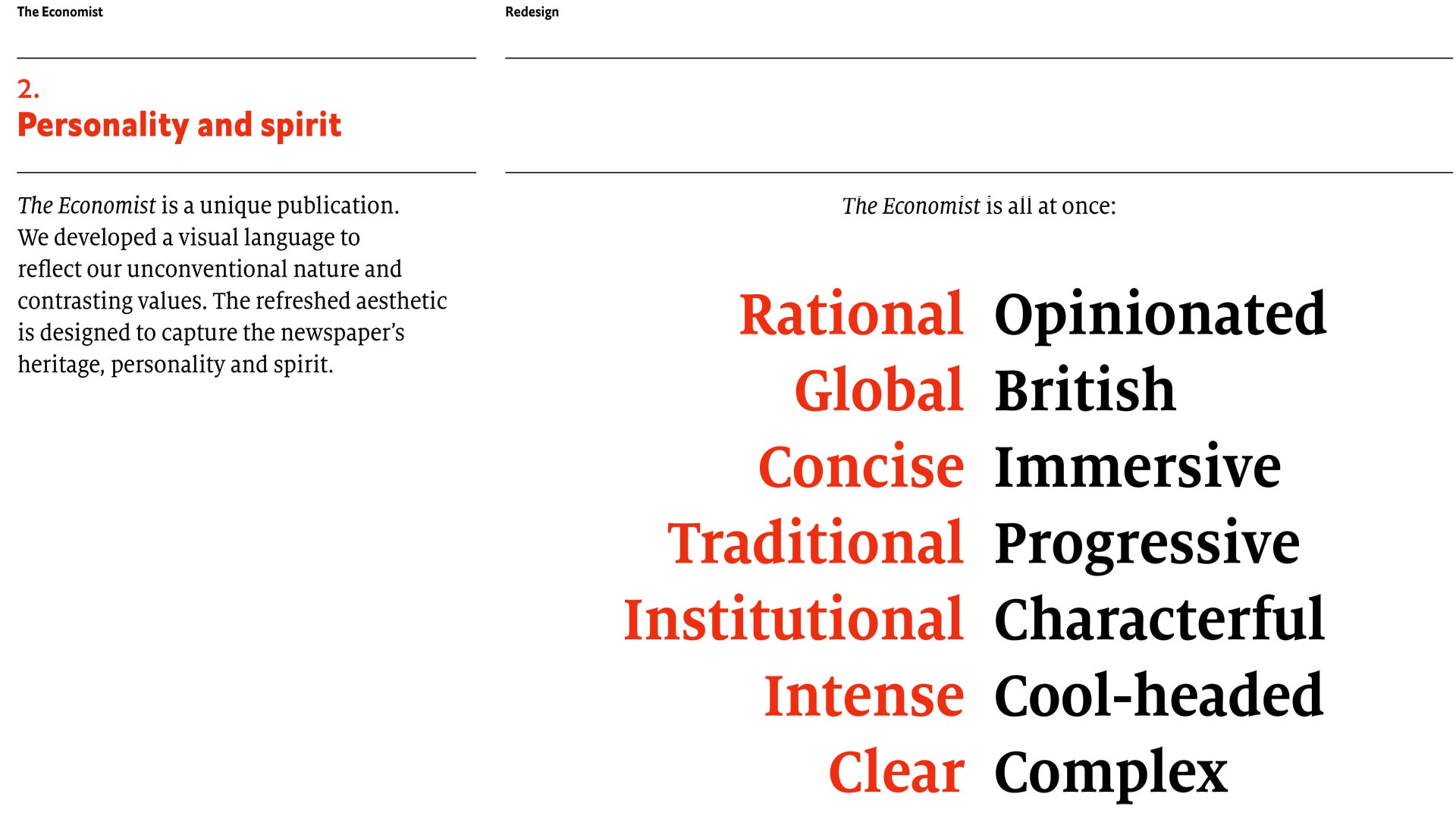
The whole concept around the redesign centered on the reading experience, according to a question and answer posted on medium by the magazine.
“If you can’t read the paper, clearly it’s not doing its job. I think the new typefaces, Milo Serif and Econ Sans, work particularly well. They give the pages an airier, less forbidding feel,” said art director Stephen Petch.
We agree. Readability – in print and online – is the primary consideration for any informational source. And The Economist nails it. Here’s a look at the redesign, from a true design perspective.
New Typefaces
Because the root of the redesign is readability and typography, we’ll start here.
The Economist – a global news magazine (or newspaper as they call it) has shifted from a more classic set of serif typefaces to a bold serif for the cover headlines. It’s beautiful readable and modern.
With Postcards Email Builder you can create and edit email templates online without any coding skills! Includes more than 100 components to help you create custom emails templates faster than ever before.
Free Email BuilderFree Email TemplatesThe old typefaces weren’t rooted in digital – they were chosen with the previous redesign in 2001 before digital reading was the dominant source of news and information. The new typefaces work for print and web applications.
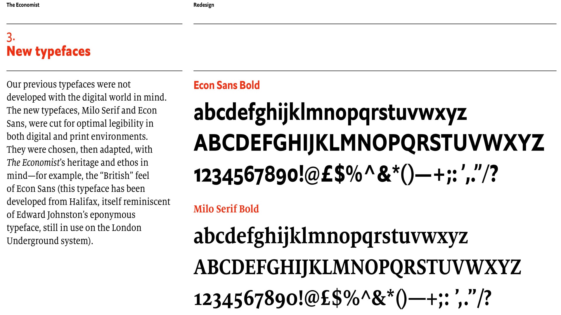
- The bold sans serif is Econ Sans Bold.
- The serif is Milo Serif Bold.
Both have more upright oval shapes. The sans serif features a uniform stroke width, for ease of readability in many sizes, and the serif features a modern style with some variance in strokes. Nothing is too thin, and it maintains readability at a variety of sizes as well.
The fonts contribute to a more readable cover presence for The Economist, particularly at smaller sizes and in digital publishing.
The typefaces are graceful on the screen and stack nicely with a bold sans serif over a serif secondary headline on the magazine cover. The presence is organized, intentional and easy to follow.
Bigger and Bolder Masthead
It might seem like a small thing, but the name of the magazine is bigger on print editions.
When it comes to branding – and standing out in today’s cluttered news environment – this is an important factor. The red box containing the name “The Economist” is slightly larger. The design is created in such as way that the red box should contrast with the background so that it appears even larger.
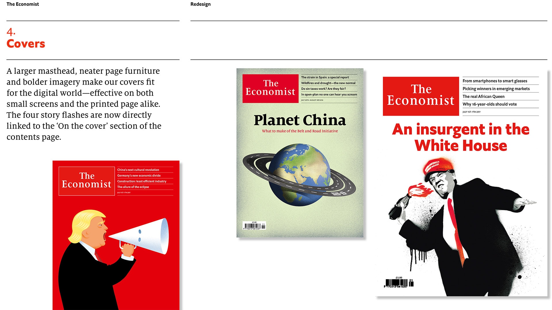
Readers will know exactly who is providing the information they are digesting.
This connection to branding sticks online as well, with a sticky header that always keeps the magazine logo in the top left corner of the design. (Notably, the same location as the masthead in the print edition.)
With Pulsetic you’ll be instantly notified the moment your website, API, or server becomes unavailable. Monitor uptime from multiple global locations and respond to incidents before your users are affected.
Create beautiful status pages in minutes to keep customers informed during outages and build trust with transparent communication.
Start Monitoring for FreeStreamlined Contents
Nothing makes my design heart pitter-patter like a great table of contents for a packed publication like The Economist. While these pages are often seen as an afterthought, this is a place where the redesign shines.
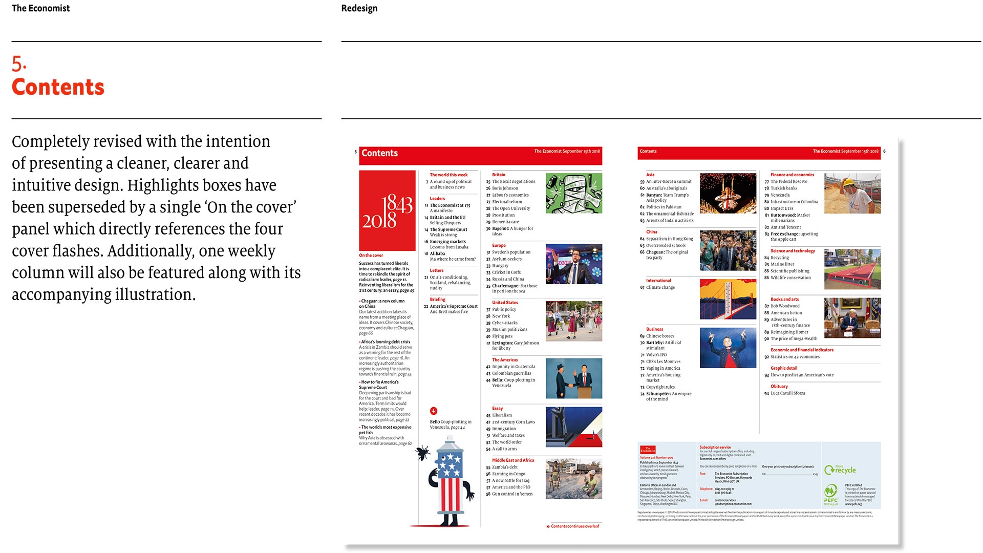
Here’s the description from magazine editors:
“Completely revised with the intention of presenting a cleaner, clearer and intuitive design. Highlights boxes have been superseded by a single ‘On the cover’ panel which directly references the four cover flashes. Additionally, one weekly column will also be featured along with its accompanying illustration.”
What that description doesn’t quite convey is how easy it is to find content with the new design. Contents are grouped so that readers can find the section they want to read first. Page numbers are clear and aligned and images help carry you through the design.
When it comes to creating something with so many small pieces of content, the design can get overwhelming quickly. This is streamlined and easy. If you need to design a contents element with a lot of individual pieces, these pages are a prime example of where to start.
Modernized Illustration Style
One of the things that always disappointed me about The Economist was the blandness of illustrations inside the magazine. The cover would grab your attention, but there just wasn’t enough art inside to keep you moving through the pages.
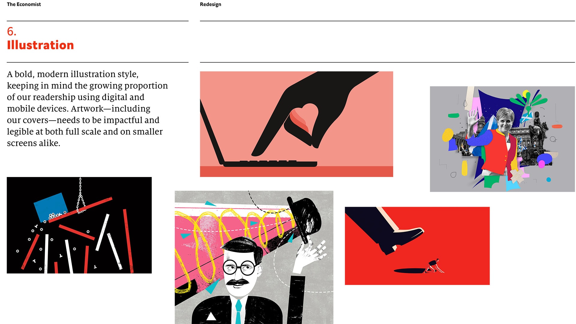
This redesign tries to remedy that.
The publication does stay true to its text-heavy roots, but more full-color illustrations make it a little less black and white.
The new illustration style is bold and modern – think a mix of flat with a touch of brutalism. It’s beautiful, engaging and has the impact that you would expect from this publication.
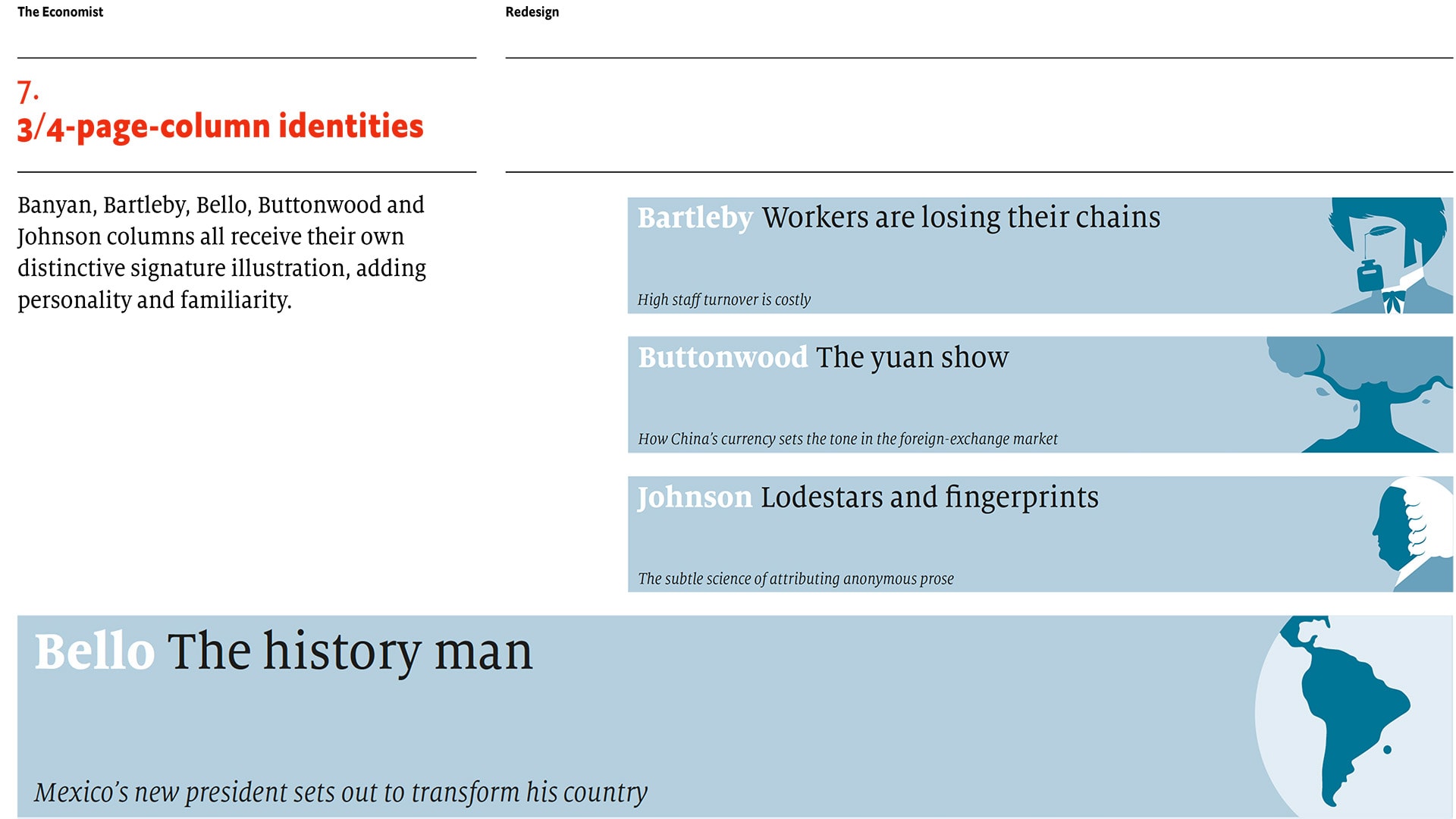
Columns also use this same style of illustration for headers with the more flat of the styles in a soft blue palette. These serve to add a distinctive touch to each columnist and make the words a little more personable.
Illustrations include imagery that read both large and small and includes nuances that the most detailed eye will catch and attach to stories. It’s part information and part art.
New Infographics and Maps Styles
Finally, to balance all that text that you’ve come to know from The Economist is new data visualization.
From Phil Kenny, head of graphics:
“And there’s the new data section, “Graphic detail”. The paper has always been text-heavy, so there’s a constraint on data visualisation. We became attuned to getting a lot of info into a small space. Going back to the 19th century, The Economist always had data storytelling. But text won the fight against graphics somewhere along the line. In the 1980s there were full pages of data vis, and they’ve since been compressed. Now they’re back.”
Data visualizations use a clean type and color palette with an emphasis on readability, just like the rest of the redesign. This is the way more people are digesting information and news. Facts – and data – are the solution to fake news. You know this is all true and credible information. And it is visually presented that way.
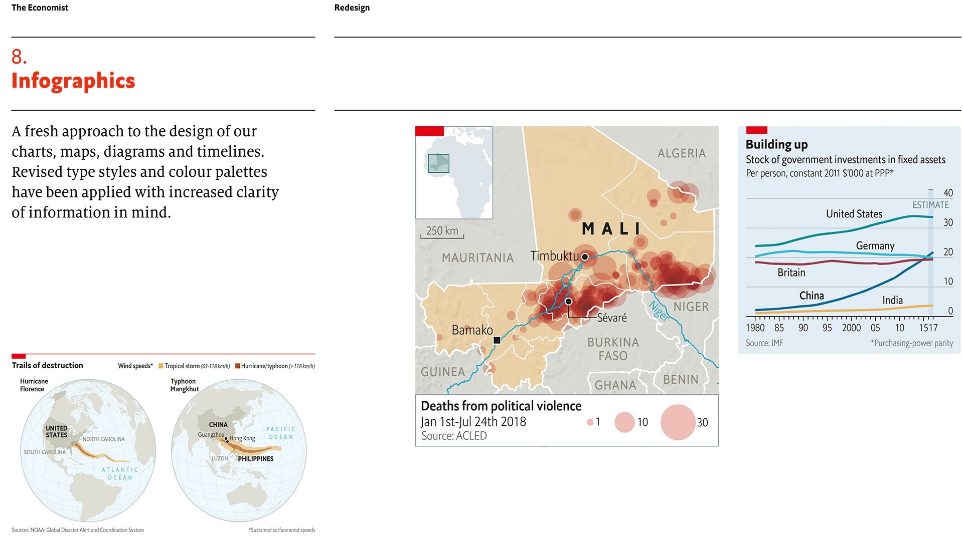
The same styles are applied to print and digital formats so that infographics, maps and other data-based visuals look and feel consistent.
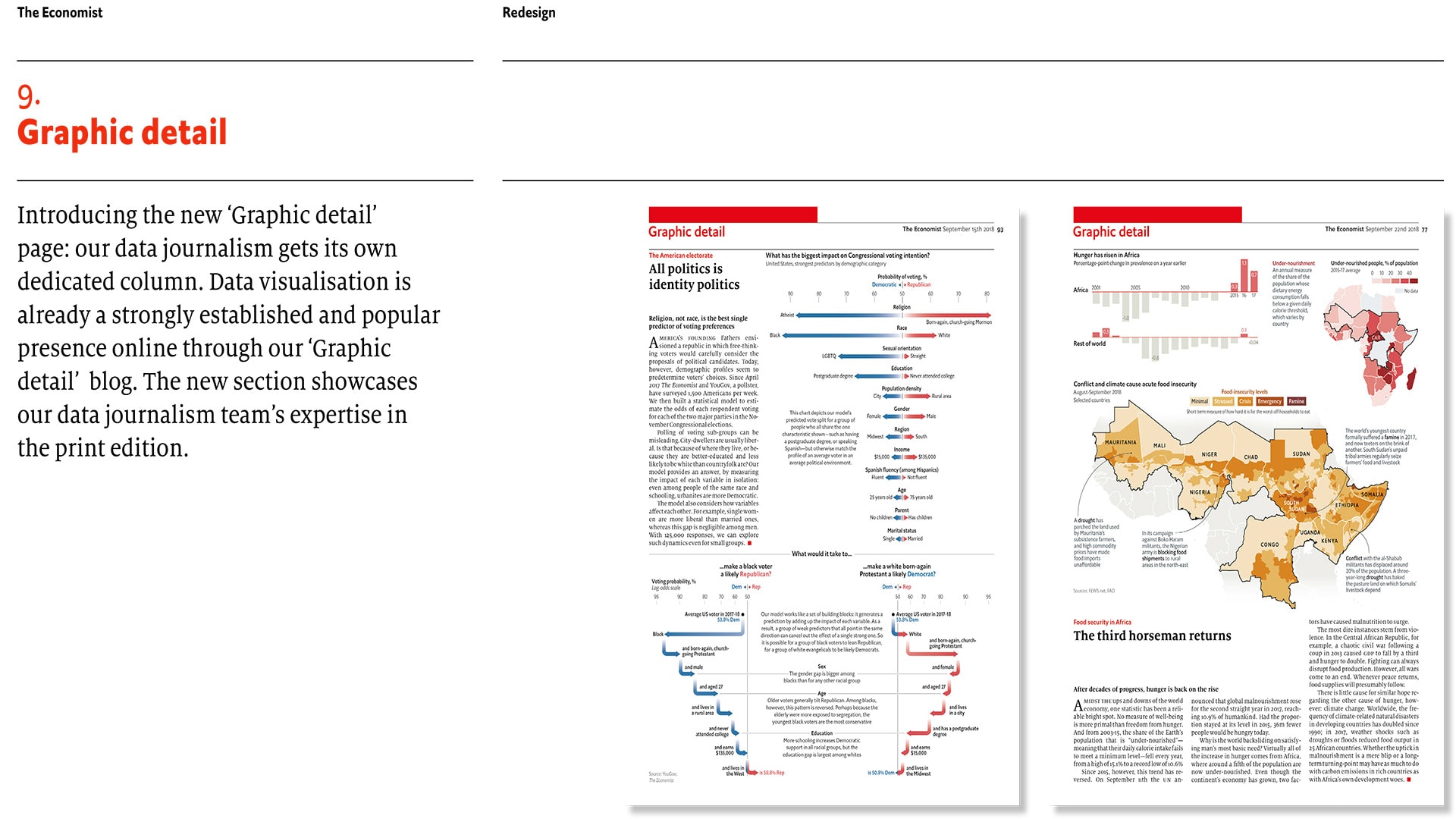
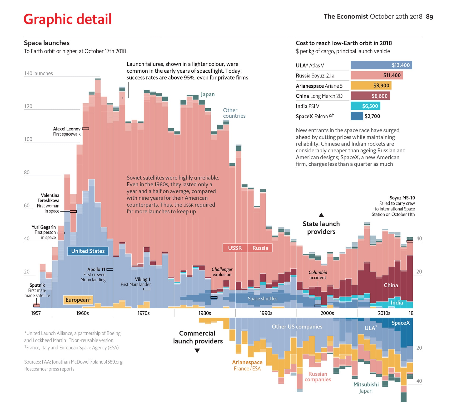
This is true throughout the publication and in the “Graphic detail” section which is devoted to this type of storytelling. (In my opinion, more storytelling in this format is definitely welcome. It looks great, makes more sense to me in the visual format and these pages just beg to be read.)
Conclusion
What’s most impressive about The Economist’s redesign is that it looks brighter, fresher and more appealing, but not wholly different. I didn’t think that it wasn’t The Economist. I saw it and thought, that’s a better version of The Economist.
That’s precisely what a redesign should do.