Typography Basics: Understand the Language of Letters
Sometimes the toughest part of getting started with a first design project can be understanding the language of design. Typographers, for example, have a whole language of their own that relates to type, fonts and design.
Read more: Typography Cheat Sheet [Infographic]
To have an open and successful conversation in your next design meeting, it will help to fully understand the lingo when talking about type. Here’s your primer.
Fonts and Strokes
What is a font anyway?
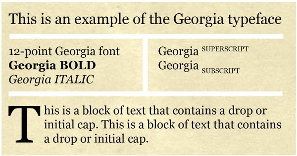
A font is a complete set of characters of a specific size and style from one typeface. A typeface is a group of letters, characters, symbols and punctuation of the same style. Helvetica, for example, is a typeface; whereas 9-point Helvetica is a font. All of the options – bold, italic, light, etc – make up a type family.
With Postcards Email Builder you can create and edit email templates online without any coding skills! Includes more than 100 components to help you create custom emails templates faster than ever before.
Free Email BuilderFree Email TemplatesThe distinction is often ignored by most designers (both for web and print) and the terms font and typeface are often used interchangeably.
Stroke: The weight of each line in a letter. Strokes were originally identified in handwritten lettering as each time the pen came off the paper to create the next line. Letters can have only one stroke, or be created using multiple strokes.
Point: Unit that relates to the measured size of a font. There are 72 points in each vertical inch of type.
Condensed: Property of type in which each letterform is made using narrow proportions. These typefaces can be made using a series of thin or thick strokes.
Bold: Type style in which each stroke is heavier than the normal stroke for a certain typeface.
Italics: Type style in which each letter is slanted (most commonly to the right) more than the normal typeface.
Subscript: Smaller letters or numbers that fall slightly below the baseline. In most instances this text is somewhat smaller than the preceding letters. (Commonly, a subscript is about 60 percent of the size of lettering around it.)
Superscript: Smaller letters or numbers that sit above the normal line of type. In most instances this text is somewhat smaller than the preceding letters. (Commonly, a superscript is about 60 percent of the size of lettering around it.)
With Startup App and Slides App you can build unlimited websites using the online website editor which includes ready-made designed and coded elements, templates and themes.
Try Startup App Try Slides AppOther ProductsInitial or drop cap: A large or decorative letter used to begin a block of text.
Brooklyn Beta
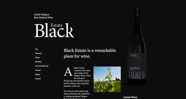
Black Estate Vineyard
Weareo3
Kiawah Island
Parts of a Letter
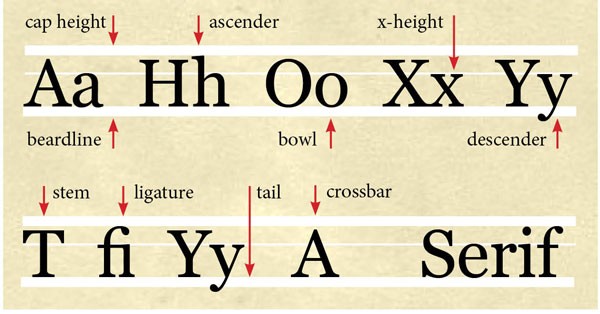
Letters have a lingo of their own as well. All of the tiny parts, from curls to connecting letters, to the bottom of a lowercase “y” have a name. An understanding and study of these parts can help typographers identify fonts and can help designers choose what typefaces may work best for a project.
X-height: The height of a lowercase “x” in each font. The x-height is used as a measure of typefaces, relating to other parts of letterforms.
Cap height: The uppermost height of letters in a typeface. This may also be called the ascender height or topline.
Beardline: The lowermost point of letters in a typeface. This may also be called the descender height and it will fall below the baseline.
Ascender: The part of a letter (upper- or lowercase)that is higher than the x-height.
Descender: The part of a lowercase letter that falls below the baseline.
Serif: Any stroke that extends from the ends of a letter form. Any type face containing serifs is called a serif font.
Sans serif: Typefaces that do not contain serifs.
Ligature: The effect when two or more letterforms connect to form a single element. Letters combinations such as “fi,” and “fl” often form ligatures in certain typefaces.
Stem: The primary vertical stroke in a letter.
Tail: The end stroke of a letter. Often a tail refers to a decorative stroke.
Crossbar: A horizontal stroke than connects two vertical or slanted strokes in a letter, such as a line in the middle of “A.”
Bowl: Any fully-closed section of a letter. The center of an “o” in most typefaces is a bowl.
Line and Letter Spacing
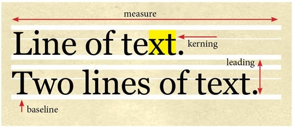
Spacing matters too. Some designers would even argue that the spacing above, below and around letters can be just as important as the letterforms themselves.
Baseline: The horizontal line where text rests, excluding descenders. In many traditional typefaces, every capital and lowercase letter will line up along a common baseline.
Leading: The space between two lines of text is called leading (line-height in CSS). The measure is from baseline to baseline. Often text applications will default to leading that is equal to the point size; designers often change this measure to best fit their typographic style.
Kerning: The space between any two given characters and the adjustment of that space is called kerning. (Some may confuse this with tracking, which adjusts the space between all characters, not just letter pairs.) Certain combinations of letters often require kerning to achieve a certain look – think of the space combinations between “AV” and “We.”
Tracking: The space between groups of characters, or words, is measured as tracking (letter-spacing in CSS). Negative tracking pulls text closer together while positive tracking pushes letters apart. Tracking set at 0 is as
Pica: Common in print publication, picas are used to measure lines of text vertically. There are 12 points per pica (and six picas per inch)
Measure: The amount of space used by a column of type horizontally. In other words, the width of a column of type as it appears on the screen (or in print). Typically a measure relates to the number of characters per line. A good rule of thumb for determining point size is that a single column of text contains 40-50 characters per line, while multiple columns of text can contain up to 75 characters per line.
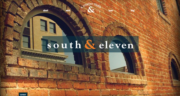
south & eleven
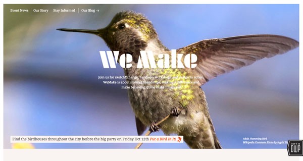
WeMake
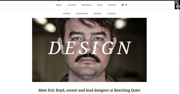
Reaching Quiet
