UI Principles for Great Interaction Design
Interaction design is a very common term today, but many designers and developers still don’t know what exactly it means. Today we are going over some different aspects than the ones you are used to: we will jump into user interface and principles for designing great interaction on your website.
First off, what’s IxD
Interaction Design (or IxD) is a quite new area, only appearing some ten-fifteen years ago, with a set of researches who presented design challenges, later appreciated and accepted by professional designers.
Interaction Design is here to facilitate interactions between people and their environment, which in our case it is a website. Interaction designers are only concerned with how users and computers interact, unlike UX designers who take into account all user-facing aspects of a software or system. You might have heard of human-computer interaction degrees at different universities – these degrees are basically training in the field of IxD.
What does such a designer do?
An Interaction Designer will take into account who the target of the product is and who will use it. A User Researcher or an Information Architect usually provides this information. Based on the research, an Interaction Designer spends a lot of time on creating this amazing way for the user to interact with the software in the easiest way possible.
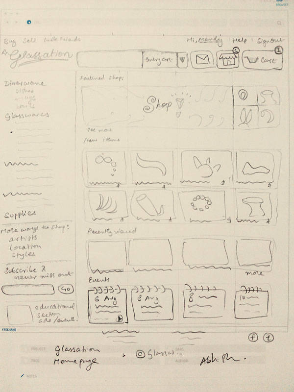
Key interactions have to be identified and wireframed, so the process continues by using sketches. Some will try to draw them, some will use software applications to aid their process (some great examples showcased at the end of the article) and some others will create these interfaces by themselves or in collaboration with others.
With Postcards Email Builder you can create and edit email templates online without any coding skills! Includes more than 100 components to help you create custom emails templates faster than ever before.
Free Email BuilderFree Email TemplatesAn IxD constantly explores new ways of interaction, as users are all the time expecting new things to appear on your website. But an Interaction Designer needs to be aware of how these features would affect the users and decide on which one of the many ideas he has needs to actually be implemented and which one will stay as a pitch for a period.
There are several concepts that drive Interaction Design and we will take a look at all of them below.
It’s goal-driven
IxD is not required to do user research, but it is essential in order to get the best design response. Users generally have a number of goals in mind when using a software and your application should do that well. In order to successfully combine design and functionality, user research is simply the most important element.
It is actually so important that many user researchers get jobs as Interaction Designers only because of their skills in the field of analyzing human patterns of software usage.
Simplicity
People don’t know what an interface is. They don’t care about that to be honest. They don’t know that there is somebody behind the website strategizing all these features that they are looking at. All they know it is they want a simple website. They want a system that is easy to use, takes quick time to load/respond, doesn’t make the user to think and doesn’t give the user cause for grief.
Affordances and patterns
Some products that we use quite often are designed in a specific way, so that everybody knows how to use them. Take scissors for example. A three-year old would know how to use them. The two wholes are for two fingers and there is only one possible movement pattern in order to use it. It doesn’t get simpler than that. Your website should be as easy to use as a scissor.
Why use the word affordances? Because this explains a lot about the functionality behind a website or a system.
Regarding patterns, a user interface should always be comprised of familiar components. If users want to submit a form, they will look for a button. A button is a familiar element. They want to find it. Designers don’t always need to reinvent the wheel every time they take on a new project.
With Pulsetic you’ll be instantly notified the moment your website, API, or server becomes unavailable. Monitor uptime from multiple global locations and respond to incidents before your users are affected.
Create beautiful status pages in minutes to keep customers informed during outages and build trust with transparent communication.
Start Monitoring for Free
Somebody told me that following known patterns and not reinventing the wheel every time would not help people innovate. I couldn’t give a damn about innovation when discussing usability. Keep in mind that usability and innovation are two different things.
If you want to go for innovation, you will still need known patterns. But if you go for great usability, nobody ever will encourage you to reinvent the wheel, as this takes time for the users to get used to.
Creating a system with great usability requires Interaction Designers to have a strong knowledge of conventions, affordances and web usability.
Now you know some of the principles IxD is based on, let’s take a look at how great Interaction Design affects the user.
Orienting the visitors
Interaction Designers need to understand who their users are, so they can orient them throughout their system.
It has to show users where they are on the page, so the experience will not be confusing for them. They also need to know where they can get from where they are. Letting the users know what their options are is important and not leaving them in a dead-end is always a good option. Search pages that show no results, without letting the user know that there should be further options, are examples of bad interaction design.
Constant dialog
Interaction design focuses a lot on giving users constant feedback. Telling the user that he did something right or wrong is an element that they will appreciate, even if only at an unconscious level. You simply have to make it clear that the user has succeeded in completing an action.
When you buy a product on Amazon, you get a confirmation in the browser and one on your e-mail. When you submit an e-mail through a contact form, you get a confirmation on the page.

This makes interaction not only about browsing and using features on a website, but it takes it to a whole new level: it helps users better understand the state they are currently in and minimize confusion and questions, while also getting rid of frustrations.
Consider the workflow
IxD is also about considering the workflow of the webpage. If you have a sign-up form, what will it happen when the users submits information through it? Will the page refresh, will it take the user to the home page, will it show a confirmation message, will it take the user to the login page or last two at the same time?
It’s about having many choices and choosing the one that will fit your users expectancies best. All the elements mentioned above are components of a website workflow. Every interaction should be followed by another logical step, which should fit into the experience that you have created on your website.
Visual hierarchies
In order to get users to do what you want them to do, you can aid their task by using visual hierarchies. You can direct their eyes through visual emphasis and achieve this with the layout, size of elements or color combinations.
But you can also use visual hierarchies in order to help users find what they are looking for. Are you renting cars? Make sure you use visual hierarchies to lead the users to the “Rent” page.
Good tools for wireframing
Because sketching and wireframing are such important elements, I would like to present to you some tools you can use for this purpose, so you can already start doing the work of an interaction designer right away.
Mockingbird
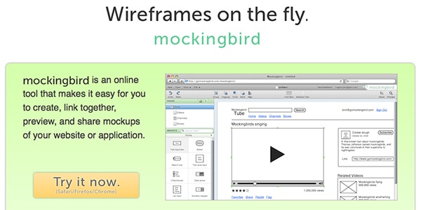
Mocking bird is a web-based app where users can create, link together, preview and share wireframes of a site or an application. The interface is clean and user-friendly where users can drag and drop elements, resize them and even share them with colleagues with a link.
Because it is web-based, it means you can basically create and work on your mock-ups from everywhere and from every computer.
Lovely Charts
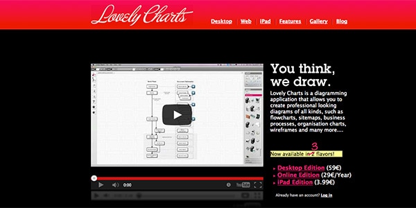
Lovely Charts is an online diagramming app allowing users to create flowcharts, organization charts, sitemaps and wireframes.
This application’s key feature is the option of making assumptions based on the diagram you are currently drawing – this helps streamlining the drawing process. It is also quite easy to go back to an earlier version and undo changes.
Mockflow
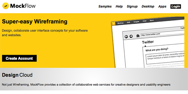
Mockflow is also one of the good web applications with a clean and minimalistic, organized interface and with an extensive set of features.
This interface works with drag and drop as well. There are built-in components all the way from charts to menus, ads and dropdowns. You can upload your own images as well as choose from a set of stickers of common site elements, so the process of building mock-ups can be very quick.
SimpleDiagrams
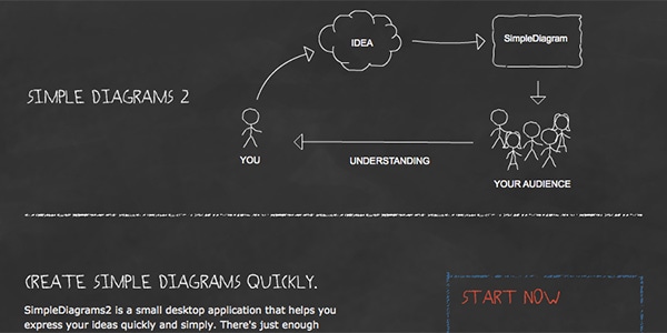
SimpleDiagrams is another desktop application helping users express their ideas by building great wireframes using the same drag and drop techniques as the other apps presented above.
Although it doesn’t have as many features as the other ones, SimpleDiagrams is actually so basic that will help users create wireframes or diagrams extremely fast.
With presenting SimpleDiagrams to you, I will wrap up today’s article. Don’t forget how important user testing is and remember that most of the time innovation and usability go on two different paths. When creating interfaces with fantastic interaction, keep innovation out of it and only focus on how to make it easy for the ones using it.
With this in mind, you should be able to go out there and do a great interaction design on your website or application’s interface.
What do you think about this great filed of IxD? Have you been trying designing such elements of an interface before, or is it something you look forward to now that you know of these principles?

