Top Web Design Trends for 2026
We are about to enter 2026. Along with taking a close look back to assess business growth and marketing tactics’ productivity, it is the right time to make strategic choices crucial to maneuvering through the digital world with confidence and clarity.
In website design, this means gathering relevant insights about new trends and consumer behaviors to understand how to adjust your web real estate for the ever-evolving market’s demands, preferences, tastes, and expectations.
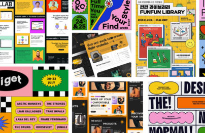
Last year, we saw how hyperreality dragged users into compelling surreal experiences, elevated brutalism got creative within constraints, leaving customers in awe, whimsical and unexpected stories unfolded before visitors, and maximalism gained steam with its large, dramatic fonts and oversized images that prolonged even the shortest attention span.
These solutions shaped the web sphere in the last two years. But what’s the next thing? Let’s inspect a dozen 2026 website design trends that reflect emerging technology, obsession with AI-powered platforms, and the changing landscape of the marketing world that relies on websites to increase user reach and retention.
But first, consider the benefits of keeping your web presence relevant and competitive by conforming to the mainstream. As we step into 2026, web design trends are set to be more immersive, user-centric, and innovative than ever before. Here’s a look at the top web design trends that will dominate 2026 and how you can leverage them to create standout digital experiences.
Benefits of Following Website Design Trends
Is it really necessary for your business to chase the latest trends and adopt them in your website design? To follow or not to follow is the dilemma many businesses, entrepreneurs, and professional bloggers face. The temptation to join in when competitors thrive on looking relevant and trendy is quite real. After all, you might:
With Postcards Email Builder you can create and edit email templates online without any coding skills! Includes more than 100 components to help you create custom emails templates faster than ever before.
Free Email BuilderFree Email Templates- Enhance brand identity and image, as trends add value to the brand story and reveal unique traits of its personality.
- Spotlight the brand’s identity, as trends help businesses bring their values front and make them look relevant and up-to-date.
- Increase brand visibility as trends enrich the user experience and help businesses stay top of mind with the target audience.
- Reinforce brand positioning, as trends help companies to keep up with the ever-changing preferences and expectations of their clients and prospects.
- Avoid stale and boring looks as trends revamp the company’s appearance and make it feel refreshing.
- Get a competitive edge as trends separate companies from lookalike competitors and deliver more value to customers than others.
- Demonstrate proficiency, as trends allow companies to show their expertise in the niche and prove to their target audience that they can handle new techniques and solutions.
- Identify new opportunities for business growth; as trends reveal customers’ current preferences, companies may meet their needs efficiently and locate areas for growth and improvement in usability, user engagement, and brand perception.
Even if you intend to stick to your guns and avoid any changes in your website appearance, it is crucial to remember that with almost 252,000 new websites created daily, your chances of standing out from the crowd and occupying top positions in search dwindle drastically. Today, businesses have higher stakes in keeping up with recent trends.
While you should not follow every emerging trend, it is still important to consider them in the context of your brand’s online presence and marketing activity, as some may certainly amplify your brand’s positioning and efforts.
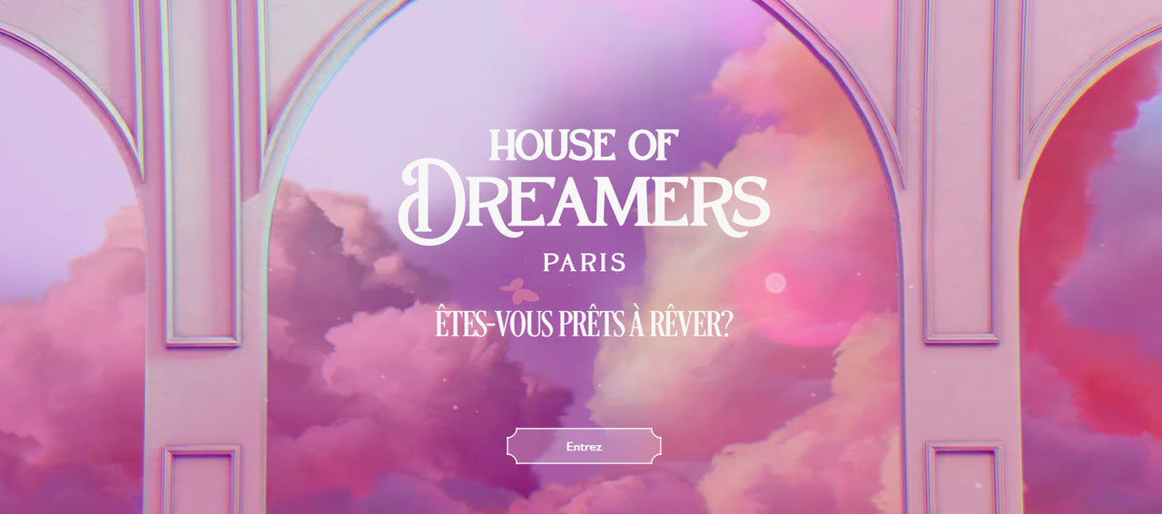
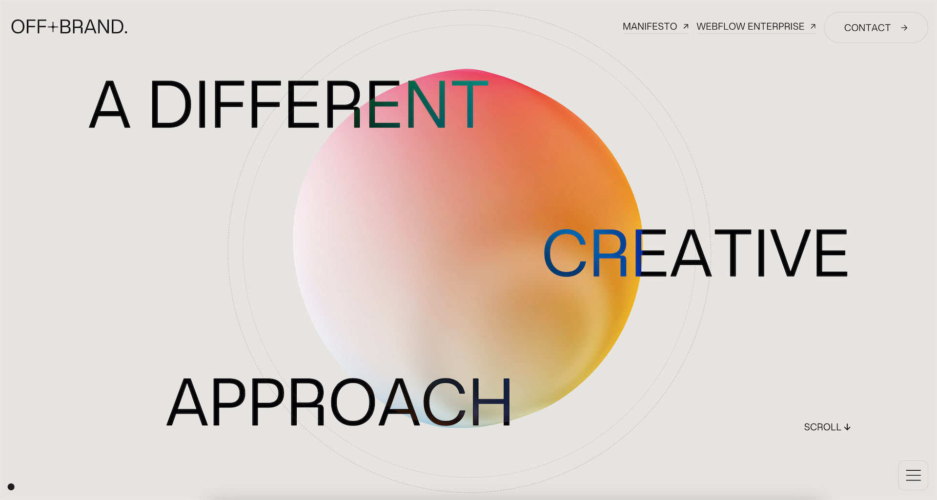
House of Dreamers
Problems with Introducing Website Design Trends in 2026
Following trends in website design is crucial to recognizing opportunities for business growth and reinforcement; however, mindlessly implementing them is a short-sighted strategy that may backfire and destroy any progress.
Website design is less flexible than email design or social media. Introducing new styles and features takes time and requires effort and skills from your team. You need to commit and devote yourself to the cause.
The problem is that trends affect essential facets of your online presence, like SEO ranking, user engagement, and overall brand identity. For instance, gamified elements may increase loading time and slow your website. Google seriously considers these factors when forming search results. So, you might lose your privileges.
The fleeting nature of web design trends presents another challenge. Trends come and go, with only the most powerful leaving their imprint and becoming integral tools for website designers. When chosen poorly, they may confuse your customers and contradict your brand vision, image, and storytelling.
With Pulsetic you’ll be instantly notified the moment your website, API, or server becomes unavailable. Monitor uptime from multiple global locations and respond to incidents before your users are affected.
Create beautiful status pages in minutes to keep customers informed during outages and build trust with transparent communication.
Start Monitoring for FreeWhen deciding whether to adapt website design trends, it is vital to take a step back and assess whether a specific trend aligns well with your current web presence. There are many aspects to take into account. Start by answering these critical questions:
- Does a trend fit your brand’s identity, personality, ethos, and current narrative?
- Does a trend fit your target audience?
- Does a trend enhance your brand’s visibility and relevance?
- How will a trend affect integral elements of your digital marketing, such as promotions, sales, and user experience?
- What is the lifespan and timing of the trend? Is it time to join in because it is gaining momentum, or skip it because it is dying?
It is important to remember that adapting website design trends should be a strategic move. To emerge victorious and unlock the potential hidden in looking trendy, businesses need to weigh the benefits and drawbacks and make informed decisions.
Sometimes, sticking to your brand identity and relying on its unique characteristics is far more beneficial than conforming to the mainstream. Other times, businesses must level up their game and retain loyal clients by changing their website appearance and ditching stale and boring experiences.
Engaging with trends selectively is important to save your brand’s positioning and progress. To do this, gather insights and stay informed about new trends to better understand consumers’ behavior and expectations. Here is our list of website design trends for 2026 to give you food for thought and a head start.
Website Design Trends 2026
Mobile-First Design and Accelerated Mobile Pages
We will start our list of 2026 website design trends with mobile-first designs and accelerated mobile pages, which are much more than trendy. They are critical factors in every modern website. If you still skip them, you lose a lot to your competitors, including missed opportunities to grow, increase traffic, and reinforce your brand’s visibility and positioning in search engines.
Do you know that website design is responsible for over 90% of the first impression of your brand, directly affecting market position, user engagement, and even revenue? And with mobile devices generating 60% of website traffic, a mobile-first approach is a key strategy in 2026.
For a website to have a successful modern web design next year, all its elements must translate flawlessly to both desktop and mobile, with the latter being prioritized. Consider the recent studies to make the case:
- Over 80% of US customers make purchases using their mobile devices.
- Over 50% of page views come from mobile phones.
- 40% of users will go to the competitor after a bad mobile experience.
Add to this Google’s mobile-first indexing initiative, which seriously considers the mobile version of websites when deciding what brand should appear in the top search results, and you can understand why mobile-first design and accelerated mobile pages occupy the first position in our list of website design trends 2026.
The importance of following this mainstream cannot be stressed enough. In addition to meeting the market’s demands and securing the top place in Google search, it also comes with certain benefits. Companies that adopt mobile-first design and AMP position themselves for long-term success and deliver superior user experiences that translate into better conversions and higher revenue.
So, how can you join this mainstream? In website design, this implies adopting progressive advancement through various essential facets of the user interface based on current trends. Here are some suggestions.
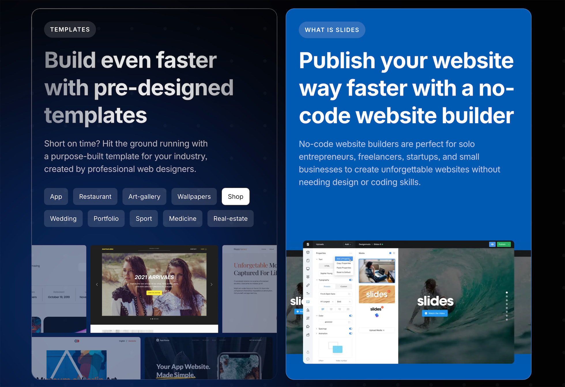
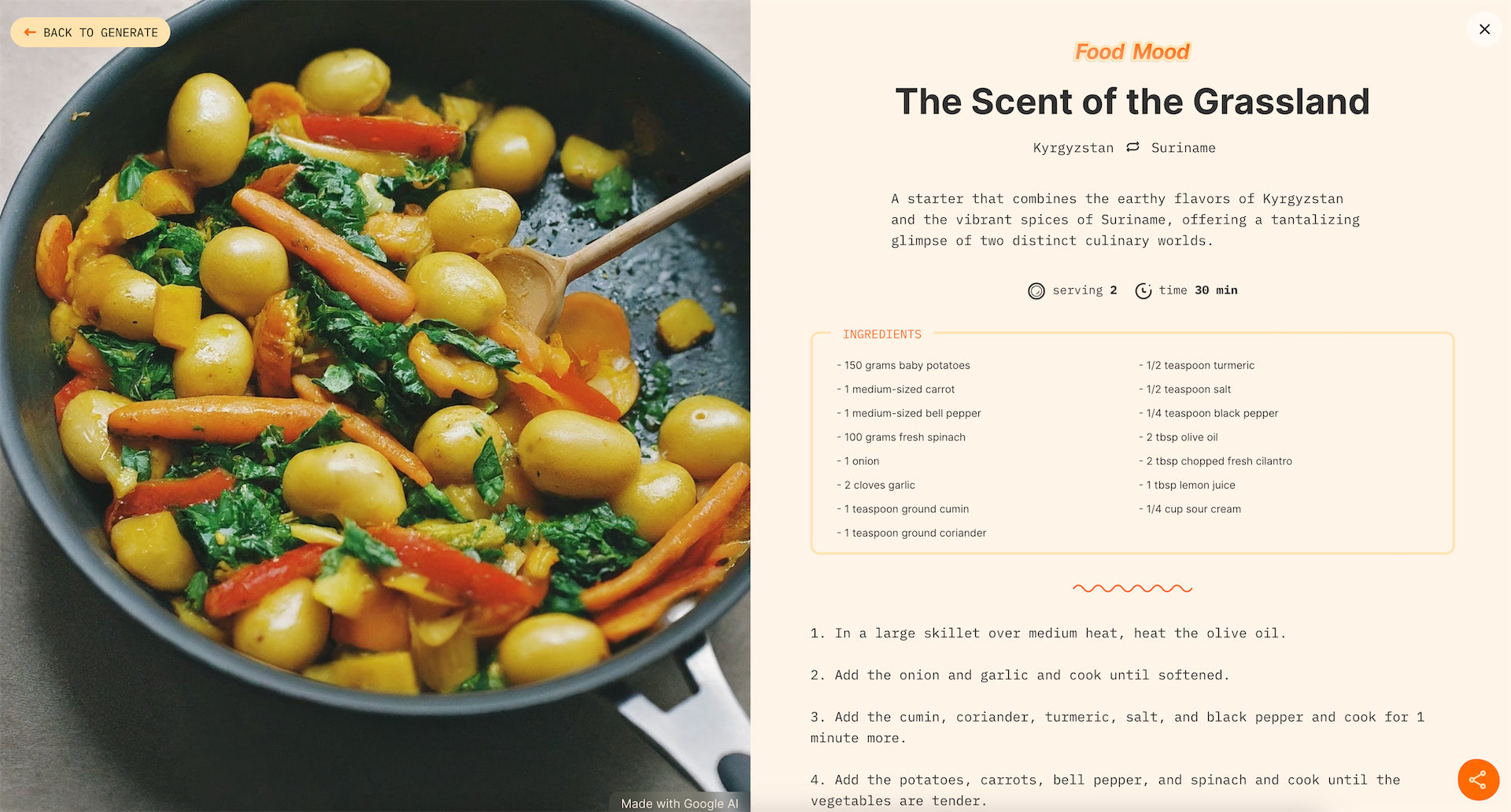
Slides – No-Code Website Builder
First, focus on the content. Due to space restrictions and users’ short attention spans, web designers must highlight the most critical elements. Therefore, adopt the “above-the-fold” approach. This implies creating impressive, impactful, meaningful, and informative hero areas. As for the rest of the layout, stick to the “cut to the chase” philosophy and include only those details and decorative elements critical for storytelling.
Think through navigation. Users should move along your website smoothly and quickly. Try navigation drawers supported by hamburger buttons to accompany the user’s every step.
Optimize images, graphics, and animations. Avoid landscape photos, overwhelming visual material, and complex animations. However, do not be boring—use branded and customized illustrations optimized for handheld devices.
Design with touch in mind. Enlarge touch targets, give hyperlinks plenty of space, and enlarge buttons. You might also add functionality and make pinch, swipe, and tap actions, and haptic feedback a part of the overall design experience.
Re-think hover and mouseover effects. Web designers strongly rely on them to support brand messages and deliver seamless user experience; however, they do not work on small screens, so they must be reimagined.
Finally, consider the mobile version as an “application.” Add elements that users can interact with without refreshing the page, such as off-canvas navigation, expandable widgets, and AJAX calls.
Ethical, Sustainable, and Accessible Website Design
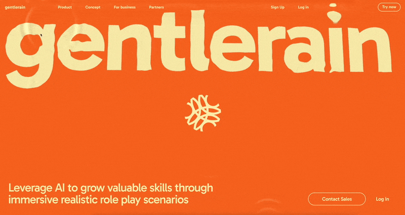
Gentlerain
Another trend showing signs of growth is ethical and sustainable website design. Started several years ago, this movement is growing in popularity as consumers become more conscious and serious about businesses’ impact on nature and a healthy society.
Not only do people crave environmentally-friendly approaches and solutions, but they also demand that their beloved brands meet them halfway. Consider the recent information from Embryo:
- 92% of respondents said they trust socially responsible or eco-friendly brands.
- 81% of shoppers prefer eco-friendly marketing and advertising more than traditional ones.
- 42% of consumers are willing to pay more for organically created products.
Statistics for ethical marketing show the same inclination.
- 34% of consumers decided to stop buying brands because of a lack of ethical concerns.
- 37% of consumers chose brands that have ethical practices or values.
- 65% of consumers consider it important for brands to value their privacy when purchasing.
The topic of ethical marketing and sustainable practices has been growing in popularity steadily. With almost 90% of consumers likely to be loyal to a company that supports social and environmental causes (according to Forbes), this mainstream will penetrate every aspect of business existence.
More companies recognize the importance of following this trend and adjusting their online presence to meet shifting customer demands. We anticipate this trend will stop being a novelty and become the norm.
So, what does the current push for sustainability and ethical marketing mean for your website design in 2026? Expect companies to embrace this trend from different angles and demonstrate their socially conscious position at every opportunity. Here are some best practices to introduce on your website to play along with the mainstream.
Sustainability in Website Design
Sustainability in website design entails companies adopting practices and styles that reduce the negative impact of web technology and mitigate energy usage, carbon footprint, and resource strain. Simply put, companies improve their website’s functionality, usability, content, information architecture, and performance. Here are some practices that businesses already introduce in their website designs to accomplish these tasks:
- Embrace minimalism and simplicity in user experience.
- Create a clear information structure.
- Provide meaningful content that gets straight to the point.
- Stick to dark mode with a black background, as brighter colors require more energy to be produced.
- Employ system fonts or free, open-source fonts in Web Open Font Format (WOFF) and WOFF2.
- Optimize images, use light formats, and select a monochrome palette or black-and-white version.
- Use responsive and mobile-friendly layouts.
Ethics in Website Design
Ethical website design implies that companies consider their users’ well-being and rights. It prioritizes positive online experience, functionality, transparency, and data protection over visually appealing design. It generally relies on these core principles: accessibility and inclusion, privacy and security, device-first experience, development, and technology.
Accessibility and Inclusion
To improve this facet of your website design and move along with the mainstream, it is crucial to create accessible and inclusive user experiences through content and design. Ensure that individuals can easily perceive and understand your message without barriers. The best practices to do that are:
- Use simple and inclusive language
- Ensure high readability
- Hit the optimal contrast ratio
- Avoid colors and graphics that cause eye strain
- Supply screen readers with all critical information
Privacy and Security
These two aspects of users’ interaction with the website are crucial to gaining trust and building a better community around the brand. They are also necessary to meet current regulations and avoid fines. Here are a few actionable steps that companies take to adjust their website designs accordingly.
- Create an eye-pleasing, meaningful, and effective pop-up message to obtain consent to track cookies.
- Add branded elements and allow your customers to tune their settings.
- Provide a clean, transparent page or section with a privacy policy and disclaimer.
Device-First Layout
Considering your audience’s viewing preferences to provide a consistent user experience is fundamental in creating ethical website design in 2026. Not only do companies switch to responsive and mobile-friendly layouts, but they also consider how customers interact with the website’s content and design. They employ techniques to offer an equal experience for visitors, whether they use a keyboard, a mouse, or assistive technology.
Development and Technology
It might not be evident, but development standards and technology choices affect the website’s front end. Companies that follow ethical principles choose solutions that meet coding standards and environmental considerations. For instance, they switch to a green web host, avoid unnecessary plugins, or employ minified and optimized plugins that might not be as impressive on the outside but are effective inside.
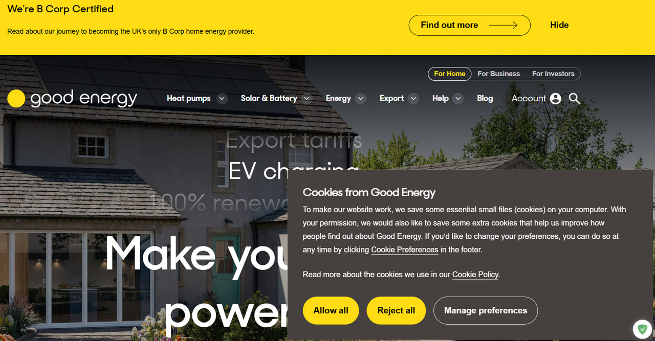
Clear cookies notice in GoodEnergy
Meaningful Interactions
With a bigger spotlight on user behavior, engagement, and retention, website design is undergoing a transformative stage. It is no longer just about the look and attention-grabbing details; it is about crafting impressive, unique, personalized, and purposeful experiences that resonate, engage, and inspire. This could be achieved through meaningful interaction – the trend that has become a staple in modern web design.
Generally, meaningful interactions imply reciprocal action or direct involvement with something that influences learners’ intellectual growth. On a website, this means ways for users to get the message or engage with the user interface. Not every interaction is meaningful; only those that deliver value and bring the knowledge necessary to move across the project efficiently.
There are various ways to create meaningful interactions and enhance user experience. For instance, we expect dynamic cursors and micro interactions to excite designers next year. Here is how you can adapt them to keep up with the mainstream.
Dynamic Cursors
The use of dynamic cursors was a trend last year, and it will be this year as more designers and businesses recognize their potential to improve usability and user experience.
Starting as an extravaganza several years ago, this take on a basic functionality has overgrown its status and become increasingly helpful in achieving goals. For instance, it might guide users across the website, unfold the brand story, highlight crucial details, and minimize confusion. And with all that, it still has a wow factor that is crucial to produce a powerful impression to win over and retain customers.
There are many solutions to play along with this mainstream. Here are some popular effects that you might apply to the cursor in your web project to look refreshing in 2026:
- Dot cursor (perhaps it is one of the most popular solutions, as it naturally communicates information and draws attention to details)
- The following cursor (it makes the pointer look more prominent, becoming ideal for visually-heavy interfaces)
- Gradient or rainbow-based swirl cursor (it is great for keeping track of the user’s movement in content-heavy interfaces)
- Flashlight effect (it is great for highlighting key details in websites with dark mode and aesthetics)
- Text cursor (it is great for revealing cues or adding branding)
- Arrow cursor (it is great for improving navigation across the website and letting users move across the project smoothly)
- Trailing cursor (it is great for adding hustle to oversimplified projects)
Microinteractions
Microinteractions are another trend that continues year after year. Can you imagine a modern website without them? Small yet impactful, these details have become integral to user experience.
The concept is constantly explored, as it offers numerous benefits. When properly applied, microinteractions increase user engagement, enhance usability, heighten user satisfaction, boost retention, create an emotional connection, and optimize mobile experiences.
To follow this trend in 2026, it is crucial to consider them in the context of user experience, accessibility, and marketing. There are several large groups of micro-interactions: triggers, rules, feedback, loops, and modes. Each one should be applied accordingly.
Therefore, identify critical touchpoints where micro-interactions can significantly enhance the user experience, like a first-time website launch, user registration, empty states, task completion steps, waiting moments, and data visualization. Think through functionality first, and only then add delight.
Playful and Impressive Entertaining Websites
Playful and impressive entertaining websites are another trend in the website design sphere that has cemented its position over the years and become a source of inspiration and invigoration. They are a playground for designers to exercise creativity, push limits, test new approaches, step out of their comfort zone, and indulge curiosity by constantly evolving.
Entertainment websites are popular not only among web designers and developers but also among the general public. From a psychological point of view, they meet the market’s inner cravings. As people live in highly stressful environments with pandemics, economic crises, and war outbreaks, they crave some peace and joy in their lives.
Playful web projects that naturally take their minds off worries and anxieties are what they need to satisfy this intrinsic demand. They are great stress relievers that can boost mood and expose visitors to new ideas, worlds, and ways of thinking, making them feel refreshed and invigorated.
Consequently, such projects see increased traffic, engagement, and involvement, amplifying the company’s visibility and boosting branding and marketing efforts.
So, what can you expect next year from this mainstream? It seems that website designers have only scratched the surface, so they will please us with more extravagant and mind-blowing projects where creativity is powered by high-end technologies, AI, and personalization.
Here are some tips if you want to try your foot there:
- Add interactive details to make users actively explore the interface and indulge in your story.
- Use custom illustrations to capture attention from the get-go and encourage them to continue browsing your content.
- Give users control over their experience and help guide them toward the information they want.
- Create unique storytelling experiences using parallax effects.
- Add transition effects to enrich scrolling and surfing.
- Think through the strategic use of animations and hover effects.
- Leverage micro-interactions to improve functionality and usability.
- Integrate interactive content like quizzes, polls, or calculators.
- Adopt graphic trends.
- Gamify projects.
So, go bald or go home. Invent and re-invent your ways to entertain your target audience, as this trend encourages you to show your wit and crazy side. Experiment with emerging techniques, be brave, and let your imagination run wild. If you need a reliable platform to bring your ideas to life, consider Slides – a no-code website builder. This professional instrument has all you need to design stunning animated websites in just a few minutes.
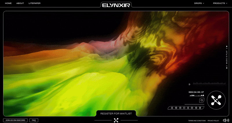
Elynxir
AI-Powered Web Projects
AI took the web by storm several years ago, becoming one of the most promising, pioneering, and intriguing trends. In 2026, we expect it to speed up as nine out of ten web designers have already used it in their routines. Recent studies have revealed that creatives employ artificial intelligence for different purposes; the top three are:
- Almost 60% use AI to generate media assets (imagery, illustrations, and tiny graphics) to enrich web user interfaces.
- 50% use AI to craft complete web page designs.
- 49% use AI for creative experiments, pushing limits, and trying new designs or elements.
AI-powered platforms are becoming popular with web artists. They offer more precise ways to track and improve the quality of creations from different points of view, such as marketing, advertising, and branding.
Therefore, we expect website designers to employ AI for these tasks in 2026.
Speed up the Website Design Process
Web artists will use AI website builders to design and code entire websites. From simplifying the process of generating code snippets to solve specific problems to developing fully-fledged mockups in seconds, they will grab a golden opportunity to bring their ideas to life quickly and without much effort and investment.
Fill in the Website with Content and Visuals
One of the most popular uses of AI is to complete websites with text, images, illustrations, and other types of visual media. Though populating pages with AI-generated content might backfire as Google pays meticulous attention to content quality on the web page, it might be helpful for quick solutions, presentations, and A/B testing.
Improve User Experience and Usability
Besides crafting websites from scratch, web artists will use AI to gather critical information about their target audience’s preferences, needs, and expectations. They will get insights on what works best for a specific market segment and business niche and translate this knowledge into attention-grabbing layouts that represent information and help the company achieve its business goals.
Surface Weaknesses of Web Projects
Rebranding, refreshing, and reinforcement strategies in the digital space greatly benefit from the powerful analytical capacities of AI tools. Website designers are going to use them to revise designs and surface weak spots and inconsistencies in the display.
Realize Personalized Marketing Strategies
Hyper-personalization has become a staple of good marketing these days. With web artists, digital marketers implement various strategies to provide their clients with personalized and interactive user experiences, achieving their goals like increasing engagement or generating more efficient conversions and revenue. Website designers will use AI to adjust layouts, fill pages with appropriate products, and improve interaction at every critical touchpoint.
Design AI Chatbots
Finally, one of the biggest sub-trends in the area is the utilization of virtual assistants. Did you know that 40% of millennials engage with digital assistants daily, and chatbots contribute to 39% of all chats between businesses and consumers?
These small conversational agents have become proven tools to improve the company’s and its clients’ interaction by providing responsive customer support. While they cannot address issues as effectively as humans, they still improve customer satisfaction with businesses and provide a comfortable environment with quick answers to the most burning issues.
Website designers will meet this demand by crafting branded and eye-pleasing layouts to introduce this functionality to a website.
Complex and Awe-Inspiring Hero Areas
Hero areas are the initial point of interaction and hold great significance in shaping a brand’s perception and achieving crucial marketing and business goals. They have been loyal designer assistants for over a decade and have proven extremely powerful in implementing the “above-the-fold” approach.
Next year is not going to be an exception. We expect this trend to grow and reveal its hidden gems, encouraging website designers to exercise their creativity and push their limits to help marketing teams deal with the shortest user attention spans ever. Here are several trendy ideas to make it work for you in 2026:
Start with a Stunning Abstract Illustration
Custom illustrations in the hero area are a match made in heaven. They perfectly complement and reinforce each other, amplifying the impact of the first user’s encounter with the project.
However, do not just go for a generic option. Instead, use abstract or absurd illustrations that give food for thought and instantly catch the eye with their unique character and personality. This will naturally separate your web project from the competition and make the most of the customer’s short attention span.
Embrace the Deconstructed Approach
The deconstructed approach is a nice change from the usual structure of a hero section to the interesting and unique world of feeling free to think outside the box. It implies a more fragmented and abstract style, including miniature pieces of text or data visualizations, bold typography, and overlapping, tilted, or asymmetrical images. It is here that abstract illustrations find their rightful place and use their unique personality to reinforce the overall impact.
Put together different design elements in a fun and surprising way and shift toward a riskier and more experimental solution to create storytelling experiences. This way, you make great first impressions that set the tone for a memorable user experience.
Power up a Headline
Even a website hero section that capitalizes on visual impact needs a headline. Adding at least two or three meaningful and branded phrases that deliver value and convey your brand’s personality or value proposition is what you need to play along with a customer’s short attention span. Ensure it drums their interest and encourages them to keep exploring.
People are always unsure what to do on a website they first encounter. The more guidance you have at this point, the more likely people are to stick with you. A thoughtfully created call-to-action button plays an important role here. It provides necessary information during the determination period and encourages action.
Recent studies show that CTAs above the fold outperform those below by 304%. From a marketing point of view, it is crucial for securing high engagement and generating much-needed conversions.
When applying it, ensure it has a highly contrasting design, uses action words, includes clear instructions, and looks big and bold.
Support with Dynamic Effects and Animations
Tiny animations and dynamic effects are trends that will become prevalent next year. Incorporating them into the hero area is a surefire way to create an ultra-modern design with a captivating and interactive appearance.
They can enhance website navigation, highlight key details of value propositions, communicate extra information, and give a company a cutting-edge advantage in a competitive landscape.
The most popular solutions to introduce this trend in the hero area are dynamic cursors, morphing animations, liquid motion effects, claymorphic animations, stop motion animations, and hover effects.
One more thing: VR and AR
The rise of VR and AR in web design is evident. Having the potential to transform the web into a more interactive and engaging space where users can experience products and environments like in brick-and-mortar stores excites everyone. With the release of the Apple Vision Pro headset and other similar makers, a shift in creating websites and user experiences in the digital world is on the horizon.
We have already seen some exceptional projects, such as e-commerce websites using AR to allow customers to visualize products in their homes, digital agencies, and booking platforms with virtual tours, AR trials, and interactive 3D models.
We expect to see more mind-blowing solutions in this area, but they will not be ubiquitous. This emerging trend is moving slowly for many reasons. First and foremost, the user’s adaptation to virtual reality is slow and expensive. Hardly anyone can afford an Apple set. Second, companies should invest their time, human resources, and money into new technologies and A/B testing. Third, while VR experiences can potentially boost marketing and branding efforts, there are still cheaper and simpler ways.
Even though VR and AR promise mind-blowing experiences, they are far from becoming common tools for creating website designs. In 2026, we will see them as marketing tactics mainly applied by industry leaders.
Conclusion
Web design continues to evolve and excite the minds of the creative crowd. From well-established AMP to freshly emerged ethical and sustainable practices, from huge immersive hero areas to tiny yet memorable dynamic cursors, plenty of creative solutions make clients’ projects look fresh, modern, and impressive in 2026.
Following these mainstreams is crucial for businesses and designers alike. As we enter the era where website design is closely connected with marketing and branding, tapping into the target audience’s demands and preferences by implementing the right trends helps companies to grow and move forward with their ultimate goals.
When introducing 2026 web design trends, artists should focus on solutions aligned with brand identity. Their projects should highlight the company’s personality and provide user-centric experiences that resonate with the market. To achieve this, it is highly recommended to use professional instruments like Slides or Startup, as they provide a reliable platform for creativity and experiments.