The Problem with Web Design Trends: Why Following Them Blindly Can Hurt Your Business
Web design trends come and go. Some trends stick around for a while, while others quickly fade into obscurity. As a business owner or web developer, jumping on the latest trend bandwagon is tempting. However, blindly following web design trends can cause more harm than good.
In this blog post, we’ll explore the problem with web design trends and why you should be cautious when implementing them.
The Fleeting Nature of Web Design Trends
Web design trends can be enticing but often prioritize aesthetics over usability or functionality. As a result, they can quickly become outdated and irrelevant, leaving your website looking outdated and stale.
For instance, flashy animations and complicated layouts were once popular but are now considered outdated and distracting.
Another example of a trend that has fallen out of favor is using skeuomorphic design. Skeuomorphism is a design style that mimics real-life objects, such as leather textures on a digital interface. While it was once popular, it’s now considered outdated and impractical due to its potential to confuse users.

The fleeting nature of web design trends means that blindly following them can result in an outdated website lacking functionality. Instead, it’s crucial to balance current design trends with practical considerations such as usability and functionality to ensure your website remains relevant and effective in the long run.
With Postcards Email Builder you can create and edit email templates online without any coding skills! Includes more than 100 components to help you create custom emails templates faster than ever before.
Free Email BuilderFree Email Templates“Trends come and go, and they always will. But good design is timeless.” – Anne Weaver
How Web Design Trends Affect User Experience
While web design trends can be visually appealing, they can hurt the user experience. Some trends, such as auto-playing videos or pop-ups, can be intrusive and frustrating for users. These design elements can distract users from the website’s main purpose and hinder navigation.
Trendy design elements can also make a website difficult to navigate or use. For example, parallax scrolling, which creates a 3D effect by moving the foreground and background at different speeds, can be visually stunning but can also slow down the website’s loading time and make it challenging for users to find what they’re looking for.
Similarly, using small font sizes or low contrast can make it difficult for users to read and engage with the content on a website. These design elements can cause users to lose interest in the website and seek out a competitor with a more user-friendly design.
Ultimately, following web design trends blindly can negatively impact user experience and drive users away from your website. Balancing trendy design elements with usability and functionality is essential to ensure your website provides an optimal user experience.
Balancing Trends with Practicality
Web design trends can be tempting, but balancing them with practical considerations such as usability, functionality, and user experience is important. A website should reflect the brand’s identity and meet the needs of its target audience .
For instance, if your brand’s identity is minimalistic, incorporating trendy design elements such as bright colors and complex layouts may not align with your brand’s image. Similarly, if your target audience is older adults, small font sizes or low contrast may not be practical as they can be difficult to read.
Websites that successfully balance current design trends with practical considerations can provide a seamless and enjoyable user experience. For example, Apple’s website is aesthetically pleasing and incorporates trendy design elements such as funky gradients and typography because they still honor timeless best practices like a clean layout and ample whitespace. It also prioritizes practical considerations such as easy navigation and clear product descriptions, making it easy for users to find what they’re looking for.
With Pulsetic you’ll be instantly notified the moment your website, API, or server becomes unavailable. Monitor uptime from multiple global locations and respond to incidents before your users are affected.
Create beautiful status pages in minutes to keep customers informed during outages and build trust with transparent communication.
Start Monitoring for FreeBalancing trendy design elements with practical considerations can help your website stand out while still providing an optimal user experience. By considering your brand’s identity and target audience’s needs, you can create a website that is both visually appealing and effective in achieving its purpose.
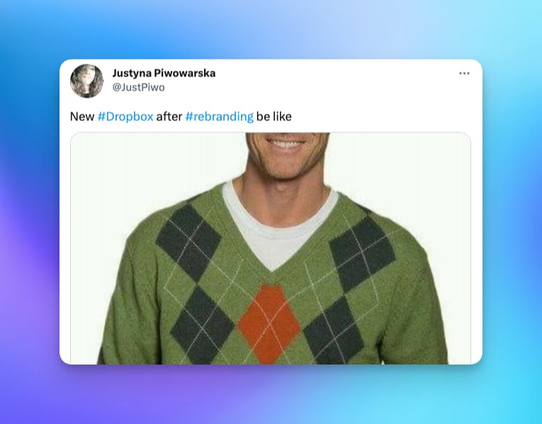
Following web design trends blindly can incur hidden costs that can be detrimental to your business. Even though there are many great UI kits and website templates that can help you pick up trends quickly, redesigning a website is costly and often requires changing other parts of the brand, such as logos, packaging, and marketing materials, to maintain consistency. This can lead to significant expenses that may not have been anticipated when initially following a trend.
“Following design trends is like dating a musician. You may have fun for a while, but eventually, you’ll be left with an empty wallet and a bad taste in your mouth.” – Luke Clum
Furthermore, changing a brand’s visual identity too frequently can also harm the brand’s heritage and damage customer loyalty. A brand that customers have come to love can lose its appeal and become unrecognizable in the blink of an eye.
Another hidden cost of following trends is the time and effort required to keep up with them. Design trends constantly evolve, and keeping up with them can be time-consuming and require significant effort. This can take away from other important business aspects, such as product development and customer engagement.
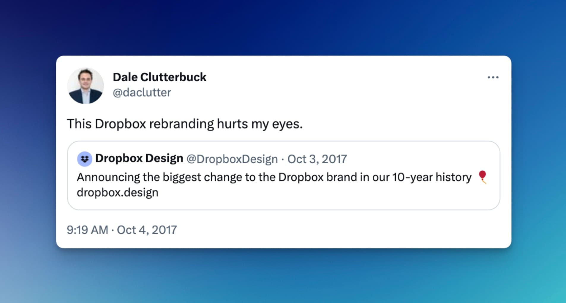
Ultimately, following web design trends blindly can have hidden costs that may not be immediately apparent. Considering the long-term impact on your brand identity, customer loyalty, and overall business success is crucial before implementing trendy design elements. Instead, aim for a timeless and functional design that aligns with your brand’s identity and meets your audience’s needs.
Standing Out in a Sea of Sameness
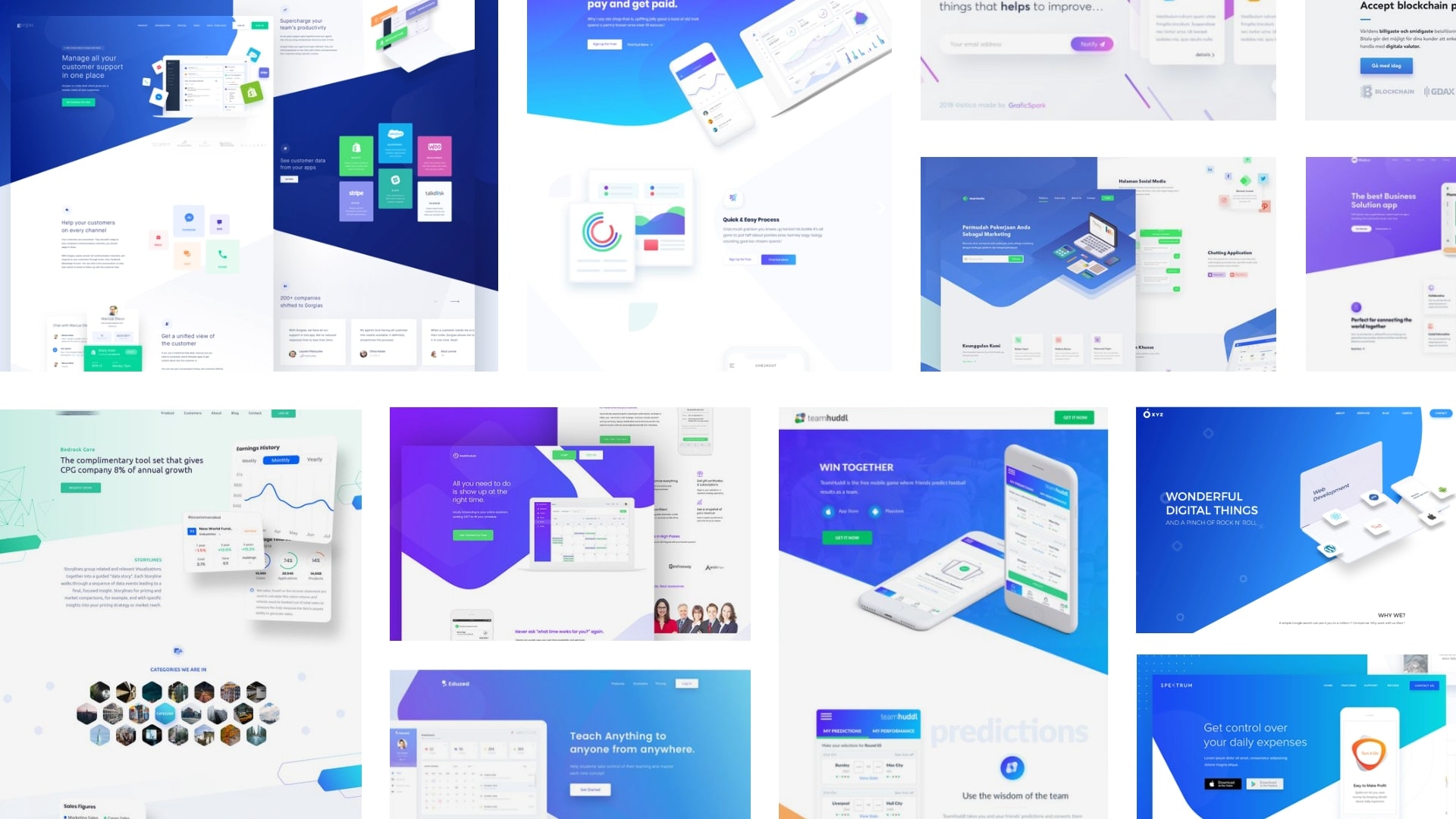
The dynamic world of web design trends is both exciting and challenging. On the one hand, they offer a fresh and innovative approach to website design. On the other hand, their overuse can lead to a lack of uniqueness, sameness, and even obsoleteness. This is why it’s crucial to balance incorporating current trends and maintaining originality.
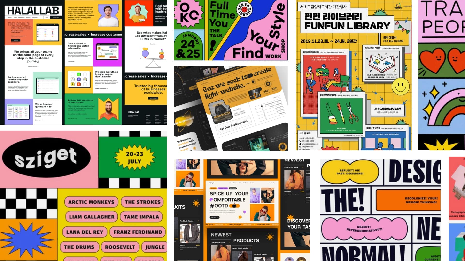
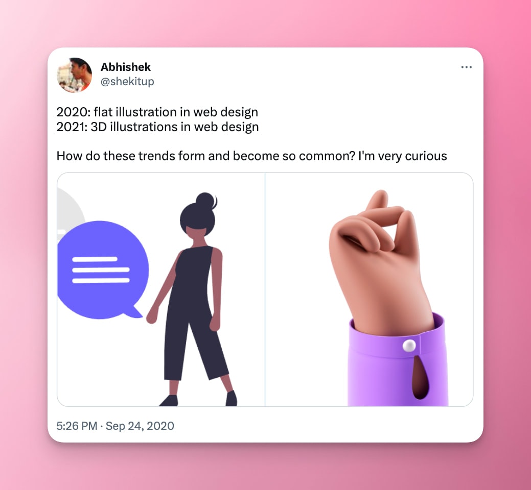
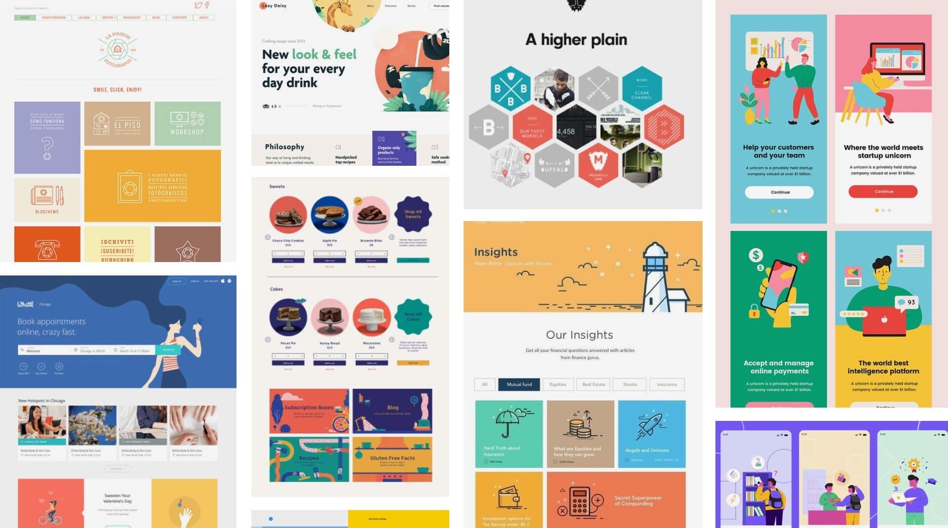
Take brutalism, stripe style, or 3D style, for instance. Once they become ubiquitous, they may no longer be an effective tool for creating a distinctive website. The overuse of a trend can diminish its impact and fail to stand out among the sea of similar websites.

However, avoiding trends altogether is not the solution. Instead, it’s important to approach them with a critical eye. Consider your brand identity and your target audience’s preferences. Will the trend provide a memorable and unique user experience? Or will it blend in with the crowd, failing to capture your website’s essence?
To create an original and engaging website, you must balance following trends and carving your own path. This requires thinking outside the box, experimenting with different styles, and being bold enough to take risks. With a little creativity and strategic thinking, you can create a website that’s trendy and timeless.
Practical Tips for Staying Ahead Without Losing Your Way
To avoid the pitfalls of blindly following web design trends, it’s important to think critically about whether a trend is right for your website and audience. Here are some tips to help you avoid the pitfalls of following web design trends blindly:
- Consider your brand’s identity and target audience’s needs before incorporating trendy design elements into your website.
- Think about the usability and functionality of your website and how trendy design elements may impact them.
- Look for inspiration from various sources, including competitor websites and design blogs, rather than simply following the latest trend.
- Test new design elements on a small scale before implementing them on a larger scale to see how they impact user experience.
- Prioritize user experience over visual appeal and ensure that trendy design elements enhance rather than hinder it.
“The best design trends are the ones that never go out of style.” – Laura Busche
By following these tips, you can avoid the pitfalls of blindly following web design trends and create a website that reflects your brand’s identity, meets your target audience’s needs, and provides an optimal user experience. Remember, a website that looks great but is difficult to use will ultimately harm your business.
Dealing with Design Fears
As a web designer, it’s natural to experience fears and anxieties about keeping up with the latest trends and techniques. However, giving in to these fears can hold you back from reaching your full potential.
Here are some tips for overcoming common design fears:
- Embrace a growth mindset: Instead of fearing failure, view challenges as opportunities to learn and grow.
- Stay curious: Seek out new design resources and techniques, and be open to trying new things.
- Collaborate with others: Surround yourself with other designers and professionals who inspire you and can help you overcome challenges.
- Celebrate your successes: Focus on what you have accomplished rather than what you still need to achieve.
Addressing Design Frustrations
Web design can be frustrating when you’re constantly playing catch-up. Here are some tips for dealing with common design frustrations:
- Prioritize your time: Identify the most important tasks and tackle them first to avoid feeling overwhelmed.
- Embrace new tools and techniques: Instead of resisting change, learn to adapt to new design trends and tools.
- Seek feedback: Solicit feedback from other designers, users, or clients to help you identify areas for improvement.
- Take breaks: Step away from your work and recharge your batteries when you feel burnt out.
By addressing your design fears and frustrations head-on, you can stay relevant and thrive in the ever-changing world of web design.
How to Become a Thought Leader in Web Design
A thought leader is at the forefront of their industry, pushing boundaries and inspiring others to innovate. In website design and development, thought leaders are the ones who create new design concepts, testing out new technologies, and share their insights with others.
Here are some strategies for becoming a thought leader in the field of web design:
- Stay up-to-date with the latest trends and technologies: Attend conferences, workshops, and seminars to stay abreast of the latest developments in web design.
- Create original content: Write blog posts, create videos, start a podcast, and share your design insights with others. This will help establish you as an authority in the field.
- Collaborate with others: Work with other designers, developers, and professionals to create new projects and concepts.
- Take risks: Don’t be afraid to experiment with new design concepts and ideas, even if they seem unconventional or risky.
- Share your knowledge: Teach others by hosting workshops or speaking at conferences, and contribute to the design community by offering feedback and advice to others.
By following these strategies, you can become a thought leader in web design and inspire others to innovate and push the boundaries of what’s possible.
Wrapping up
While web design trends can be exciting and visually appealing, they should be cautiously approached. Blindly following trends can hurt your business by making your website difficult to use and outdated-looking. By balancing current trends with practical considerations and thinking critically about their suitability for your website, you can create a website that reflects your brand and meets the needs of your audience.

