Why Web Designers are Choosing the Emotional Approach to Attract More Clients
Emotional design turns casual users into fanatics, ready to tell others about their positive experience. – Aarron Walter, author of Designing for Emotion.
Website design is technologically superior to many crafts. It requires the hands of a skilled artist, one who understands complexity yet knows how to display it in a simple way. It also requires the ability to adapt to an ever-changing industry and a dedication to learning the latest technologies to remain competitive.
Web design has rapidly switched its gears in the last two decades. The websites of yesterday lacked personality and character and were based on serious company personas. Businesses left humor and creativity at the door because they thought users would think these traits were trivial.
This line of thinking has shifted in the last 5-10 years and the web has become more about identifying a unique brand personality rather than trying to be “stuffy” and machine-like.
The web design industry for many years has been a left-brained industry where accuracy and perfection were paramount to success. Though this precision is still necessary to execute professional designs, it can become a handicap when it overshadows the much-needed, emotional attributes of right-brained thinking.
Website visitors must have a dual-brained experience when landing on a website. Here is what two sides of the brain would think:
With Postcards Email Builder you can create and edit email templates online without any coding skills! Includes more than 100 components to help you create custom emails templates faster than ever before.
Free Email BuilderFree Email TemplatesLeft-brained thinking
- The website appears professional
- It contains all the necessary elements
- It loads fast
- The content is grammatically correct
- All elements are in place and neat
Right-brained thinking
- I feel secure on this website
- I can trust the webmaster
- The site makes me feel comfortable
- I feel connected to the person behind the website
- I do not feel like it will be a risk to proceed further
- I like the design and colors
What’s interesting is that both of these categories will intersect. For example, if a user cannot find the elements for which he is looking (left-brained), he will express emotions of frustration (right-brained) and potentially leave the site.
The most successful websites satisfy both the left and right brains of visitors and leave a lasting impression.
Web design for emotions is more than just making people happy or excited. We will discuss some of those principles when we talk about color theory, but generally, designing for emotions is centered on building a site that allows users to build trust and feel secure.
The internet is somewhat of an invisible entity. Virtually anyone can put up a site and scam people into giving them money. The web is full of job scams, identity theft plots, and phishing crimes and internet users are scared as a result.
Visitors will arrive to your website site already skeptical. They will consider you guilty until proven innocent. This defense mechanism can only be eliminated when you, with your web design, make visitors feel comfortable and strive to portray someone they can trust.
You must find a way to “humanize” your site so people will feel there is a real, genuine person behind it and not a computer or machine.
With Startup App and Slides App you can build unlimited websites using the online website editor which includes ready-made designed and coded elements, templates and themes.
Try Startup App Try Slides AppOther ProductsWhen visitors feel a connection, no matter how small, the walls of skepticism begin to dissolve, and trust will replace it. Trust is one of the most sacred of human emotions.
Here are some ways you can use web design elements to connect with your visitors on an emotional level:
It’s In the Details
Usability is a crucial aspect of designing for emotions because, as stated before, if your visitors cannot perform simple tasks, they will leave frustrated. Ensure your design is clean, professional and easy to navigate. Usability will form the foundation of a great website and allow emotional aspects to take center stage.
Creative details are very important in web design. It’s that extra something that makes people think your site is special because you took the time to add elements that are a little “outside of the box”. It’s similar to how Zappos automatically upgrades your package to Next Day shipping when you pay for Ground, or how your husband comes home with a rose even if it isn’t a special occasion.
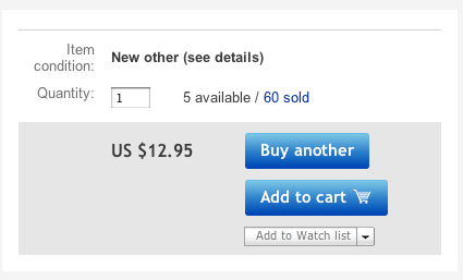
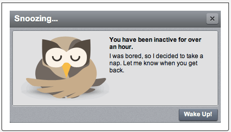
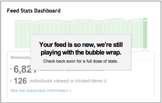
Take a look at how these websites offered small details that made a big difference and got noticed by users.
If you already purchased an item, the button changes to “Buy Another.”
This little bit of humor gives users a chuckle which breaks down walls immediately urging people on the fence to take the next step. Garnering a smile is a great way to establish a connection, provided it is done professionally and in the right industries (it wouldn’t be appropriate on a funeral home’s website!).
Thanks to Little Big Details for these UI design inspirations
Know Your Audience
You cannot effectively arouse emotion in your website visitors without knowing who they are. I am not referring just to their age, sex or occupation. To truly know your audience means reaching beyond the surface and creating a marketing persona.
What is a marketing persona? It is a detailed analysis of the people you service. A persona allows you to put a “face” to your audience which will help you see your visitors as real people. It gives you insight into what motivates your visitors and their decisions to work with you. This thought process will lead to a website design that is connected to the needs and wants of your visitors.
A marketing persona will answer questions like:
- Who are my customers?
- What is their daily stress?
- What are their immediate goals?
- Do they have kids? A spouse?
- What is their income level?
- What are their hobbies?
These questions may seem unimportant. But the websites that exercise these techniques will edge out all the rest because they will speak directly to their visitors and establish an emotional connection quicker than anyone else.
Here are some great resources on creating marketing personas:
How to Create Killer Marketing Personas
12 Point Marketing Persona Checklist
If you are designing a website for your clients, you can impress them by asking them detailed questions about their target audience. By designing with their target audience in mind, your final product will not only look great, but it will also do a better job at increasing conversions.
Color
Color theory is very important for web designers because colors will affect people in different ways and command different emotions. Even a slight change in a hue or saturation can evoke varying emotions. For a great discussion on color theory and how web designers can use them in their arsenal, check out this Smashing Magazine 3-part series: Color Theory for Designers
Images and Connection
People, by nature, seek to make emotional connections with others. If this were not true, we would never get married, build friendships or have children. This relationship connection is crucial to understand when designing a great website.
People want to feel familiarity and recognize themselves which is why images of people are popular and often used on websites.
Take a look at these examples:
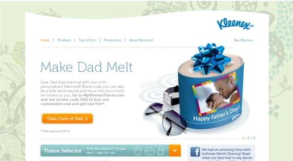 Kleenex does a great job appealing more to the female demographic with the floral background. The image paints a picture of a father-child relationship which will most certainly evoke emotion.
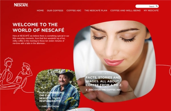 Nescafe paints a picture with its images and content that endears visitors to its brand.
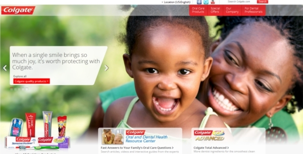
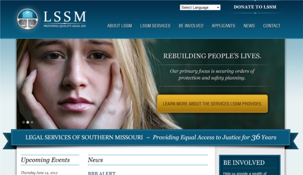
Some websites may find that an emotional connection can be established through “sad” feelings, which is appropriate for this website and how its clients most likely feel.
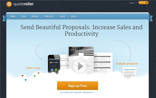
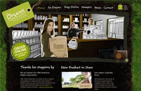
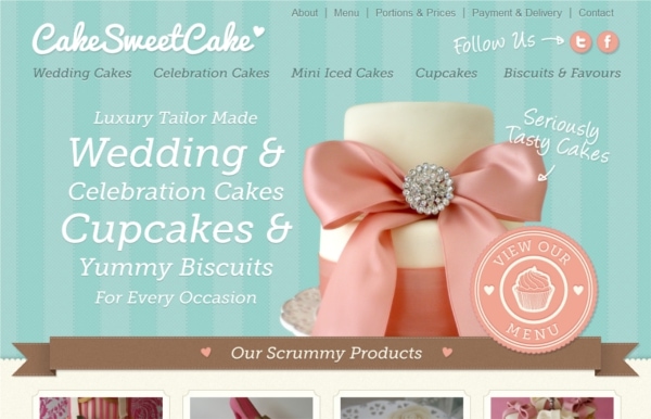
While images of people are effective, websites can also create that feeling of recognition in other ways. Your visitors can recognize a problem or habit for which they need solutions and feel that familiarity with demographic-specific design elements and strong copy. The website can make them feel right at home. The more “humanized” the website to a specific target audience, the greater the chance of trust and a lasting connection.
Here are some examples:
Quoteroller
Organic Supermarket
Cake Sweet Cake
Content
You cannot separate great web design from impactful content because the two are closely related. The relationship building extends from the design to the copy to create a cohesive whole. All of the above points also apply to content and the tone of voice should mirror the website design as well as the audience’s needs. Whether you write your own website copy for your clients or you hire a copywriter, make sure the writer understands the power of evoking emotion and building a foundation of trust with words, tone and layout.
Conclusion
Never forget that businesses are made up of people, not inanimate objects. At the core of every person is a desire to connect and find meaning in the world. That first impression is everything, and the quicker you can pull out an emotion from a website visitor that leads to a connection, the greater the chance of gaining a customer/client for life.
What About You?
Have you ever thought about designing with emotions? Do you use your website designs to connect with website visitors in other ways?
Please share with us any examples of designs you created that take some of these points into consideration.
