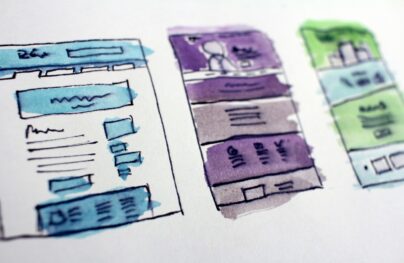
How To Manage White Space in Mobile Responsive Layouts
White space is a crucial design tool whether you realize it or not. Many designers adjust page elements until they “look good”. Most often this leads to a natural balance of white space between page sections just from gut instinct.
But when you get into responsive design this subject gets a bit tricky. White space needs to be adjusted at different breakpoints to create a seamless experience for all users.
This can be done with many different techniques and I’d like to cover the best ones here. All modern websites should be fully responsive so it’s no question that responsive design is important. The only question is how to handle white space so that all users have an awesome experience.
Naturally the first thing every designer considers is how to handle the navigation menu.
If a site has dozens of links you really don’t have many options. You could use a select input field or a hidden menu with the three-bar hamburger icon.
With Postcards Email Builder you can create and edit email templates online without any coding skills! Includes more than 100 components to help you create custom emails templates faster than ever before.
Free Email BuilderFree Email TemplatesHere’s an example where the top navigation doesn’t even resize. Once your browser window hits a certain breakpoint the links automatically hide into a menu and get replaced with a hamburger icon.
But pay attention to the extra whitespace added between each link. This is a common technique and generally a great idea to space out links for finger taps on mobile.
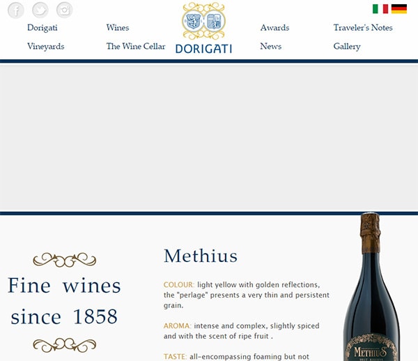
Most websites rearrange their navigation a few times before finally settling on the three-bar icon. For example Dorigati uses a full-width navigation menu which eventually breaks down into a grid system.
Then at the 960px breakpoint the entire layout shifts from a top header to a sidebar navigation. The logo and links all rearrange themselves into the new sidebar.
Once you go even smaller the nav links eventually move back to the top with a hidden hamburger menu. It’s a very complex solution but it provides a more natural experience for different browser resolutions.
And remember if the navigation is small enough then you won’t even need the hamburger. It’s generally a good idea to avoid hidden menus when possible, so a solution like Regent College would be perfect for sites with smaller menus.

With Pulsetic you’ll be instantly notified the moment your website, API, or server becomes unavailable. Monitor uptime from multiple global locations and respond to incidents before your users are affected.
Create beautiful status pages in minutes to keep customers informed during outages and build trust with transparent communication.
Start Monitoring for FreeAll links are still visible but they get rearranged into different widths. Font sizes get reduced and eventually the links are crammed together.
As long as visitors can still browse the site and tap on the right links then you can squeeze them together as much as needed.
Shift From Horizontal To Vertical
White space on a desktop layout moves across and down the page.
But when you’re dealing with smaller devices you should be more concerned with vertical space. This defines the pace of content and it’s the natural “flow” for smartphones & tablets with resolutions that are longer than wider.

On Jisc you’ll notice there are many horizontally-oriented page sections. Once you resize the page all these little block elements drop beneath each other.
One page section would ideally span the entire width of a 320px smartphone screen. But the responsive layout needs more vertical negative space between elements to create that vertical flow.
The idea of negative space is powerful in web design. You need that space to break up sections of the page and to let blocks of text breathe. Nobody enjoys reading a wall of text.
This is true with corporate websites and with blogs like Mashable. When you’re on a desktop the entire homepage spans 3-4 columns of content.
But responsive users need to get a simplified version of one really long column.
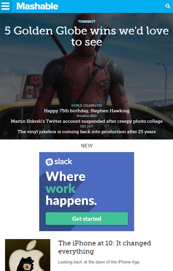
All the other columns can either drop beneath the main column, or they can be hidden from the responsive page. Each site has a different solution.
But when you’re shifting white space for mobile you always need to think vertically.
The horizontal should be controlled by one element at a time. You should instead focus on how much space you need between elements and between other sections of the page.
Font Sizes & Spacing
Some designs can get by with the same traditional font sizes. But if you have oversized headers or tiny paragraph text then you’ll need to adjust sizes at specific breakpoints.
There’s a lot you can do with responsive typography beyond the typical sizing properties. You can also adjust line height, letter spacing, color, and the margins between two blocks of text.

The Next Web’s desktop layout has a lot of white space between the header and the top navigation. But their mobile responsive layout shortens this space dramatically.
Meanwhile the header text is also reduced in size while spacing out the paragraphs a bit.
You’ll have to trust your gut when it comes to mobile typography. Try to feel out what would look best and try to achieve that.
Also consider how your site behaves on mobile screens. Agra Culture has a series of image blocks that display text on hover.
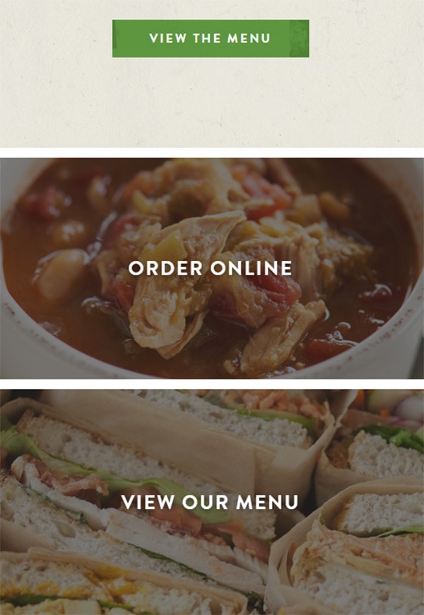
But since mobile users can’t hover the text is automatically displayed past a certain breakpoint. It seems like a small consideration but it makes a big impact in the mobile experience.
White space increases between page sections giving the illusion of crafty content areas.
This same effect can be seen on Cartoon Network’s page where they have a top navigation with icons.
Past a certain breakpoint the CN logo shrinks down along with the main links. You’ll notice links that had icons will shrink down and completely lose the icons on smaller screens.
It is true that graphics can improve navigation. But there’s only so much space on mobile and you have to be judicious.
When restyling type always consider horizontal and vertical space issues. Mobile users deserve a workable solution even if the page has to be lengthened considerably just to hold everything.
Restyling Images
One other consideration is the use of widescreen images. Since most monitors are widescreen the web has adapted to include images that are typically wider than taller.
Mobile responsive sites either have to shrink these images down or rearrange them to fit properly.

UPP Broadgate Park has an interesting solution where the top header image resizes to fit vertically. The image slideshow is built to fit the full width of the screen, but any screen smaller than 500px gets a lengthened image.
This adds a tremendous amount of vertical space into the page which can be good if you’re looking for that.
I’ll admit this is a tough strategy to pull off. You need to know your image sizes and the focal points of each image to properly resize them.
But if you’re willing to put in the effort it will ultimately lead to a greater experience.
In other scenarios you might choose to hide longer images and completely remove them from the mobile experience. The Golden Isles website uses this technique on the top header slideshow.
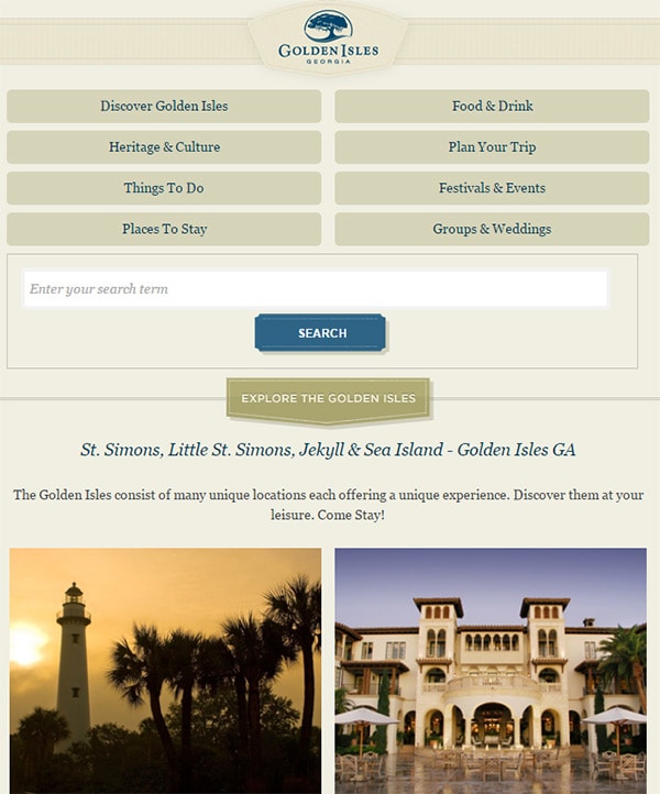
All other images on the page get rearranged into single columns with added white space. But since the carousel doesn’t add much to the user experience it can be hidden for mobile users.
Consider how you want to handle images and how much space you need between them. A thumbnail gallery might be closer together than a slideshow or a featured stock photo.
Each scenario is different so be willing to try different strategies to see what works best.
Wrapping Up
White space is a crucial aspect of web design and it plays a big role in content flow for responsive websites. Most designers can estimate white space values by eye, but it helps to understand why you’re adding whitespace into a design.
If you think of any related trends or tips for crafting responsive white space feel free to drop a comment below.