Designing a Great Photography Website
You’ve got a pile of great images. Now, what can you do with them?
Designing a website to showcase all that great photography is not as simple as just dumping all your images into a package made with CSS and HTML. It needs to be planned and designed to support those images.
Here we’ll look at 10 ways to design and make the most of a website that features a lot of photography, from portfolios to blogs and business sites. And as we all know, good images are a strong part of a good visual theme.
Use Hero Images
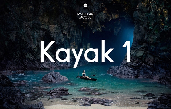
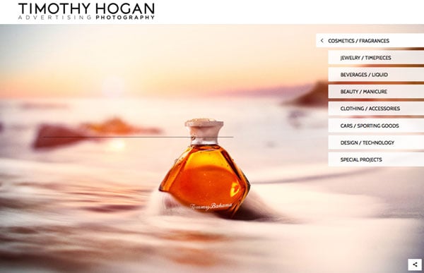
One of the most visually stunning ways to use photography is when it is large. Oversized, or hero images can have a dramatic impact and lure visitors into your website.
With Postcards Email Builder you can create and edit email templates online without any coding skills! Includes more than 100 components to help you create custom emails templates faster than ever before.
Free Email BuilderFree Email Templates(You can learn a lot more about hero headers and best practices for using them in a previous Designmodo article.)
Opt for hero images when you have one or two stunning photographs with plenty of detail and impact. Images should represent what your site or brand is all about without a lot of additional detail.
Sliders Add Interest for Multiple Photos
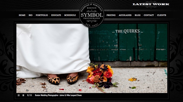
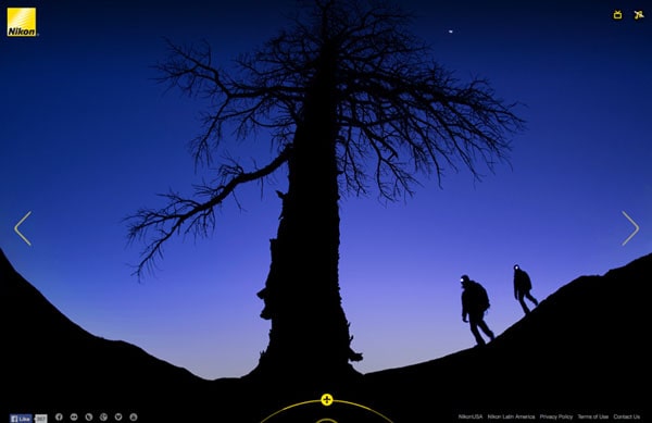
When you have more than one image to showcase, sliders can be a good option. What’s also nice about a slider is that it can often accommodate multiple sizes, so you are not locked into a full-screen image.
The key to using a slider is to not go crazy. Stick to a handful of images for the most impact. Make sure each image is relevant and does not duplicate or look like another image in the set. Another bonus to a slider is that you can change the images from time-to-time, such as replacing images with seasonal photos or adding images of new products.
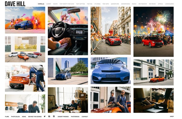
Create a Collage or Grid
With Startup App and Slides App you can build unlimited websites using the online website editor which includes ready-made designed and coded elements, templates and themes.
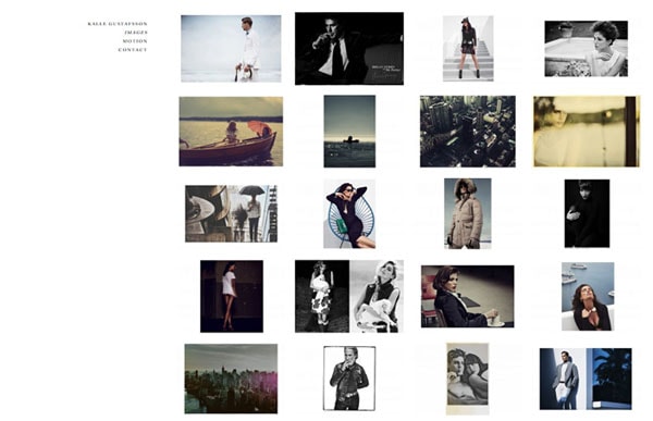
Try Startup App Try Slides AppOther ProductsA beautiful grouping of photos can add drama to your site. But you have to be careful about photo selection, cropping and grouping. Ajax scrolling features are a fun way to keep users moving through groupings of photos.
But there are a few things to keep in mind when creating a collage or grid – mainly photo size on the screen. Select images that you can see at smaller sizes. Typically this will include images with simpler framing and composition. This design technique is popular with looking at groups of tight images or faces. It does not work so well for landscapes or images with a lot of details.
Use a Minimal Aesthetic
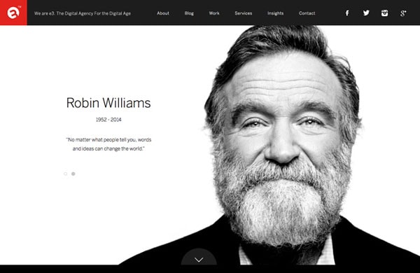
Keep the rest of the design simple when working with photography as a theme. You want to let images speak for themselves and a lot of “obvious design” can take away from the images themselves.
Simple buttons, elements and even colors will give photos more room to be enjoyed on the screen. (This is why so many portfolio sites take advantage of a minimalistic style and back and white backgrounds.)
Stay Away from Too Many Effects

At this point, most designers are already avoiding flash, but it is still important to remember. Avoid flash in your photography website designs, as enticing as it may be.
High-resolution photos need to load quickly – they are large files – and accurately on all devices. Keep this in mind when designing animations, loading presets or other effects. And if special effects or techniques impact speed or take away from actually looking at the photography, don’t apply them.
If you want to use an effect, keep it simple. Consider parallax scrolling or autoloading images.
Design a ‘Photo’ Theme
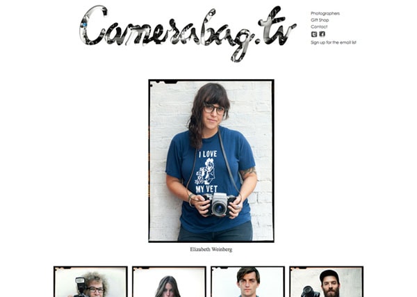
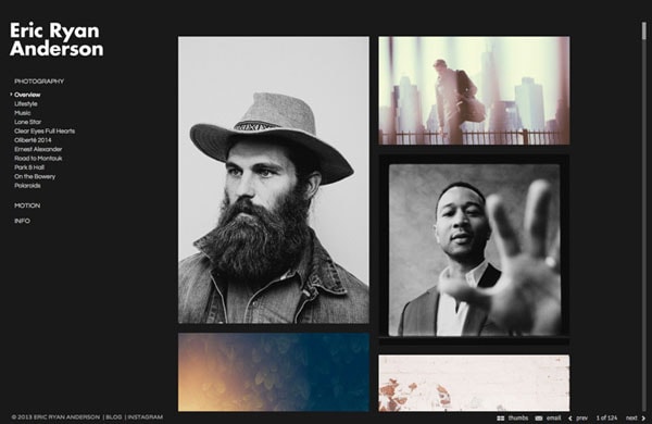
Some photography sites use fun “themes” for photos, which can be a good way to show off photography and some other design skills. Them ideas include an Instagram-style look, Pinterest design theme, black and white gallery, an effect with borders or edging or a color overlay. There are plenty of fun options that you can use to create a site with a photo-based theme.
The caution is to not take away from the message photos are supposed to have. Use a theme in a way that compliments photography and does not hide it.
Mix Up Shape and Size
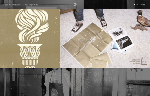
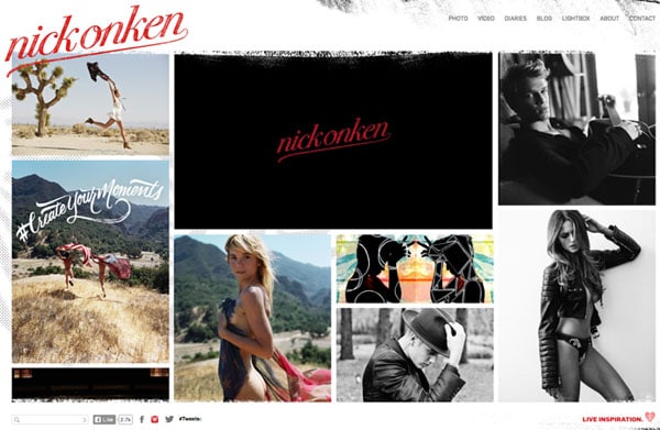
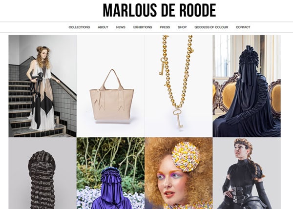
Some designers get caught up in shape and size when it comes to photography. Images can be different shapes, sizes and orientations (portrait versus landscape). Using a mix creates more visual interest.
Using that same concept, think about the framing and composition of photos as well. Some should be close, others at medium or distant ranges. Think about this variance when it comes to color and background as well. Using a large group of similar photos will bore users quickly; mix it up to keep users flipping (or clicking) through your images longer.
Place Text Strategically
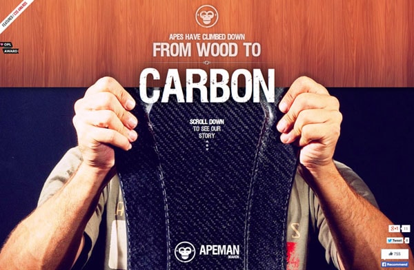
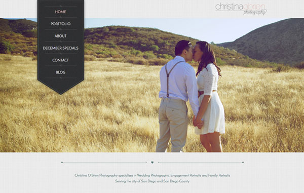
Poor text placement can ruin a website that features great photography. Ensure that text, buttons or other elements are not placed over key parts of an image.
One trend that we’ve seen a lot of recently is the use of large images and ghost buttons. This combination allows for a dominant image with a large-style button that does not overpower the photo.
(Learn more about ghost buttons and how to use them effectively in a previous Designmodo article.)
A few rules of thumb when thinking about text or element placement and photos is to avoid placing elements over faces, keep elements out of the action of images and make sure clickable tools are discernable from the image.
Create Contrast
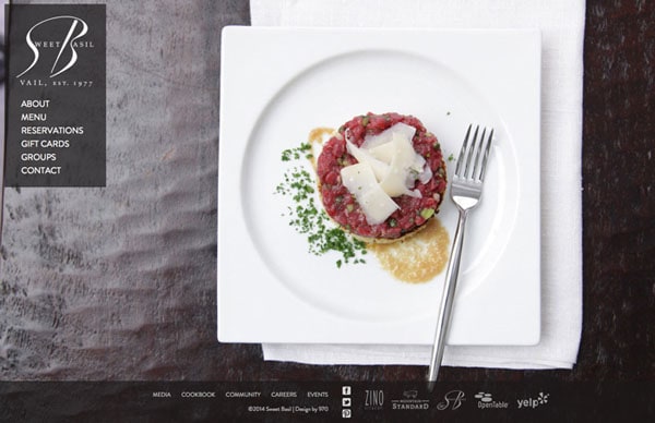
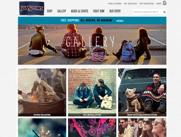
Contrast is one of the key principles of design and is incredibly important when thinking about websites design around images. Create text and backgrounds that are very different from photography.
Black, white or neutral backgrounds often work best in photography websites because they are so plain in comparison to the intrigue of images. This contrast tells users where to look on the screen.
Use plenty of white space so that photos have room. Each image should have enough context and contrast to be distinguishable from surrounding photographs.
Whatever design aesthetic you choose, make sure that images and the outline where they live are different enough so that users know the main part of the message (the photo) from background elements or navigational tools.
Design for the Images

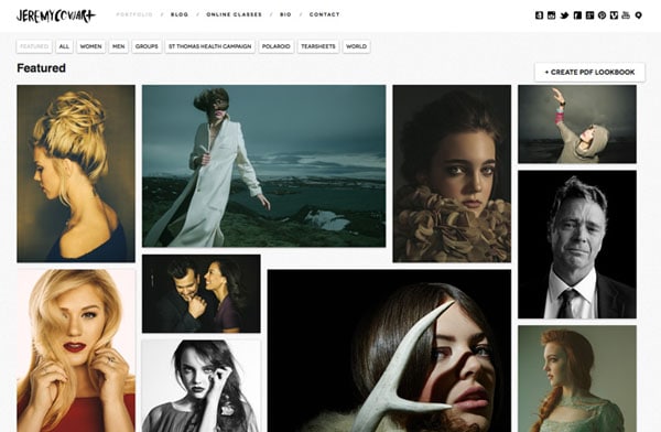
The most important thing you can do with designing a photography-based website is to design for photography. Creating a design outline and then adding photos in later will often feel awkward and clunky.
Choose your images first and design a framework to support your content. Design is nothing without content. Treat it properly and you might be surprised at how much better your overall project turns out.
Conclusion
Photography websites are among some of the best on the web. Photos engage and entice users and can be a great way to establish a solid design framework. Just make sure you have great, high-resolution images to get started.
Have you created a photography website? What other things did you consider? Join the conversation in the comments.
