Base CSS and Navigation Systems in Bootstrap
In this tutorial, we’re going to study the different base elements and navigation system.
Using the Base CSS
Styling HTML elements — which includes headings, paragraphs, forms and tables — is easy but can take some time in the process of web development. Here, we’ll walk though how to use Bootstrap Base CSS in your HTML pages and how to customize it.
Looking for a Bootstrap online builder?
- 👉 Try our Bootstrap Builder and create unlimited projects for unlimited clients.
- 👉 Start to build a website using our Bootstrap Templates.
Headings
Just like normal HTML, Bootstrap comes with headings of different default sizes. Let’s check out the sizes.
- Heading level 1 <h1> – comes with 38px font size (2.70 X the default base font size of 14 px)
- Heading level 2 <h2> – comes with 32px font size (2.25 X the default base font size of 14 px)
- Heading level 3 <h3> – comes with 24px font size (1.70 X the default base font size of 14 px)
- Heading level 4 <h4> – comes with 18px font size (1.25 X the default base font size of 14 px)
- Heading level 5 <h5> – comes with 14px font size (same as the base font size of 14px)
- Heading level 6 <h6> – comes with 12px font size (0.85 X the default base font size of 14 px)
Take a look at the code below and see how the default sizes look.
<h1>This is H1</h1>
<h2>This is H2</h2>
<h3>This is H3</h3>
<h4>This is H4</h4>
<h5>This is H5</h5>
<h6>This is H6</h6>
See the output below:
With Postcards Email Builder you can create and edit email templates online without any coding skills! Includes more than 100 components to help you create custom emails templates faster than ever before.
Free Email BuilderFree Email Templates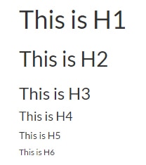
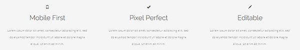
Small Element
The small element is also called “small print,” which is mostly used for legal disclaimers. Let’s see this in action.
<div class="row">
	<div class="col-lg-4 callout">
		<span class="glyphicon glyphicon-phone" aria-hidden="true"></span>
		<h2>Mobile First</h2>
		<p>
			<small>Lorem ipsum dolor sit amet, consectetur adipiscing elit, sed do eiusmod tempor incididunt ut labore et dolore magna aliqua. Ut enim ad minim. </small>
		</p>
	</div>
	<!-- col-lg-4 -->
	<div class="col-lg-4 callout">
		<span class="glyphicon glyphicon-ok" aria-hidden="true"></span>
		<h2>Pixel Perfect</h2>
		<p>
			<small>Lorem ipsum dolor sit amet, consectetur adipiscing elit, sed do eiusmod tempor incididunt ut labore et dolore magna aliqua. Ut enim ad minim. </small>
		</p>
	</div>
	<!-- col-lg-4 -->
	<div class="col-lg-4 callout">
		<span class="glyphicon glyphicon-pencil" aria-hidden="true"></span>
		<h2>Editable</h2>
		<p>
			<small>Lorem ipsum dolor sit amet, consectetur adipiscing elit, sed do eiusmod tempor incididunt ut labore et dolore magna aliqua. Ut enim ad minim. </small>
		</p>
	</div>
	<!-- col-lg-4 -->
</div>
<!-- row -->
As you can see, the small element was used inside a paragraph tag so it will inherit the size of 12px by default.
You can also use the small text inside of the headings which will have the following sizes:
- Small Text heading level 1 <h1> – comes with 24px font size
- Small Text heading level 2 <h2> – comes with 18px font size
- Small Text heading level 3 <h3> – comes with 14px font size
- Small Text heading level 4 <h4> – comes with default 14 base font size
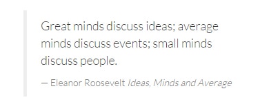
Block Quote
A block quote tag usually emphasizes quoted text from an outside source. By default bootstrap uses a 5 pixel border on the left size of the quote to specify a block quote. See the sample code below.
<blockquote>
	<p> Great minds discuss ideas; average minds discuss events; small minds discuss people. </p>
	<small>Eleanor Roosevelt
		<cite title="Source Title">Ideas, Minds and Average</cite>
	</small>
</blockquote>
Take a look on the output of the code.
With Pulsetic you’ll be instantly notified the moment your website, API, or server becomes unavailable. Monitor uptime from multiple global locations and respond to incidents before your users are affected.
Create beautiful status pages in minutes to keep customers informed during outages and build trust with transparent communication.
Start Monitoring for FreeAddresses
Addresses are represented with the HTML element address. Bootstrap comes with this type of element with just a simple design. See code and output below.
<address id="contact">
	<h3>Reach to Us</h3>
	<p>
		<span class="glyphicon glyphicon-home"></span> #123 St. Kansas City, MO
		<br/>
		<span class="glyphicon glyphicon-phone"></span> +34 1234 5678
		<br/>
		<span class="glyphicon glyphicon-folder-open"></span>
		<a href="#"> [email protected]</a>
		<br/>
	</p>
</address>
The output of the code is:

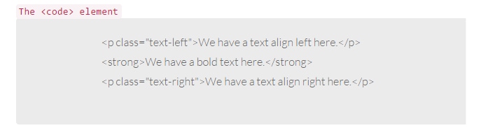
Code Element
The code element usually indicates the fragment of computer code which contains HTML or other programming languages. Usually Bootstrap wraps inline code snippets with the <code> tag along with <pre> tag. To escape coding characters you need to use < and > for the angular brackets in the <code> tag. See the example below.
<code>The <code> element</code> <pre> <p class="text-left">We have a text align left here.</p> <strong>We have a bold text here.</strong> <p class="text-right">We have a text align right here.</p> </pre>
Using the above code, you’ll get a result similar to this:
Alignment Classes
Bootstrap comes with three CSS classes that align text from left to right. The classes include:
- text-left – aligns text to the left
- text-right – aligns text to the right
- text-center – aligns text to the center
- text-justify – stretches the lines to have an equal width in the container element
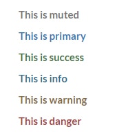
Emphasis Classes
Aside from alignment classes, bootstrap also provides emphasis classes that change the color of the text varying from the mood of the class. Check out the following classes:
- text-warning – change the color of the text orange
- text-muted – change the color of the text to light gray
- text-success – change the color of the text to green
- text-danger – change the color of the text to red
- text-info – change the color of the text to blue
- text-primary – change the color of the text to sky blue
Let’s see this in action.
 <p class="text-muted"> This is muted </p>
<p class="text-primary"> This is primary </p>
<p class="text-success"> This is success </p>
<p class="text-info"> This is info </p>
<p class="text-warning"> This is warning </p>
<p class="text-danger"> This is danger </p>
With the code above you’ll get these results:
Forms
Forms in Bootstrap have a defined style. They can be in normal, horizontal or inline style. Let’s take a look.
Default Forms
Check out the code below to see how a normal form in bootstrap works.
<form>
	<div class="form-group">
		<label for="email">Email</label>
		<input type="email" class="form-control" id="email" placeholder="Your Email..">
		</div>
		<div class="form-group">
			<label for="password">Password</label>
			<input type="password" class="form-control" id="password" placeholder="Your Password..">
			</div>
			<div class="form-group">
				<label for="file-upload">Browse File</label>
				<input type="file" id="file-upload">
				</div>
				<div class="checkbox">
					<label>
						<input type="checkbox"> This is a checkbox
						</label>
					</div>
					<button type="submit" class="btn btn-success">Log-in!</button>
				</form>
The output of the code will look like the image below.
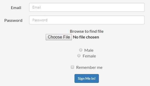
As you can see, forms in bootstrap have a generic style from the elements group within a class of form-group for proper spacing.
Inline Forms
Aside from the normal form style in bootstrap you can also use an inline which will set inputs next to each other.
To do this, you just need to add the form-inline class to the form element.
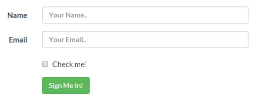
<form class="form-inline">
	<div class="form-group">
		<label for="name">Your Name</label>
		<input type="text" class="form-control" id="name" placeholder="Your Name..">
		</div>
		<div class="form-group">
			<label for="email">Your Email</label>
			<input type="email" class="form-control" id="email" placeholder="Your Email..">
			</div>
			<button type="submit" class="btn btn-primary">Submit!</button>
		</form>
The output of the code will look like the image below.

Horizontal Forms
To align form labels and fields in a horizontal manner in bootstrap, you just need to add the form-horizontal class to the form.
<form class="form-horizontal">
	<div class="form-group">
		<label for="name" class="col-sm-2 control-label">Name</label>
		<div class="col-sm-10">
			<input type="text" class="form-control" id="name" placeholder="Your Name..">
			</div>
		</div>
		<div class="form-group">
			<label for="email" class="col-sm-2 control-label">Email</label>
			<div class="col-sm-10">
				<input type="email" class="form-control" id="email" placeholder="Your Email..">
				</div>
			</div>
			<div class="form-group">
				<div class="col-sm-offset-2 col-sm-10">
					<div class="checkbox">
						<label>
							<input type="checkbox"> Check me!
							</label>
						</div>
					</div>
				</div>
				<div class="form-group">
					<div class="col-sm-offset-2 col-sm-10">
						<button type="submit" class="btn btn-success">Sign Me In!</button>
					</div>
				</div>
			</form>
The output of the code will look like the image below.
As you can see, the form has a horizontal layout. You’ll notice that I put some grid classes on the labels and doing so will make them behave like the grid system. You can also use icons by adding a span class with the glyphicon icon. Learn more about glyphicons.
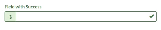
Let’s see this in action.
<div class="form-group has-success has-feedback">
	<label class="control-label" for="Success">Field with Success</label>
	<div class="input-group">
		<span class="input-group-addon">@</span>
		<input type="text" class="form-control" id="inputSuccess1" aria-describedby="inputSuccessStatus1">
		</div>
		<span class="glyphicon glyphicon-ok form-control-feedback" aria-hidden="true"></span>
		<span id="inputSuccessStatus1" class="sr-only">(success)</span>
	</div>
As you can see from the code above we set up an icon for the input field as well as added .has-feedback with right icon. We also use .sr-only and aria-describedy relating to each other to hide information for screen readers.
Tables
Bootstrap provides five layouts for tables.
- Basic comes with simple table layout with only horizontal dividers. To use, just add class table on the <table> tag.
- Striped rows comes with a zebra-stripe layout. To use, just add class table-striped on the <table> tag.
- Bordered table comes with a typical table with border on each sides. To use, just add class table-bordered on the <table> tag.
- Hover rows is like the basic style but with hover state within each row. To use, just add class table-hover on the <table> tag.
- Condensed table comes with compact cell spacing and padding. To use, just add class table-condensed on the <table> tag.
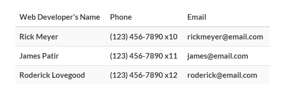
Let’s take a look at the striped rows layout.
<table class="table table-striped">
	<thead>
		<tr>
			<th>Web Developer's Name</th>
			<th>Phone</th>
			<th>Email</th>
		</tr>
	</thead>
	<tbody>
		<tr>
			<td>Rick Meyer</td>
			<td>(123) 456-7890 x10</td>
			<td>[email protected]</td>
		</tr>
		<tr>
			<td>James Patir</td>
			<td>(123) 456-7890 x11</td>
			<td>[email protected]</td>
		</tr>
		<tr>
			<td>Roderick Lovegood</td>
			<td>(123) 456-7890 x12</td>
			<td>[email protected]</td>
		</tr>
	</tbody>
</table>
As you can see the code above has ordinary table tags but using the class table-striped, we’ve styled it with zebra-stripe layout. You can set the background color of tables by changing the value of @table-bg via LESS variable and @table-bg-accent for the striped background color.
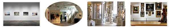
Images
For images, bootstrap uses three classes inside an <img> tag to style images. They are the following:
- img-rounded – styles the images to a rounded-radius shape corner
- img-circle – styles the images to a circle-crop shape
- img-thumbnail – styles the images in an elegant way with border and a little padding inside the image
Take note that images can be made responsive using the img-responsive class however IE 8-10, SVG images are disproportionately sized. You can fix it by adding width: 100% \9; on your image CSS.
Let’s see this in action.
<div class="container">
	<div class="col-lg-12">
		<div class="col-md-3">
			<img src="img/image1.jpg" alt="" class="img-thumbnail img-responsive">
			</div>
			<div class="col-md-3">
				<img src="img/image2.jpg" alt="" class="img-circle img-responsive">
				</div>
				<div class="col-md-3">
					<img src="img/image3.jpg" alt="" class="img-rounded img-responsive">
					</div>
					<div class="col-md-3">
						<img src="img/image4.jpg" alt="" class="img-thumbnail img-responsive">
						</div>
					</div>
				</div>
On the code above we’ve used the three classes that we can use for images. Here’s the output.
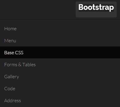
The navbar is one of the responsive components of Bootstrap that serves as the navigation header or container. It is a self-contained bar which has the ability to collapse on smaller screens.
Aside from menus, you can also add forms, search boxes and drop-down menus.
Here’s some example code.
<div id="navbar-main">
	<!-- Fixed navbar -->
	<div class="navbar navbar-inverse navbar-fixed-top">
		<div class="container">
			<div class="navbar-header">
				<button type="button" class="navbar-toggle" data-toggle="collapse" data-target=".navbar-collapse">
					<img src="img/logo.png" class="logo"/>
				</button>
				<a class="navbar-brand hidden-xs hidden-sm" href="#home">
					<img src="img/logo.png" class="logo"/>
				</a>
			</div>
			<div class="navbar-collapse collapse">
				<ul class="nav navbar-nav">
					<li>
						<a href="#home">Home</a>
					</li>
					<li>
						<a href="#home">Menu</a>
					</li>
					<li>
						<a href="#base">Base CSS</a>
					</li>
					<li>
						<a href="#forms"> Forms & Tables</a>
					</li>
					<li>
						<a href="#gallery"> Gallery</a>
					</li>
					<li>
						<a href="#code"> Code</a>
					</li>
					<li>
						<a href="#contact"> Address</a>
					</li>
				</div>
				<!--/.nav-collapse -->
				<form class="navbar-form navbar-right search" role="search">
					<div class="form-group">
						<input type="text" class="form-control" placeholder="Search">
						</div>
						<button type="submit" class="btn btn-primary">Submit</button>
					</form>
				</div>
			</div>
		</div>
In Bootstrap, you need to define the role as navigation to help with accessibility. Followed by the navbar class, notice that I used navbar-inverse and navbar-fixed-top. Adding navbar-inverse class will add a black background and a white text on the menu while, the navbar-fixed-top will make it stick and fixed to to the top and make it scroll statically with the page.
Next, we’ve added .navbar-header to the <div> element along with the class navbar-brand in an anchor tag inside it.
To make responsive navigation, we’ve also set up the classes navbar-collapse and collapse. The class .navbar-toggle will enable the two data elements: data-toggle and data-target which will define which element to toggle. For us to be able to add links, we simply put an unordered list with inside the nav and navbar-nav class.
As a final step, we’ve added a simple search bar on the right side of our navbar via navbar-form class. Check out the output image.
Conclusion
That’s a blast! In this second part of the tutorial, we’ve learned how Base CSS can be customized and used for the navigation system inside Bootstrap.
For the last part of our tutorial, we’re going to dig more into other components of Bootstrap that will surely help you on your projects. Stay tuned.