Create a Dropdown Menu with Search Bar in CSS3 and HTML
Difficulty: Intermediate
Estimated Completion Time: 45 min
In this tutorial, we will be creating a flat style navigation with a search bar and dropdown menu from the Square UI.
Slides: HTML Static Website Builder
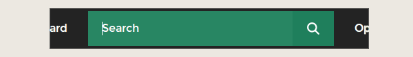
Search Bar with Dropdown
A search bar with a dropdown is a user interface (UI) element that combines a text input field with a dropdown menu. This combination allows users to type in search queries and select from a list of suggested options simultaneously. The dropdown typically displays a dynamic list of suggestions or popular search terms based on the user’s input. This functionality can improve the overall user experience by streamlining the search process and reducing the effort required to find the desired information.
UX recommendations for designing a better search bar with a dropdown:
- Position and prominence: Place the search bar in a prominent and easily accessible location on the page, usually in the header or at the top of the main content area. This will ensure users can quickly find and use the search functionality.
- Clear labeling and placeholder text: Clearly label the search bar and use placeholder text to guide users on the expected input. This helps users understand the purpose of the search bar and the type of information they can search for.
- Autocomplete and predictive suggestions: Implement autocomplete and predictive suggestions based on user input. This helps users find the information they’re looking for more quickly, reducing the need for multiple searches and refining search queries.
- Categorization of suggestions: Organize suggestions in the dropdown into categories, if applicable, to help users quickly identify the most relevant search results. This is particularly useful for websites with a vast amount of content or complex navigation structures.
- Responsive design: Ensure the search bar with a dropdown is responsive and adapts well to different screen sizes and devices. This will guarantee a consistent user experience across various platforms.
- Keyboard navigation: Enable keyboard navigation (e.g., arrow keys, Enter key) for the dropdown menu to improve accessibility and make it easier for users to interact with the search bar.
- Quick loading: Optimize the search bar with a dropdown to load suggestions quickly and efficiently. Slow-loading suggestions can lead to user frustration and a negative user experience.
A search bar with a dropdown solves several problems:
With Postcards Email Builder you can create and edit email templates online without any coding skills! Includes more than 100 components to help you create custom emails templates faster than ever before.
Free Email BuilderFree Email Templates- Reduces user effort: By providing relevant suggestions based on user input, users can find the desired information more easily, minimizing the need for multiple searches.
- Enhances discoverability: Users may discover new content or features they were not aware of, based on the suggestions provided in the dropdown.
- Improves accessibility: By allowing keyboard navigation, a search bar with a dropdown accommodates users with various accessibility needs, ensuring a more inclusive user experience.
- Streamlines navigation: For websites with complex navigation structures or a large amount of content, a search bar with a dropdown helps users quickly locate the information they need, rather than navigating through multiple pages or menus.
The navigation is made up of an unordered list (.nav) containing various types of elements inside them:
- List items(LIs) which contain normal links do not have any id/class.
- #settings contains an image based link.
- #search contains the search field along with a submit button.
- #options contains a link as well as an unordered list (.subnav) which acts as a dropdown.
At the end we include prefixfree which lets us use only unprefixed CSS properties everywhere.
<ul class="nav">
    <li id="settings">
        <a href="#"><img src="settings.png" /></a>
    </li>
    <li>
        <a href="#">Application</a>
    </li>
    <li>
        <a href="#">Board</a>
    </li>
    <li id="search">
        <form action="" method="get">
            <input type="text" name="search_text" id="search_text" placeholder="Search"/>
            <input type="button" name="search_button" id="search_button"/>
        </form>
    </li>
    <li id="options">
        <a href="#">Options</a>
        <ul class="subnav">
            <li><a href="#">Settings</a></li>
            <li><a href="#">Application</a></li>
            <li><a href="#">Board</a></li>
            <li><a href="#">Options</a></li>
        </ul>
    </li>
</ul>

<script src="prefixfree-1.0.7.js" type="text/javascript"></script>
CSS
1. Basic Styles
@import url(https://fonts.googleapis.com/css?family=Montserrat);

* {
	margin: 0;
	padding: 0;
}
We start with a basic CSS reset and import a custom font ‘Montserrat’ from Google Fonts.
.nav {
	background: #232323;
	height: 60px;
	display: inline-block;
}

.nav li {
	float: left;
	list-style-type: none;
	position: relative;
}
The main navigation element has a dark grey background and a fixed height. The list items are floated left and are positioned relatively so that they can contain the dropdown menu which is absolutely positioned later on.
3. Links
.nav li a {
	font-size: 16px;
	color: white;
	display: block;
	line-height: 60px;
	padding: 0 26px;
	text-decoration: none;
	border-left: 1px solid #2e2e2e;
	font-family: Montserrat, sans-serif;
	text-shadow: 0 0 1px rgba(255, 255, 255, 0.5);
}
.nav li a:hover {
	background-color: #2e2e2e;
}

#settings a {
	padding: 18px;
	height: 24px;
	font-size: 10px;
	line-height: 24px;
}
The links have basic styling. They use the Montserrat font we imported earlier from Google Fonts. A subtle white glow is added to make the text smooth and bold. The links have a 60px line height which is same as that of .nav.
The links also have a hover effect where the background is changed to a lighter version of the grey background.
#settings contains an image link hence its layout is adjusted to make the settings icon appear in the center.
4. Search Bar
With Pulsetic you’ll be instantly notified the moment your website, API, or server becomes unavailable. Monitor uptime from multiple global locations and respond to incidents before your users are affected.
Create beautiful status pages in minutes to keep customers informed during outages and build trust with transparent communication.
Start Monitoring for Free
#search {
	width: 357px;
	margin: 4px;
}
#search_text{
	width: 297px;
	padding: 15px 0 15px 20px;
	font-size: 16px;
	font-family: Montserrat, sans-serif;
	border: 0 none;
	height: 52px;
	margin-right: 0;
	color: white;
	outline: none;
	background: #1f7f5c;
	float: left;
	box-sizing: border-box;
	transition: all 0.15s;
}
::-webkit-input-placeholder { /* WebKit browsers */
    color: white;
}
:-moz-placeholder { /* Mozilla Firefox 4 to 18 */
    color: white;
}
::-moz-placeholder { /* Mozilla Firefox 19+ */
    color: white;
}
:-ms-input-placeholder { /* Internet Explorer 10+ */
    color: white;
}
#search_text:focus {
    background: rgb(64, 151, 119);
}
#search_button {
	border: 0 none;
	background: #1f7f5c url(search.png) center no-repeat;
	width: 60px;
	float: left;
	padding: 0;
	text-align: center;
	height: 52px;
	cursor: pointer;
}
#search is provided with a fixed width and a small margin or 4px around it.
#search_text is floated to the left and is provided with a green background which animates to a lighter shade on hover.
#search_button is also floated to the left to make it align with #search_text horizontally. It uses a search icon as its background which is positioned at its center.
Styling the placeholder is a tricky one. It appears grey on some browsers. This answer on Stackoverflow gives a complete overview on how to do it.
5. Dropdown
#options a{
border-left: 0 none;
}
#options&amp;gt;a {
background-image: url(triangle.png);
background-position: 85% center;
background-repeat: no-repeat;
padding-right: 42px;
}
.subnav {
visibility: hidden;
position: absolute;
top: 110%;
right: 0;
width: 200px;
height: auto;
opacity: 0;
transition: all 0.1s;
background: #232323;
}
.subnav li {
float: none;
}
.subnav li a {
border-bottom: 1px solid #2e2e2e;
}
#options:hover .subnav {
visibility: visible;
top: 100%;
opacity: 1;
}
#options which contains a dropdown is given a triangle icon as a background on the right to make it more intuitive.
.subnav is hidden by default using a combination of CSS visibility and opacity properties. Its positioned at 110% from the top. On hover the top changes to 100% along with the opacity and visibility properties giving a cool hover effect to the dropdown menu.

Download Source Files
