Using Bootstrap 4 Flexbox
The CSS3 Flexible Box, or Flexbox, is a new layout mode to improve arrangement of items on a page that can also manage directions and order within a container to accommodate different screen sizes and different display devices. It works like a box model which modifies the width or the height of its child items filling up the space available without the use of floats.
Looking for a Bootstrap online builder?
- 👉 Try our Bootstrap Builder and create unlimited projects for unlimited clients.
- 👉 Start to build a website using our Bootstrap Templates.
A lot of designers and developers use a Flexbox layout to easily position elements on different screen sizes by just using a small bit of code. This saves a lot of time in the development process.

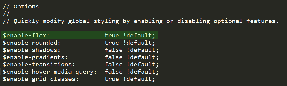
Fortunately, Bootstrap 4 added Flexbox support. In today’s tutorial, we’re going to work with Bootstrap 4 Flexbox and how to activate it within your Bootstrap grid components. Internet Explorer 9 doesn’t support Flexbox, but it was optionally added in Bootstrap 4. You can install this by navigating the _variable.scss file on the scss folder.
Enabling Flexbox via _variables.scss
Using the core Sass files inside the Bootstrap 4 package, navigate to the $enable-flex variable in the _variables.scss file. By default, this was set into false, if you set this to true and recompile, all grid components immediately switch to Flexbox and you don’t need to adjust the HTML syntax.
With Postcards Email Builder you can create and edit email templates online without any coding skills! Includes more than 100 components to help you create custom emails templates faster than ever before.
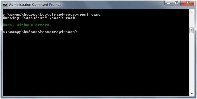
Free Email BuilderFree Email TemplatesLet’s try that now. I am using npm and Grunt.js to recompile the bootstrap.min.css but feel free to use other Sass compiler tools. Set up the $enabled-flex variable into true by using the grunt sass (grunt-contrib-sass plugin) command in the terminal or command prompt.
<div class="container">
    <div class="row">

        <div class="col-lg-3">
            <h3>Item 1</h3>
            <p>Lorem ipsum dolor sit amet, consectetur adipisicing elit.</p>
        </div>

        <div class="col-lg-3">
            <h3>Item 2</h3>
            <p>Lorem ipsum dolor sit amet, consectetur adipisicing elit.</p>
        </div>

        <div class="col-lg-3">
            <h3>Item 3</h3>
            <p>Lorem ipsum dolor sit amet, consectetur adipiscing elit, sed do eiusmod tempor incididunt ut labore et dolore magna aliqua. Ut enim ad minim veniam, quis nostrud exercitation ullamco laboris nisi ut aliquip ex ea commodo consequat. </p>
        </div>

        <div class="col-lg-3">
           	<h3>Item 4</h3>
            <p>Lorem ipsum dolor sit amet, consectetur adipisicing elit.</p>
        </div>

                <div class="col-lg-3">
            <h3>Item 5</h3>
            <p>Lorem ipsum dolor sit amet, consectetur adipiscing elit, sed do eiusmod tempor incididunt ut labore et dolore magna aliqua. Ut enim ad minim veniam, quis nostrud exercitation ullamco laboris nisi ut aliquip ex ea commodo consequat. </p>
        </div>

        <div class="col-lg-3">
            <h3>Item 6</h3>
            <p>Lorem ipsum dolor sit amet, consectetur adipisicing elit.</p>
        </div>

        <div class="col-lg-3">
            <h3>Item 7</h3>
            <p>Lorem ipsum dolor sit amet, consectetur adipiscing elit, sed do eiusmod tempor incididunt ut labore et dolore magna aliqua. Ut enim ad minim veniam, quis nostrud exercitation ullamco laboris nisi ut aliquip ex ea commodo consequat. </p>
        </div>

        <div class="col-lg-3">
           	<h3>Item 8</h3>
            <p>Lorem ipsum dolor sit amet, consectetur adipisicing elit.</p>
        </div>

    </div>
</div>
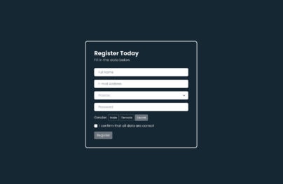
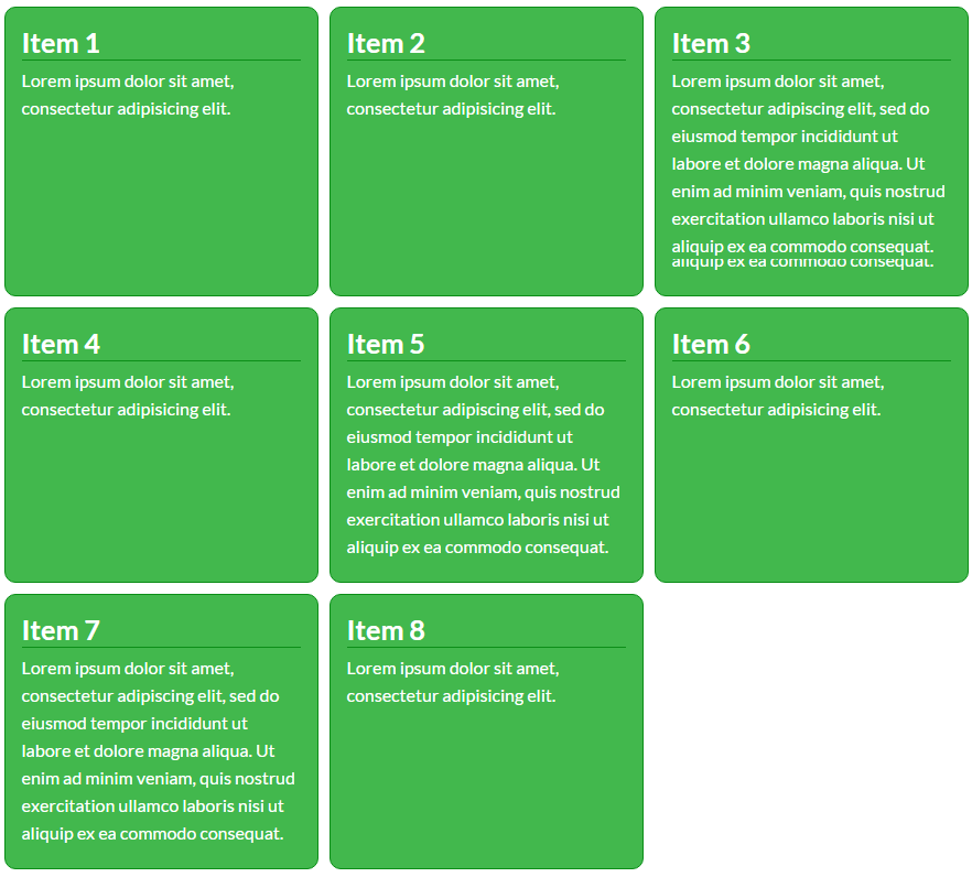
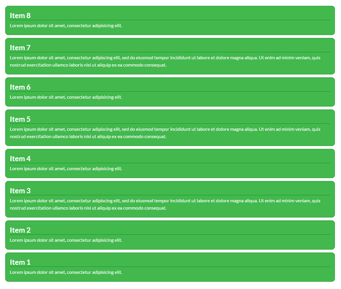
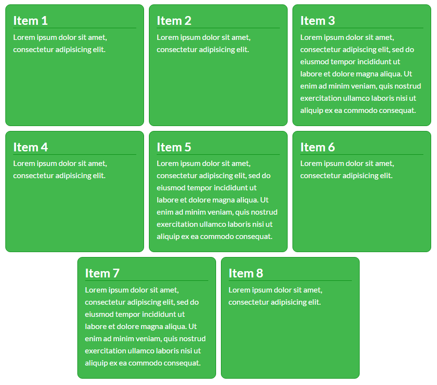
By default, you will have the output like the image below.
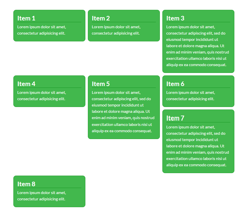
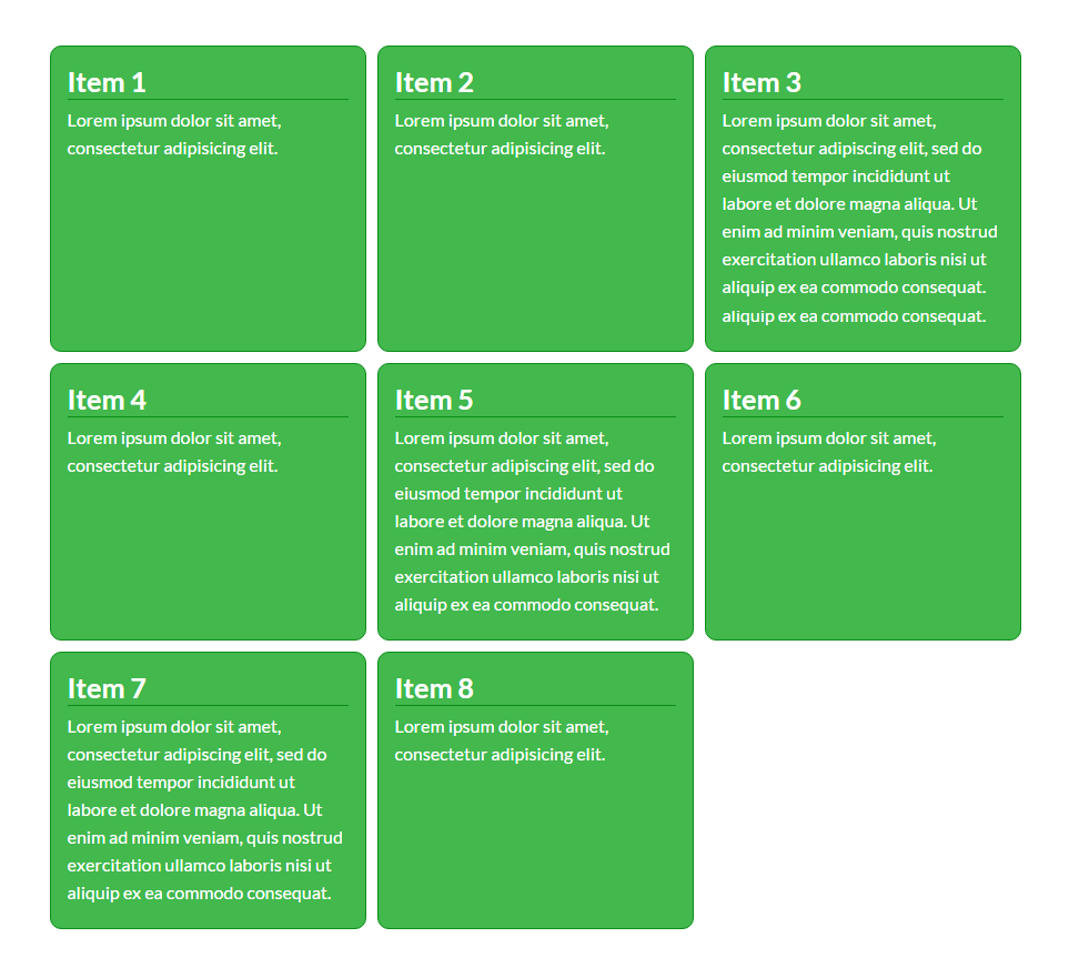
When we activate Flexbox it will automatically convert each of the columns into flex items matching the heights of columns. The entire grid system (mixins and predefined classes), switch from floats to display: flex;.
See image below.
Adjusting Flexbox Layout
Using the flex-direction property, we can specify how flex items will be displayed in the flex container by setting the direction of the flex container’s main axis. There are two main directions we can use:
With Pulsetic you’ll be instantly notified the moment your website, API, or server becomes unavailable. Monitor uptime from multiple global locations and respond to incidents before your users are affected.
Create beautiful status pages in minutes to keep customers informed during outages and build trust with transparent communication.
Start Monitoring for Free- Row – display flex items horizontally
- Column – display flex items vertically
Given the CSS below we can display each flex items from left to right stacked next to each other.
.row {
  -webkit-flex-direction: row;  /* Safari */
  flex-direction:  row;
}
We can also display each item from right to left, stacked next to each other by using the row-reverse direction. Check out the example below.
.row {
  -webkit-flex-direction: row;  /* Safari */
  flex-direction:  row-reverse;
}
Using the column value we can set the direction the flex items stacked in a column from top to bottom manner.
.row {
  -webkit-flex-direction: row;  /* Safari */
  flex-direction:  column;
}
In addition you can also set the direction the flex items in from bottom to top manner by using the column-reverse value.
.row {
  -webkit-flex-direction: row;  /* Safari */
  flex-direction:  column-reverse;
}
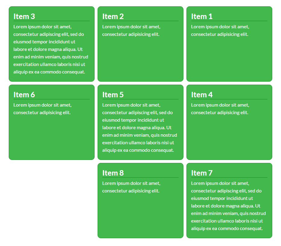
Adjust Flexbox Item Order
You can also control how each Flexbox item appears inside the container by using the order property using integer values.
Negative integer value will place the item on the left corner of the container while giving positive integer value will place the item to the right corner. The default value is 0.
Let’s try that. Using the same HTML we have above, let’s add an additional progressive item-* class along with the class col-lg-* for each column.
<div class="container">
    <div class="row">

        <div class="col-lg-3 item-1">
            <h3>Item 1</h3>
            <p>Lorem ipsum dolor sit amet, consectetur adipisicing elit.</p>
        </div>

        <div class="col-lg-3 item-2">
            <h3>Item 2</h3>
            <p>Lorem ipsum dolor sit amet, consectetur adipisicing elit.</p>
        </div>

        <div class="col-lg-3 item-3">
            <h3>Item 3</h3>
            <p>Lorem ipsum dolor sit amet, consectetur adipiscing elit, sed do eiusmod tempor incididunt ut labore et dolore magna aliqua. Ut enim ad minim veniam, quis nostrud exercitation ullamco laboris nisi ut aliquip ex ea commodo consequat. </p>
        </div>

        <div class="col-lg-3 item-4">
           	<h3>Item 4</h3>
            <p>Lorem ipsum dolor sit amet, consectetur adipisicing elit.</p>
        </div>

                <div class="col-lg-3 item-5">
            <h3>Item 5</h3>
            <p>Lorem ipsum dolor sit amet, consectetur adipiscing elit, sed do eiusmod tempor incididunt ut labore et dolore magna aliqua. Ut enim ad minim veniam, quis nostrud exercitation ullamco laboris nisi ut aliquip ex ea commodo consequat. </p>
        </div>

        <div class="col-lg-3 item-6">
            <h3>Item 6</h3>
            <p>Lorem ipsum dolor sit amet, consectetur adipisicing elit.</p>
        </div>

        <div class="col-lg-3 item-7">
            <h3>Item 7</h3>
            <p>Lorem ipsum dolor sit amet, consectetur adipiscing elit, sed do eiusmod tempor incididunt ut labore et dolore magna aliqua. Ut enim ad minim veniam, quis nostrud exercitation ullamco laboris nisi ut aliquip ex ea commodo consequat. </p>
        </div>

        <div class="col-lg-3 item-8">
           	<h3>Item 8</h3>
            <p>Lorem ipsum dolor sit amet, consectetur adipisicing elit.</p>
        </div>

    </div>
</div>
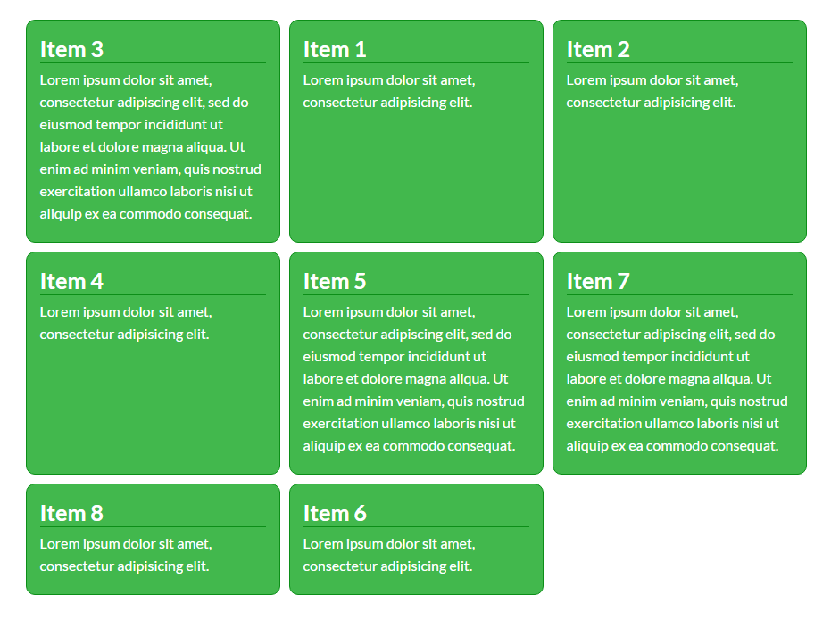
Now let’s try to make the items 1, 2, 3 appears in the order 3, 1, 2 and the items 6, 7, 8 appears in the order 7, 8, 6 using the order property.
.item-1{
	order: -1;
}
.item-2{
	order: 0;
}
.item-3{
	order: -2;
}
.item-6{
	order: 2;
}
.item-7{
	order: 0;
}

.item-8{
	order: 1;
}
Adjust Flex Item Alignment
We can also align flex items along the main axis of the flex container by using the justify-content property.
There are three values we can use:
- flex-start – align flex items to the left side of the flex container
- flex-end – align flex items to the right side of the flex container
- center – align flex items to the center of the flex container
.row {
  -webkit-justify-content: flex-start; /* Safari */
  justify-content:   flex-start;
}

.row {
  -webkit-justify-content: flex-end; /* Safari */
  justify-content:   flex-end;
}
.row {
  -webkit-justify-content: center; /* Safari */
  justify-content:   center;
}
Note that Internet Explorer 10 has a few known issues, which requires using a prefix, and only supports the syntax from the old 2012 version of the spec.
- Chrome 29+
- Firefox 28+
- Internet Explorer 11+
- Opera 17+
- Safari 6.1+ (prefixed with -webkit-)
- Android 4.4+
- iOS 7.1+ (prefixed with -webkit-)
You can check this site for compatibility.
Wrapping Up
Most of the grid systems use one of two layout methods: float or inline-block. But neither of these methods were really intended to be used for layout. Thanks to Flexbox it address the problem of white-space between inline-block item and some more issues related to this.
Flexbox support has finally come to Bootstrap 4. Though opt-in to the new CSS layout styles with a switch of a variable is easy, but please be extra conscious of your user base when enabling Flexbox for projects.