Understanding the Bootstrap 4 Grid System
Grid systems enable us to properly organize website content. Dividing the screen into multiple rows and columns is the best way to create a variety of layouts for any kind of website.
Looking for a Bootstrap online builder?
- 👉 Try our Bootstrap Builder and create unlimited projects for unlimited clients.
- 👉 Start to build a website using our Bootstrap Templates.
Bootstrap’s grid system has a division of columns ― up to 12 in each row. Each column width varies according to the size of screen they’re displayed in. Bootstrap’s grids are responsive and each rows may collapse at a certain breakpoints or can displayed fluidly across different viewports.
Bootstrap allows users to create a vast number of rows depending on the design of the website. In Bootstrap 4, we are working in terms of rem and em units instead of pixels. Though some of the classes name remains, there is a new tier -sm added to better target mobile devices.
In this article, we will dive in to the grid system of Bootstrap 4. You will learn how the grid system works and how you can use it in your website or project. At the end of this article, we will create some sample website layouts in order to understand it better.
Video Tutorial
With Postcards Email Builder you can create and edit email templates online without any coding skills! Includes more than 100 components to help you create custom emails templates faster than ever before.
Free Email BuilderFree Email TemplatesResources You Need:
- min.css (we’ll use CDN link)
- Basic knowledge of HTML and CSS
- Time and patience
Creating a Basic Grid
We’re going to create a basic grid layout using Bootstrap’s grid system. First, you need to create an index.html file and copy and paste the basic markup below.
<!DOCTYPE html>
<html lang="en">
 <head>
 <meta charset="utf-8">
 <meta http-equiv="X-UA-Compatible" content="IE=edge">
 <meta name="viewport" content="width=device-width,initial-scale=1">
 <title>Basic Grid System</title>
 <link rel="stylesheet" href="https://cdn.rawgit.com/twbs/bootstrap/v4-dev/dist/css/bootstrap.css">
  <!--[if lt IE 9]>
 <script src="https://cdnjs.cloudflare.com/ajax/libs/html5shiv/3.7.3/html5shiv.min.js"></script>
 <script src="https://cdnjs.cloudflare.com/ajax/libs/respond.js/1.4.2/respond.min.js"></script>
 <![endif]-->
 </head>
 <body>
 <!-- Content goes here -->
 </body>
</html>
To create a simple layout, create a div with a container class. Place all the rows and columns inside this container in order for them to have proper placement on the screen. There are two types of container:
- container – for fixed width (no extra space for both sides)
- container-fluid – for full-width fluid (liquid-like grids)
We will use the fixed-width container in our demo. Let’s go ahead and create a container in our HTML page:
<div class="container">
</div>
Next, we’ll create a row class inside a container. Once the row is defined, we can start creating the columns. You can place a series of rows inside a container.
Tip: For enhanced results, it is recommended to have a single container with all of the rows inside to wrap everything and center elements on the screen.
<div class="container">
<div class="row">
	 </div>
</div>
Next, let’s talk about columns. Bootstrap columns can be created by specifying the col class and its prefix sizes adding up the scales of 12.
Bootstrap 4 has five types of class prefixes for creating columns for different size displays:
With Startup App and Slides App you can build unlimited websites using the online website editor which includes ready-made designed and coded elements, templates and themes.
Try Startup App Try Slides AppOther Products- col-xs for extra small display (screen width less than 34em)
- col-sm for smaller display (screen width 34em and up)
- col-md for medium display (screen width 48em and up)
- col-lg for larger display (screen width 62em and up)
- col-xl for extra large display (screen width 75em and up)
Let’s say we want to have only a single column. It should span across all twelve available Bootstrap columns. So we can use class col-xs-12, with the number 12 specifying the amount of columns to span.
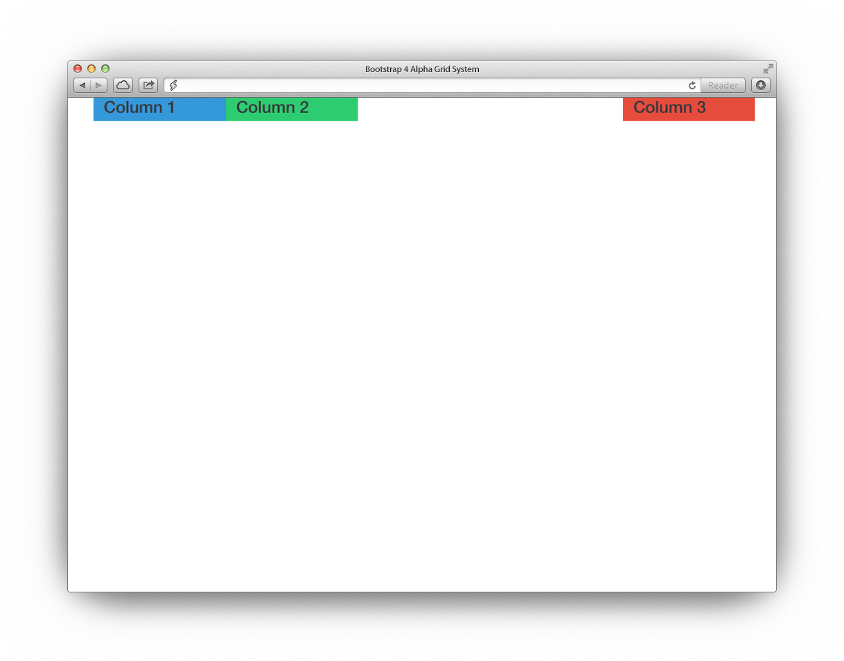
As an example, let’s create three equal-width columns in a row, we’d use the class col-xs-4 for each one. This tells Bootstrap that we want three columns that span across six of Bootstrap’s columns. Check out the code below.
Note: I added the custom class col-1, col-2, col-3, to our markup so that the columns pick their respective CSS styling.
<div class="container">
<div class="row">
<div class="col-sm-4 col-1">
<h4>Column 1</h4>
	 </div>
<div class="col-sm-4 col-2">
<h4>Column 2</h4>
 	</div>
<div class="col-sm-4 col-3">
<h4>Column 3</h4>
 	</div>
 </div>
</div>
To make it obvious how these columns works, let’s give each custom class a background color. Let’s add some internal styles on our head section. Add the following styles just before the closing </head> tag.
<style>
.col-1{
 background: #3498db;
}

.col-2{
 background: #2ecc71;
}

.col-3{
 background: #e74c3c;
}
</style>
With the code above you’ll see exactly the same output below.
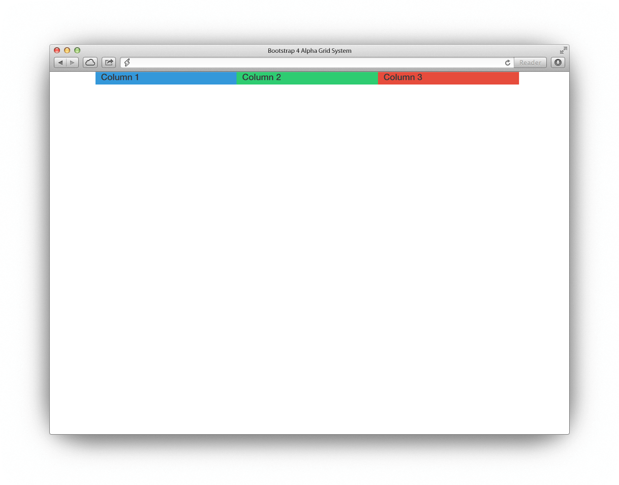
On our code above, we specify the class col-sm-4, it means the element should span all three grids (adding up to 12 columns) for each of the available Bootstrap columns on small screens.
So that is easy, but what if we want this to behave differently on large screens?
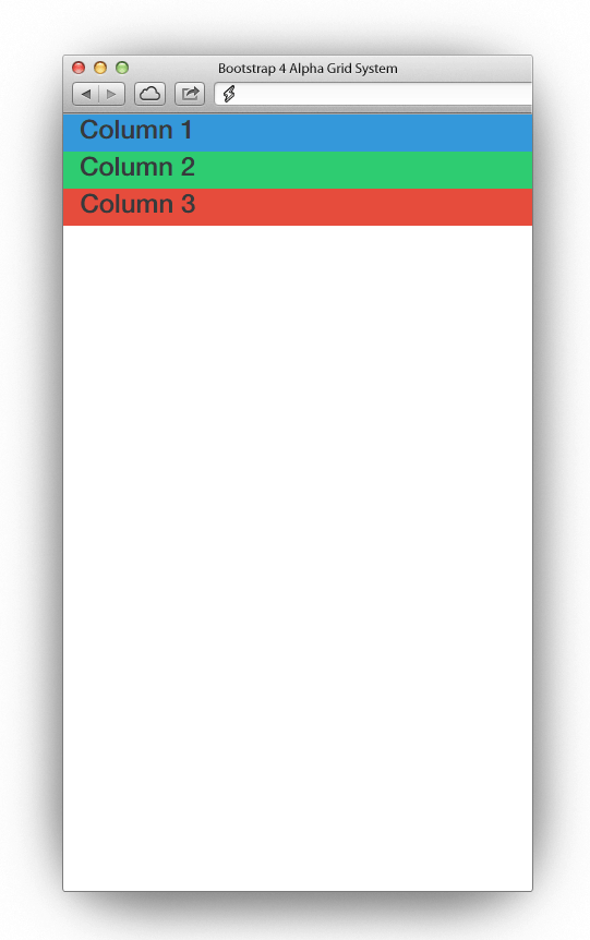
In the above code, we haven’t specified how the div should span on larger screen types. By default Bootstrap will automatically setup the layout for the larger screen size. Let’s check out the code below.
<div class="container">
<div class="row">
<div class="col-sm-4 col-lg-12 col-1">
<h4>Column 1</h4>
	 </div>
<div class="col-sm-4 col-lg-12 col-2">
<h4>Column 2</h4>
 	</div>
<div class="col-sm-4 col-lg-12 col-3">
<h4>Column 3</h4>
 	</div>
 </div>
</div>
In the code above we set up the class col-lg-12 for larger display (screen width 62em and up) and class col-sm-4 for a smaller screens (screen width 34em and up).
That means on smaller screens each column will have three Bootstrap columns, while on larger screens they will occupy the 12-column layout. See the result below.
Setting Up Grids for Different Screens
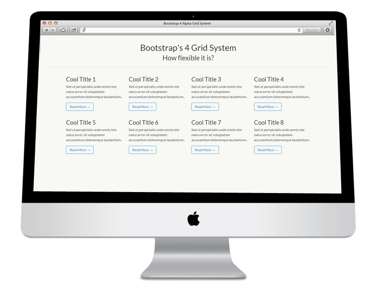
In this section, let’s see how we can create a flexible layout for desktop, tablet and mobile devices. Our final output will be like this image.
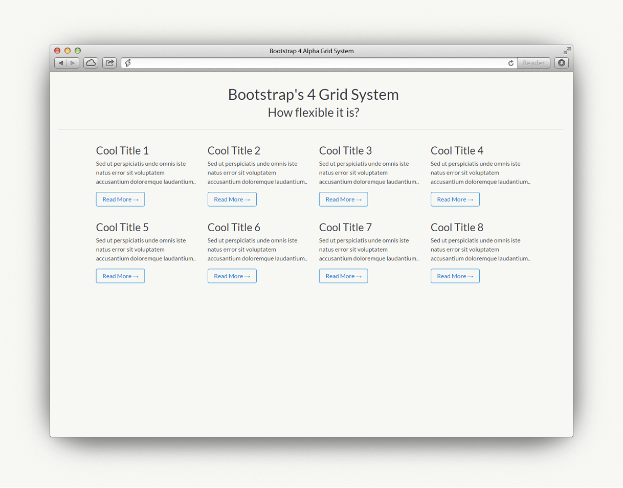
In our output image, we place a header on the center of the screen and then set up a four-column layout containing dummy text. Let’s see how it will look like on different screen sizes.
Desktop
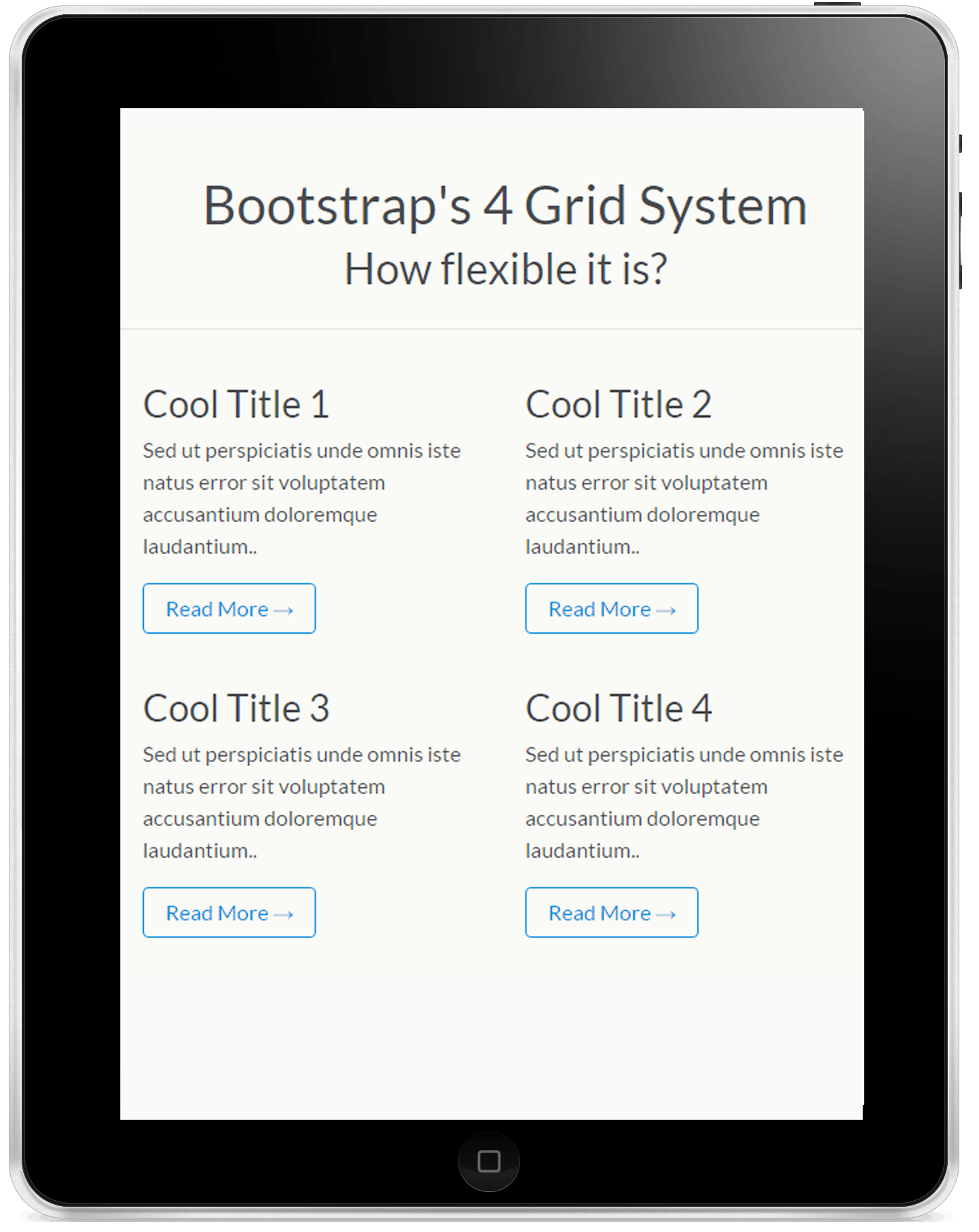
Tablet
Smartphone
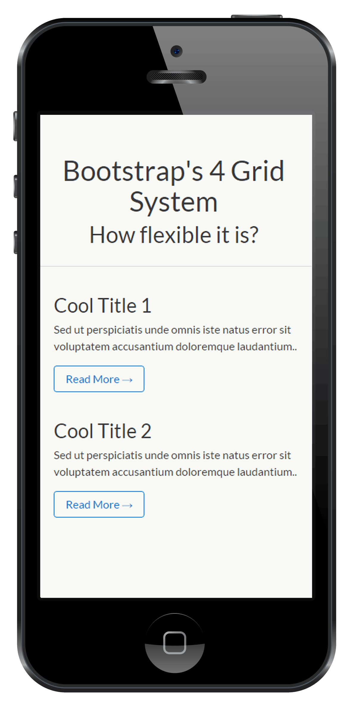
As you can see on our desktop view we have four columns, while there are two columns on tablet view and one column for mobile view.
Getting Started
First, let’s create a new HTML file named grids_view.html. We will then place our basic markup below. Don’t worry it’s actually almost the same markup we set up on our first example. Nothing special here.
<!DOCTYPE html>
<html lang="en">
 <head>
 <meta charset="utf-8">
 <meta http-equiv="X-UA-Compatible" content="IE=edge">
 <meta name="viewport" content="width=device-width,initial-scale=1">
 <title>Setting up grids for different screens</title>
 <link rel="stylesheet" href="https://cdn.rawgit.com/twbs/bootstrap/v4-dev/dist/css/bootstrap.css">
 <link href='https://fonts.googleapis.com/css?family=Lato:400,300,700,700italic,900,900italic' rel='stylesheet' type='text/css'>
  <!--[if lt IE 9]>
 <script src="https://cdnjs.cloudflare.com/ajax/libs/html5shiv/3.7.3/html5shiv.min.js"></script>
 <script src="https://cdnjs.cloudflare.com/ajax/libs/respond.js/1.4.2/respond.min.js"></script>
 <![endif]-->

<style>
/*Your styles goes here*/
</style>

 </head>
 <body>
 <!-- Content goes here -->
 </body>
</html>
Desktop View
Desktop displays are mostly larger than 1080px. For this part, we will be using the class with prefix col-md-* to for our columns in desktop screens.
You may also use the col-lg-* and col-xl-* prefix. After all it have no additional effect on the layout for larger displays that are larger than 1200px.
Let’s create a div container and a row class first. Then inside it we will create eight columns with col-md-3 class. Inside each columns we’ll just set up an h3 tag, a text and a link. Let us not forget to add a header section for our and then place col-md-12 class to expand it all over the screen.
Check out the code below.
<div class="container"> <div class="row"> <header class="col-md-12 text-center"> <h1>Bootstrap's 4 Grid System</h1> <h2>How flexible it is?</h2> </header> <div class="col-md-3"> <h3>Cool Title 1</h3> Sed ut perspiciatis unde omnis iste natus error sit voluptatem accusantium doloremque laudantium.. <a class="btn btn-primary-outline" href="#" role="button">Read More →</a> </div> <div class="col-md-3"> <h3>Cool Title 2</h3> Sed ut perspiciatis unde omnis iste natus error sit voluptatem accusantium doloremque laudantium.. <a class="btn btn-primary-outline" href="#" role="button">Read More →</a> </div> <div class="col-md-3"> <h3>Cool Title 3</h3> Sed ut perspiciatis unde omnis iste natus error sit voluptatem accusantium doloremque laudantium.. <a class="btn btn-primary-outline" href="#" role="button">Read More →</a> </div> <div class="col-md-3"> <h3>Cool Title 4</h3> Sed ut perspiciatis unde omnis iste natus error sit voluptatem accusantium doloremque laudantium.. <a class="btn btn-primary-outline" href="#" role="button">Read More →</a> </div> <div class="col-md-3"> <h3>Cool Title 5</h3> Sed ut perspiciatis unde omnis iste natus error sit voluptatem accusantium doloremque laudantium.. <a class="btn btn-primary-outline" href="#" role="button">Read More →</a> </div> <div class="col-md-3"> <h3>Cool Title 6</h3> Sed ut perspiciatis unde omnis iste natus error sit voluptatem accusantium doloremque laudantium.. <a class="btn btn-primary-outline" href="#" role="button">Read More →</a> </div> <div class="col-md-3"> <h3>Cool Title 7</h3> Sed ut perspiciatis unde omnis iste natus error sit voluptatem accusantium doloremque laudantium.. <a class="btn btn-primary-outline" href="#" role="button">Read More →</a> </div> <div class="col-md-3"> <h3>Cool Title 8</h3> Sed ut perspiciatis unde omnis iste natus error sit voluptatem accusantium doloremque laudantium.. <a class="btn btn-primary-outline" href="#" role="button">Read More →</a> </div> </div> </div>
Add custom styles to make our grids a bit presentable. These are just basic fixed.
body{
	font-family: 'Lato', sans-serif;
	background: #f7f7f4;
}

.text-center{
	text-align: center;
	margin: 1.25rem 0;
	border-bottom: 1px solid #dadada;
	padding: 1.25rem 0;
}

.col-md-3{
	margin: 1.25rem 0;
}

@media screen and (max-width: 34em) {
  .col-sm-6{
	margin-left: 1.25rem;
}

}
The output will look exactly the image you see on the desktop view. Next, let’s work on the tablet view.
Tablet View
Add extra code to the code above to achieve our layout for tablets. Unlike desktops, tablets can display the columns in either portrait or landscape view. The landscape view can be achieve with a col-md-* classes but for a portrait we can use col-sm-* classes.
For this part, we’re going to achieve two column layout in smaller displays using col-sm-6 classes. We need to display column to span across Bootstrap columns so that the remaining columns will just be displayed on the next rows. Copy and paste the code below.
Note: The result of the code below will look exactly the image of a tablet image above.
<div class="container"> <div class="row"> <div class="row"> <header class="col-md-12 text-center"> <h1>Bootstrap's 4 Grid System</h1> <h2>How flexible it is?</h2> </header> <div class="col-md-3 col-sm-6"> <h3>Cool Title 1</h3> Sed ut perspiciatis unde omnis iste natus error sit voluptatem accusantium doloremque laudantium.. <a class="btn btn-primary-outline" href="#" role="button">Read More →</a> </div> <div class="col-md-3 col-sm-6"> <h3>Cool Title 2</h3> Sed ut perspiciatis unde omnis iste natus error sit voluptatem accusantium doloremque laudantium.. <a class="btn btn-primary-outline" href="#" role="button">Read More →</a> </div> <div class="col-md-3 col-sm-6"> <h3>Cool Title 3</h3> Sed ut perspiciatis unde omnis iste natus error sit voluptatem accusantium doloremque laudantium.. <a class="btn btn-primary-outline" href="#" role="button">Read More →</a> </div> <div class="col-md-3 col-sm-6"> <h3>Cool Title 4</h3> Sed ut perspiciatis unde omnis iste natus error sit voluptatem accusantium doloremque laudantium.. <a class="btn btn-primary-outline" href="#" role="button">Read More →</a> </div> <div class="col-md-3 col-sm-6"> <h3>Cool Title 5</h3> Sed ut perspiciatis unde omnis iste natus error sit voluptatem accusantium doloremque laudantium.. <a class="btn btn-primary-outline" href="#" role="button">Read More →</a> </div> <div class="col-md-3 col-sm-6"> <h3>Cool Title 6</h3> Sed ut perspiciatis unde omnis iste natus error sit voluptatem accusantium doloremque laudantium.. <a class="btn btn-primary-outline" href="#" role="button">Read More →</a> </div> <div class="col-md-3 col-sm-6"> <h3>Cool Title 7</h3> Sed ut perspiciatis unde omnis iste natus error sit voluptatem accusantium doloremque laudantium.. <a class="btn btn-primary-outline" href="#" role="button">Read More →</a> </div> <div class="col-md-3 col-sm-6"> <h3>Cool Title 8</h3> Sed ut perspiciatis unde omnis iste natus error sit voluptatem accusantium doloremque laudantium.. <a class="btn btn-primary-outline" href="#" role="button">Read More →</a> </div> </div> </div>
Mobile View
For the mobile view can use the col-xs-12 class. The landscape view in mobile devices uses small-sized displays and can be taken care of using col-sm-* classes while the portrait can be handled by col-xs-* class.
So since this is actually a smaller version of our grids, we will display one column per row. Check out the code below.
<div class="container"> <div class="row"> <div class="row"> <header class="col-md-12 text-center"> <h1>Bootstrap's 4 Grid System</h1> <h2>How flexible it is?</h2> </header> <div class="col-md-3 col-sm-6 col-xs-12"> <h3>Cool Title 1</h3> Sed ut perspiciatis unde omnis iste natus error sit voluptatem accusantium doloremque laudantium.. <a class="btn btn-primary-outline" href="#" role="button">Read More →</a> </div> <div class="col-md-3 col-sm-6 col-xs-12"> <h3>Cool Title 2</h3> Sed ut perspiciatis unde omnis iste natus error sit voluptatem accusantium doloremque laudantium.. <a class="btn btn-primary-outline" href="#" role="button">Read More →</a> </div> <div class="col-md-3 col-sm-6 col-xs-12"> <h3>Cool Title 3</h3> Sed ut perspiciatis unde omnis iste natus error sit voluptatem accusantium doloremque laudantium.. <a class="btn btn-primary-outline" href="#" role="button">Read More →</a> </div> <div class="col-md-3 col-sm-6 col-xs-12"> <h3>Cool Title 4</h3> Sed ut perspiciatis unde omnis iste natus error sit voluptatem accusantium doloremque laudantium.. <a class="btn btn-primary-outline" href="#" role="button">Read More →</a> </div> <div class="col-md-3 col-sm-6 col-xs-12"> <h3>Cool Title 5</h3> Sed ut perspiciatis unde omnis iste natus error sit voluptatem accusantium doloremque laudantium.. <a class="btn btn-primary-outline" href="#" role="button">Read More →</a> </div> <div class="col-md-3 col-sm-6 col-xs-12"> <h3>Cool Title 6</h3> Sed ut perspiciatis unde omnis iste natus error sit voluptatem accusantium doloremque laudantium.. <a class="btn btn-primary-outline" href="#" role="button">Read More →</a> </div> <div class="col-md-3 col-sm-6 col-xs-12"> <h3>Cool Title 7</h3> Sed ut perspiciatis unde omnis iste natus error sit voluptatem accusantium doloremque laudantium.. <a class="btn btn-primary-outline" href="#" role="button">Read More →</a> </div> <div class="col-md-3 col-sm-6 col-xs-12"> <h3>Cool Title 8</h3> Sed ut perspiciatis unde omnis iste natus error sit voluptatem accusantium doloremque laudantium.. <a class="btn btn-primary-outline" href="#" role="button">Read More →</a> </div> </div> </div>
Check out the result of these code on the iPhone image above.
Offsetting Columns
In Bootstrap 4, you can move columns to right using offset-* class. This is one of the great features of bootstrap as it increase the left margin of a column.
For instance, if you have a column that you want to offset or simply to put a gap within you can simply use this feature.
There are four classes you can use to offset in Bootstrap:
- col-xs-offset-*
- col-sm-offset-*
- col-md-offset-*
- col-lg-offset-*
As an example, let’s say we want to move four columns to the right in small display we can use col-sm-offset-4 to achieve this. See the code below.
<div class="container">
<div class="row">
<div class="col-sm-2 col-1">
<h4>Column 1</h4>
	 </div>
<div class="col-sm-2 col-2">
<h4>Column 2</h4>
 	</div>
<div class="col-sm-2 col-sm-offset-4 col-3">
<h4>Column 3</h4>
 	</div>
 </div>
</div>
The result of the code above look like this image.
Tip: If you want to center a div and offset a three-column gap on the left, there will be also a three-column gap on the right side of other column. This is one of the best ways of centering a 50 percent width column in the center of the screen
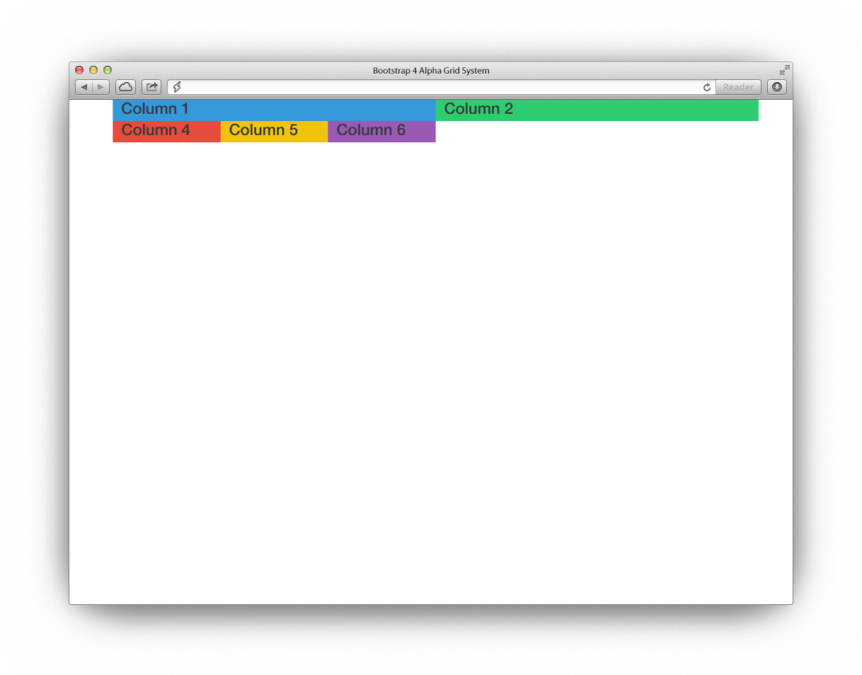
Nesting Columns
Bootstrap offers a feature where in you can nest your content with the default grid. By creating a new row within an existing column you can then fill this row with some custom columns which can also span within the 12 scale column and is limited to its parent’s width.
Let’s see this in action.
<div class="container">
<div class="row">
<div class="col-lg-6 col-1">
<h3>Column 1</h3>
<div class="row">
<div class="col-sm-4 col-3">
<h3>Column 4</h3>
			 </div>
<div class="col-sm-4 col-4">
<h3>Column 5</h3>
			</div>
<div class="col-sm-4 col-5">
<h3>Column 6</h3>
			</div>
		 </div>
		 </div>
<div class="col-lg-6 col-2">
<h3>Column 2</h3>
		 </div>
	 </div>
</div>
As you can inside the column one we created a new row and added three additional col-sm-3 classes. This means that we will be having additional three columns inside column one.
So the code we have above will output the image below.
Reordering Columns
Column ordering classes enables us to change the order of our grid system based. This will allow us to have a different view on a large screen, and then a different view on a mobile screen.
To do this we need to use the class col-column size-pull-* and col-column size-push-* to move column to to left and right.
There are four classes you can use here:
- col-xs-pull-* and col-xs-push-* for extra smaller screens
- col-sm-pull-* and col-sm-push-* for smaller screens
- col-md-pull-* and col-md-push-* for medium screens
- col-lg-pull-* and col-lg-push-* for larger screens
Let’s have an example. For instance, we will create two columns: col-md-4 and col-md-8. See code below.
<div class="container">
<div class="row">
<div class="col-md-4 col-1">
<h3>COLUMN-1</h3>
    </div>
<div class="col-md-8 col-2">
<h3>COLUMN-2</h3>
    </div>
</div>
</div>
This how it will look in our browser:
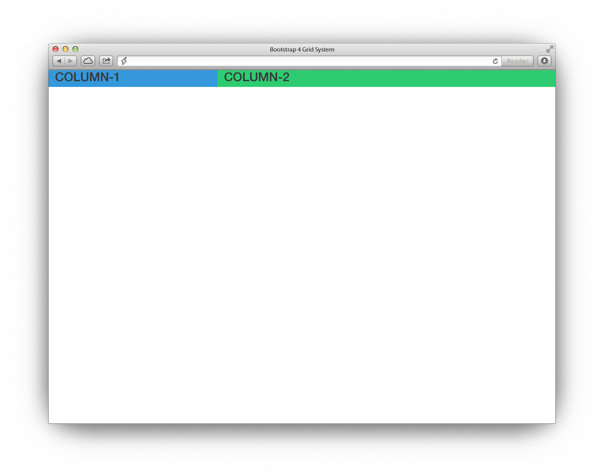
As you can see we have two columns.
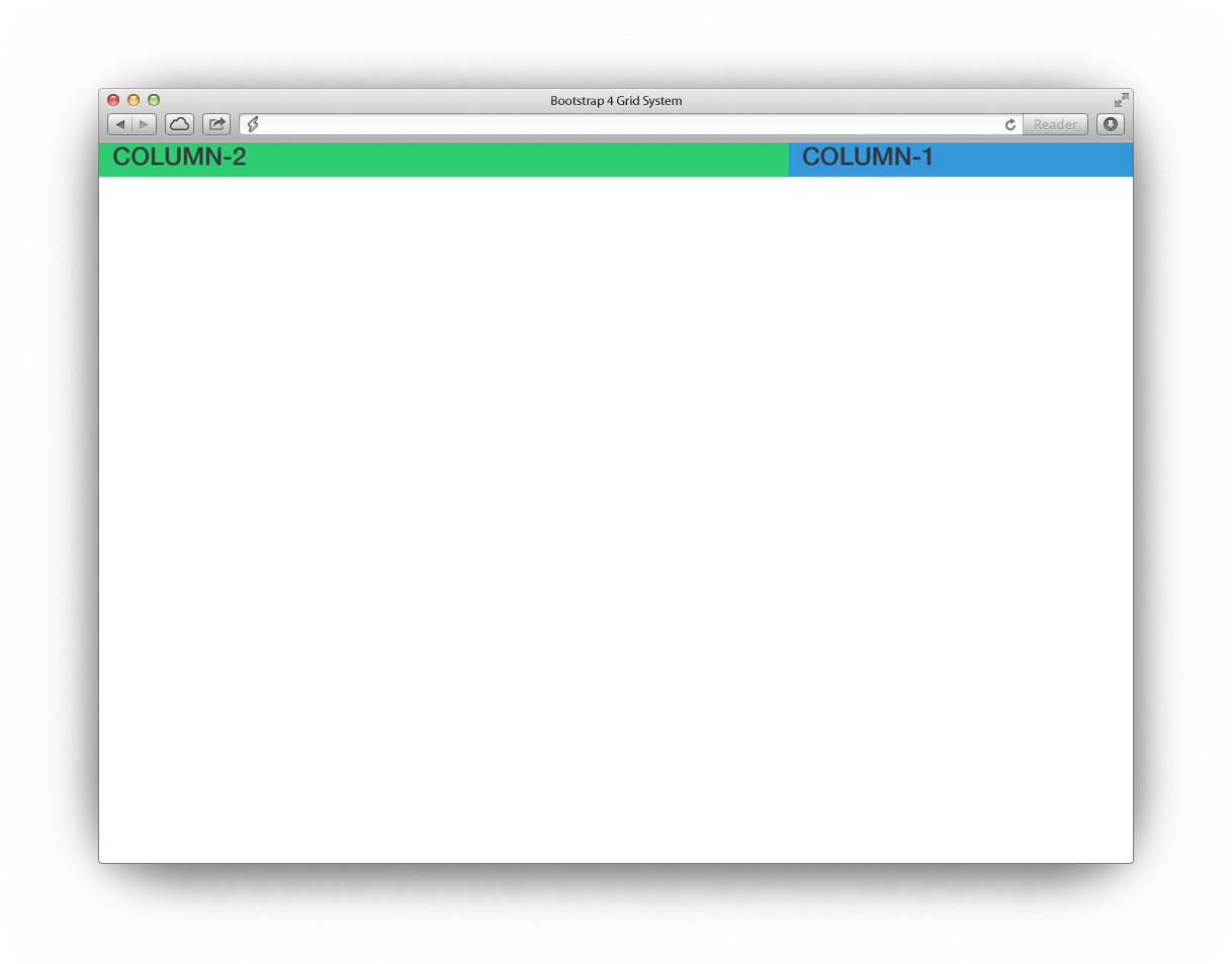
Now let’s push column one to the right on medium-size screens by eight columns and let’s pull column two to the left by four columns on medium-size screens. See the code below.
<div class="container">
<div class="row">
<div class="col-md-4 col-md-push-8 col-1">
<h3>COLUMN-1</h3>
	    </div>
<div class="col-md-8 col-md-pull-4 col-2">
<h3>COLUMN-2</h3>
	    </div>
	</div>
</div>
With the code above we have successfully pushed column one to the right and column two to the left. So our code will look like this on medium screens.
Conclusion
The default grid system of Bootstrap 4 utilizes 12 columns that can help you create any kind of website layout depending on the design. Modern websites use Bootstrap to create beautiful responsive websites at ease.
After the release of Bootstrap Alpha 4, there are several things that makes it more powerful as it enhance it support to different mobile viewports. You can always check out their documentation here.


 siter.io
 pulsetic.com
 static.app
 mailpost.io