Comparing iOS Designs of 5 Apps Over the Years
It’s interesting to think about how design has changed over the years. Each time a new design is published it, there is another genius and gorgeous unveiling. Or what about point of view where you look at old designs and get embarrassed at how poor, terrible or simply funny they were?
Here, we’ll take a trip down memory lane for Instagram, Flipboard, AirBnB, Facebook and Readability. We will compare the designs from these five apps between what their apps look like now and what they looked like years ago.
Instagram: Just a New Coat of Paint
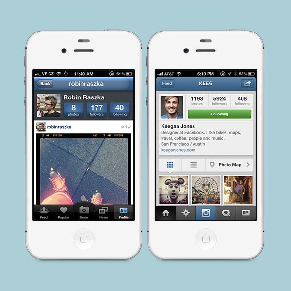
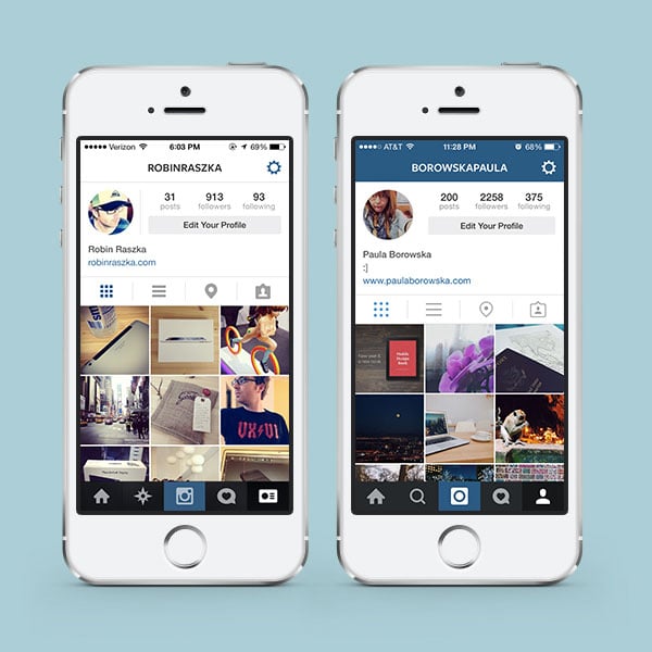
Instagram has been a longtime favorite for millions of users. The app was a genius idea, which was validated when Facebook purchased Instagram in 2012. They know what they are doing. But did they know what they were doing years ago when it comes to design? It seems so as the overall layout and functionality hasn’t changed drastically.
Instagram has stayed pretty much the same; the only major updates to the app have been cosmetic changes. Of course, they’ve tweaked a thing or two here and there but nonetheless the app functions the same; it just has an updated UI.
With Postcards Email Builder you can create and edit email templates online without any coding skills! Includes more than 100 components to help you create custom emails templates faster than ever before.
Free Email BuilderFree Email TemplatesLooking back at their UI in the first screenshot atop it does look outdated as the design community has outlawed these bevels and shines as no longer cool. But beside that, Instagram’s designs look pretty solid. There is little clutter, the colors are great and the icons perfectly crafted.
There is always room for improvement, but their UI seems just as solid now as it was years ago.
Flipboard: Keeping Things Visually Light and Airy
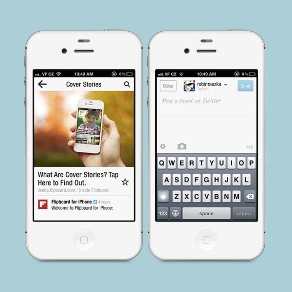
If you care about news, Flipboard is an app for you. You can discover, share or even collect relevant news stories. As you can see in the first screenshot, the app was pretty basic in the beginning. It doesn’t look too spectacular to be honest, but that’s a good thing.
The old design was clean; it was far from overwhelming. As a user, you clearly knew where everything was and what was going on.
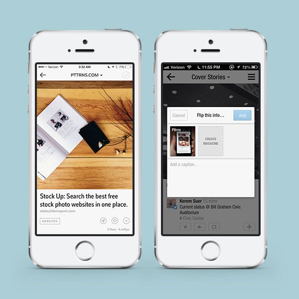
But if you take a look at the most recent design, you can see that they’ve stepped up their game. Viewing stories seems easier and roomier. Of course, it’s in part because of bigger screen sizes but also through design decisions. They implemented a light font, light text and icons on a light – white – background. It’s visually lighter.
They’ve also changed the way you share stories. They definitely took design serious throughout their years as an app and tried to push it to work very hard for their users. Simplicity and lightness were key goals, for sure.
With Startup App and Slides App you can build unlimited websites using the online website editor which includes ready-made designed and coded elements, templates and themes.
Try Startup App Try Slides AppOther ProductsAirBnB: From Friendly to Sophistication
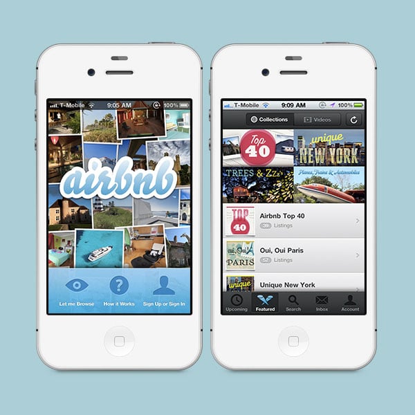
When AirBnB debuted, they had a great visual style. The app and website were designed with a bubbly, rounded and glossy, web 2.0-inspired style. It worked well for them. You can see the old logo atop to get a good sense of what their brand was all about circa 2010.
The look and feel was all about a friendly atmosphere and environment; and, it had to be in order to encourage trust from people all around the world who didn’t know the company yet as they were still establishing themselves.
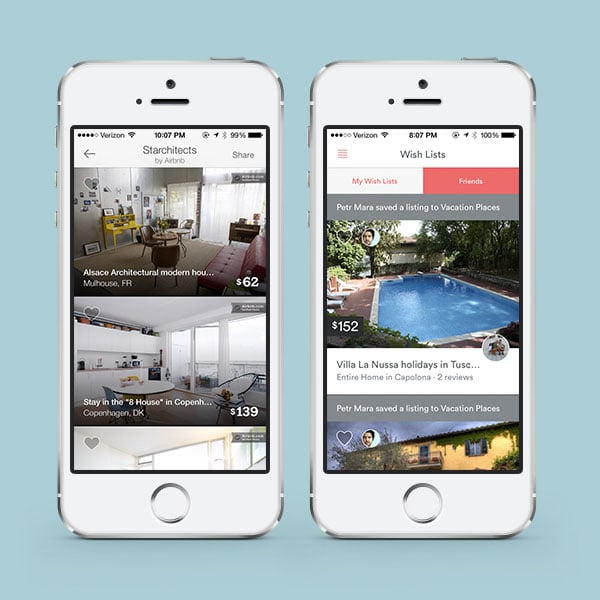
Fast forward to 2014 and AirBnB is a new brand. It doesn’t need to convince people they are a trusted company – that has already been established. In 2014, the company did a major redesign where the focus shifted to create an intimate, but sophisticated community that was all about people, their users.
The visual style has most definitely grown up. It features flat design, slim typography and vibrant colors, but most importantly lacks the bubbly look and feel.
Facebook: Clearing Up Content
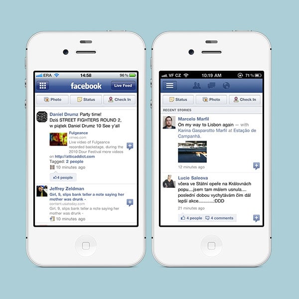
Like most apps, Facebook went through that awkward stage we called skeuomorphism. Look how shiny and glossy its buttons used to be! Or, how big of a gradient its top navigation bar once had. How ridiculous does that look?! Okay, enough with the jokes. I have nothing against the old styles of gloss or gradients but they do look outdated.
I’ve never been a big fan of Facebook’s mobile design as it simply was too busy. It was no tragedy back in the day – and is still acceptable – but the feed always felt more cluttered than it should have been.
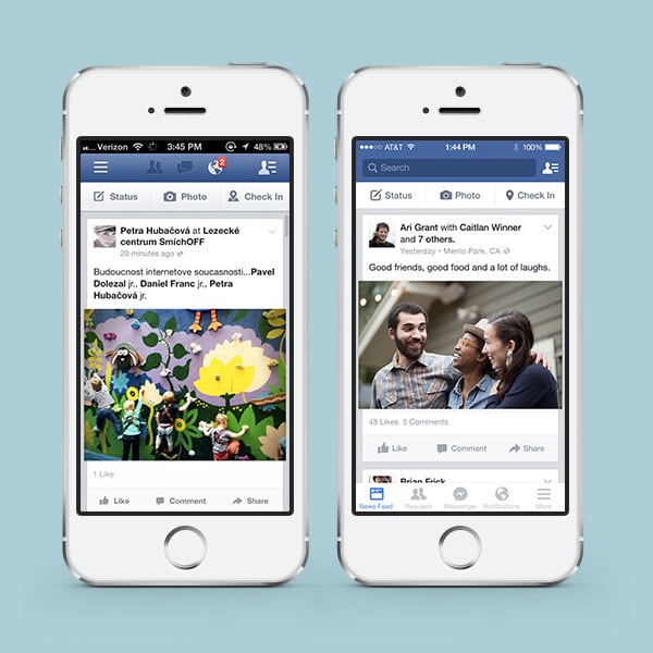
This problem is still true. The typography and use of colors may have gotten more sophisticated but that doesn’t solve the problem. For a long time, the interface featured countless buttons, options and possible actions. My biggest pet peeve was the boxed in content – if only the newsfeed content wasn’t in a box, the design would feel roomier. But, it is what it is. Is their design ineffective? Absolutely not. Could it be better? You bet.
I’m biased as their content drive product is not overwhelming; I’d be praising it if it was another company. But they are Facebook and I think they could create drop dead gorgeous UI.
Readability: The Exact Same Thing
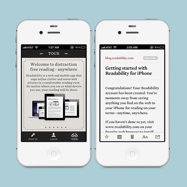
Readability is one of those read later apps where you save articles you’ve come across to, well, read later. They must have nailed the reading experience when they launched because the reading experience has basically stayed the same.
There are other things that were different in the older app design like the now rarely used bottom navigation bars. They also used a lot of the same or darker colors throughout the app. Nothing wrong with that though.
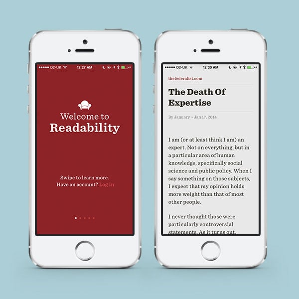
Today the app decided to try something a little bit bolder for some of their non-reading screens. You can see above the screen their walkthrough pages feature a bold red background. But, like I said before, their reading interface stayed practically the same.
It’s interesting to see something like this as apps evolve over time at least bit by bit with small changes of colors, font sizes or font families; but, not Readability. It’s just a design phenomenon you don’t see very often. I’m now curious how much research they’ve done when they first released this screen and what their data looks like!
There You Have It
What was it like going down memory lane with these five apps? Did you enjoy the flashback to skeuomorphism or tiny iPhone screens? I think it’s always a treat to look back at the way things once when there is something to take away or learn.
If you’re curious to learn more about what makes for good mobile app designs I’d encourage you to check out my free email course on mobile design, where I go over what make good (or bad) design.