How to Create Infographics in Adobe Illustrator
Difficulty: Intermediate / Advanced
Estimated completion time: 2 hours
In this tutorial we will learn how to create the information graphics (Infographics) using the standard tools of Adobe Illustrator. We will also show you some ways how to change graph appearance retaining its dynamic functions; i.e. you will be able to edit the data graphs after all transformations. Let’s begin!
Step 1
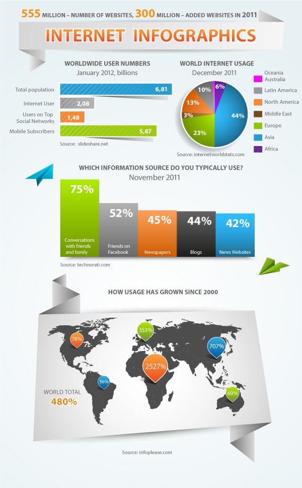
The work with infographics always involves information search and data processing in the first phase of your project. I use the internet statistics in this tutorial. The first graph, which we create, will show a number of internet users, social networks, mobile subscribers and total population (source: slideshare.net). All that I listed above is called categories, and numbers which correspond to these categories are called data. Take the Bar Graph Tool and create a marquee selection on the black area of the current document. As a result, the Graph Data window opens, where all categories and data should be entered.
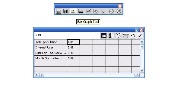
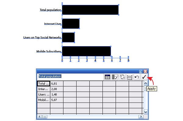
All information should be entered in the Entry text box. The selection of necessary cells of the table can be made with the cursor. After entering the information click on the Apply in the Graph Data window, this leads to the creation of a graph.
With Postcards Email Builder you can create and edit email templates online without any coding skills! Includes more than 100 components to help you create custom emails templates faster than ever before.
Free Email BuilderFree Email TemplatesStep 2
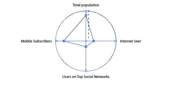
Our created object is a dynamic object, i.e. we can always change the name, data sequence and the number of categories and/or data. If you closed the Graph Data window, go to the Object > Graph > Data… where you can change your data again. We can change the type of graph after it has been already formed. To do so, go to the Object > Graph > Tape….
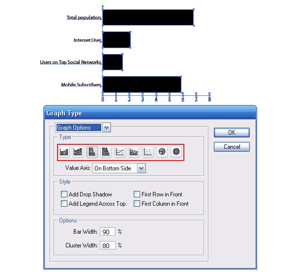
The graph design will change only after you click on OK in the dialog box.
Step 3
Let’s examine the Graph Type window. As you can see, we can change the width of bars, indicate the axis position and even add drop shadow!.
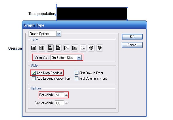
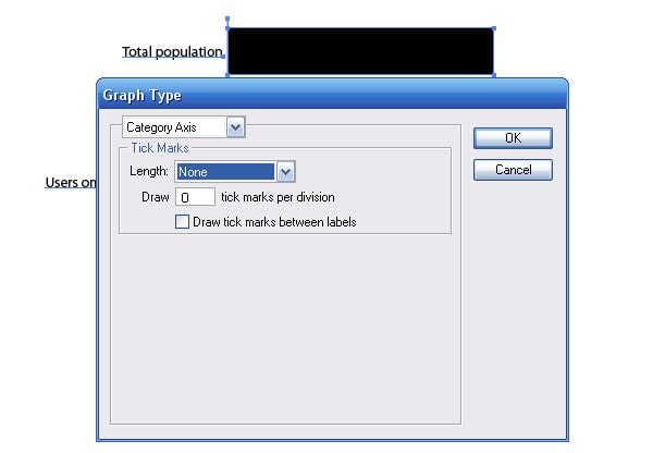
Moreover, we can edit the Value and Category axis.
With Pulsetic you’ll be instantly notified the moment your website, API, or server becomes unavailable. Monitor uptime from multiple global locations and respond to incidents before your users are affected.
Create beautiful status pages in minutes to keep customers informed during outages and build trust with transparent communication.
Start Monitoring for FreeBut as you all understand it is clearly not enough to make the right kind of graph. And here a lot of graphic designers make one and the same mistake: they convert a dynamic graph into a group of regular vector objects. It can be done by ungrouping with the Graph object (Shift + Cmd / Ctrl + G). The fact that you lose the ability of editing you data.
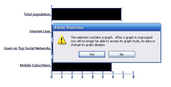
We won’t do this mistake; we will save the dynamic functions of the graph. You will find out how to change graph’s appearance a little bit later.
Step 4
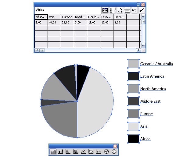
Now let’s create two more dynamic graphs. To create “World Internet Usage” Graph (source: internetworldstats.com) I used the Pie Graph Tool.
I used the Column Graph Tool for the “Information Sources” Graph (source: technorati.com).
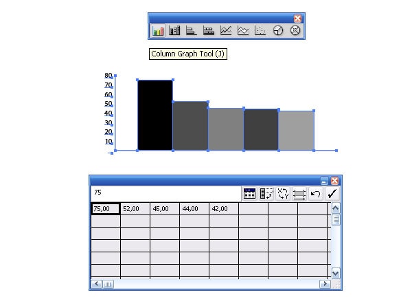
The principle of work with these graphs doesn’t differ from work with the first graph (see step 1).
Step 5
Now let’s create the overall design of our Infograph. I decided to use the Origami style (this style is quite popular these days). With the Rectangle Tool (M) create a rectangle and fill it with radial gradient from white to blue.
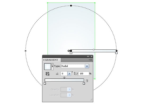
The width of the rectangle is 600px (customer’s requirement). It height can be changed in the process of adding items.
Step 6
With the Pen Tool (P) create a form of a paper ribbon where the title of our Infograph will be placed. Fill the object with linear gradient from white to grey.
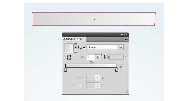
The direction of the gradient corresponds to the direction of light source. All the following items will be lit by this common source. The global lighting solution is the first sign of good design.
Step 7
Let’s create a couple of paper windings with the Pen Tool (P). With the linear gradients we will show the light and shade change on these surfaces.
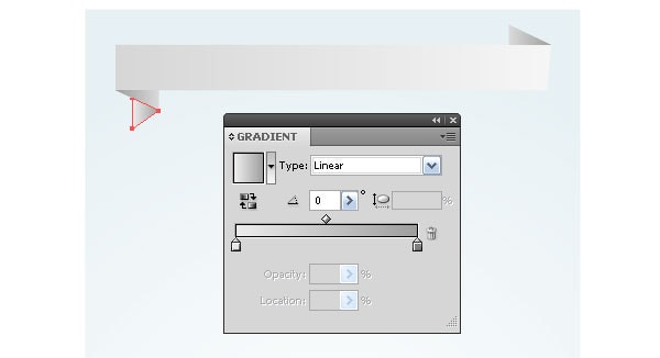
To make some contrast between the light background and paper tape we create the drops of shadow. With the Ellipse Tool (L) create a circle with radial gradient fill from grey to white.
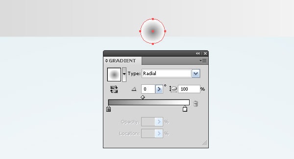
Transform the circle into an ellipse with the Selection Tool (V) and with the keys Opt / Alt held.
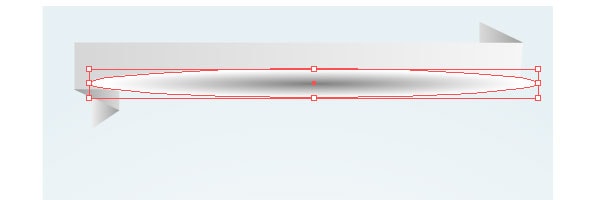
Apply the Multiply Blending mode to the circle and place it below the paper tape.
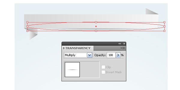
Using this technique create shadow in the upper part of the tape.

Step 8
Create one more paper tape as it is shown on the figure below.

The creation technique of such objects was described above. Place a vector world map on this tape.

Step 9
It’s high time to get back to our graphs. Place the first graph in the place created by design. As you can see, it should be reduced.
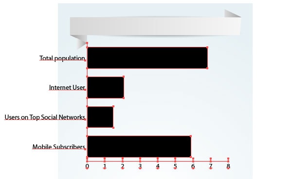
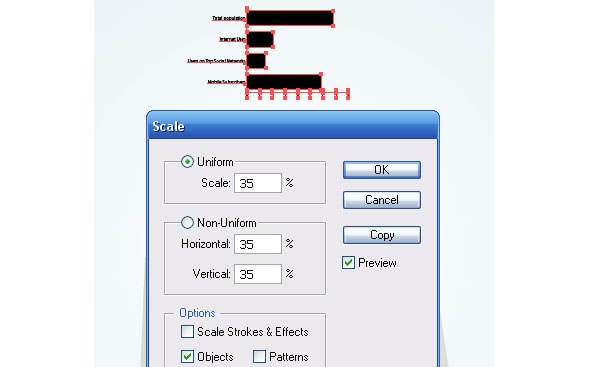
But it is impossible to do it with the Selection Tool (V). It’s not a problem. Select the Graph object and go to the Object > Transform > Scale… and set the necessary value for reduction.
Step 10
On the example of this graph let’s see how to convert its elements without losing their dynamic functions. I’ve decided to delete the axes. Select one of it with the Direct Selection Tool (A) and click on Delete.
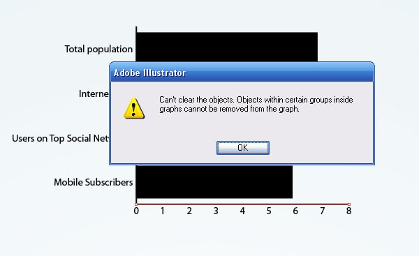
As you can see, it is impossible. But we can turn off the stroke of the path. The object will be invisible.
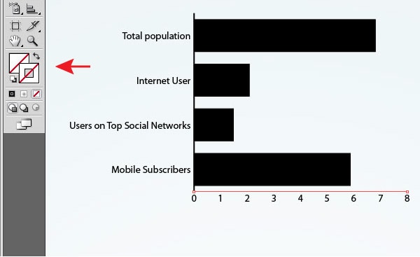
Make two axes invisible.
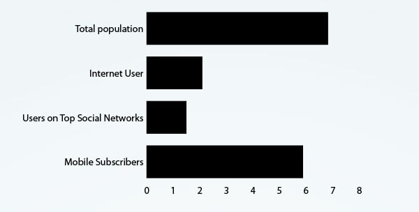
To make the numbers invisible, turn off their fill.
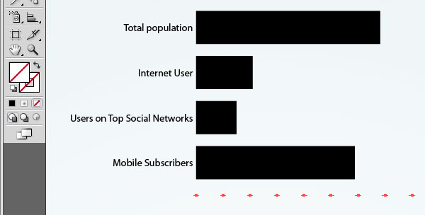
Step 11
Select the name category with the Direct Selection Tool (A) and change the text parameters with the Character panel (Window > Type > Character). You can also change the text color and its position. These and following changes won’t lead to lose of graph dynamic status.
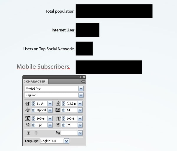
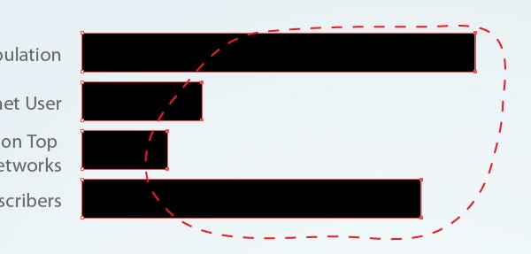
With the Lasso Tool (Q) or the Direct Selection Tool (A) select the points indicated on the figure below and while holding down the Shift key lengthen the columns with the Direct Selection Tool (A).
Step 12
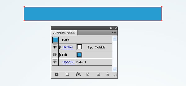
Low let’s work with the columns. We will make all changes with the Appearance panel (Window > Appearance). Replace the column fill with blue. Apply white to its stroke.
Step 13
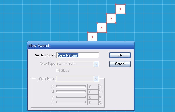
Now let’s create a very simple Seamless pattern. Turn the Pixel preview mode (View > Pixel Preview) to place the elements exactly in the cells of the pixel grid. Take the Rectangle Tool (M) and create ten squares with 1 x 1px of size, as it is shown on the figure below.

Select all squares and go to the Edit > Define Pattern…, click on OK in the dialog box.
Step 14
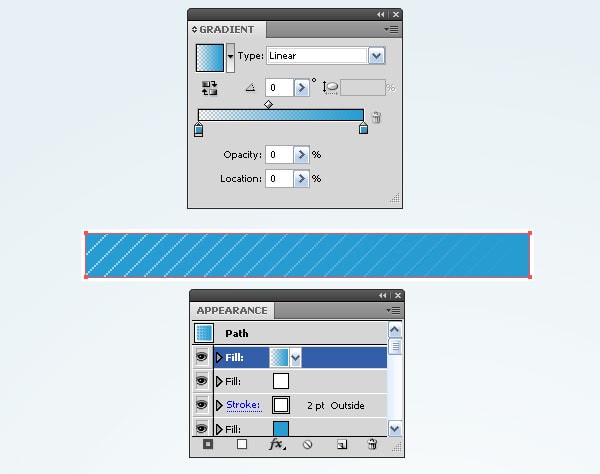
Select a column of the graph and add a new fill in the Appearance panel. Apply a pattern to this fill which was created in the previous step and reduce the opacity to 60%.
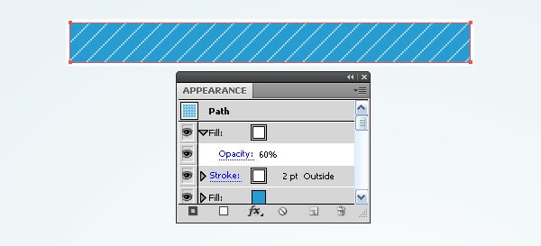
Add one more fill and apply a linear gradient to it, which consists of two blue sliders, one of which has 0% opacity.
Step 15
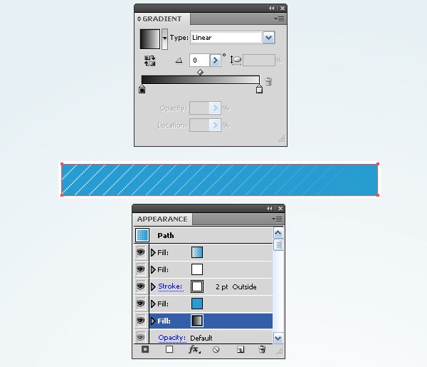
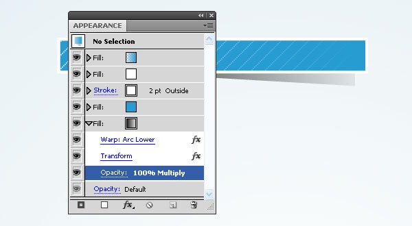
Create drop shadow from a column. Add a new fill and place it below all in the Appearance panel. Apply a linear gradient from black to light-grey.
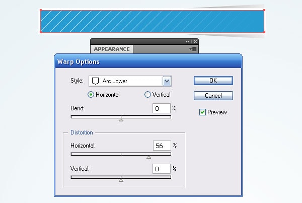
Keep the fill selected and go to the Effect > Warp > Arc Lower… and set the parameters indicated on the figure below.
Now go to the Effect > Transform & Distort > Transform… and set the parameters in the dialog box.
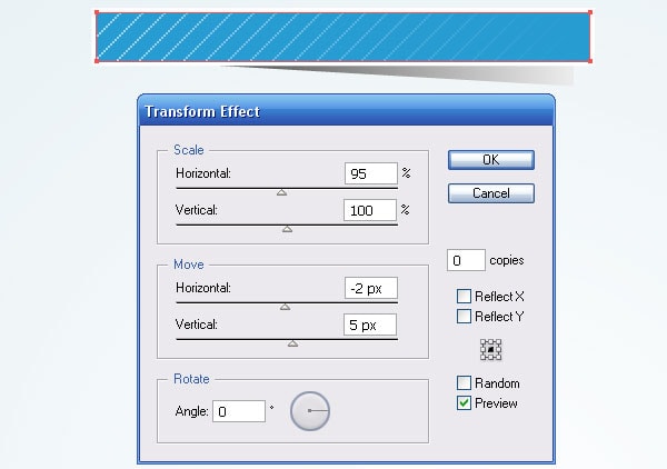
Apply the Multiply Blending mode to the fill. It can also be done in the Appearance panel.
Step 16
In order not to repeat an entire sequence of actions for the rest of the graph columns save the graph style in appropriate panel.
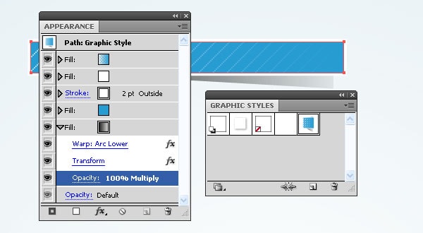
Apply the graph style to the lower column. Change linear gradient colors and one of the fill in the Appearance panel.
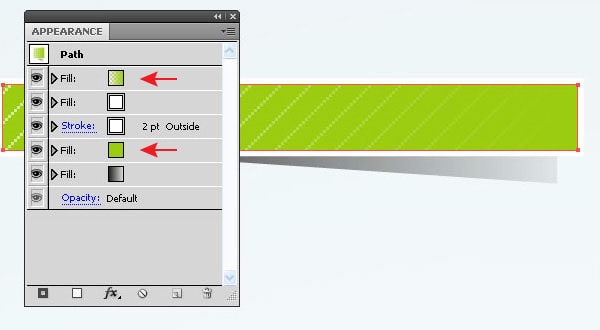
Apply the same style to middle columns. Delete the lower fill with shadow in this case.
Step 17
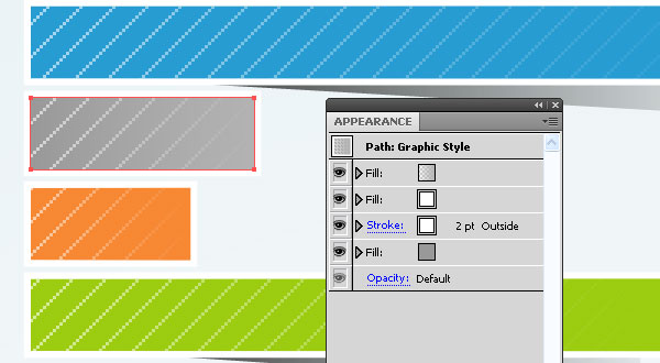
With the Type Tool (T) write some data which corresponds to categories ‘the graph name’ and ‘information source’.
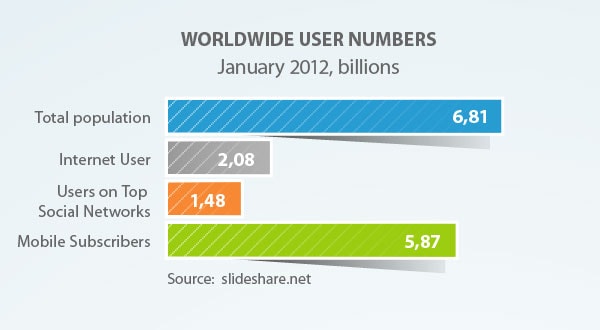
Let’s check if our graph is still dynamic. Go to the Object > Graph > Date….
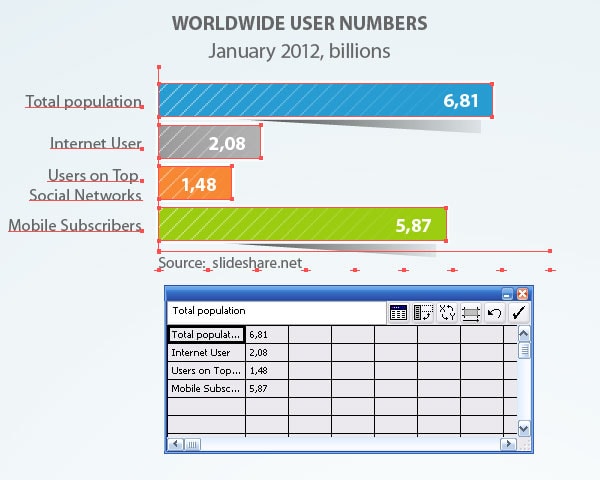
As you can see, I was right, it is still dynamic.
Step 18
I’ve changed the design of other graphs using the described techniques.
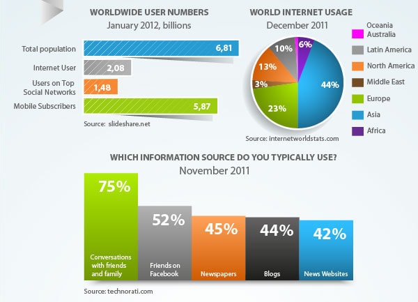
In order my tutorial not only gives you technical information but also demonstrates some interesting internet statistics to you, I presented it in graphs.

Conclusion
I’m sure that Infograph should remain dynamic, so you or your clients could change the data anytime. Statistic data is not a constant data; it should be changed sooner or later, so why make it all over again when we simply can edit it? Follow us if you want to be the first to know about the latest tutorials and articles.


