Use of Flat Design in Mobile App Interfaces, Best Examples
Emphasis on typography, roomy widgets, muted color palette, one-colored or blurred background, grid or horizontal stripe layout, inornate graphics, 2d illustrations – all these can be easily attributed to flat style, that recently got its second rebirth.
Microsoft’s “Metro” aesthetic has captured the minds of a great deal of designers, pushing them on eschewing shadows, highlights, gradients, various effects and even textures. Such overwhelming infatuation with simplicity and ingenuousness has been reflected not only on web design, but also on mobile design, that traditionally has been known for its skeuomorphism.
Today contemporary mobile app UI is inspired by time-tasted Swiss design that beautifully intersects with modern Windows 8-style, that as a result gives us interface, which is generally focused on typography and huge vibrant monochromatic blocks.
Fresh and Exquisite Flat-style Mobile App Interfaces
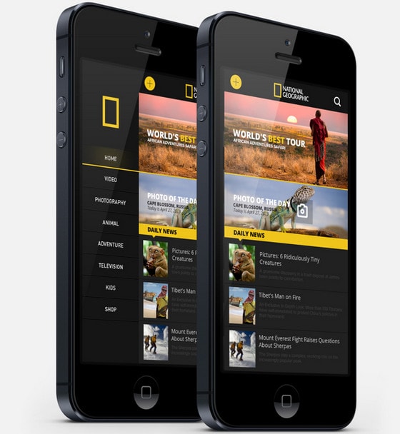
National Geographic Re-design looks sophisticated and stylish. Dark and yellow color palette never gets old; it is beautifully accompanied by white font and spectacular nature shots.
Taasky by Jakub Antalík has a refined appearance. Grey background is nicely brightened by muted color palette and rainbow-like panel on the right side.
With Postcards Email Builder you can create and edit email templates online without any coding skills! Includes more than 100 components to help you create custom emails templates faster than ever before.
Free Email BuilderFree Email Templates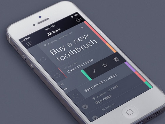
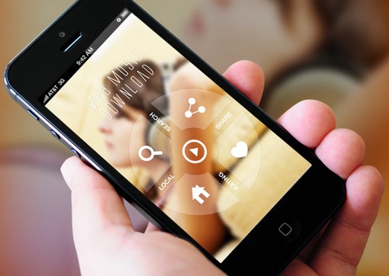
New Music App by Amit Rai delivers overwhelming first impression, fascinating users by vibrant warm background and exquisite almost transparent circular navigation panel.
PicLab by Roberto Nickson utilizes bright colors in order to make interface inviting, and also provides colorfully executed footer with settings.
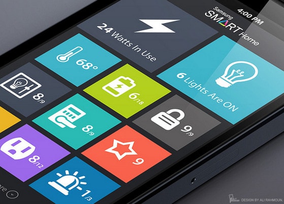
Samsung Smart Home App Concept by Ali Rahmoun has indiscrete lively tile-based outward. It also depicts colorful grid along with white flat regular icons.
Alarm Clock App by Samuel Bednár has a truly minimalist vibe, leveraging grey color scheme, plane graphics and several vibrant elements.
With Pulsetic you’ll be instantly notified the moment your website, API, or server becomes unavailable. Monitor uptime from multiple global locations and respond to incidents before your users are affected.
Create beautiful status pages in minutes to keep customers informed during outages and build trust with transparent communication.
Start Monitoring for Free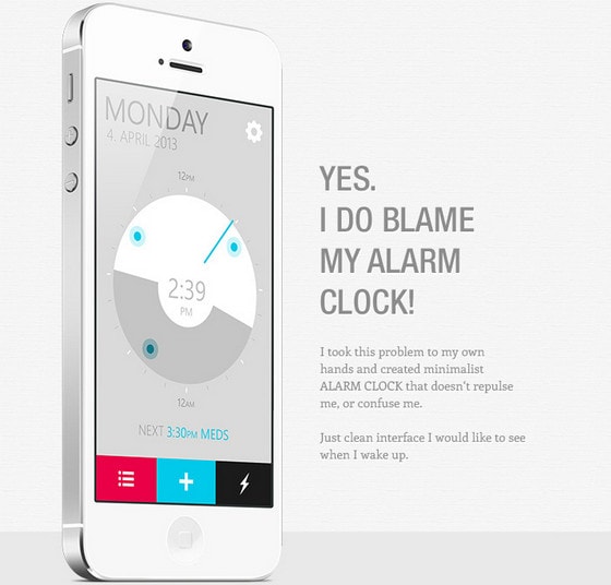
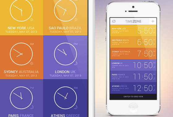
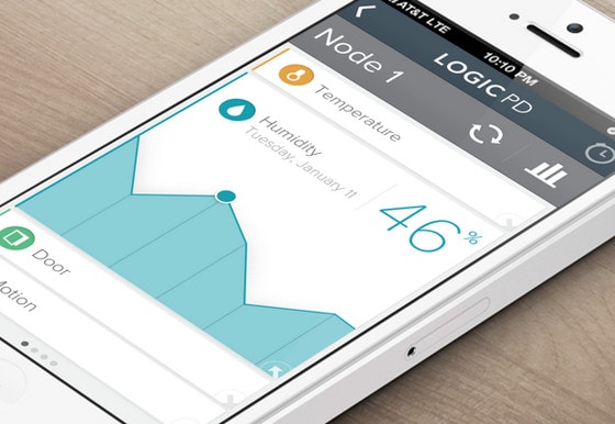
Time Zone App Concept by GraphicBurger has a brisk color-driven interface that capable of representing data both in lines and as a grid. Both approaches are spiced up with glaring and alluring shades.
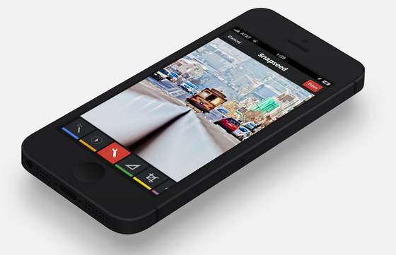
Snapseed Redesign by Shiping Toohey features full-screen showy photo background that is supported by vivid flat-style footer with settings.
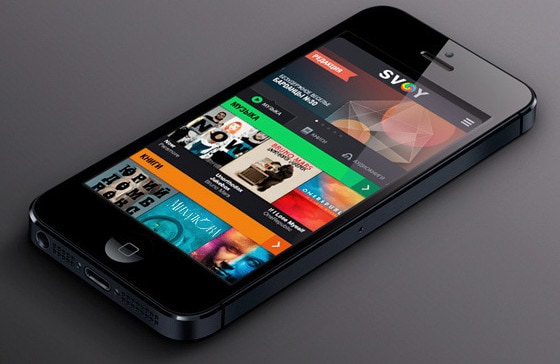
SVOY app design by Alexandre Efimov At first sight, interface looks like a colorful mess of colors, plane graphics, images, typography and icons, but in fact it is efficiently organized.
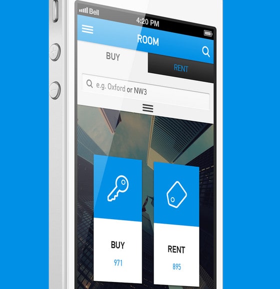
Room App by Pavlo Tyshchuk easily provides powerful contrast between photo background and foreground elements due to relatively huge monotonous data blocks and distinctive blue and white colors.
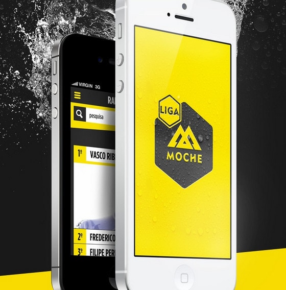
iOS App Liga Moche by Duarte Pires strongly relies on three-color scale. Designer wonderfully combines and complements widgets of different colors, keeping things accurate and organized.
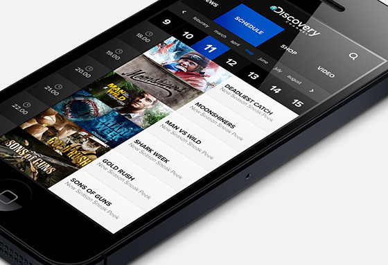
Discovery Channel by Enes Danış uses list-oriented layout to demonstrate as much data as possible. Lack of optional styles and shadows makes application look neat and clean.
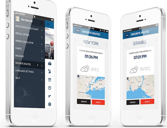
Turkish Airlines Redesign by Umut Isbilir leverages white as a core color and sharp foreground elements, thereby readily adding to interface clean and fresh appeal.
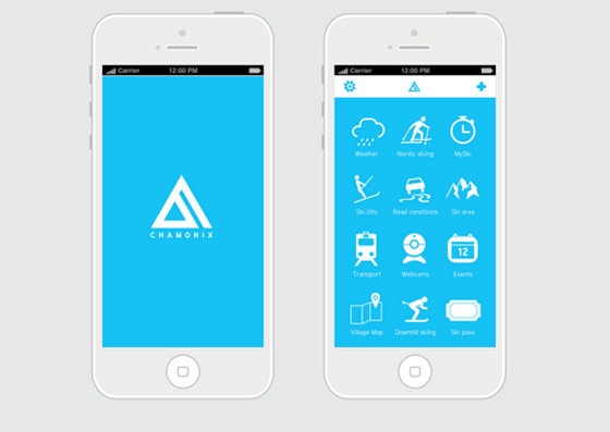
Chamonix Experience iPhone app skillfully utilizes only 2 colors: sky blue and strong white. Intuitive vector icons and ordinary sleek rather small font are ably arranged, so that on the whole application has a lively spacious appearance.
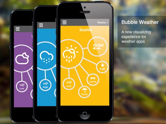
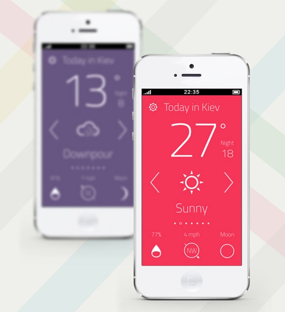
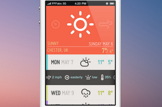
Bubble weather app by Pamela Rodriguez represents weather conditions with a help of bicolor scheme, providing owners with highly discernible data.
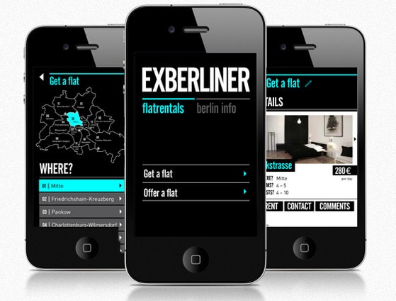
Exberliner by Raïssa Lara Fasel has a beautiful neon vibe. Prevailing black colors, huge type and injections of blue make application look a bit glamorous.
FlatPlayer by Ehsan Rahimi has a lively but slightly messy horizontal stripe layout which is supplemented by muted red and blue colors. Nevertheless UI has modern and stylish outward.
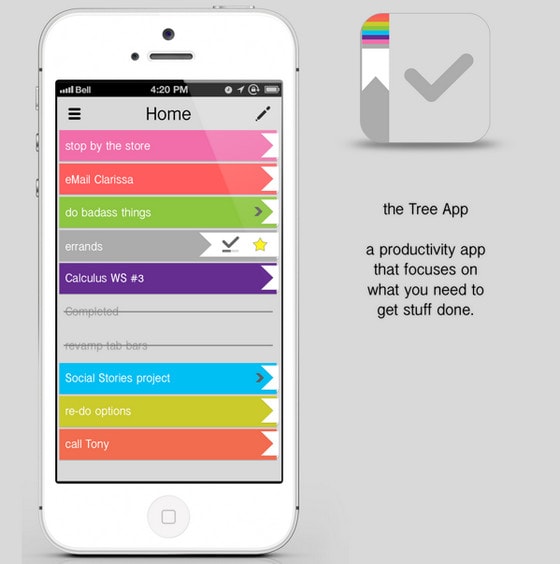
A Productivity App by Megan Holstein is another good example that utilizes stripe layout, which is enlivened by bright colors and ribbon-themed graphics.
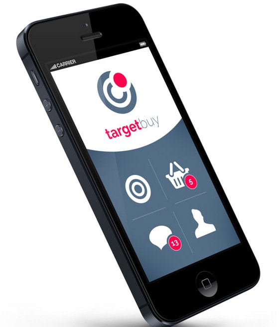
TargetBuy by Martin Schurdak plays heavily on 3 color palette: grey, white and red. Huge sleek light icons and smooth lines add a sense of business atmosphere.
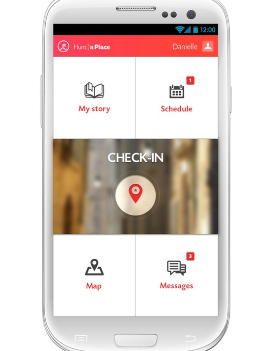
Hunt a Place is a comprehensive exploration in flat style. Interface comprises majority of aspects of it, including blurred background, plain monotonous icons, tiny font and a lot of free space.
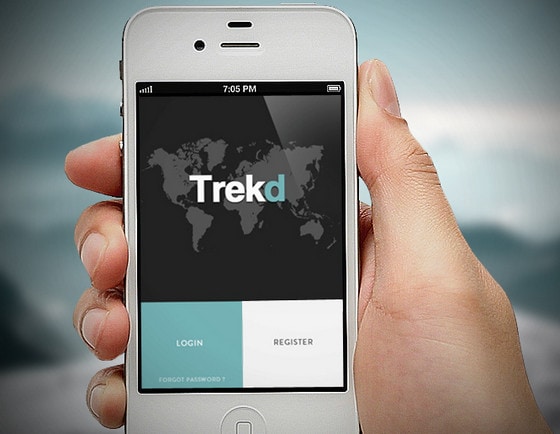
App | Trekd Concept by Thomas Le Corre exudes simplicity and cleanliness, adding a spacious feeling due to relatively small type and rather huge widget areas.
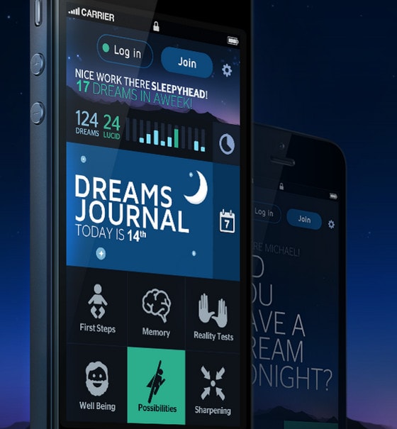
Lucid Dreaming APP by Michał Sambora immediately states the idea behind an app by means of properly chosen color palette ( which is widely associated with night and dream) and several appropriate graphical elements such as moon icon or photo of darken landscape.
Weather App “Outside the window” by Artem Svitelskyi leverages only 2 colors. First one is used for background, and second one is responsible for highlighting rest components, including icons, pagination and type.
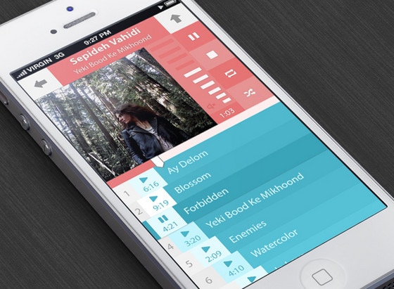
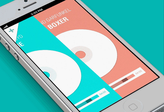
Music App by eyal zuri takes on minimal style, and showcases elegant flat audio player with neatly placed components.
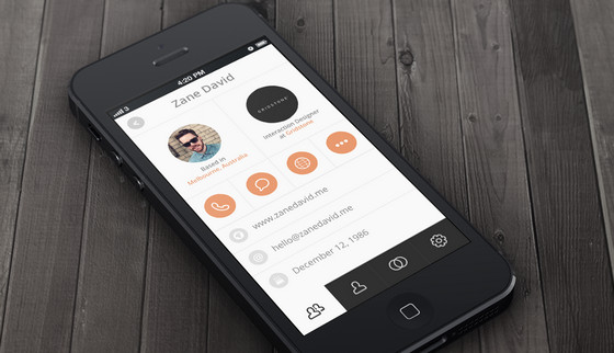
Profile Screen by Zane David gets the feel of refined flat style from circular plane elements, regular icons, shadowless components, one-colored background and comparatively small lettering.
Weatherette by Fabio Basile is another good example of line-inspired layout. Interface is filled with a great deal of weather information that is liberally scattered throughout all strings.
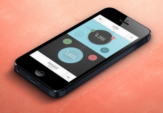
Invoice APP by Tomas Zeman has a strong circular vibe. Majority of data enclosed in round shapes that wonderfully complemented by pale color palette.
HTML5 app by Zach Robinson closes our collection with its polished and clean interface. It ably draws attention by bold colors and sharp neat icons and charts.
Reflection
Flat style is famous for its ability of adding extra flair of sophistication, elegance and neatness to any app interface, making it look more spacious and organized. As a rule, plain graphics and common icons skillfully interact with vivid color scheme, recreating flamboyant touches. Simplicity, absence of styles and effects give the design, at the same time, uncomplicated, and slightly intricate appearance.
Share with us your opinion about utilization of flat style in mobile application design? Which example has earned your admiration? Do you prefer elegance and ease of flat style or realism and complexity of skeuomorphism?