Holiday Themed Websites: How to Avoid Cliche Design
You may be feeling the pressure to turn you website into a sea of Santas and red and green.
But don’t do it.
There are plenty of ways to create subtle changes on your site to last you through the holidays without a site design that screams cliché.
Here, we are going to look at a few ways to add a little holiday spirit to your website without going overboard. As with almost any other design technique, it is important to remember that less is often more.
Subtle Color Changes
With Postcards Email Builder you can create and edit email templates online without any coding skills! Includes more than 100 components to help you create custom emails templates faster than ever before.
Free Email BuilderFree Email TemplatesYou may consider toning down or cooling your website color scheme for the holiday season, which runs through the new year.
A color scheme that uses cool tones, such as blues, purples and greens can have a more “wintery” feel than warmer hues. This association is connected to the winter weather themes that are often associated with the holiday season.
If you want to feel a little more holly and jolly, consider some subtle touches of red and green. Change the color of small elements such as buttons or add a highlight to the “Holiday” part of your navigation menu. Think about adding a Happy Holidays, Free Shipping or Special Deals banner on your homepage.
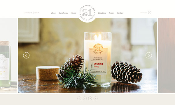
Use these colors in interested ways. Rather than just adding red and green to the framework of your site, show products that use these colors. Use photos with seasonal greenery (such as Circle 21 Candles above) and show what your site is about in a way the represents the season subtly.
Ornate Lettering
Another simple touch that can create holiday feelings is ornate typography.
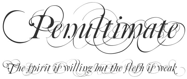
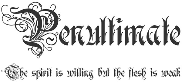
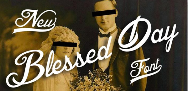
Use sparingly, ornate lettering can be an easy way to set the mood without overhauling your site or adding a lot of special holiday extras to the overall design. Opt for an ornate style with classic lines and a traditional feel.
Here are 10 free options for ornate typefaces:
Billy Argel Font

With Startup App and Slides App you can build unlimited websites using the online website editor which includes ready-made designed and coded elements, templates and themes.
Try Startup App Try Slides AppOther ProductsBlessed Day
Bodoni Ultra
Christmas Card
Christmas Ligtness
Diamonds are Forever
Emporium Capitals
Mutlu
Rothenburg Decorative
Santas Big Secret
Winter-Themed Photography
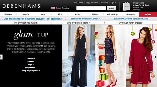
One of the great things about the holiday season is all the great winter- and cool-themed photography available.
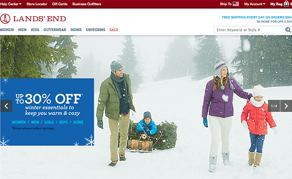
There’s nothing like beautiful images of sleighs in the snow, or kids in winter hats or snowflakes falling. All of these images are perfect for the holiday season. They do not represent a single holiday but capture winter, when all of these holidays converge.
As an added bonus, this winter imagery will carry you through the holiday and well into the new year. (Great if you are planning on taking a little time off after the holiday.)
In addition to winter-themed photography, consider holiday-themed images. Rather than retooling your whole site outline, just add a few images into the mix that show holiday items. Gift ideas that show wrapping paper, holiday ornaments arrange in an interesting way, your products under a tree: All of these are ways to show the holiday season without actually redesigning your site. This is an increasingly popular strategy among retailers.
Simple Decorations
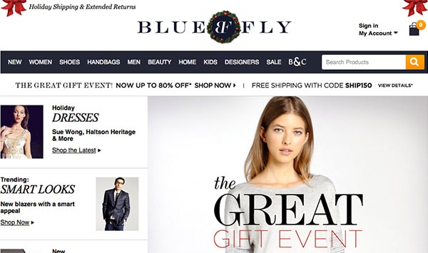
While some designers like to add a lot of elements to holiday design, you don’t have to. Something as simple as a string of lights around your logo, or a Happy Holidays note in the navigation menu or banner, or snow along the bottom of the page can be enough to welcome users during this season.
These small effects can be quite easy to implement and will be less likely to cause issues on different types of devices. (You don’t want to bog your site down with too many holiday effects.)
These simple decorations don’t need to be flashy to be effective.
Tips for Success
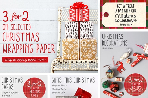
Add simple holiday touches for the best results.
Consider adding a holiday page to your website for the season. You can add a little more ornamentation there and remove the page after the season is over.
Avoid auto-play holiday music.
Use holiday-themed words throughout the site. Christmas, holiday, snow and so on can help create a visual connection to the holiday. Words that have strong visual associations can help set an overall tone.
Be aware of religious overtones. Be careful not to offend clients or users with overly religious themes unless that is what they expect from your site. There are multiple holidays during this season for people of different religions. Be cognizant of that when planning design changes.
Look at trends and use them in your design. Flat design techniques, for example, are ok to use during the holidays too.
Even with holiday touches, you should maintain the normal look and feel of your site. When users visit your page, you want them to know they came to the right place. The user interface should work in a familiar way and should not look drastically different.
Don’t use overly cliché imagery such as Santas on every page, dancing reindeer or Christmas trees with blinking lights.There are a large number of sites doing those things. Create a custom look for your holiday theme.
Be aware of holiday clip art and stock images. Too often sites end up with the same images, decreasing brand recognition, identity and making the site feel less unique and special.
Finally, plan for extra traffic if you are planning better-then-normal promotions on your site. You don’t want your site to go down during a time when you would hope to be doing great business.
Conclusion
The key to a great holiday-themed website is simplicity.
All of the tools that you use daily to create a great site are the same as the ones you will use during the holiday season. Don’t get caught up in the madness to create a site that is overly holiday. Users will most appreciate your site if it looks similar to and works in a way they expect, just with an added touch or two of holiday spirit.
What great holiday-themed sites have you come across this season? Share them with us in the comments.
