Helpful Tips to Improve Your Checkout Conversions
Believe it or not but the checkout process starts much earlier than when someone is literally making a purchase from their online cart. In order to improve checkout conversions, you need to ensure that the whole shopping experience is wonderful; this way users are more convinced to actually buy your products.
In this post I want to go over the buying funnel on eCommerce websites with examples of what can be improved that will impact conversion rates.
Are Users Motivated to Buy Your Product?
When people invest time in creating something they care about, they are more likely to save it. This analogy works when online services allow customers to sample their web app. It also extends to eCommerce. You need to get people invested in the product you are selling.
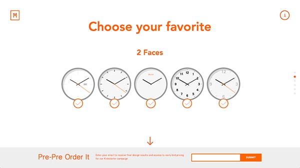
MIJLO’s watches are a perfect example of this. As you scroll down their landing page, you create a watch for yourself, step by step. You don’t think too much of it, it’s just building a watch. When the company asks you to preorder, you are more likely to actually do so because you’ve taken the time to follow their long page to actually make a custom watch. You didn’t just click some random buttons to see what variations they offer, you’ve customized it, you’ve built it.
Use Emotional Design to Your Advantage
Some products don’t work out to have a wonderful and engaging landing page. There are other things you can do. You can utilize emotional design to show off the product for a user in a grand way that will help connect with your product. The product page for Lush’s face mask has a video header of a woman applying the mask. It shows the product, how it looks and how to use it. It’s more interesting than pictures, it’s more engaging too. It uses emotional design to show off the product in a delightful way. In turn, this allows the customer to like the product more and therefore motive them to buy it.
With Postcards Email Builder you can create and edit email templates online without any coding skills! Includes more than 100 components to help you create custom emails templates faster than ever before.
Free Email BuilderFree Email Templates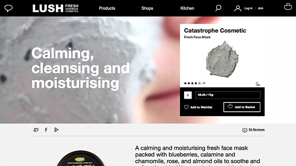
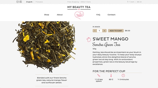
My Beauty Tea is another example. The product selection page is wonderful. They show off the various teas in heart shapes. It’s cute… The product pages are well designed too. The tea is big, and you can clearly see the herbs; it’s a high quality picture. There are even instructions on how to brew this particular blend. The page is clean and a nice experience. Overall, it’s a beautiful product display page.
Product Display Is Important
The way you display your product matters. If you have a quality product page, your visitors are going to engage more. This can lead to an increased number of users in your funnel. The nicer you display a product, the more inviting it is, the more convincing it will be. This will make your product more desirable to purchase.
Usability Counts
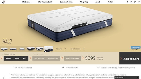
The usability of your product page matters. One of the bigger mistakes you can make is have poor error messages when someone has unsuccessfully added an item to the cart. Clearly define what went wrong so that the user can go on. Sleeping Duck sells mattresses and when you try to add one to cart right away you can’t. You need to select size and how firm you’d prefer it to be. If you don’t, the missing selection flashes lightly to make you pay attention to it. It’s an obvious indication that you forgot to pick the size of your mattress. It works because frankly their page is a little busy. This is a perfect way to draw attention without confusing the user as to what went wrong.
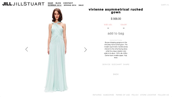
Another example is Jill Jill Stuart’s product page. When you try to add to the cart a dress without specifying size or color, the missing fields turn red. The page doesn’t reload, the change is small but brings attention to the missing field. It’s a very subtle way to let a user know that something went wrong, and that it needs to be addressed.
With Startup App and Slides App you can build unlimited websites using the online website editor which includes ready-made designed and coded elements, templates and themes.
Try Startup App Try Slides AppOther ProductsHow Easy Is Your Actual Checkout?
At one time, to checkout of Forever21 you had to have an account. You couldn’t just give them your credit card, you had to be logged in to a verified account. They since added the ability to checkout as a guest where you don’t need to create an account; I can only image that increased their bottom line. You need to have an easy way for users to actually checkout. So what if I want to buy your goods? If I’m having a hard time checking out it serves me no good.
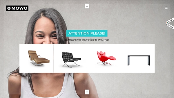
Does your cart have a clear checkout CTA? Because when I finally find the cart for Mowo, I still don’t see it. I see a promotion. If I didn’t notice the arrow at the bottom of the screen, I wouldn’t have seen that there was something else. Without reading, I wouldn’t know that was a promotion – not to mention that landing is a layered mess, one thing on top of the other … I can’t even see the cart, how am I supposed to checkout?
Harvey Vice, on the other hand, has a minimal shopping cart. Yet, there is a big and bold checkout button right below cart items. You can also checkout with PayPal verified. But if you do it the old fashioned way, the checkout is all on one page. You can see the order total at all times, the form asks you for basic shipping information and then your credit card. The form is simple, minimal in design, but lovely. You must see for yourself the design of the credit card. It’s different, and obvious, making for a better checkout experience.
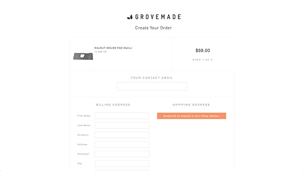
Grove Made has such a simple shopping cart. There is an obvious big button I can click that takes me to the checkout. Once I’m there everything is so neat. I’m told that I’m on page 1 out of 2; I can see the product. Everything is well organized and it’s neat. It helps that they are powered by Shopify. I’m certain Shopify AB tests checkouts so that they can help customers have the best experience. There is nothing wrong with using Shopify especially because they help provide for a simple and easy checkout experience.
Usability of the Checkout Form
When it comes to the literal checkout form you should embrace the usability and best practices of online forms. That will always interfere with users checking out. Are error messages human-friendly and clear? Are there unnecessary fields to be filled out? Is microcopy friendly and informative? Is the progress clear? There are countless things that impact the efficiency of the actual form, but that is not the only thing that matters when it comes to improving checkout conversions because this is at the every end of the checkout funnel.
