
Free Bootstrap Page Builder
It’s a quick and easy way to launch your website using pre-designed blocks and elements.
Trusted by the biggest companies
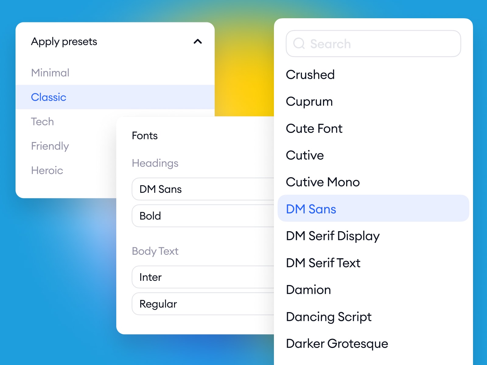
Powerful online editor
Add, clone, move or customize design elements in any pre-designed block. Each element has lots of possibilities, so you can easily make any landing page layout your own.
Champions of customer service
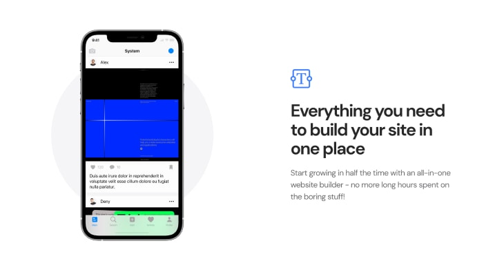
Create screens directly in Method or add your images from Sketch or Figma. You can even sync designs from your cloud storage!
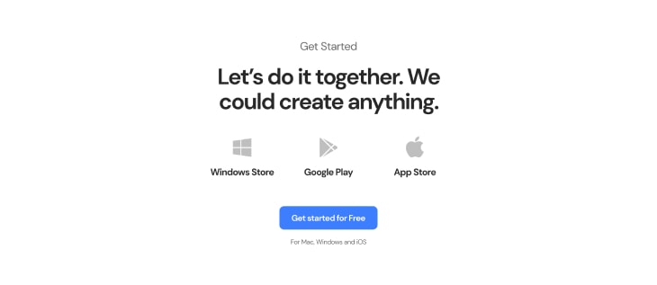
Get started
Edit the content online
Our Bootstrap builder allows you to visually edit and customize content without the need for a backend content management system. Once you’re done, easily export and publish your website on any hosting platform of your choice.
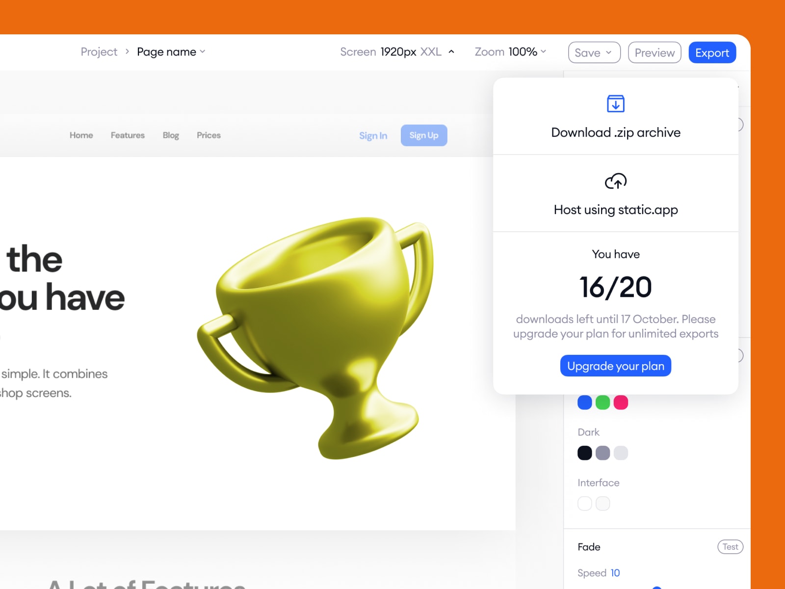

Startup App is fully integrated with Static.app. Now it’s easy to host your website online with a one-click integration.
Your website will be online in one minute!
Static website hosting by Designmodo
Drag and drop an archive with your landing page or website and we will take care of the rest.
Learn more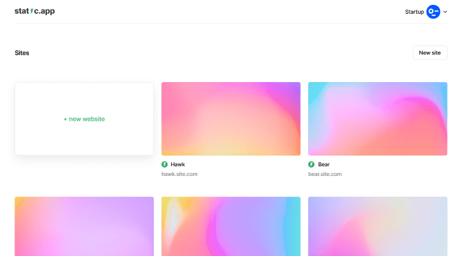
SSL certificate
No hassle of adding SSL to your website. Static.app provides a free SSL certificate.
Custom domain
Add a custom domain name in a few clicks or use the free sub-domain name.
Media storage
Store content for your website right in Static.app (like images, videos, docs, PDFs etc.)
Code editor
Static.app comes with a code editor so you could change your pages directly in your account.
Our roadmap
Here’s a roadmap of what you’ll get in future updates and what we’ve already done.
Globally accessible blocks
Global block (navigation, footer, etc.) if edited, the changes will be applied to all pages that contain it.
Easier integrations setup
Set forms integrations directly in our app.
New integrations
More integrations with external services. Full list will be published later.
Popups category
New category will include Accept cookies, Privacy policy, etc popups.
Team feature
Create your team and work together on one project with the extended Team plan.
More elements in UI Kit
More ready-to-use elements like Accordion, Badge, Collapse, List, Popover, Tabs, Toast, Tooltip.
SVG library
Use only icons that you need, add your own, store them all in one file to increase page loading speed.
This list is supplemented!
Have a suggestion?
Improved editor
Edit any element without coding. All settings are available in the editor.
Bootstrap 5
New Startup 5 runs on Bootstrap 5.
No jQuery dependency
jQuery is no longer required and not included by default. You can add it at any time if you need it.
UI Kit in editor
Added library of ready-to-use elements - create an element with one click.
Projects Feature
Collect your pages into one project, use the same styles for the whole website, create multipage websites.
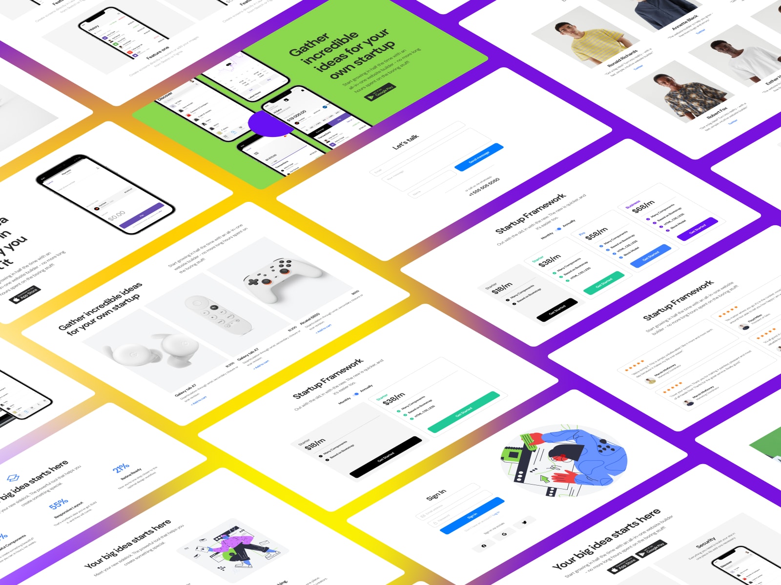
New blocks design
Now you have 156 brand-new blocks designed from scratch.
Dark & Light blocks
Each block is available in light and dark versions - choose the most suitable one for your purposes.
Autosave
You'll never lost your changes with new Autosave feature.
Device preview
Check how your page looks on different screen sizes.
Static.app integration
Publish and host your website in one click.
Duplicate blocks
Duplicate your customized block and continue to change it's copy.
Move elements between blocks
Move elements from one block into another.
Custom code for the whole page
Add your own CSS, JS code, Facebook pixels, Google analytics codes, etc.
Linking website pages
Link your website pages without thinking about their names.
RTL support
We plan to add Right-to-left language support for our customers in the near future.
Custom code element
Add any custom code (HTML, CSS, JS) to any part of your page.
Auto-backup website pages
We’ll save the latest 50 versions of your website. You could revert back the website version at any time.
Basic SEO optimization
Change meta tags, favicon, open graph, body classes directly in our app.
Ready to Get Started?
Free
$0- No credit card needed
- Limited amount of features
- Support
Business
- 20 Exports per month
- Full access to all features
- Priority support
Agency
Choose this plan!
- Unlimited exports
- Full access to all features
- Priority support
- SSO login
These world-class design teams already use Startup

People talk

Bahadir Balban
Founder at Tech Buzz
The Startup drag & drop builder by Designmodo provided flexibility on mixing components. The template variety also helped create unique pages.

Jacob Jacquet
CEO at Rezi
Using Startup Bootstrap website builder was one of the key decision that contributed to Rezi’s early success. The value is unmatched for young startups.

Mark McGrotty
Design Lead at Deloitte Digital
Used Startup theme generator for the core components and responsive layout. Very intuitive (if familiar with Bootstrap) and good documentation to follow.

Gleb Kuznetsov
Designer at Milkside
Startup has the best interface for bootstrapping product websites and services.

Abdo Mallah
Entrepreneur and investor, CEO at Sowlutions
Designmodo provides easy drag and drop Bootstrap website builder that are trendy. Startup tool is a good tool if you do not want to spend a lot of time coding your own website from scratch.

Bryan Smith
Web Developer at Pixelsum
We created our second company in the last three years; this newest venture wouldn’t have been possible without Startup app — end of the story. We are able to go from wireframe to finished product 3x faster. The last one was entirely finished on mobile: Startup export > Working copy > Textastic. It’s mind-blowing. Five stars aren’t enough for all you do.