Product Design Process & Documentation Essentials (Part 1)
From the zipper to apps like Dropbox for iOS, every product gets put to paper (or onto the screen) before they come to life. The design stage is a right of passage for all products — they’re either desirable or they just don’t make the cut.
Source: Product Design
The definition of product design is pretty simplistic — but today’s world requires endless considerations to produce a perfect product. Is it helpful? Easy to use? Does it create a sense of familiarity after the first use? Product designers have a serious responsibility since customers have problems and the product needs to give them a sense of ease and well being. The product is just a vehicle for delivering an unforgettable experience.
While it might feel like the process is littered with crumpled paper and even a broken screen or two, you can rest assured knowing there is a method to the madness. In this piece, we’ll explain the different forms of documentation you can use as your idea grows into a design that’s informed by user research. Read on to learn about conceptual sketching and wireframing, low and high fidelity prototypes, and product design specification.
Iterated Sketching & Wireframing
Sketches are likely the most prevalent documentation you’ll create during the UX design process. As discussed in detail in Guide to UX Design & Process Documentation, a general workflow is sketch mockups followed by usability testing (whether it’s internal or involving carefully picked testers) followed by plenty of iteration.
With Postcards Email Builder you can create and edit email templates online without any coding skills! Includes more than 100 components to help you create custom emails templates faster than ever before.
Free Email BuilderFree Email TemplatesRegardless of the tool you use to create your sketches, it’s important to keep user personas in mind. As you create your sketches, remember to reference the personas you created during the Analysis phase to keep users at the top of your mind. Below, we’ll look at both rough sketching and wireframing.
1. Rough Sketching
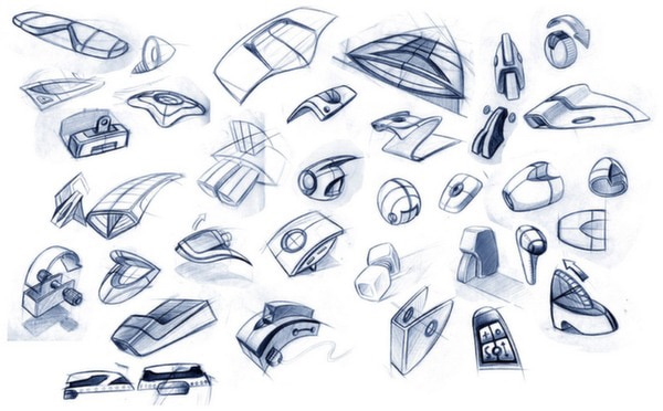
You can create rough sketches with anything that makes pigment on a surface. Pens, pencils, markers, crayons, Paper App, and even the classic Microsoft Paint all work.
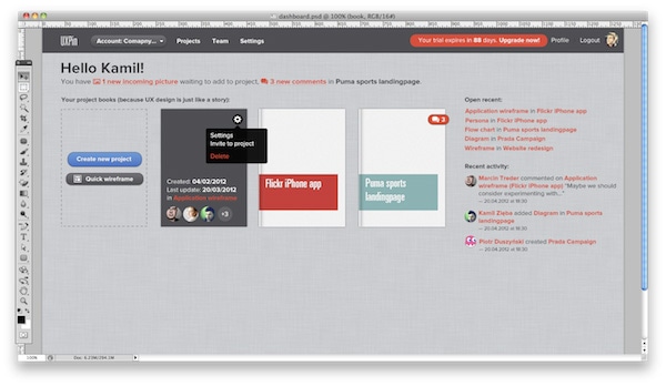
Source: The Guide to Wireframing by UXPin
Laura Busche, design writer at Smashing Magazine, specifies that sketching by hand has distinct benefits for extending memory, aiding concentration, and improving flexibility. Drawing by hand is also the fastest way to visualize a concept so it should always serve as your backup method.
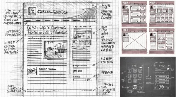
Product design firm ZURB relies heavily on paper sketching to present the function and flow of products. They prefer using sharpies compared to paper because it limits the amount of detail and focuses the sketch on just the broad points. For them, paper sketching is all about communicating a process or interaction — not getting feedback on body copy or iconography. While paper sketching is fast, focused, and flexible, it’s ultimately not very scalable or interactive since you can’t use any templates and there’s no way to link sketches together.
2. Wireframing
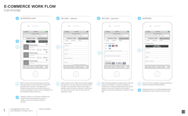
Digital wireframing software abounds, but there’s really only a few serious apps worth checking out such as UXPin, Balsamiq, Axure, and Proto.io. If you’re going the paper route, you can sketch a wireframe by dividing up sections of the page and adding grid lines and boxes where appropriate. Wireframing should act as the backbone of the product. For tips and exercises, check out the Guide to Wireframing.
With Startup App and Slides App you can build unlimited websites using the online website editor which includes ready-made designed and coded elements, templates and themes.
Try Startup App Try Slides AppOther ProductsSource: A Practical Look At Using Wireframes
Anthony Tseng, Editor-in-Chief of UX Movement, thinks you can also go high fidelity if the goal is better reflecting the actual form and function to persuade stakeholders. While they may take more time and are less ideal for quick feedback, high fidelity wireframes are clear representations of the interface and therefore leave no questions to stakeholders and users about what’s a form field or button.
Detailed Mockups
Depending on your process, detailed mockups can either be the highest fidelity wireframes or the next iteration of concept mockups.
Source: Wireframes vs. Prototypes vs. Mockups
Some companies will skip wireframing altogether and create a lower fidelity concept mockup before increasing fidelity to a detailed mockup. Other companies may follower a more evolutionary path which uses wireframes as the skeletons for mockups. While you might hear the terms “wireframing” and “mockups” used interchangeably, they really are two different types of documents. The wireframes lay out the structure and then texture and fidelity is injected to turn it into a mockup which acts as a model of the app or website.
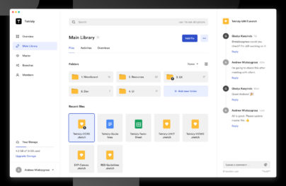
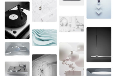
According to UXPin CEO Marcin Treder, a detailed mockup is oftentimes a design draft or can be the actual visual design. Almost photorealistic, a well-created detailed mockup encourages people to actually review the visual side of the project. Wireframes might contain shapes, lines, and possibly some detail (if it’s high fidelity), but a detailed mockup always shows specific fonts, color choices, and the overall final appearance.
Nick Pettit, designer at Treehouse, reiterates that detailed mockups are helpful as a means of design communication but shouldn’t be treated as a “tossover” to development. He explains that the process of spending hours on a detailed mockup as a spec sheet for developers is no longer relevant given the rise of responsive design and Agile methodologies. Furthermore, lower fidelity wireframes can be friendlier for iterating since they require less effort while prototyping can be an easier way to bridge the functional gap.
Prototyping Principles
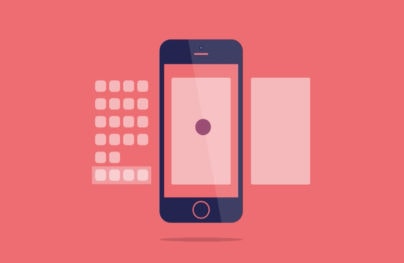
If wireframes are about structure, then prototypes are about experience. Wireframes or mockups can be linked together using an app like Invision or UXPin to create a clickable prototype.
Source: Design Better Faster With Rapid Prototyping
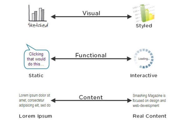
As you can see above, there are multiple dimensions for fidelity and workflow. Josh Porter, former Director of UX at HubSpot, believes in a leaner workflow where you jump straight from sketching to prototyping (and skipping wireframing altogether). For him, sketches require less time but can answer the same functional questions like “What objects go on the page, and what can we do to them?” while more effort can be dedicated to building out a prototype. This doesn’t mean that wireframes and mockups are dead — instead, it just means that more time can be reallocated from developing static assets towards interactive assets.
The real strength of prototyping is its ability to get teams to think less about deliverables and more about practicality. As discussed in the Guide to Minimum Viable Products, some successful companies even released prototypes as their first product.
Low Fidelity Prototypes
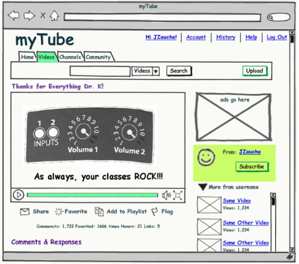
When people talk about rapid prototyping and Lean UX, they’re usually referring to low fidelity prototypes. Low fidelity prototypes are great for avoiding tunnel vision by focusing on the refinement of interaction rather than the details of visual or technical implementation. They can be created using online apps (Balsamiq, Invision, or UXPin to name a few) or coded in HTML the old fashioned way.
Source: Low Down on Low Fidelity
Notable entrepreneur Andrew Chen believes that low-fidelity prototyping is one of the best ways to incorporate customer-driven design. Because you want your product to be the right one (regardless of iterations), low fidelity prototypes created in an online app may be uglier but can help you iterate quicker versus a coded or high fidelity prototype. He’s described 4 particular benefits, which we’ve summarized below:
- Better and more honest feedback — People may focus on the visuals of a picture-perfect prototype rather than the value proposition. They may also feel hesitant to build on your idea since it is beyond their capability to duplicate.
- Great for A/B testing — A/B testing thrives off variety at the UI layer where small changes can be tried and optimized. Therefore, 10-20 rough variations in UI can provide more insights than 2-3 pixel-perfect ones.
- Cheaper to make mistakes — Pivoting with a low-fidelity prototype is easier since less resources are involved and the team isn’t as defensive to change.
- Focuses on flow instead of pages — One of the most important decisions isn’t what a page looks like, but what happens before and after. Low fidelity prototypes let you draw and link up lots of small pages, play with interaction, and do other things that feel natural when the environment is more sandbox-like.
If you’re going low fidelity, a good rule of thumb is to focus on 20% of the functionality that will be used 80% of the time.
Define, Design and Refine
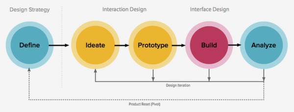
As we’ve shown, product design is defined by multiple tactics that all help to turn your idea into an experience. Whether you go low fidelity or high fidelity, the ultimate goal of sketching, wireframing, and prototyping is delivering great product concepts — not deliverables.
Read the Part 2 of this article.
