Creating a Responsive Menu in WordPress for Mobile Devices
In a responsive theme you will want some parts of your website to look the same whether you see it on a large screen device like a laptop or smaller device like mobile phones or tablets. But some parts of your website should behave and feel very different based on screen size as users interact differently.
The top or the side menu is one such element where you should strictly consider a providing a different experience on different devices of different sizes. In case you have large menus for your normal desktop size it will surely give a very bad feeling on a mobile device and also might end up to the user to do unnecessary scroll. In this article we are going to see that how we can provide a different responsive menu in WordPress using the WordPress APIs and media queries.
Screen real-estate is much different on mobile devices than on the laptop. You might want to use each and every piece of that real estate to show the most important things to the user. These constraints are a little lighter when the user is viewing your site on a larger screen. You have a chance of getting more things in. It’s practically mandatory to not have the same long menus, which you would have for your site with larger displays. It makes sense to have two separate menus for devices of larger and smaller screen size. You might want to have the menu items in a different order on mobile screens as mobile users use your site differently than users on the desktop.
You should check the behavior of users in the analytics tool you are using and try to reorder the items in the menu for mobile users.You might also have some pages of the site made custom only for mobile devices (may be with smaller images etc.). Hence, you might want to link to these mobile specific pages in your sites navigation menu when a user is watching the site on a mobile.
Your WordPress theme should render different menus for the different types of devices you plan to support.
With Postcards Email Builder you can create and edit email templates online without any coding skills! Includes more than 100 components to help you create custom emails templates faster than ever before.
Free Email BuilderFree Email TemplatesCreating a Child Theme
To try out having a different menu for your WordPress theme we are first going to create a child theme of twentytwelve. To create a child theme of twentytwelve create a folder wp-content\themes\twentytwelvechild and in that add a style.css with the following text:
/*
Theme Name:     Twenty twelve child different responsive menu
Theme URI:
Description:    Child to responsive menu in WordPress
Author:         Abbas S for Designmodo
Template:       twentytwelve
Version:        1.0
*/
@import url("../twentytwelve/style.css");
In the above code you have just specified the meta data for you theme like its name version etc. The template field specifies that is is the child theme and the parent theme is twentytwelve. Then we just import the twentytwelve style.css in this style.css so that we get all the styles of the parent theme. If you are new to creating child themes of WordPress please refer to this link for more details.
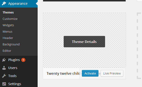
Once you have added the style.css you will see the child theme in your admin section as seen below. You can activate it.
Once you have created a child theme , now lets start adding a separate menu which will be used for mobile sites.The first thing is to create a file called functions.php with the following code:
<?php
function twentytwelvechild_setup() {
	register_nav_menu( 'primary-mobile', __( 'Primary Mobile Menu', 'twentytwelvechild' ) );
}
add_action( 'after_setup_theme', 'twentytwelvechild_setup' );
In the above code we hook into the action after_setup_theme of WordPress and call a function twentytwelvechild_setup. The action hook after_setup_theme is called after each page load after the theme has been initialized. You can read more details about after_setup_theme. In the function twentytwelvechild_setup we register a new custom menu called “primary-mobile” using the WordPress function register_nav_menu. Once you have done this you will be able to see the custom menu in the admin section.
As this is the main header menu, you will have to add code to display particular menu in your header.php. Create an exact copy of the header.php from your base theme (in this case it is twentytwelve) and add the following line to display the primary-mobile menu.
With Startup App and Slides App you can build unlimited websites using the online website editor which includes ready-made designed and coded elements, templates and themes.
Try Startup App Try Slides AppOther Products<?php wp_nav_menu( array( 'theme_location' => 'primary-mobile', 'menu_class' => 'nav-menu-mobile' ) ); ?>
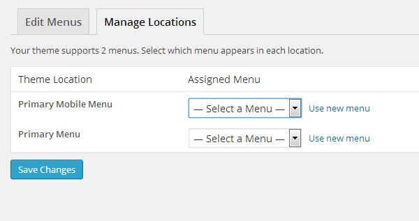
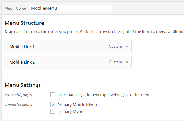
Now go to your menu admin and create a new mobile menu and add specific links you want to show on the mobile menu and attach it to the primary mobile menu theme location.
If everything has gone right now you should see both the menus on your site – the primary menu and the primary mobile menu.
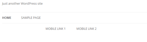
We don’t want both the menus to show up. We want the mobile menu to show up only on mobile devices and the normal menu to show up on larger screens. We will achieve this using the css media queries. The first thing is to not show up the mobile menu by default. Add the following code to your style.css:
.nav-menu-mobile {
		display: none;
}
Now when the site is seen on mobile screens we want to hide the main menu and show up the primary-mobile menu. We might also want some additional styles like a border etc. to highlight the menu item on mobile devices. To do that, add the following code to your style.css:
/* Mobiles in Potrait mode */
@media only screen
and (max-width : 320px) {
	.nav-menu-mobile {
		display: block;

	}

	.nav-menu-mobile a{
		border: solid;
		padding: 5px;
	}
	.nav-menu {
		display:none;
	}

}

/* Mobiles in landscape mode */
@media only screen
and (min-width : 321px)
and (max-width : 480px) {

	.nav-menu-mobile {
		display: block;

	}

	.nav-menu-mobile a{
		border: solid;
		padding: 5px;
	}
	.nav-menu {
		display:none;
	}

}
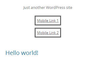
In the above code we have displayed the mobile menu when the screen sizes are small and hidden the main menu. The media query tags kick in only when the size of the screen matches the one we specified. You can add any further styling you want on your menu. Now if you see you site on a smaller screen you should be able to see only the mobile menu as shown below. You have now added a responsive menu for your WordPress site.
Conclusion
Top and side menus are important elements of your site. Your mobile users should not feel frustrated when navigating them. Menus should be easily accessible and should have the appropriate content, even from mobile users’ points of view.
In this article you saw how we can achieve a different responsive menu for the mobile users using media queries and some WordPress API. Once such a menu is created the admin can easily update the menu from the admin section. You can easily change pages or the order of the menu items without actually affecting the menu which will be displayed on the larger screen. Have fun developing you next responsive WordPress menu!


 siter.io
 pulsetic.com
 static.app
 mailpost.io