Retro is Reborn: A Look at the Color Trend
What’s old is new again.
That’s the way most trends seem to work anyway. Retro color palettes are a great example of how an old look is being reborn in web design.
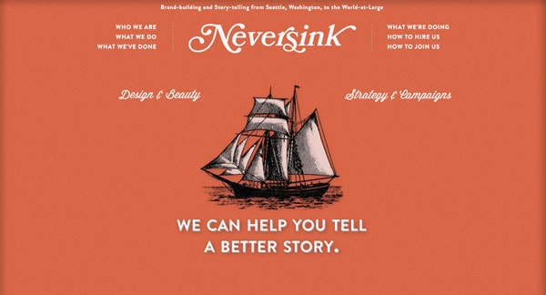
Retro color styles are popping up in a variety of uses but commonly we are seeing more mod, flat, art deco-style colors being used in projects. From oranges to yellowish-browns to off-white to blues, retro color is definitely making a comeback.
The Retro Color Trend
With Postcards Email Builder you can create and edit email templates online without any coding skills! Includes more than 100 components to help you create custom emails templates faster than ever before.
Free Email BuilderFree Email Templates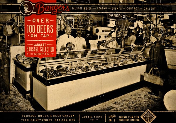
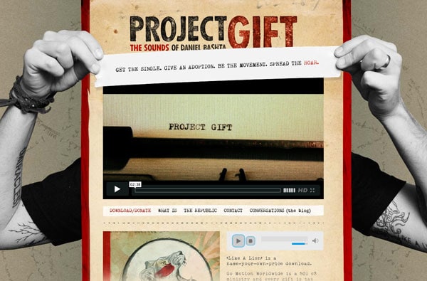
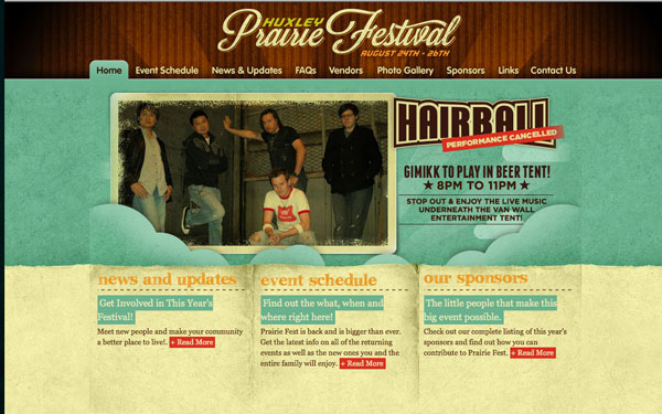
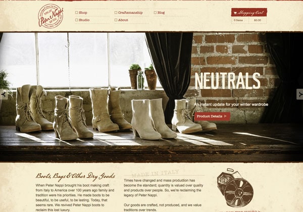
Retro colors are those that are often less saturated and have a more flat feel than other hues. Retro colors schemes are often used to create an old or vintage feel and have come back into fashion partially due to the popularity of photo filters in mobile phone apps such as Instagram.
Retro can be popular because the design style, easily creates a feel and sense of era. Most commonly feelings of yesteryear or age are associated with retro themes. The color scheme is also another way to really make your design stand out from many of the others out there. By using less saturated colors, you may be able to select a stronger hue as the primary color for your project.
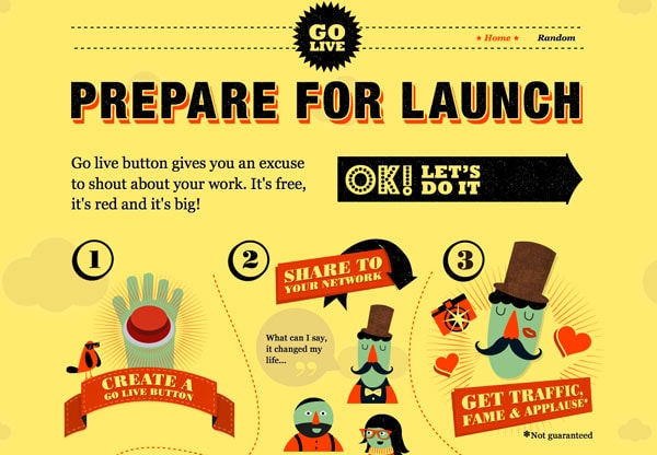
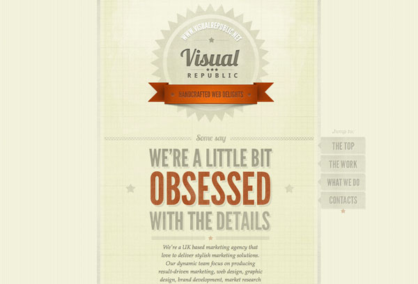
The retro trend is also complemented by other distinct characteristics, such as the use of circles and starbursts (or other geometric shapes), textures and curved or dramatic lettering.
Characteristics of Retro Schemes
With Pulsetic you’ll be instantly notified the moment your website, API, or server becomes unavailable. Monitor uptime from multiple global locations and respond to incidents before your users are affected.
Create beautiful status pages in minutes to keep customers informed during outages and build trust with transparent communication.
Start Monitoring for FreeThe first thing you notice about a retro color scheme is the lack of bright color. Hues are muted – often dramatically but not to the level of pastels – to create a distinct look.
A retro palette is not though a collection of tints for your project. Creating retro color styles often requires a purposeful manipulation of colors to achieve a desired effect. The retro color effect can be applied to simple color swatches, textures and images.
Using and implementing a retro color scheme into a project is about more than just color choice. It is also about number of colors. True retro design schemes only use a few colors – two is common – to imitate the printing capabilities of the time they aim to replicate. It was uncommon to use full color printing in the time frame from which many of these styles showcase because of both printing and monetary constraints.
Not only are colors often paired in retro schemes they are also often from opposite sides of the color wheel. This creates an extra element of contrast that was common in the era – from the 1950s to 70s – when these design styles were first popular.
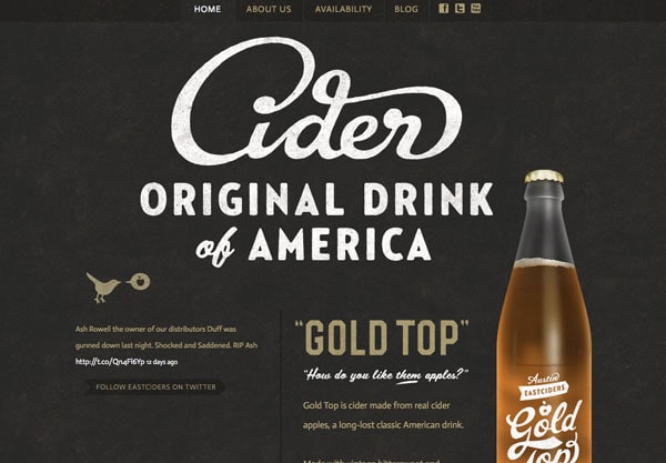
Retro Fonts and Textures
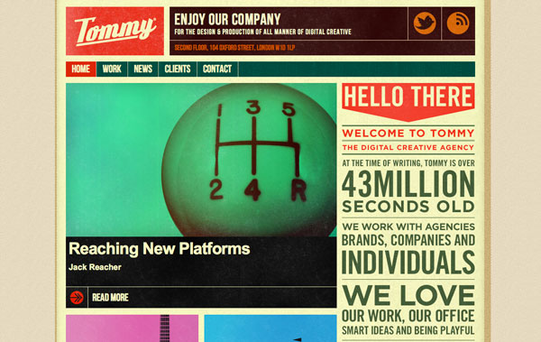
Typography is almost as important as color when choosing and working with a retro theme. You retro color palette will not have as much impact when paired with the wrong style of lettering.
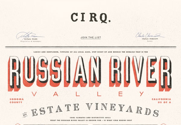
Retro color palettes tend to work best with period lettering (typefaces that also have an “old” feel to them) or with type styles that features plenty of curves. While these two type styles vary dramatically they create a similar effect in the end to create a style that has correct feel.
Play up more mod style typefaces when using colors from the primary locations on the color wheel (reds, yellows and blues). You may also try them when working with other brighter selections such as orange or purple.
Opt for more curved or angled typefaces when using the most muted hues, such as browns, greens or grays.
Remember that texture is important as well. The texture style and typeface style should match. Try to avoid combinations that clash or leave you feeling restless when you look at the overall design. Consider using a texture overlay for color that bleeds into the type as well for a more unified presence.
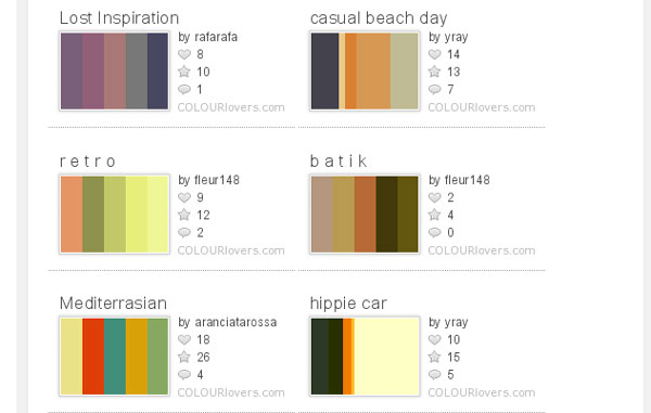
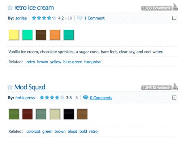
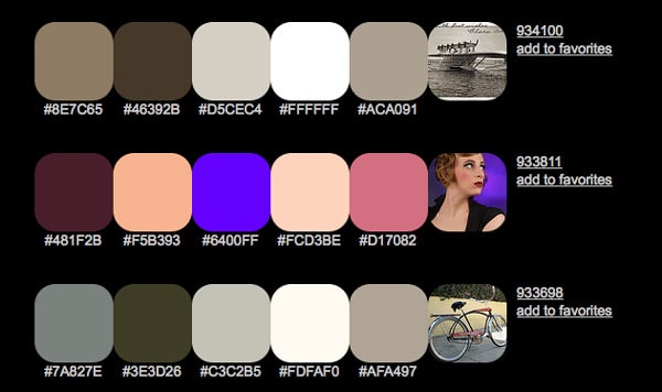
Retro Color Inspiration
Not sure where to start with a retro color palette? There are some great preplanned colors available for you. Check them out and get inspired.
Colour Lovers 130 Retro Color Palettes
Color Schemer, tagged retro
Color Hunter Retro Color Palettes
Photoshop Your Way to the Retro Look
There are a few quick and common ways to create your own custom retro color using Adobe Photoshop. You can apply these color adjustments to simple swatches, textures or images to create or complement a retro color palette.
Using Hue and Saturation Adjustment: Open the Hue/Saturation menu by clicking Image > Adjustments > Hue/Saturation (Ctrl + U) and slide the Saturation bar (in the middle) to the left to lessen saturation. This will decrease the saturation levels for an entire image. You can also adjust the saturation by adding an adjustment layer (recommended) by clicking Layer > New Adjustment Layer > Hue/Saturation and following the same steps after you create the layer and name it.
Use the Color Picker to Choose a Less Saturated Color: To select a desaturated color from the start, open the color panel (click on the foreground color in the toolbar box). Select a color that you like and move your cursor directly left. The more left on the spectrum, the less saturated the color.
Make Color Adjustments to Images: Using the Curves panel, you can adjust the vibrancy of a photo to desaturate or adjust color to complement your retro scheme. Open the Curves panel by selecting Layer > New Adjustment Layer > Curves. Select the red channel and adjust it so that it has an S shape. Then select the green channel (midtones) and create an arc. Then adjust the blue channel to create an almost flat backward S.The create a new fill layer and using a 20 percent tint, fill with a solid color, using the soft light blending mode – consider sticking to red, yellow or orange to maintain your retro feel.
Conclusion
Using retro color schemes and design techniques can be a fun and interesting way to approach a design project. Experiment with a variety of colors that lack complete brightness and saturation to create the most authentic look. And remember to match textures and typefaces to the overall feel of the color palette you create.
The style of days past should be simple and direct. Keep that in mind when making color choices.