Blue Websites Examples: Using a Favorite Color in Web Design
We all dream in color. Every design concept and sketch comes with some sort of color association. But what do those colors mean? What associations are we making just with that choice alone?
Blue is a color favorite among many people. The color, which is seen in the skies and oceans, is a constant and tends to have associations with nature. Use blue as a design element to represent feelings of calm, security, power and faith or conversely for sadness, cold and ambiguity.
Here we take a look at blue – meanings, color pairings and sites that are doing it well.
Shades of Blue
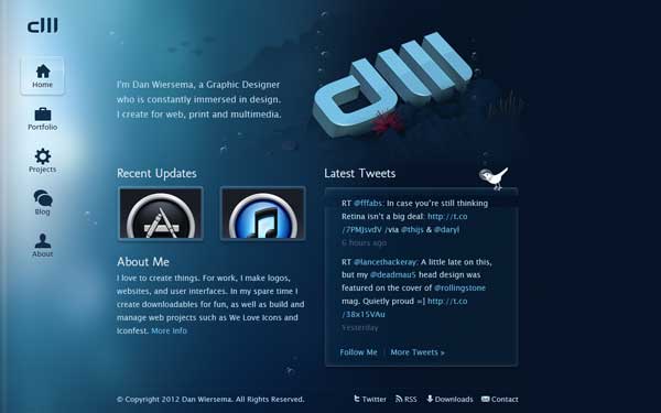
Dan Wiersema
Wunderkit

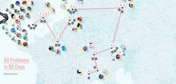
Solve 50 problems in 50 days
With Postcards Email Builder you can create and edit email templates online without any coding skills! Includes more than 100 components to help you create custom emails templates faster than ever before.
Free Email BuilderFree Email TemplatesBlue is an interesting color because it can have many, and quite wide-ranging meanings.
As a positive, it is seen as a constant and relates to nature, faith and serenity. These associations can range throughout the scale of different shades of blue and tend to correlate with other design elements such as images or text. As a negative, blue can represent coldness, depression and even instability.
Blue is a common design tool, used in many websites as a background or primary color. It is appealing to men and women and in some situations, almost considered a neutral color in design because of its popularity among both sexes. There is almost no shade of blue that people find commonly offensive or with only negative connotations. Blue is also considered a corporate color and is often used in the logos of large financial institutions, laws firms and hospitals.
The color can also impact a person physically as well as emotionally. Blue is said to calm and sedate (among the reasons why it is a popular color to paint a bedroom), it cools the body and assists a person’s intuition.
Use blue in design when you wish to create a sense of calm or relaxation and as a counterpart to chaos, as a tool to encourage communication or learning and to encourage further thought or emotional associations with peach and solitude.
Light blue: Lighter blues are seen as being closest to nature – think of sky blue or water. Lighter, paler shades have the coolest associations but can also be linked to peacefulness and even the Spring season.
Dark blue: Some of the darkest shades, such as navy, can be considered neutral and carry many of the same properties as black. These hues are associated with power, importance, authority, unity and intelligence.
Light and dark combinations: By using a pairing of light and dark blues, you create a feeling of trust and honesty. (This is the No. 1 color combination used by banks.)
With Pulsetic you’ll be instantly notified the moment your website, API, or server becomes unavailable. Monitor uptime from multiple global locations and respond to incidents before your users are affected.
Create beautiful status pages in minutes to keep customers informed during outages and build trust with transparent communication.
Start Monitoring for FreeTurquoise: This bright shade is symbolic of youth and communication. The color and mineral of the same name are used to represent strength, health, protection and confidence.
Cultural Considerations

In American and Western European cultures, the meaning of blue is commonly associated with its surroundings – whether it is naturally-occurring or in something man-made such as web design. There are some instances and cultural associations where blue does though have very specific meanings.
In religion, blue has associations in Christianity as Madonna is usually clothed in blue to represent virtue and in the Jewish faith blue represents holiness. Blue is the color of the god Krishna in Hinduism.
In France, blue is the color of royalty and the aristocracy.
Color Wheel and Pairing
Neutron Creations
524concepts

Blue is one of three primary colors that make the color wheel. (The others are yellow and red). Primary colors can’t be created by mixing other colors and every other color in the rainbow is created by mixing shades of yellow, blue and red. The wheel further expands to 12 tertiary colors to create many of the most common color schemes.
You can use the color wheel to create color schemes of multiple hues that can create a sense of harmony or chaos. Create a scheme using three side-by-side colors for an analogous scheme – blue-green, blue and blue-purple. A complementary scheme pairs blue and orange (opposites on the wheel), while natural schemes can pair blue, green and yellow because each color appears in nature.
Famous Brand Associations
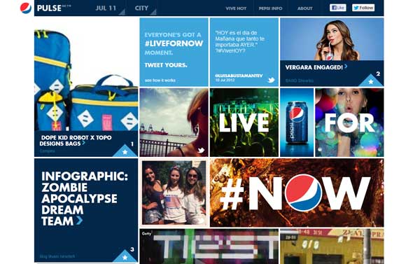
Pepsi
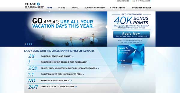
Chase Sapphire Card
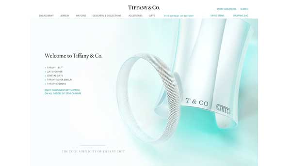
Tiffany and Co.
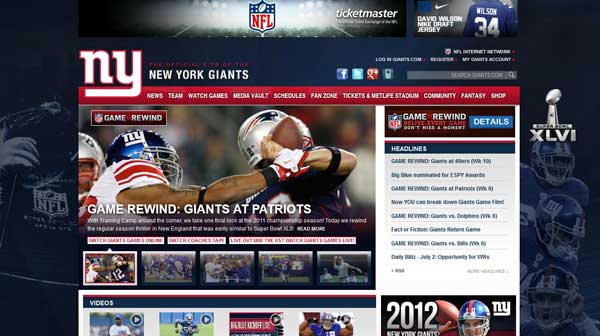
Giants
Because of its association with corporations, blue is used by many companies with a world-wide presence.
Ford, Pepsi, Tiffany & Co., and Chase are just a few of the large companies that rely on the association of blue to represent their brand. Further, the Blue Man Group is another well-known example of the color in branding. Many sports teams also use blue, including the New York Giants (nicknamed “Big Blue”), Toronto Blue Jays and Kentucky Wildcats.
Doing It Well
Blue can be found all over the web. Here are a few sites that are using blue well and in interesting ways.
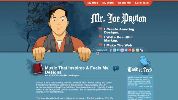
Joseph Payton
Combining blues: Combining different hues of blue is a common tool. This site does an excellent job with shading and using a blue theme.
One Pause
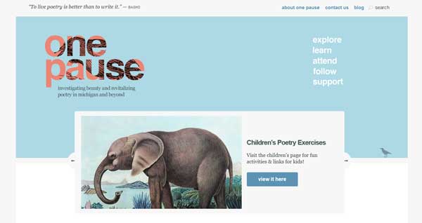
Colors of nature: The use of blue, rather than the expected green, is brilliant. The color is natural and strikes a great harmony with the image.
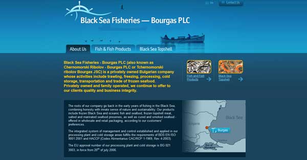
Black Sea Fisheries
Create a feel: Blue in this instance really creates a mood that corresponds with the company name, Black Sea Fisheries. The imagery is dark and deep.
Theory Design
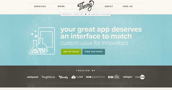
Blue as a neutral: Used with beige and brown, this blue (an aqua hue) is used as a neutral. The colors are unobtrusive and encourage users to pay attention to the words on the page.
