Using the Rule of Thirds as a Grid Outline
Designers talk about grid structures all the time.
It’s not surprising. Grids are the backbone of just about any design project.
But what about the rule of thirds – a mathematically-based grid that can be traced to design projects that are hundreds of years old? Do designers think about it?
The answer should be yes.
The rule of thirds is an important grid concept that explains how people look at images, websites and other visual information. Intentional or not, almost every person who looks at an image, “reads” it using the theory behind this grid.
What is the Rule of Thirds?


With Postcards Email Builder you can create and edit email templates online without any coding skills! Includes more than 100 components to help you create custom emails templates faster than ever before.
Free Email BuilderFree Email TemplatesThe rule of thirds is a three-frame wide by three-frame deep grid that can rest over an image and tell designers a lot about how eyes will follow the image or design. The grid helps designers (and especially photographers) understand how and where a person will look at an image.
Each of the blocks in the rule of thirds grid I the same size (nine total blocks) but those blocks can change shape and size with each project. The full grid covers the working canvas, or full frame of an image or screenshot.
The grid helps designers with a few key points that may come as somewhat of a surprise.
- The common path of the eye on a design is from top to bottom and then left to right.
- The best design is not always symmetrical. The most-viewed location on the rule of thirds grid is the intersection at the bottom corner of the top block.
- Even if you design without the rule of thirds in mind, it is still applicable.

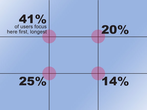
Think about how the principle applies to your design. Each user will focus on intersections from the rule of thirds grid. The No. 1 focal point is the intersection at the top left – 41 percent of eyes will rest here and look at this part of the image or screen first, making this an ideal location for a logo or other key information. The eyes then move to the intersection directly below it – 25 percent of eye stops. Then users will look to the top right intersection and finally at the bottom right intersection. It is important to note that less than 15 percent of people will focus on the bottom third of the screen; designers should be careful of what information is placed there.
Website Design
The most important application for the rule of thirds in web design is what appears above the scroll. This entryway into a webpage typically contains a few key items – logo or header, navigation and basic image or information. Place these items in key rule of thirds locations for the most impact.
Then think about how users will scroll through your page. Are there natural stopping points along the way that should be rule of thirds focused?
With Startup App and Slides App you can build unlimited websites using the online website editor which includes ready-made designed and coded elements, templates and themes.
Try Startup App Try Slides AppOther ProductsThe rule of thirds concept is most important on homepages. This is where users develop a first-impression of a website and makes decisions about whether the site is useful to them. The rule of thirds is important to a lesser degree on content pages, but still comes into play for overall aesthetic value.
The rule of thirds is commonly used to create a sense of place for news and ad-driven sites. Often, banner ads appear along the upper gridline on the top third of the screen below a horizontal header. Sidebars and sidebar ads often sit along the rightmost gridline. This common configuration is designed to drive eyes to paid advertising and also keep it somewhat separate from website content.
Photos


One of the most important uses of the rule of thirds is in photography and image cropping. The way an image is framed can help draw in eyes to a photo or allow it to be overlooked.
Photographers often take pictures with the rule of thirds in mind. A photographer will try to focus a portrait so that a person’s eyes fall along a rule of thirds gridline. (The same rule is often used by videographers.)
Using the rule of thirds for images can also imply motion with the use of open spaces and directional objects. The grid also helps create a sense of natural balance and harmony. Think about how an image falls in the grid – from where the horizon of a landscape or sky appears in an image (the top third is suggested) to how much dead space is in the image (be cautious of too much space near intersections of thirds).
Create a Rule of Thirds Grid
Creating a rule of thirds grid to use for your next project is pretty simple. Most photo editing software has a built-in template or you can sketch out a grid on paper. Here are a couple suggestions to get started.
On paper, draw what looks like a tic-tac-toe board over your image so that each of the nine blocks is the same size. Make sure to keep the aspect ratio of your design in mind when creating the sketch.
You can also figure the rule of thirds precisely by doing the math by hand. (This works for new design or existing websites.) Start with the width and depth of the screen size you want to optimize for the rule of thirds. Divide the width and height by 3. This will give you the size of each block. For example a site that is 1,024 x 768 would be divided into nine 341 x 256 blocks placed three wide by three high.

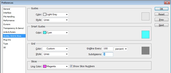
In editing software such as Adobe Photoshop, you can use the crop tool or create a custom-shaped grid. To create a custom grid, open the Preferences menu and select the Guides, Grid & Slices option. In the Grid option: Change Gridline Every to 100 percent and Subdivisions to 3. Turn the grid on (or off) so that it overlays the image using Ctrl+’ (Command+’ on a Mac). This grid is not printable; it is only an on-screen guide.

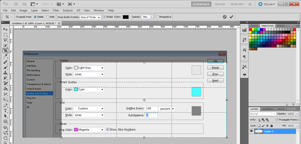
In more recent versions of Photoshop, the crop tool opens using a rule of thirds grid. Using the automatic crop settings the designer can see exactly how an image will look using the ages-old principle.


