Trending Ways to Use Color in Web Design
Color is a staple design element we see everywhere in our lives such as on every website we visit or app we use. Right now you’re seeing the colors of Designmodo. If you’re reading this article on a “read it later” kind of app you’re seeing the colors of that app. No brainer. The thing is, each year we see a lot of design trend predictions and they never fail to include color.
Over time, designers have used color more boldly and more strategically. Sometimes it is used to give a specific element more attention, sometimes to tell a better story and sometimes to enhance the brand experience.
The current landscape of color in website design is interesting to think about. Most websites look more or less the same, yet color can be a powerful tool in design.
I’m not trying to state this as anything revolutionary or as an extraordinary find. But if most websites have similar color schemes, what does that mean for color? Actually, it means a lot. Imagine a world where every website was colorful – it would possibly be very pretty and rainbow-filled but it would mean that nothing stood out. It’s like having every paragraph bolded in your essay.
Therefore, when color schemes are muted, it allows for many opportunities.
Let’s talk about some of those examples.
With Postcards Email Builder you can create and edit email templates online without any coding skills! Includes more than 100 components to help you create custom emails templates faster than ever before.
Free Email BuilderFree Email TemplatesCreate a Strong Background
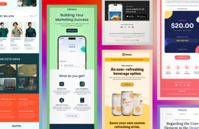
A few years back there was a tremendous trend of bold backgrounds. I still see examples like that today. In a good design, a colorful and powerful background can be a good move to give interest to a specific section. Whatever your opinion on trends may be, we can agree that when done well, a good background color can help a section stand out.
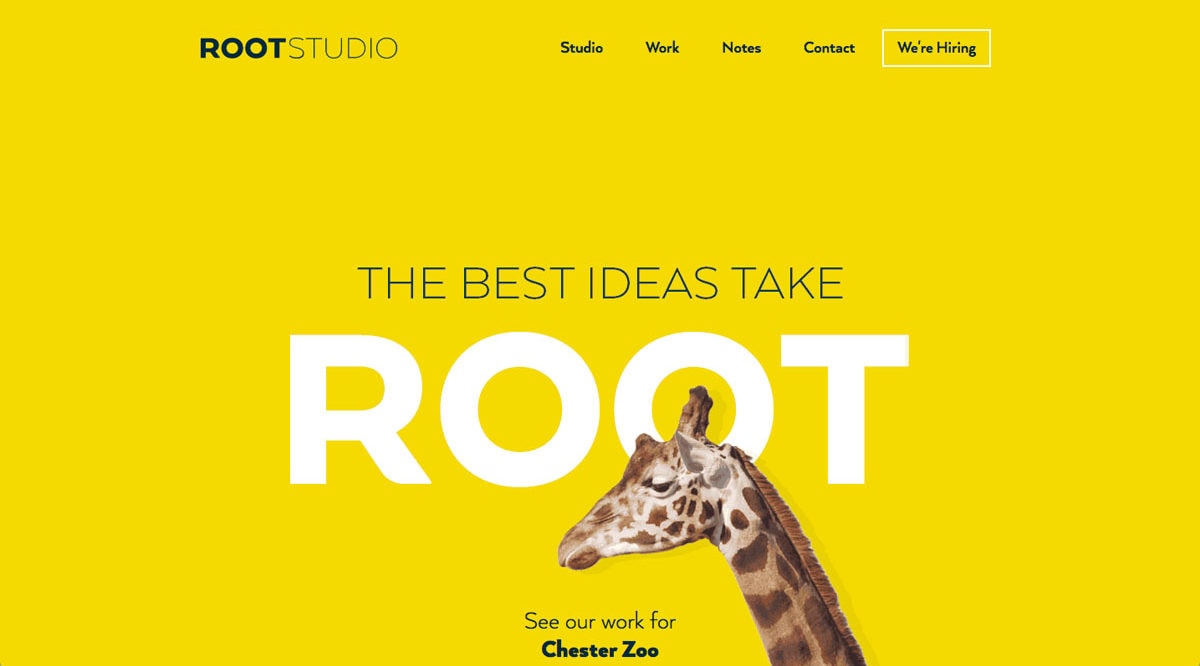
Let’s start with Root Studio and how the design uses a yellow background to highlight its case study about the Chester Zoo. The yellow background helps set the tone for the case study. In addition to the minimalist design style, the background color is an important design element. Not all of their case studies use vibrant colors like the Chester Zoo yellow and that’s okay – you don’t have to use a vibrant hue to make something stand out. This design wouldn’t work so well if the case study sections weren’t minimalistic either.
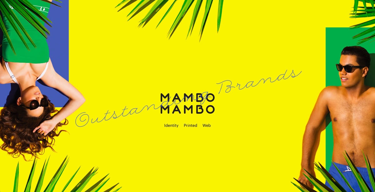
Next, is Mambo Mambo which uses color to highlight different sections of the portfolio as well. Some sections are neon yellow, deep blue and even black. In the screenshot you can see that the neon yellow is paired with greens, blues black and skin tones; they work in harmony.
In this whole page, it’s the background colors that help make these sections unique and interesting. It’s also good branding for the agency.
Make a Statement
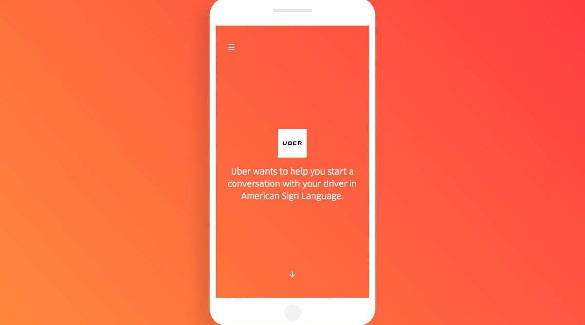
Other times, color can be used to make a bold statement. Let’s start with the Uber sign language landing page. The orange gradient background definitely catches your attention. This is a great design strategy since the purpose of the page is to teach people basic sign language which relies on visual cues.
With Pulsetic you’ll be instantly notified the moment your website, API, or server becomes unavailable. Monitor uptime from multiple global locations and respond to incidents before your users are affected.
Create beautiful status pages in minutes to keep customers informed during outages and build trust with transparent communication.
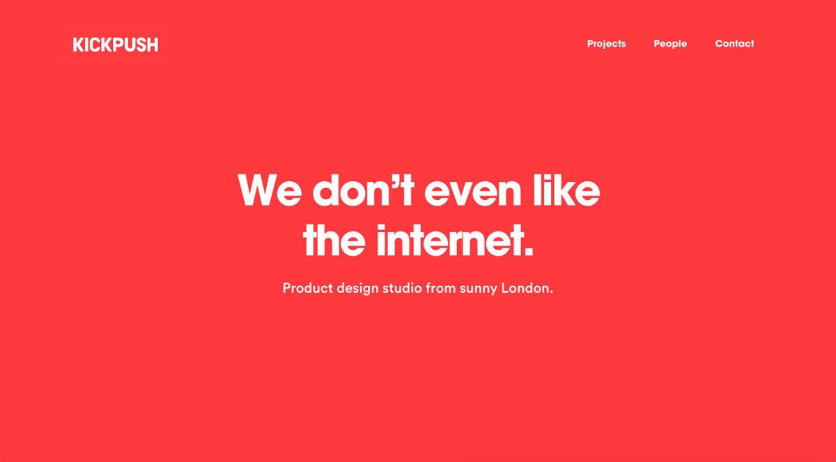
Start Monitoring for FreeNext, is Kickpush design studio portfolio. As you read the copy, notice they have a different kind of personality. Kickpush wants to show they are different and the chosen color scheme helps do this. It is purposeful and makes a quick visual statement.
This is also a good example of branding that we’ll talk about later.
Tell a Better Story
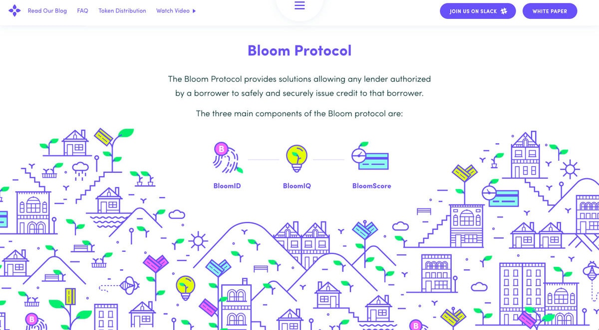
Color is a great asset in helping to tell a story. A good example of this is the home page of Bloom. They use the same almost-electric blue throughout the design. Along with other visual elements, the blue is used to help the user scroll from the header to the footer. If all the different sections had a different main color in this flow, the storytelling would be broken.
I can say the exact same thing for Adobe’s Marketing Cloud landing page. It’s a massive page with large sections. Each section has its own color scheme. Colors differ from light blue at the top to fire engine red to dark purple. It’s not just the solid UI color either; the photography goes with each color as well.
Because this is such a long page, color helps tells the story of each section.
Create Bursts of Interest and Add Personality
Sometimes color is used specifically to add a interest to a design. Large and bold colors don’t always have to be front and center in a design in order for color to be used effectively.
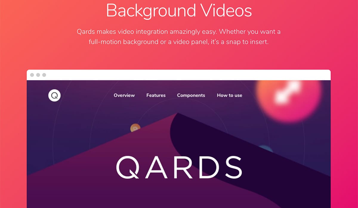
For example, Designmodo’s own Qards landing page uses all sorts of little color bursts. It makes the landing page more pleasant to look at and engage with without having the bright red background or anything else that might be considered over the top. As long as it’s strategic, using bursts of color can be a good tool.
Improve Branding for Your Product or Company
I’ve saved my favorite use of color for last. I just adore when color is critically used in branding. I don’t only mean just one hue or color set like for Kickpush or Bloom.
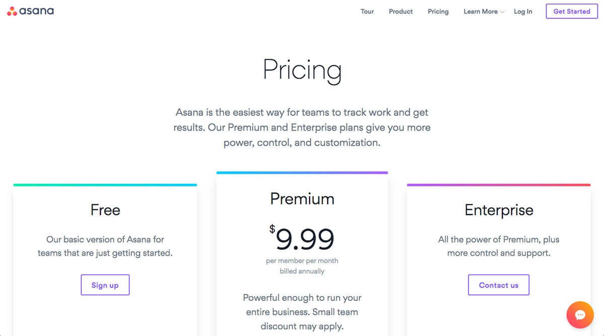
Many of us have followed Asana’s redesign, where they implemented various color gradients as part of their new identity. In some sections of the website, color is heavily used while in others not so much; it’s a balance. The colors are vibrant and different. The colors work well together, too. Now, Asana’s newest branding is vibrant and colorful. Asana is now bright pink, orange and purple. The color strategy seems to be a key in Asana’s brand positioning.
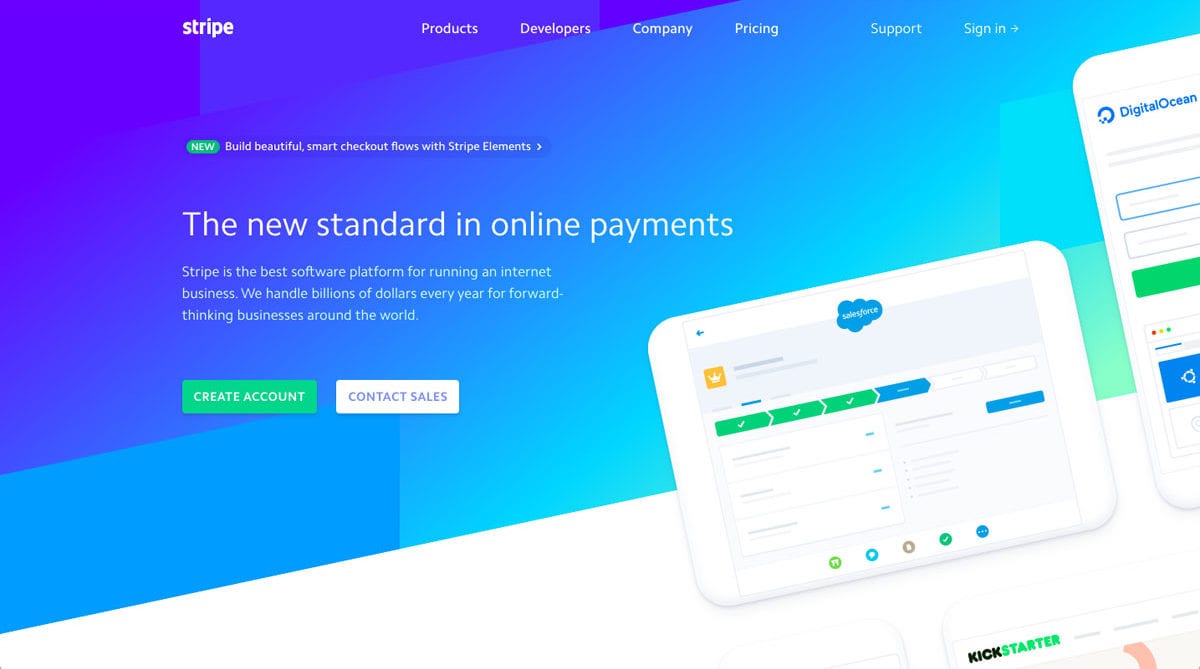
The same thing can be said for Stripe, which might be a big trendsetter in this kind of color use. They use gradients between neighboring colors like blue and green. The branding is mostly blue but the designs don’t shy from including green, pink, purple or orange. Color choices work together and make impactful branding for Stripe.
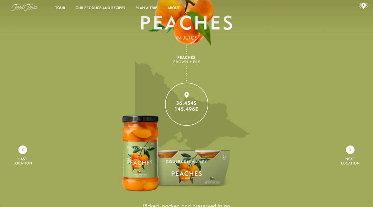
The last example is the website for Goulburn Valley. Their branding uses slightly unusual colors. Yet, the design is very good.
The landing page uses the same brand colors as in the screenshot throughout all of the photography. Green with hints of orange. It’s great to see that the colors weren’t just important for UI elements. The whole landing page flows well thanks to coordination of colors in the photographs.
Conclusion
We are seeing more strategic use of color on websites, whether it is to create better branding like Asana or make a bold statement with a bright red background to make sure people realize you’re different like Kickpush.
Above all, color helps bring about personality and, most notably, brand identity. The use of color in web design is only going to get better and stronger as designers grow even when web design trends change. As you can see color is powerful. Color can do a lot of things for a design if you let it; color can guide a user’s eye, help guide a user through a flow as well as make a grand statement. Color is full of personality and can be fun to work with. Personally, I think color, or lack thereof, gives life to a design. So have fun with it!