Create a Website Design using The Bricks UI
Difficulty: Beginner
Estimated Completion Time: 30 Mins
In this tutorial we will be creating a simple but elegant e-commerce layout of a website, it being entirely built by using The Bricks UI e-commerce user-interface set. I will teach you how to start with a blank document and end with a beautiful layout that can actually be used as a design for an e-store.
Starting Out
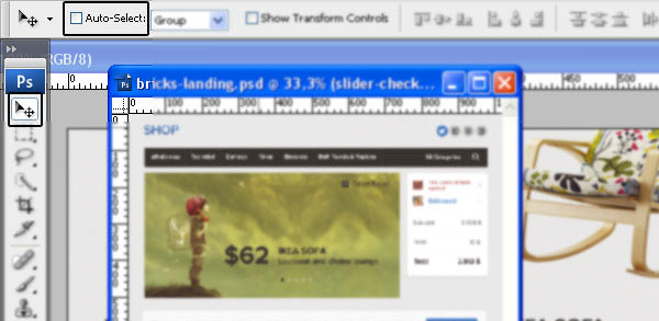
Moving Elements
As you know we will be “importing” some of the .psd files you can find in the UI set to our new document, and thanks to Photoshop and its super friendly drag-n-drop way of importing, you are basically going to select the required folder/layer and you’ll drop it to your new document. You will be using the tool showed in the screenshot above.
Copying Styling of a Layer
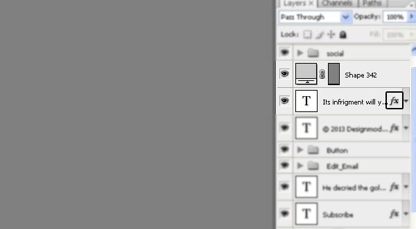
If you are pretty new to Adobe Photoshop then you might me interested in a few quick tips/tricks, and here’s a very simple but necessary one. In case you have a blank shape but you’d like to copy-paste the styling of an element instead of applying it from the beginning, then you simply have got to hold ALT and move the little (fx) icon to the respective shape.
With Postcards Email Builder you can create and edit email templates online without any coding skills! Includes more than 100 components to help you create custom emails templates faster than ever before.
Free Email BuilderFree Email TemplatesResizing Elements
If you’d like to know how to resize an element in Photoshop then you should know that no tool is used for this and a simple shortcut “CTRL/Command + T” will open up the Transform tool which will be used to actually resize/transform your layer. Be sure to only resize shapes and not apply major changes in size to image/photo elements because you’ll have a blurred image at the end.
Step 1
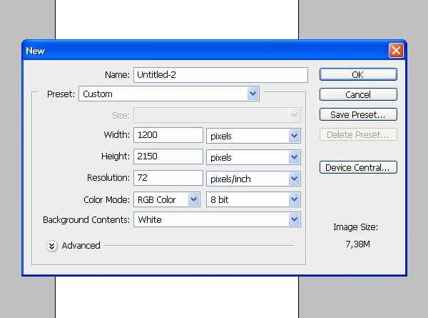
We’ll start the layout by creating a new document which is 1200 pixels in Width and 2150 in Height. The Bricks UI is built with a 960-grid in mind that’s why we will be using one for our layout as well, I’m always usign Nathan Smith’s 960 Grid Framework as I found it best for most of my projects.
Step 2
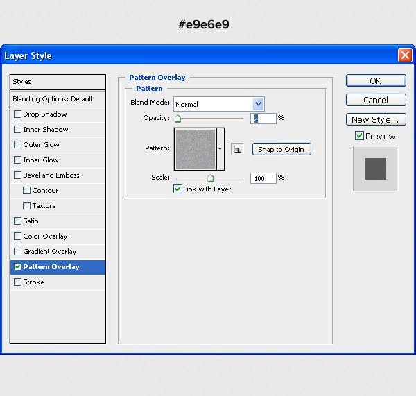
By using the Bucket Tool (G) we will give it a background color of a light grey (#E9E6E9). Apply some light noise to it, and the way I prefer of applying that noise is creating a new document, giving it a very “sharp” noise (Filter->Noise->Add Noise) and then define that document as a pattern, and apply it as shown on the image. That’s not of the best ways of doing it but it does the job, keeps our shape and it’s easy to apply.
Step 3
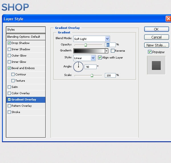
By using the Proxima Nova or any other suitable font, type in the “SHOP” words. This will be our so-called logotype. Give it a dark blue color and then apply a soft-light Gradient Overlay effect with an Opacity of 40%. I’ve also applied a 1 pixel Drop Shadow effect with the color set as white. Another optional effect would be the Bevel and Emboss one, which would make the lower base of our logotype a little bit darker.
With Startup App and Slides App you can build unlimited websites using the online website editor which includes ready-made designed and coded elements, templates and themes.
Try Startup App Try Slides AppOther ProductsStep 4
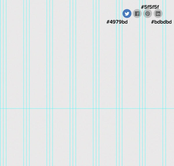
At the right top of the layout, we will place our social media icons. I’ve turned on the grid so that you can have a better idea of placing. I will create the circles by using the Ellipse Tool (U) and will use the icons from the icon set that comes along the Bricks UI set. I’ll give the hovered icon a blue color, #4979bd, the static circles a grey one (#bdbdbd) and the icons a dark-grey one – #5f5f5f.
Step 5
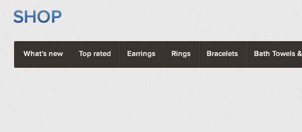
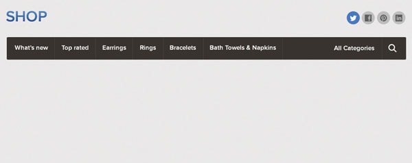
I’ll grab the menu at the top from the “E-commerce UI #1” section and will place it at the top. It will cover the entire “working” space.
Step 6
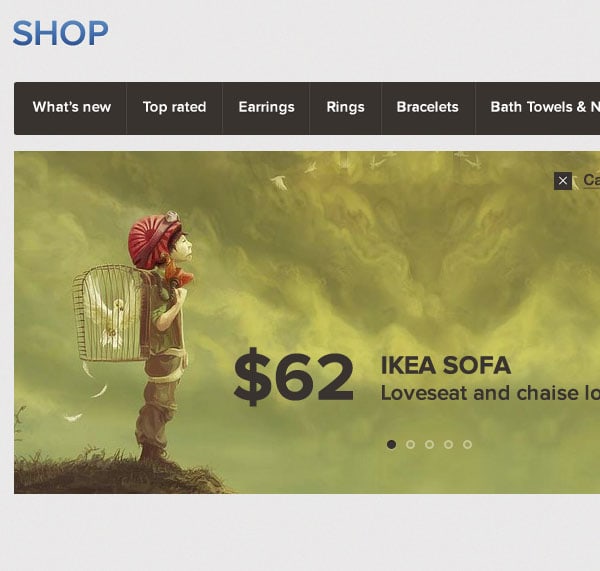
From the very same “E-commerce #1” set I’ll grab the slider and will place it under the navigation. The very best thing about the elements in the UI set is that they are already perfectly suiting our layout. The slider covers exactly ¾ of the layout.
Step 7
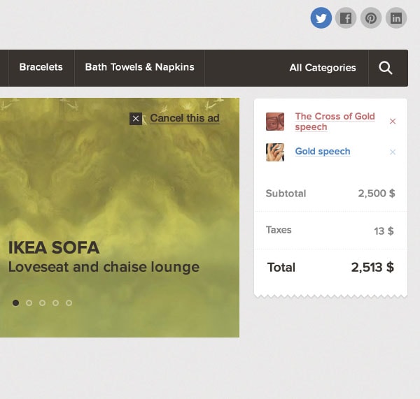
Just below the menu and at the right of slider, I’ll place a checkout form which I got from the “e-commerce #1” as well.
Step 8
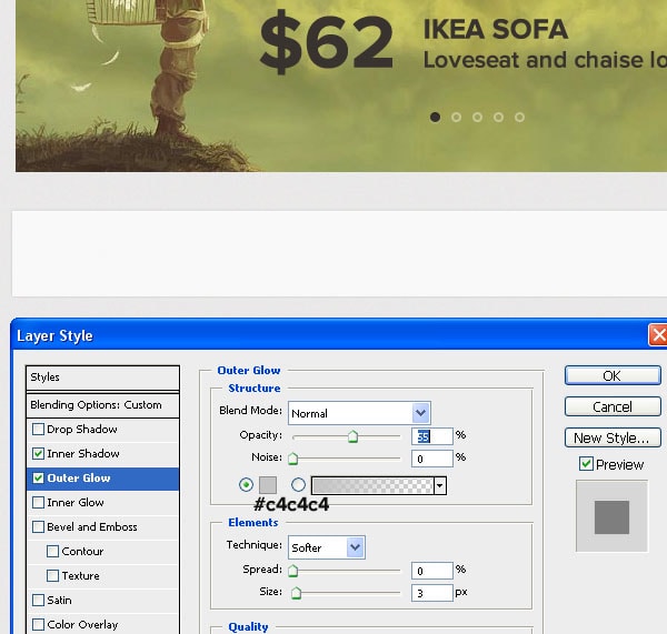
Right below the slider I will create a section that we can put some emphasis one. I’ll contain a headline and a call-to-action button which seems fine. The shape is 960 pixels in width and about 90 pixels in height. I will give it a “Fill” of 70% and will apply an “Outer Glow” effect of 3 pixels in size and the opacity set to 55%. I’ll also apply an Inner Shadow effect, of 1 pixel in size and white color.
Step 9
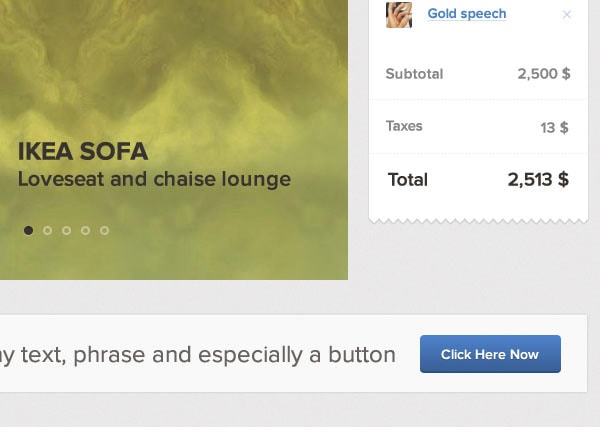
By using the very same font, Proxima Nova, I’ll input some text on the shape we have just created. Now I’ll browse through the set and will find any CTA button, and will throw that one on our current document and will position it accordingly.
Step 10
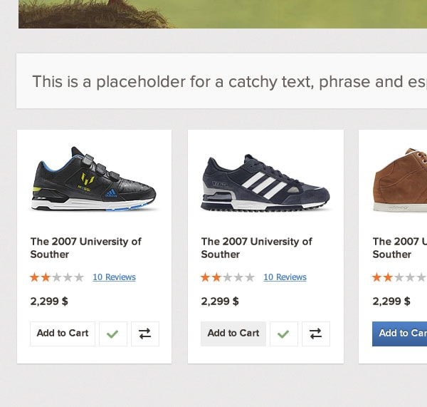
In the next steps we will be inputting a bunch of various item widgets, all of which we’ll get, again, from the “e-commerce #1” sub-set. Our first row of items will be the ones you can see on the screenshot, the well-designed widgets with sports-wear items in them.
Step 11 (Result so Far)
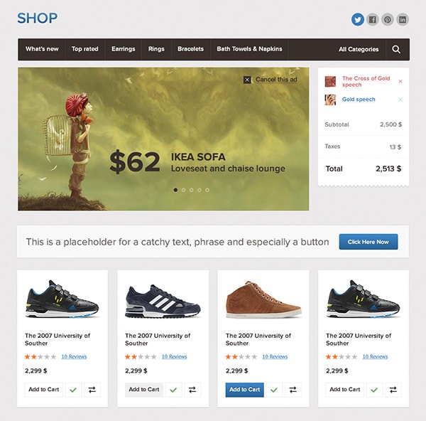
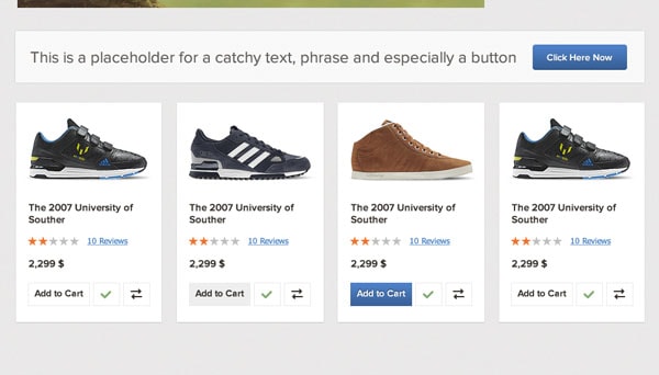
This is a better preview of the recent item blocks we have added and the cta-button section we have recently created. As you can see that our template starts to get a proper definition.
Step 12
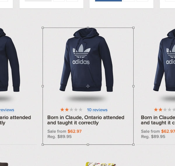
We will continue by adding another row of items. This time I went with a set of “3 hoodies” and a little bit different styling than the previous row of items. This will be our middle row of “items for sale” placed on the layout.
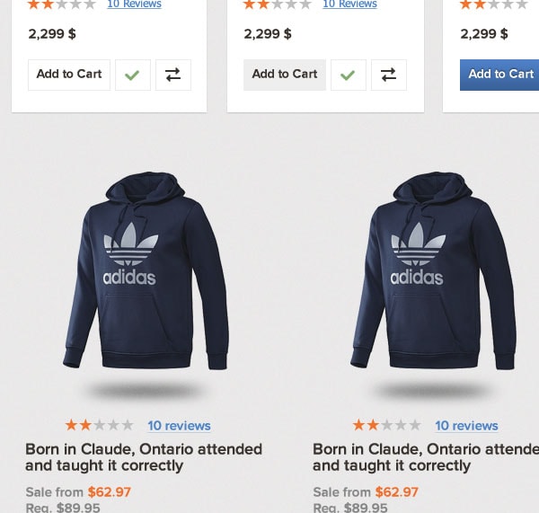
Step 13
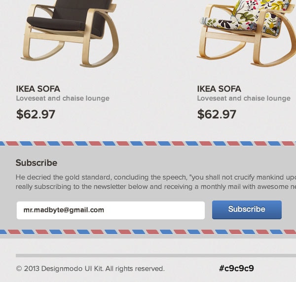
We’ll finish the items section with another row of “lounges & seats” items. If we take to compare the styling of the following widgets and the ones we’ve used before, then we can conclude that these are the most simple but that makes perfect sense and does create a pleasant diversification on the page.
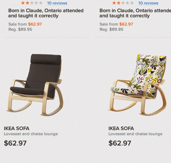
Step 14 (Result so Far)
This is the result so far we have achieved. As you can see the styling for the last row does fit very well and since it’s not drastically different than the previous row, it does fit well in the page.
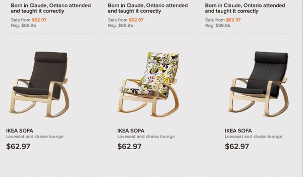
Step 15
Right before our “footer” zone we will be adding a subscribe section where users can actually leave their e-mail and receive regular newsletters. To create this section, we will rely on an already designed “newsletter” widget which I found in the FORMS-UI #2 psd. The pre-designed widget has slightly shorter “border-patterns” but it’s an easy job just to duplicate those, or simple increase them in width.
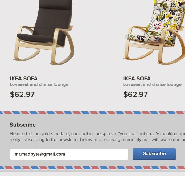
Step 16
The last step would a small footer we will creating now. It is very simple and consists of a 5-pixel line which we’ll give a light-grey color (#c9c9c9) and will place it just below the subscribe widget. By using the very same font I’ll write down a copyright line and will give it a dark grey color.
