Getting Started with Bootstrap 5 Helpers
Bootstrap is one of the most popular frameworks for building websites and applications. It enables you as a developer to use the same layout configuration across your design, with predefined classes and themes provided by the framework. With bootstrap, you can speed up your development while maintaining the coherence of the elements used.
Bootstrap includes a number of helper classes for a certain purpose. Helpers are bootstrap classes that make certain customization as quickly as possible. These classes are built to offer a single purpose and reduce CSS frequency of repeated rules. Bootstrap comes with good CSS structure and the framework was established to promote best coding practices with the concept of DRY (Don’t Repeat Yourself) and naming convention or methodology quite practically similar to BEM (Block Element Modifier) and OOCSS (Object Oriented CSS) in principle, making your CSS code more maintainable. The end goal of bootstrap is to always increase the pace of development as much as possible without completely reinventing the wheel.
In this tutorial, you will learn what the existing predefined Bootstrap 5 helper classes are and how to use them in certain situations. Bootstrap offers tons of them with the same objective. You might have already used some of them in the past unknowingly. By the end of this tutorial, you will be able to quickly handle particular component customization through built in helper classes provided by bootstrap.
Bootstrap 5 Helpers
Float & Clearfix
Bootstrap 5 contains built-in helpful classes to make an element float. By simply adding the .float-start or .float-end class in a div, you can make your elements float left (start) or right (end), accordingly. Of course, there are other responsive floats that exist that you can use for each value based on the current viewport size. Keep in mind though that both classes apply the !important modifier to avoid specificity issues.
Here are all the support classes for float:
<ul>
 	<li>.float-start</li>
 	<li>.float-end</li>
 	<li>.float-none</li>
 	<li>.float-sm-start</li>
 	<li>.float-sm-end</li>
 	<li>.float-sm-none</li>
 	<li>.float-md-start</li>
 	<li>.float-md-end</li>
 	<li>.float-md-none</li>
 	<li>.float-lg-start</li>
 	<li>.float-lg-end</li>
 	<li>.float-lg-none</li>
 	<li>.float-xl-start</li>
 	<li>.float-xl-end</li>
 	<li>.float-xl-none</li>
 	<li>.float-xxl-start</li>
 	<li>.float-xxl-end</li>
 	<li>.float-xxl-none</li>
</ul>
To fully understand what the use of a clearfix is, let’s have a basic example of floated elements.
With Postcards Email Builder you can create and edit email templates online without any coding skills! Includes more than 100 components to help you create custom emails templates faster than ever before.
Free Email BuilderFree Email Templates
<div class="wrapper">
   <div class="float-start">
      FLOATED LEFT ELEMENT
   </div>
   <div class="float-end">
      FLOATED RIGHT ELEMENT
   </div>
</div>
As you can see on the markup above, we have a <div> tag with a class .wrapper and inside it we have another two <div> tags with class .float-start and .float-end which will basically float the elements on both left (start) and right (end).
With some custom CSS added for demonstration, the result in the browser should look like this:

As you can see, without the clearfix the wrapping <div> tag would not span around the two <div> tags which would cause a broken layout.
Using the same markup above, let’s try to add a .clearfix class inside our .wrapper <div> tag:
<div class="wrapper clearfix">
   <div class="float-start">
      FLOATED LEFT ELEMENT
   </div>
   <div class="float-end">
      FLOATED RIGHT ELEMENT
   </div>
</div>
With .clearfix class added, the result in the browser should look like this:

Clearfix is a way to easily clear the floating of an element related to its child element within a container and without any additional markup. The Bootstrap 5 columns are all floated left, and the parent row has a clearfix. This allows every column to appear right next to each other, and the row does not overlap with other rows.
Colored Links
Hyperlinks or links are one of the essential components of the web. It allows you to click/tap a link and navigate from one web page to another which is a definite way to implement reference mechanisms from one source to another related source.
Bootstrap 5 offers a way to style links using its colored links helper classes through its extensive default theme colors that theme its styles and components without worrying about adding extra CSS or making use of pseudo-classes to style link states.
With Pulsetic you’ll be instantly notified the moment your website, API, or server becomes unavailable. Monitor uptime from multiple global locations and respond to incidents before your users are affected.
Create beautiful status pages in minutes to keep customers informed during outages and build trust with transparent communication.
Start Monitoring for FreeIn order to take advantage on colored links feature, you need to remember this class syntax .link-*. The “*” represents the supported theme colors utilized in various states or situations (e.g primary, secondary etc.). Compared with .text-* classes, colored links helper classes have a :hover and :focus state.
The following are list of supported colored links classes:
<ul>
 	<li>.link-primary</li>
 	<li>.link-secondary</li>
 	<li>.link-success</li>
 	<li>.link-danger</li>
 	<li>.link-warning</li>
 	<li>.link-info</li>
 	<li>.link-light</li>
 	<li>.link-dark</li>
</ul>
Let’s see how all these classes’ works. Check out the markup below.
<a href="#" class="link-primary">Primary link</a>
<a href="#" class="link-secondary">Secondary link</a>
<a href="#" class="link-success">Success link</a>
<a href="#" class="link-danger">Danger link</a>
<a href="#" class="link-warning">Warning link</a>
<a href="#" class="link-info">Info link</a>
<a href="#" class="link-light">Light link</a>
<a href="#" class="link-dark">Dark link</a>
With some custom CSS added for demonstration, the result in the browser should look like this:

As you can see on the image above, the color of the links varies according to the theme color class setup to .link-* class. Additionally, if you hover your mouse or click on each of the links you’ll see a nice hover and focus state color.
Ratio
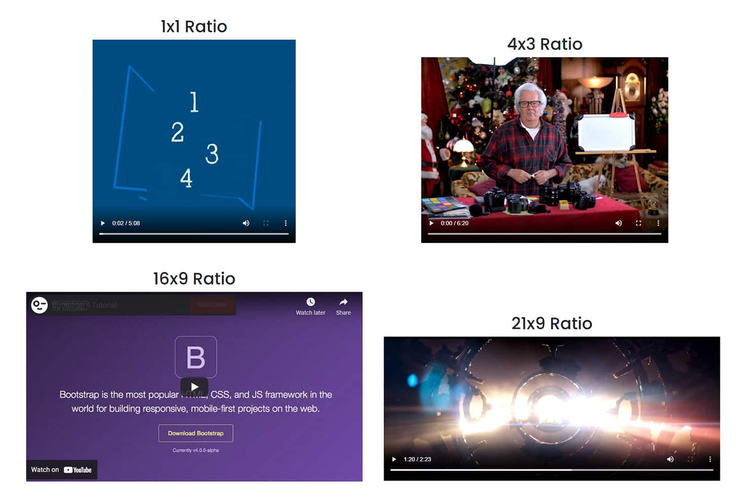
Bootstrap 5 also allows you to make your external content elements such <iframe>, <embed>, <video> and <object> responsive. By using the .ratio class along with modifier .ratio-* class (“*” represents the size or aspect ratio: width and height of the external content you want to adopt at a particular state). All styles are applied from the parent .ratio class to the child elements. Keep in mind that the aspect ratio of an element is the proportional relationship of the width to the height which is usually notated by two numbers separated by a colon in an x:y format. However, when it comes to using ratio helper in bootstrap, the notation is the modifier use inside the .ratio-* class separated by x instead of a colon.
There are four supported aspect ratio modifier classes that you can use:
- .ratio-1×1 – element’s width and height are equal, similar to a square shape.
- .ratio-4×3 – element’s width and height similar to a TV display and computer monitor screen size comparable to a rectangular shape.
- .ratio-16×9 – element’s width and height similar to a presentation slide, computer monitor, or widescreen TV but with a thinner and moderately elongated rectangular shape.
- .ratio-21×9 – element’s width and height for ultra-wide display with a broader field of view.
Let’s have an example of the ratio helper class applied to all of the supported external content elements. Take a look at the markup below:
<div class="ratio ratio-1x1">
   <embed type="video/webm" src="video.mp4" width="100%"/>
</div>
<div class="ratio ratio-4x3">
   <video width="100%" controls>
      <source src="movie.mp4" type="video/mp4"/>
   </video>
</div>
<div class="ratio ratio-16x9">
   <iframe width="560" height="315" src="https://www.youtube.com/embed/AW3SppO7qfY" title="YouTube video player" frameborder="0" allow="accelerometer; autoplay; clipboard-write; encrypted-media; gyroscope; picture-in-picture" allowfullscreen></iframe>
</div>
<div class="ratio ratio-21x9">
   <object data="film.mp4" width="100%"></object>
</div>
Let’s go over each code to fully understand this:
- On the first <div> tag, we used both class .ratio and .ratio-1×1 as our wrapping element to an <embed> tag which contains a video. This will produce an aspect ratio with equal width and height similar to a square shape.
- On the second <div> tag, we used both class .ratio and .ratio-4×3 as our wrapping element to an <video> tag which is a type of video and a video source file. This will produce an aspect ratio with width and height similar to a TV display and computer monitor screen size comparable to a rectangular shape.
- On the third <div> tag, we used both class .ratio and .ratio-16×9 as our wrapping element to an <iframe> tag wherein we used a YouTube video as our source file. This will produce an aspect ratio with a slimmer and moderately elongated rectangular shape with a width and height similar to a presentation slide, computer monitor, or widescreen TV.
- Finally, on the fourth <div> tag, we used both class .ratio and .ratio-21×9 as our wrapping element to an <object> tag where in the data source is an mp4 video. This will produce an ultra-wide display aspect ratio with a horizontally stretched appearance.
The result of our markup above should look like this on the browser:
Position
Bootstrap offers a very straightforward way to configure the position of a particular element. You can place an element at the top of your web page, or even in places where you want that behavior.
These position helper classes are usually used to fix navbar or header on top of a web page to stay always visible. Additionally, there are situations where you want your footer or a scroll to top element to stay at the bottom of the page while scrolling. It all depends on your layout needs.
Bootstrap provides three default classes for positioning an element on your web page with additional customized classes for .sticky-top class for responsive variations.
The following are the main three default position helper classes:
- .fixed-top
- .fixed-bottom
- .sticky-top
Below are the supported responsive sticky top classes:
- .sticky-sm-top
- .sticky-md-top
- .sticky-lg-top
- .sticky-xl-top
Let’s see how these position helper classes work. First, we will demo how .fixed-top and .fixed-bottom classes work. Checkout the markup below:
<nav class="navbar navbar-expand-lg navbar-dark bg-dark fixed-top">
   <div class="container-fluid">
      <a class="navbar-brand" href="#">Navbar</a>
      <button class="navbar-toggler" type="button" data-bs-toggle="collapse" data-bs-target="#navbarNav" aria-controls="navbarNav" aria-expanded="false" aria-label="Toggle navigation">
      <span class="navbar-toggler-icon"></span>
      </button>
      <div class="collapse navbar-collapse" id="navbarNav">
         <ul class="navbar-nav ms-auto">
            <li class="nav-item">
               <a class="nav-link active" aria-current="page" href="#">Home</a>
            </li>
            <li class="nav-item">
               <a class="nav-link" href="#">About</a>
            </li>
            <li class="nav-item">
               <a class="nav-link" href="#">Contact</a>
            </li>
         </ul>
      </div>
   </div>
</nav>
<!-- Your main content here -->
<footer class="fixed-bottom">
   <p class="text-center">Footer</p>
</footer>
The markup above is very straightforward. We utilized the standard bootstrap navbar markup and then used the .fixed-top class inside the <nav> tag. This will place the navbar fixed to the top of the web page independent of the page scroll.
We also created a simple <footer> tag and used the .fixed-bottom class inside. This will place the <footer> content at the bottom of the web page in fixed position independent of the page scroll.
The result of our markup above should look like this on the browser:
Next, let’s demo how the .sticky-top works. We will use almost the same markup above except for the <footer> tag. Check out the markup below:
<nav class="navbar navbar-expand-lg navbar-dark bg-dark sticky-top">
   <div class="container-fluid">
      <a class="navbar-brand" href="#">Navbar</a>
      <button class="navbar-toggler" type="button" data-bs-toggle="collapse" data-bs-target="#navbarNav" aria-controls="navbarNav" aria-expanded="false" aria-label="Toggle navigation">
      <span class="navbar-toggler-icon"></span>
      </button>
      <div class="collapse navbar-collapse" id="navbarNav">
         <ul class="navbar-nav ms-auto">
            <li class="nav-item">
               <a class="nav-link active" aria-current="page" href="#">Home</a>
            </li>
            <li class="nav-item">
               <a class="nav-link" href="#">About</a>
            </li>
            <li class="nav-item">
               <a class="nav-link" href="#">Contact</a>
            </li>
         </ul>
      </div>
   </div>
</nav>
The markup above is also straightforward as explained above except that we’ve used .sticky-top class this time. This will behave almost the same as the .fixed-top class except that the element’s position occupies the space, so the next element will not be hidden behind it. When using .fixed-top class it is anticipated that it will not occupy any space in the body, so the next element under it will be behind the fixed element.
To summarize, using .fixed-top class will position the element in fixed position and will be displayed with reference to the viewport or the browser window itself. It always stays in the same place even if the page is scrolled. While using .sticky-top will position the element based on the user’s scroll position. This also means that every time the user scrolled back, it got back to its preceding or relative position.
The result of our markup above should look like this on the browser:
Bootstrap also offers responsive variations for .sticky-top helper class. These classes will behave almost the same as the default .sticky-top class except that the element will stick to the top on viewports sized provided within the .sticky-(modifier)-top class (e.g. .sticky-sm-top)
Another useful bootstrap helper class to use when it comes to hiding elements from regular display technologies and viewports, but making them accessible to screen readers or assistive technologies are the visually hidden helper classes.
Bootstrap offers two supported visually hidden classes each with specific purpose:
- .visually-hidden – this class will enable you to hide an element while still enabling it to be exposed to assistive technologies (such as screen readers)
- .visually-hidden-focusable – this class will enable you to visually hide an element by default, but to display it when it’s focused (e.g. by a keyboard-only user)
Stretched link
In the past versions of bootstrap, you generally need to put all of the elements inside a hyperlink to make all elements clickable.
In Bootstrap 4, .stretched-link helper class was introduced which solves this specific problem (at least in most cases). Using .stretched-link to a link makes the parent containing block clickable through a ::after pseudo element.
This helper class is usually being used on self-containing elements such as bootstrap card element or any containing block element. Keep in mind thought that .stretched-link helper class cannot be mixed with most table elements.
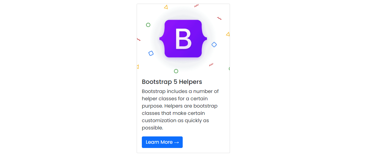
Let’s see how this helper class works with a card element. Checkout the markup below:
<div class="card">
<img src="https://i.imgur.com/BY4dr4M.png" class="card-img-top" alt="Bootstrap 5"/>
<div class="card-body">
<h5 class="card-title">Bootstrap 5 Helpers</h5>
<p class="card-text">Bootstrap includes a number of helper classes for a certain purpose. Helpers are bootstrap classes that make certain customization as quickly as possible.</p>
<a href="#" class="btn btn-primary stretched-link">Learn More →</a>
</div>
</div>
As you can see on our markup above, we used a bootstrap card element and within the hyperlink element, we added .stretched-link class along with the bootstrap’s default button classes. Cards contain a position: relative by default, so in this case you can securely add the .stretched-link class to a link in the card without any additional HTML changes.
Note: If a custom element does not have position: relative, it will require you to add the relative position CSS rule to the prevent link from covering the outside elements of the current parent element.
Let’s see the result on the browser:
If you try to click on any part of the card element, you will see that everything is clickable.
Text truncation
Text truncation is used regularly on blogs and other sections of a website or app as there are situations where users can benefit from seeing a preview of an article or information.
Bootstrap provides a predefined class to truncate long strings of text with an ellipsis using .text-truncate class. In order for this to work, your wrapping element should have display: inline-block or display: block CSS rule.
Let’s see how this class works. Consider the markup below:
<!-- Block level -->
<div class="col-3 text-truncate">
   Bootstrap is one of the most popular frameworks for building websites and applications.
</div>
<!-- Inline level -->
<span class="d-inline-block text-truncate" style="max-width: 350px;">
The end goal of bootstrap is to always increase the pace of development as much as possible without completely reinventing the wheel.
</span>
The result should look like this:

Note: The truncated text size will vary depending on the width of the wrapping element where you place the .text-truncate class.
Wrapping Up
Bootstrap 5 offers helper classes and vendor’s mixins, which offer cross-browser support. Helpers are Bootstrap classes that help developers attain certain customizations without adding extra markup or CSS rules. Additionally, these classes are built to provide a specific purpose in a specific situation and reduce CSS frequency of repeated rules.
You can visit Bootstrap 5 documentation if you want to learn more.
