12 Screen Reader Facts for Accessible Web Design
Designing for accessibility, and specifically for screen readers, is a skill every UX designer needs. The importance of accessibility cannot be over-stressed. In this article, we will review the essential points you need to know about designing for screen readers. By understanding the basics, you will be better equipped to create the most accessible websites.
Although each screen-reading app can work a little bit differently, they do function similarly. They also provide additional setting options for further customization based on user preferences.
Three Components of Accessibility
Accessibility can be divided into three parts: Content, visual design, and development. We’re going to touch upon all of them as they’re so interconnected and equally important. As a designer, your job might be to focus on visual accessibility (and color accessibility). Yet, it’s essential to know how accessibility relates to the content and development, too. This way, you can better advocate for accessibility and can spot accessibility issues quicker.
SEO Brownie Points
It’s no secret that many browsers, especially Google, penalize websites that aren’t accessible. Things like alt text for images and proper heading hierarchy is one of the first things an SEO checker will flag. So yes, there is an added bonus of making sure your website is accessible beyond user experience.
But think about it. Search engines don’t want to guide visitors to websites they wouldn’t be able to use; it defeats the purpose of the search. There are many examples of sites that don’t care about search engines like web apps or online products, and that’s fine. SEO shouldn’t be the only motivator for creating accessible sites. It should be a lovely benefit for sites that rely on traffic from search engine results.
Titles, Headings, and Overall Copy
Let’s start with the content and its context and meaning to users. Because most website content is still in written form it’s a great place to start.
With Postcards Email Builder you can create and edit email templates online without any coding skills! Includes more than 100 components to help you create custom emails templates faster than ever before.
Free Email BuilderFree Email Templates
1. Use contextualized page titles
Each web page needs its own title, which will allow all visitors to distinguish the page from others. It’s often the same as a page’s first heading. A good practice is to put the page name first, followed by the website name such as a company or organization name. Additionally, if the page is part of a multi-step process like a sign-up or checkout flow, include the step number such as Step 1 of 3.
2. Make headings practical
Headings are an important element of any page. First, they break up large chunks of text. Second, they provide context on the content that follows them. Third, they allow for easy scanning. The best headings are meaningful and provide great structure to the page’s content. For visitors browsing your site with a screen reader, they’re vital. Headings are supposed to give them insight into the following content. That’s why short but concise headings are best.
The inverted pyramid writing structure is successful for a reason. Make sure the content you’re working with follows this pattern. And, make sure you organize and design this content properly too.
Some screen readers will announce “heading one, “heading two,” and so on before reading the text itself.
This is generally good advice for links, but link text needs to make sense when reading out of context. Link copy like “submit” or “click here” isn’t informative; there is no meaning to the copy out of context. The link copy needs to set an expectation as to what’s about to happen. Where are you taking the user? What are they about to do, see or accomplish by clicking the link (or button)? Be as explicit as possible, and you’ll have a meaningful link.
4. Provide clear instruction
This is especially true for interactive elements, such as forms. Not only should you provide clear instructions to avoid error messages, make sure that your error messages are as clear and easy to understand too. Generally speaking, avoid using technical jargon. Don’t forget to describe the input requirements.
I’m sure we all had seen one too many notorious passwords fields that don’t give any instructions and generate an error when you didn’t guess those instructions correctly. It’s a lot more difficult to figure out when relying on a screen reader to understand what went wrong and why.
With Pulsetic you’ll be instantly notified the moment your website, API, or server becomes unavailable. Monitor uptime from multiple global locations and respond to incidents before your users are affected.
Create beautiful status pages in minutes to keep customers informed during outages and build trust with transparent communication.
Start Monitoring for Free
Image source
This is precisely why clearly identified instructions are a must. Otherwise, at best, you’re annoying your leads. At worst, the site is literally in the way of someone converting or accessing important information.
5. Writing and structuring concise content
We’ve already touched upon the inverted pyramid for headings. It’s important for the content, too! Using short, concise, and direct communication is key. Avoid technical or industry-specific jargon. Avoid complex words or phrases. If need be, provide a glossary. The first time you use an acronym, expand upon it to identify its meaning. (More on acronyms shortly.)
Use bullets and other text styles (such as bold or italics) to organize content, distinguish its parts, and emphasize different pieces of information.
6. Be mindful of homographs
If possible, avoid homographs in your copy. Those are words that are pronounced differently depending on the context, such as “read” and “read” or “contract” and “contract.”

Unfortunately, screen readers don’t always understand the context and can pronounce the words incorrectly.
7. Screen readers and punctuation
First of all, screen readers pause for certain punctuations, including:
- Periods
- Semicolons
- Commas
- Question marks
- Exclamation points
- Paragraph endings
Screen readers respond well to other text treatments such as lists and text decorations, too.
It’s important to know that screen readers will try to pronounce acronyms when they can, otherwise they spell out the letters. Commonly pronounced acronyms such as “NASA”, they will pronounce as such. Whereas, they will pronounce “NFL” as letters N-F-L.
Images and multimedia
If a piece of content isn’t written it’s going to be an image or another multimedia file. Let’s go over some key elements on how to work with them for screen reader accessibility.
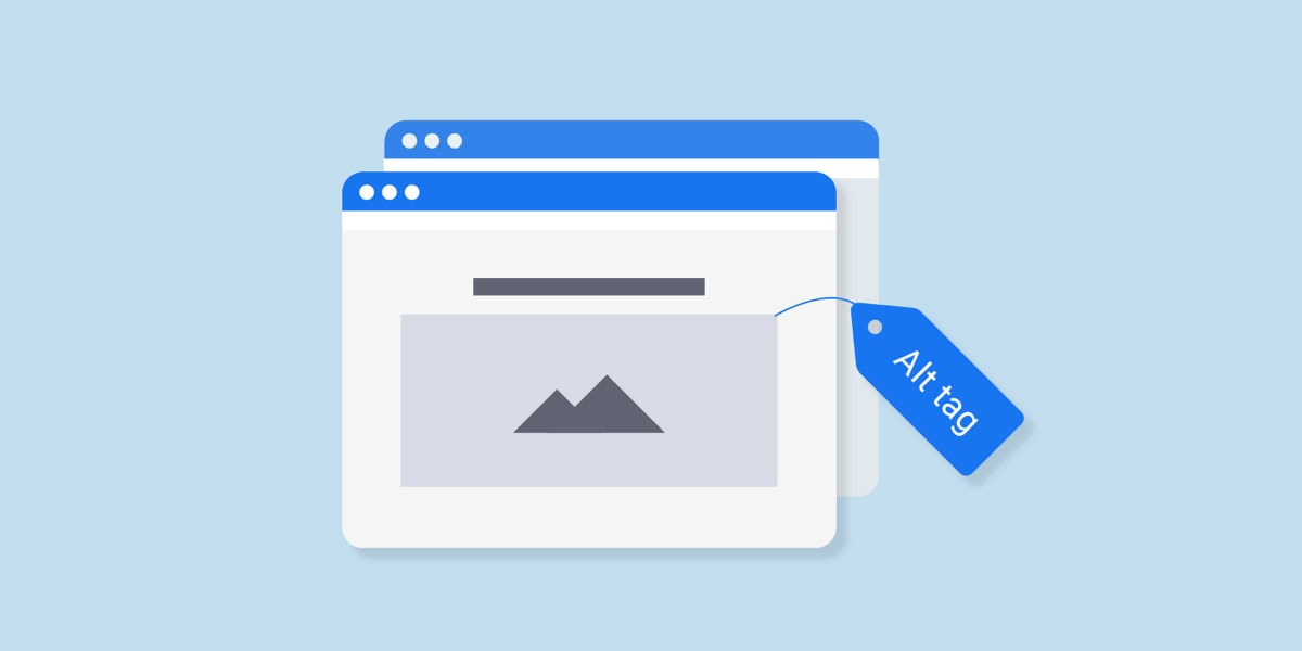
8. Alt text on images
Screen readers will read alt text of images, if it’s present. Most screen readers will skip it altogether if there isn’t one, however, some of them, depending on the user’s preferences, can also read the file name for the visitor. There’s no way for you to hide that there is an image. Always take the time to include a descriptive summary of an image – from social media icons to photographs and everything in between.
Some screen readers such as JAWS will preface an image with the word “graphic” or “graphic link” if the image also links somewhere, too.
9. Transcripts and captions
If you’re using videos, audio files, or other multimedia accesibility, be prepared to use them with transcripts or captions. Many internet users have hearing disabilities – others simply don’t have working speakers. Either way, it’s important that you include what is being said in the multimedia files, but also any other additional sounds cues like background or noises or music. Indicate if someone dropped something off-screen, and it made a sound if someone is screaming, humming or panting, or when someone enters or leaves a room. Basically, include any and all descriptions of auditory cues.
Additional screen reader functionality
Let’s touch upon some additional screen reader features that you may not be aware of.
10. Screen readers can be paused
Naturally, screen readers can be paused. However, a user can also smoothly go back to reread something, either a word or a sentence. Additionally, they can also have the screen reader spell out a word letter by letter.
11. Screen readers and typing
When typing, the screen readers will also read what a user is typing, often letter by letter. Password fields are an exception where they will announce “asterisk” or “star” for each character entered.
12. On page load announcements
When a page is loading, a screen reader will read out the page title. Some will also announce the number of links on a page while a page is loading, too.
Conclusion
Poorly coded websites aren’t going to translate well to screen reader,s but neither will websites with poorly written content or poor layout or poorly structured design. That’s why accessibility is a three-part effort.
It starts with content and goes into visual design to make sure that everything is placed appropriately. Then, it follows into development to make sure it’s well coded. This introduction to designing for screen readers is a fantastic starting point on making sure you deliver accessible designs.


