How to Create a Coding Page Illustration in Adobe Illustrator
With all the flat style madness going on in the design community, we can quickly see how this is the direction of the future. Whether it’s icon design, mobile design, or web design, beautiful playful colors, lines and shapes are creating a new world for us to play in.
Having said that, the current tutorial will focus on helping you create a simple and attractive illustration for a website page specialized in computer coding.

Step 1 – setting up a proper document
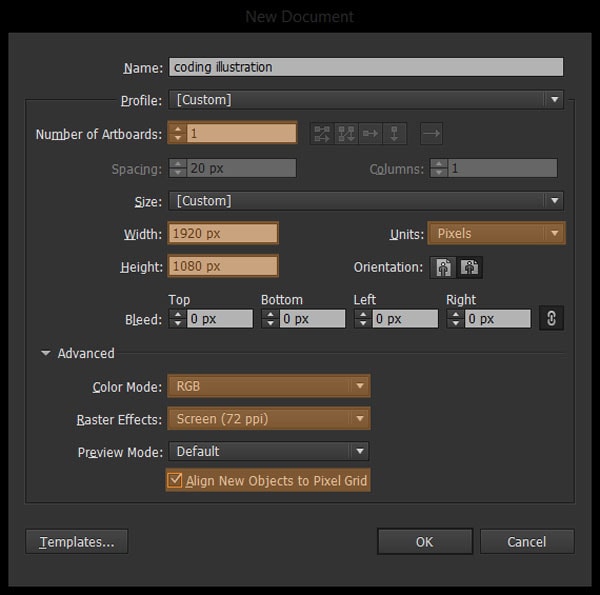
Open up Illustrator and create a new document with the following settings:
- number of artboards: 1;
- units: pixels;
- width: 1920px;
- height: 1080px;
- color mode: RGB;
- raster effects: 72ppi;
- align new objects to the pixel grid: checked.
You might wonder why I chose such a big size for the artboard. If you are familiar with the Retina technology from Apple (and other manufacturers that offer high resolution monitors) you might already know that on such devices, images need to have a higher pixel density in order for them to look crisp. I will show you how to achieve this at the end of the process when we will prep the file for saving.
With Postcards Email Builder you can create and edit email templates online without any coding skills! Includes more than 100 components to help you create custom emails templates faster than ever before.
Free Email BuilderFree Email TemplatesStep 2 – Layering our illustration
Layers are in my opinion a must when dealing with detailed illustrations that have parts and pieces which go ontop one another. By layering your design, you will increase your workflow and most important you will have the ability to hide and show specific parts that need attention during the creative process.
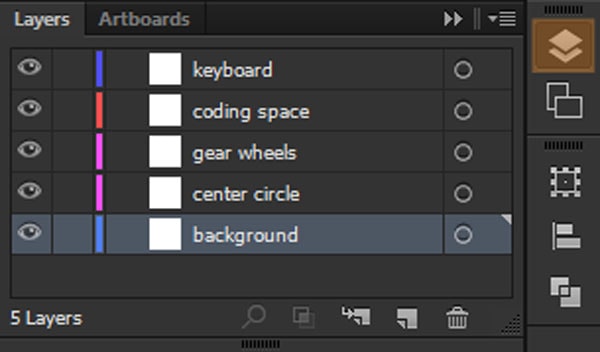
So without wasting anymore time, set up 5 layers and name them as follows from the base up:
- background;
- center circle;
- gear wheels;
- coding space;
- keyboard.
Now that we have everything set up nicely, we will start building our way up the background layer until we get that neat illustration.
Step 3 – start “building”!
3.1. The background
I have to tell you from the start that this part of the illustration is purely intended to help you visualize how the design will end up looking when it’s finalized. As the composition will end up being used on a web page, the background will be set using CSS, but I will tell you more along the way.
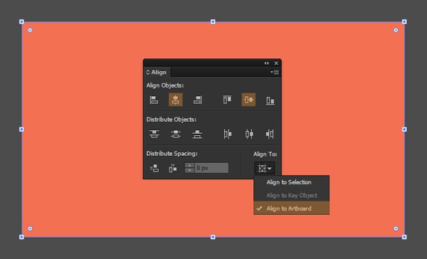
So our artboard has 1920 x 1080px that means we need to make a rectangle of the same size and then position it in place. Grab the rectangle tool (M) and click anywhere in Illustrator to get the custom width and height box where you will enter the same numbers from the artboard.
Once you’ve done that, select the new object, change its fill color to #f37053 (R: 243, G: 112, B: 83) and then using the Align panel center it both vertically and horizontal.
With Pulsetic you’ll be instantly notified the moment your website, API, or server becomes unavailable. Monitor uptime from multiple global locations and respond to incidents before your users are affected.
Create beautiful status pages in minutes to keep customers informed during outages and build trust with transparent communication.
Start Monitoring for FreeQuick tip: make sure that the Align to option is set to Align to Artboard so that the object uses our artboard as a reference point.
Once you’re done, make sure to lock the layer and move on to the center circle layer.
3.2. The circle-pop effect
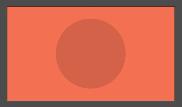
This part of the illustration is meant to give the overall design a visual pop so that it won’t end up looking too doll.
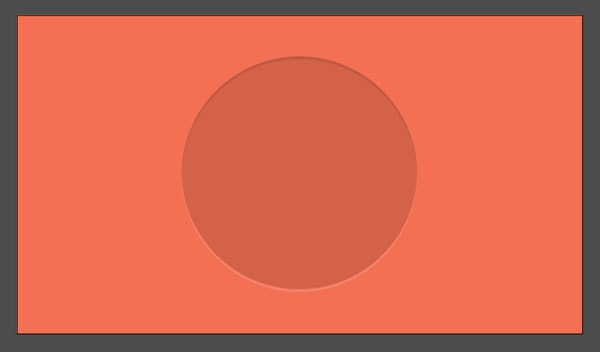
Using the Ellipse tool draw an 800 x 800px object and then change its color to a darker orange #d46249 (R: 212, G: 98, B: 73). As with the background, center align it using the Align panel.
Now that we have the circle we need to add some dimensionality to it. Copy (ctrl + C on a pc, cmd + C on a mac) and paste the object in place (ctrl + F on a pc, cmd + F on a mac) 2 times. Select the one above, and using the Move function (Object>Transform>Move or shift + ctrl+M on a pc, shift + cmd + M on a mac) nudge it down vertically by 10px.
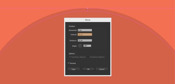
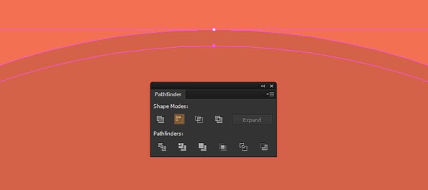
Selecting both the circle above and the one underneath, go to the Pathfinder panel and use the Minus front command.
Color the remaining section in an even darker orange #bf5942 (R: 191, G: 89, B: 66). For the bottom section you can either follow the same steps as above or simply copy the first one, duplicate it and the flip it horizontally using the Reflect tool (right click on the object>Reflect). Once you have the bottom part, select it and change its color to something lighter #f38268 (R: 243, G: 130, B: 104).
If you followed the steps above you should now have something like this.
3.3. The coding interface
You might have noticed that we jumped the gear wheels layer and went straight to the coding one. As the little window (that holds the code lines) will be on top of the gears, it ultimately makes sense as I want you to see how important it is to have a good perspective on using space and positioning when it comes to the actual composition.
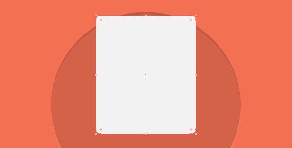
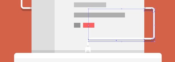
To create the cute interface we first need to make a 420 x 500px rectangle with a corner radius of 20px, color it using #808080 (R: 128, G: 128, B: 128) and then position it using the following x and y coordinates:
- x: 960px;
- y: 405px.
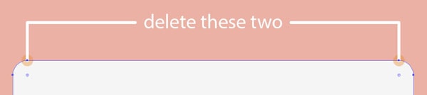
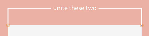
Next, wee need to create the top section that holds the Apple styled “traffic lights” buttons. Copy the previous object, place it in place, and then double click on it to enter isolation mode. Then grab the direct selection tool (A), select the 2 bottom centered anchor points (left click on the first one and while holding down shift select the second one) and then delete them by pressing Del.
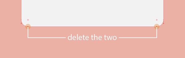
Without clicking on anything else, unite the remaining bottom anchor points by using the Join function (ctrl + J on a pc, cmd + J on a mac).
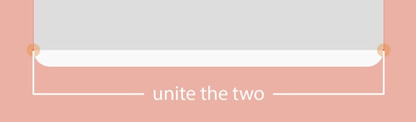
With both of the anchor points still selected, use the move function to shorten the object by setting a value of -432px in the vertical input container, and the color it white.

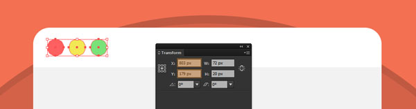
Next, create three 20 x 20px circles, position them at 6px from one another, and color them from left to right as follows:
- red – # fc6060 (R: 252, G: 96, B: 96);
- yellow – # f2e755 (R: 242, G: 231, B: 85);
- green – # 79e279 (R: 121, G: 226, B: 121).
Select all 3 objects, group them (ctrl + G on a pc, cmd + G on a mac), and the position them:
- x: 803px;
- y: 179px.
Now how about adding some details. Select the main object (the large grey one) copy and paste it in place and then going through the same process of deleting and uniting the anchor points get rid of the right centered ones. With the top and bottom right anchors selected, move them to the left by -314px.
Change the color of the object to #dedede (R: 222, G: 222, B: 222) and then by selecting both it and the object under, right click>Arrange>Send to back. This portion will act as the left side code holder.
For the code part, create a 40 x 8px rectangle, color it using # c4c4c4 (R: 196, G: 196, B: 196) and position it:
- x: 786px;
- y: 237px.
Then create 7 more rectangles and position them in the right place:
- 1 – size: 54 x 8px – position: x: 793 / y: 251;
- 2 – size: 40 x 8px – position: x: 786 / y: 265;
- 3 – size: 18 x 8px – position: x: 775 / y: 279;
- 4 – size: 32 x 8px – position: x: 804 / y: 279;
- 5 – size: 30 x 8px – position: x: 781 / y: 317;
- 6 – size: 14 x 8px – position: x: 807 / y: 317;
- 7 – size: 54 x 8px – position: x: 793 / y: 331.

After you get all the “code” right as in the reference image, we need to move on to the left arrow (less than symbol) and the central code. Click on the rectangle tool (M) and create a 32 x 18px object, using the direct selection tool grab both of the right side anchor points and then right click>Transform>Move (same function as Object>Transform>Move) and pull them -20px vertically.
Once you’ve done this, duplicate the object, flip it (either vertical or horizontal – as both will give you the same result) and then move it down until the left side anchor points align with the ones from the shape underneath.
For the bigger code lines, we will create 9 rectangles and position them as follows:
- 1 – size: 34 x 18px – position: x: 925 / y: 369 – #949494;
- 2 – size: 76 x 18px – position: x: 990 / y: 369 – #adadad;
- 3 – size: 76 x 18px – position: x: 946 / y: 407 – #adadad;
- 4 – size: 24 x 18px – position: x: 1006 / y: 407 – #79e279;
- 5 – size: 48 x 18px – position: x: 1052 / y: 407 – #949494;
- 6 – size: 120 x 18px – position: x: 968 / y: 445 – #c2c2c2;
- 7 – size: 190 x 18px – position: x: 1003 / y: 483 – #adadad;
- 8 – size: 24 x 18px – position: x: 920 / y: 521 – #949494;
- 9 – size: 42 x 18px – position: x: 963 / y: 521 – #fc6060.
To finish this part of the illustration, create a 420 x 10px shape which will act as a shadow, and position it just under the window’s top white bar (the ones with the 3 colored circles). Color it black (#bdccd4) and then set the blending mode to Multiply and lower the opacity to 10%.

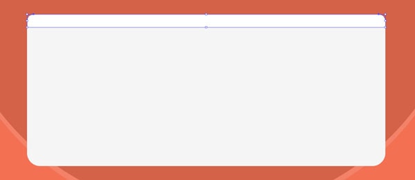
3.4. The keyboard
Assuming you’re now done with the previous layer, lock it, and then make sure you’re on the keyboard layer. We first need to make our “base” shape (which I don’t know if you’ve noticed but it has different rounded corners on the top and bottom sides) so with the rounded rectangle tool selected, create a 550 x 234px object with a 20px corner radius. Color it using #f5f5f5 (R: 245, G: 245, B: 245), and with the help of the direct selection tool (A) delete the top center anchor points.
Select the remaining two anchors, and join them together (ctrl + J on a pc, cmd + J on a mac).
Now create another 550 x 234px object but this time with a corner radius of just 10px. Using the same steps as above delete the bottom middle anchor points, and then unite the remaining ones. Select the object and the one underneath it (the previous created one) and using Pathfinder unite them.

Once we have our base shape, we need to create a small white top section. First duplicate the previous created object, paste it in place, and the using the direct selection tool (A) delete the bottom middle anchor points, unite the remaining ones and move them up by -194px.
Great! Now let’s take care of the keys. To make things easier, I’ll approach this part of the process by using 4 rows of white keys (all of which have a corner radius of 4), as follows:
Row 1 (bottom row)
The bottom row has 5 buttons (4 of which have the same size) that we will create using the following attributes:
- 1 – size: 40 x 40px – position: x: 725 / y: 818;
- 2 – size: 40 x 40px – position: x: 775 / y: 818;
- 3 – size: 310 x 40px – position: x: 960 / y: 818;
- 4 – size: 40 x 40px – position: x: 1145 / y: 818;
- 5 – size: 40 x 40px – position: x: 1195 / y: 818;
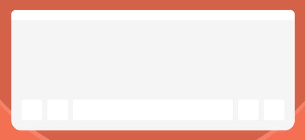
Row 2
The second row has 10 buttons, but most of them have the same size of 40 x 40px as before, so grab a key from the row underneath and duplicate it 8 times, and then with all of them selected, align them from one another at a distance of 10px.
Next, draw a 50 x 40px rectangle (remember – 4px corner radius), left align it to the first row, and then distance it using a 10px value. Horizontally align the previous 8 keys to it, and then duplicate and align this new object to the right side as follows.
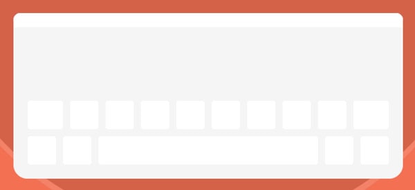
Row 3
Copy 7 of the rounded squares, and move them up by 10px. Using the rounded rectangle tool create a 75 x 40 object and left align it to the previous row. Grab the copied keys and horizontally align them with this new object keeping the same 10px distance.
Now duplicate the larger button and then align it to the right side.

Row 4
We have a slight change in dimensions, as all of the keys from row 4 have a height of 24px, almost have compared to the rest. With the help of the rounded rectangle tool create a 60 x 24px object with a 4px corner radius and as always make sure it’s left aligned at a distance of 10px to and from the row underneath. Then, make nine 40 x 24px smaller objects, horizontally align them and distance them correctly from one another.
Congrats! You should now have all the keys in place.

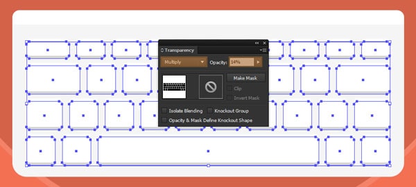
As things look kind of boring, let’s add some shadows underneath our created keys. First select and group them all, then copy and paste them in place, after which make sure you move them down by 4px. Change the color to black, the blending mode to Multiply and the Opacity to 14%.
As you can see from my workflow, I have hidden the coding space layer as until now it would have just got in the way. As we need to create the cable that goes around the window, we need to change that.
Assuming that you can now see the coding layer, we need to create the thicker part of the cable that goes inside the keyboard and holds the cable itself.
Create a white 20 x 26 rectangle with a corner radius of 4px. Using the trick with the direct selection tool, get rid of the bottom centered anchor points and unite the remaining parts. Select the new object and then vertically align it with the keyboard, positioning it exactly on top.
Give it some style by creating another 12 x 14px object with yet again a 4px corner radius. Change its color to #999999, then repeat the same bottom anchor points deletion process, after which central align it to the base of the previous shape.

For the cable part, select your Pen tool (P), flip the fill with the stroke (shift + X), set it to 6px and by going into Pixel Preview Mode follow the guides bellow:
Left cable section:
- from the top of the thicker cable section we created just a few moments ago, create our first anchor point and then at about 31px upwards add the second anchor point;
- go right and at about 246px add the third anchor point;
- go up and after 114px add the fourth anchor point;
- finally go left and click just next to the code window to add the final anchor point.
Right cable section:
- using an imaginary line, go under the code window and set the first anchor point on the left side of it;
- go left 37px and add the second anchor;
- go up 97px and add the third anchor point;
- go right and add the fourth and last anchor exactly near the code window.
Select both cable sections and then go to Effect>Stylize>Rounded Corners and enter a radius value of 8px. Next we need to expand them so go to Object>Expand>Fill and Stroke.
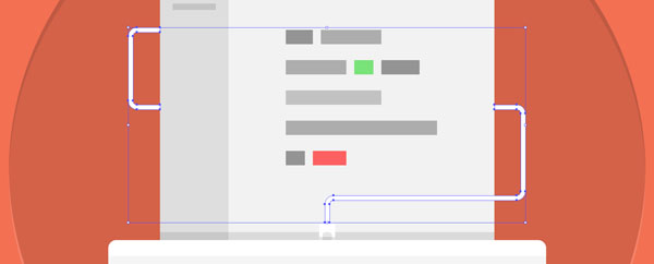
For the left cable we need to make sure to add the thunderbolt like connector.
Using the rounded rectangle tool create a white 30 x 30px object with an 8px corner radius. Delete the right center anchor points and then position the connector:
- x: 739px;
- y: 360px.
Add some detail to it by creating and an 8 x 16px rectangle with a corner radius of 2px. Horizontally and vertically align it to the previous created shape, and then move it 3px towards the right.

As we added some shadows in the previous steps, it’s almost rude not to do so with the rest of the components that make up the current layer.
Let’s start doing so by adding one for the left cable section and then work our way down from there. Select both the cable and the connector, duplicate them, unite the duplicates using Pathfinder and then move the new object down by 8px. Change the fill color to black, set the blending mode to multiply and then lower the opacity to about 20%. You might have noticed that now we have a small gap between the object and its shadow. To correct this, grab the direct selection tool (A) select the bottom and top highlighted anchors and push them up 2px.
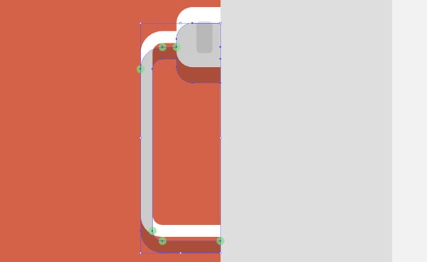
Once you’ve done that, make sure to send the shadow to the back right click>Arrange>Send to back.
Next, add some more shadows using the same values for the color, blending mode and opacity, using rectangle with either a 4 or 6px width.
Apply the same process to the right cable section and then make your way to the thicker part of the cable going into the keyboard.
If for the shadows going outside the code window we used a 20% opacity, for the ones inside it we will lower down to 10%. That means that the lower side of the right cable shadow will actually have 2 parts, one darker and one lighter.
For the shadow created by the keyboard onto the window, create a 420 x 10px and position it right above the first.
Finally let’s add the shadow created by the keyboard onto the background circle.
To do so, copy the base shape from it, and then paste it in place. Change the color to black, keep the blending mode and opacity consistent (same values we used before) and then move it down by 8px. Don’t forget to send it back so that it won’t go over the rest of the design.
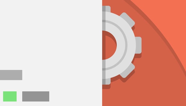
Let’s move on to the next and last piece of our illustration: the gears.
3.5. The gear wheels
Position yourself on the correct layer and then create a 120 x 120 circle, color it using #e0e0e0 (R: 224, G: 224, B: 224) and align it to the right side of the window using the following coordinates:
- x: 1170px;
- y: 316px.
Now draw another 52 x 52px circle, horizontally and vertically align it to the one previously created, select them both and then use minus front from the Pathfinder panel.
Using the ellipse tool draw a 86 x 86px object, color it in a darker grey #c2c2c2 (R: 194, G: 194, B: 194), flip the fill to stroke (shift + X) and then change the thickness to 4px. As always, expand the ring by using Object>Expand.
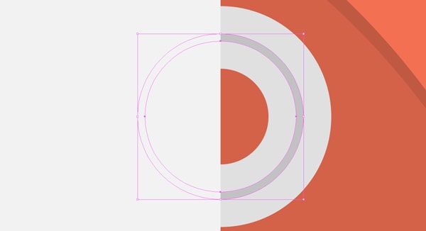
Next let’s create the little “teeth” that go around the main ring. Using the rounded rectangle tool create a 30 x 20px shape with a 4px corner radius and color it #c2c2c2 (R: 194, G: 194, B: 194). Duplicate the object and vertically align the two at a distance of 100px. Group them and then vertically and horizontally align them to the key ring of the gear.
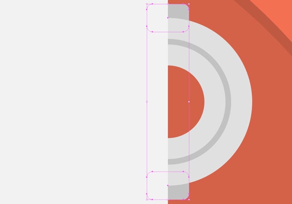
In order to get the rest of the “teeth”, simply duplicate the current pair 3 times, and then rotate each one at a 45º angle.
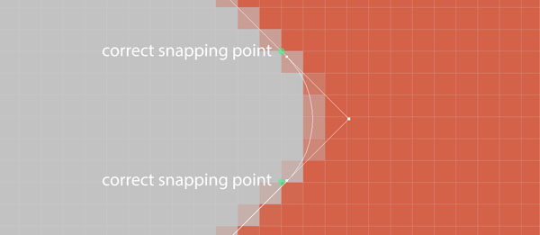
As we want everything to look crisp, make sure you correct the little mistakes made during the rotation process by going into Pixel preview mode, with the direct selection tool (A) and forcing the anchor points to snap to the nearest point on the grid.
Add some shadows to the mix and our first gear is now done.
For the second one, things should be mostly the same, the only little changes will be regarding the sizing of the elements and the color pallette.
With the Ellipse tool (L) selected draw a 60 x 60px shape, color it white, flip the fill with the stroke, set it 17px and make sure it’s aligned towards the inside. Expand the object and then position it using these values:
- x: 750px;
- y: 542px.
For the inner ring, create a 42 x 42px circle, again flip the fill (#e8e8e8, R: 232, G: 232, B: 232) with the stroke, and then change its thickness to 2px – and don’t forget to align and expand it.
For the “teeth” draw a 14 x 10px with a corner radius of 2px, color it # e8e8e8 (R: 232, G: 232, B: 232) and then follow the same steps as the previous gear.

We should now be done with the design part, but how about that @2x thing I talked to you about at the beginning?
Step 4 – understanding and using @2x
Since Apple created the hole “retina” rupture, a new method of creating images intended for its high resolution displays was needed.
The way @2x works is that you create compositions twice the size you would normally do (depending on the newest retina pixel density), and then by means of code you squeeze them to half so that you get crystal crisp images.
Quick tip: you can read more on the subject straight from Apple’s library.
Now let’s assume that you’re working on a web project that needs a header image, such as the one we just created. How do you go about saving and telling the coder (if you’re not the one actually coding it) that the image is in fact retina ready?
Well pretty simple. You create it at double the size (checked) and then you save it as you would normally do but at the naming phase add a “@2x” at the end which will let everybody know how to handle it.
If you’re the front end developer, just add a “width” and “height” line of code on the img src level.
Ex:
<img src=”1920x1080_illustration@2x” width=”960” height=”540”>
Of course there are multiple ways of doing it (using media queries etc) but hey, there are tons and tons of guides out there.
I hope you enjoyed this tutorial as much as I did, and most importantly learned some tricks along the way.