Drawing Attention Through Color in Web Design
Working with color can be so much fun. Color can set the mood and tone of a design. Color can make a design appear clean or messy. Another thing we can use color for is to draw attention to a desired piece of content or element.
In this post, we’ll go over the various way in which color can be manipulated to draw attention to something. Some of the examples will talk about repetitiveness, some about photography and others about how a lack of color can be a strategic thing too.
Let’s get started in analyzing how to draw attention through color.
Nursing bras, photography, and attention
There are a plenty of website designs out there that make use color in a strategic way. Color is so versatile and comes in all different shapes and forms. For instance, when I speak about color in design most people assume about things like text or buttons. We’ll get to that. For now, I want to talk about the less obvious way we color effects a design, through photos.
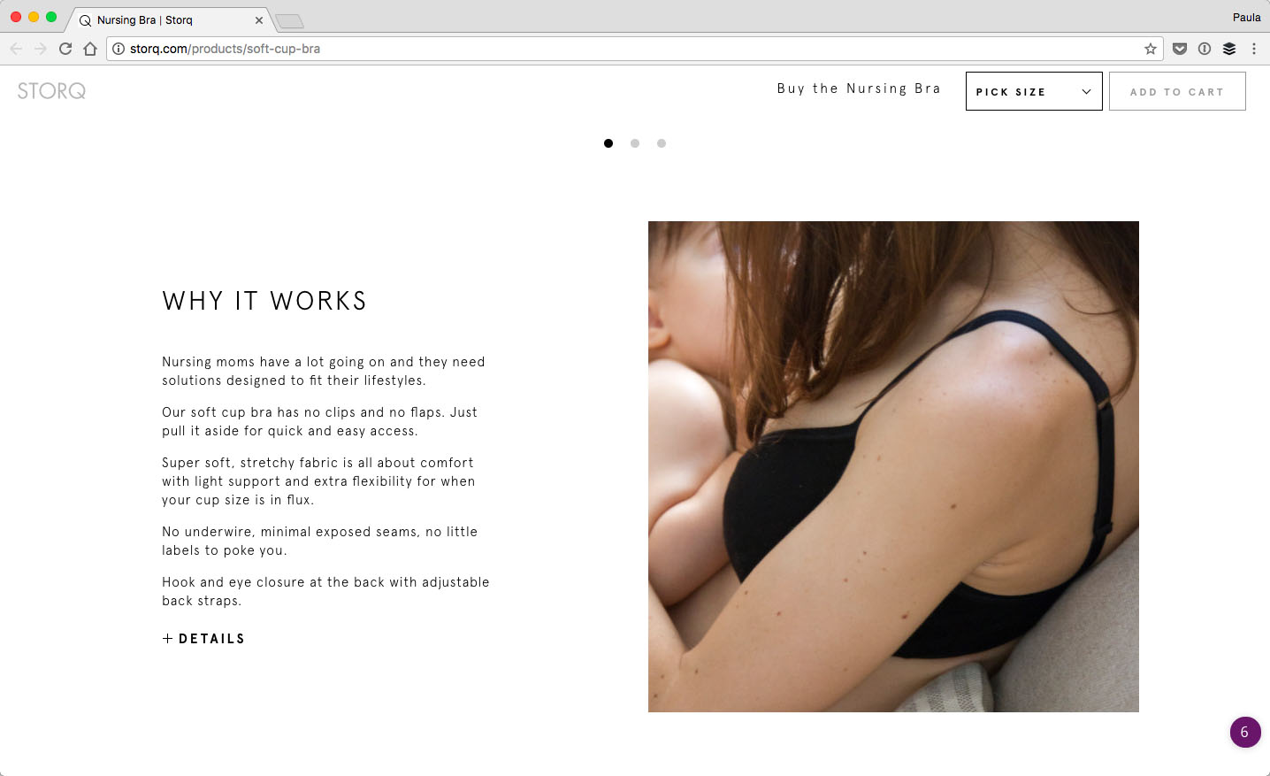
Storq is clothing store for pregnant women. Overall, the website doesn’t feature too many colors. However, on the product pages, the photos command attention. Part of it has to do with the fact the photos are large. The other part has a lot to do with the fact that the photos are the only elements on the page that have color in it.
With Postcards Email Builder you can create and edit email templates online without any coding skills! Includes more than 100 components to help you create custom emails templates faster than ever before.
Free Email BuilderFree Email TemplatesThe photos feature darker shades and similar shades too. Storq uses photography that fits right in with the overall design. They don’t use dramatic or stark colors in the photos to draw attention; that would be too much and unnecessary.
Neon or contrasting colors are not the only ones that can draw attention when thought through with the context of the design.
Colorful texts can draw attention too
Let’s talk about changing the color of text such as headings or large pieces of copy. I have found two amazing examples of how text colors can leverage a visitor’s attention too.
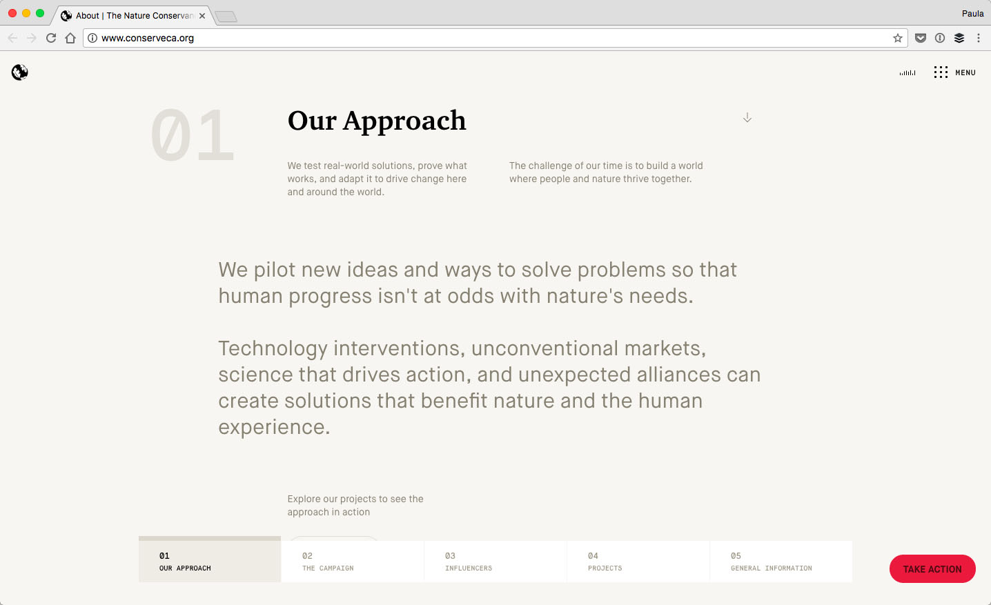
The first example is that of The Nature Conservancy in California. The website is a great example for two reasons.
First, the design leverages color but also a hierarchy. Hierarchy is a fantastic design tool in pinpointing what is the most important to the least. It’s clear at a first glance, what is important to look at first in the above screenshot. “Our approach” is the darkest piece of text in that whole section.
The rest of the text is the same color but what is more important is determined by size. In this example, color is a unifying factor, except for the heading off course. At the same time, color is used to draw attention away from more trivial elements like the numbers on the left-hand side of the headings.
It’s nice to know the order of the sections but, more or less, the numbers are irrelevant to the experience. Therefore, they are lighter in color.
With Pulsetic you’ll be instantly notified the moment your website, API, or server becomes unavailable. Monitor uptime from multiple global locations and respond to incidents before your users are affected.
Create beautiful status pages in minutes to keep customers informed during outages and build trust with transparent communication.
Start Monitoring for Free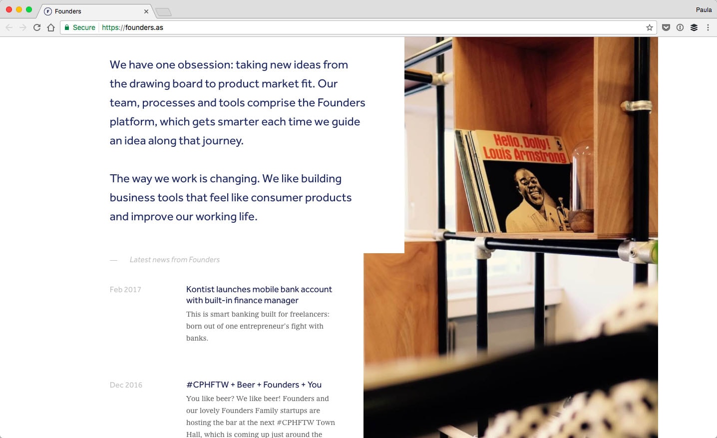
Additionally, we have an example of Founders. By the time you make it halfway down the home page, you’d have seen at least three different font colors.
When you first take a look at the green hero text, it grabs your attention because of its front and center. But the second you realize it’s actually a dark green color, it gets to keep your attention for a little longer. Here the green is a little unexpected so it keeps a visitor a little curious.
At the very least, if the green headline go unnoticed, it’s hard not notice the change of color in the text within the middle section again.
The headlines are a dark blue while the supporting content is gray in color. The contrast of the light gray against the blue heading gives a lot more prominence to the headlines themselves. The gray makes the headlines stand out a whole lot more. I love that such seemingly irrelevant but highly effective manipulation can be done with just color.
Using colorful decorations to create a focal point
In this and the next section, we’ll talk about how to leverage shapes, patterns and color to your advantage. For now, we’ll discuss the decorative aspect of shapes. Unfortunately, decoration have a bad name in web design which is just a shame. You can easily use decorations to create a focal point within a design or a specific section without adding visual jargon to a design.
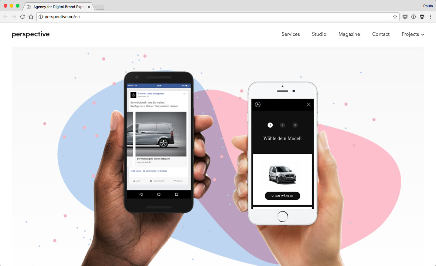
That’s exactly what Perspective did. They are a creative agency with a fantastic and simple website. If you take a look at the bottom of their homepage, you’ll see there is one section that will fit perfectly as a great example for this point. It’s the same section as the screenshot above.
As you can see, the section is made up of two different elements. First, there are the hands holding up the two smartphones.Behind it, you’ll notice the decorative, rounded shapes.
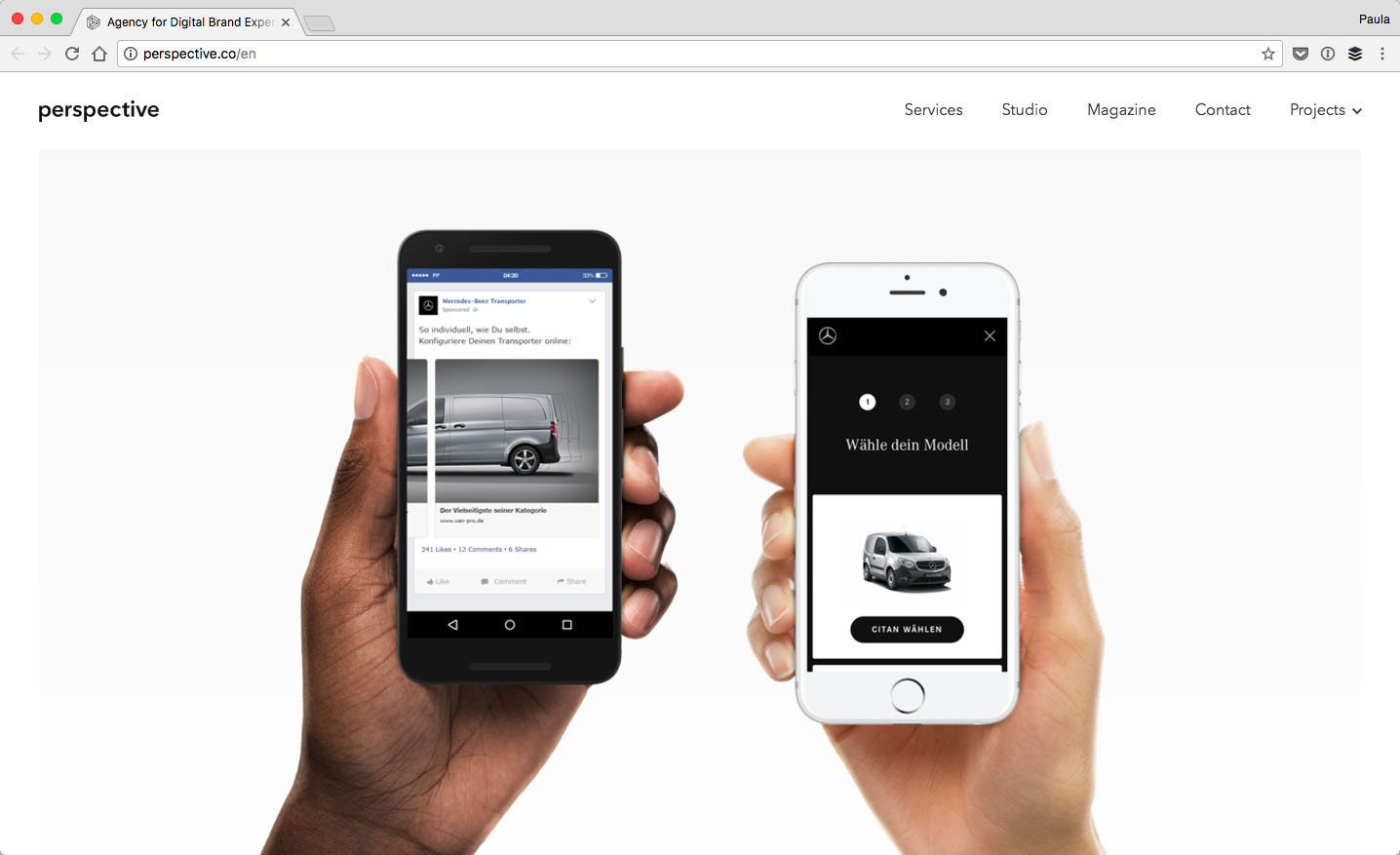
The section looks completely different without the colors behind it. And, the experience of the web page changes completely now. Without that burst of color, the section doesn’t have the necessary visual focus when you’re idly scrolling down.
So although, yes, those blue and pink bubbles are seemingly irrelevant, they have an important job to do. Especially, if you notice that the section lacks significant color without them and therefore becomes significantly less interesting too.
Shapes, color, and repetitiveness make up visual languages
A visual language is a system of communication using visual elements such as colors, shapes, headings, and so on. Often times, designers will develop a style guide but a visual language goes a whole lot beyond that.
A visual language has detailed relationships between each kind of element. It specifies what you can and cannot do. It explains how elements are to be used with one another to best represent the visual style. A visual language build a whole library of visual components and details how they are to be used.
Color, naturally, is a big part of any visual language the same way it is a big part of any style guide.
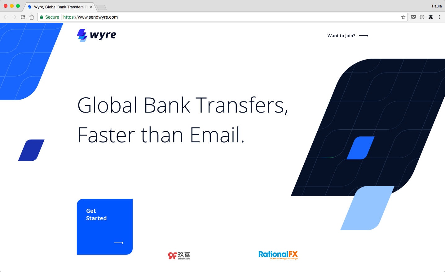
This is not about Material Design, however. It’s about the visual language of Wyre, online bank transfer service. The company’s branding heavily relies on the repetitive leaf-like shape that makes up the logo. You can see this shape in use all over their website from the home page to the about page all the way through to the signup page. Another thing that’s repetitive on the website’s design is the use of various blues.
Oftentimes, the use of the shape is combined with a use of a specific color such as the common CTA on the homepage to get started. On the home page, the blue shape is used as the CTA button multiple times. It’s actually used exclusively as the signup CTA. That’s a great stepping stone in developing a fantastic visual language. Each time a user sees the leaf-like shape with text over it, without even reading what it says, the user can easily take a hint it’s the main and only CTA on the website after having used it for a quick while.
Such a correlation wouldn’t have been possible without the redundancy in both shape and color.
Lack of color variation can be a good thing
Not every design calls for the most colorful color schemes. The first example in this post, Storq, did just fine in drawing attention with their color-limited color scheme. Let’s take a look at two examples that draw attention to selected elements by removing color as the focal point.
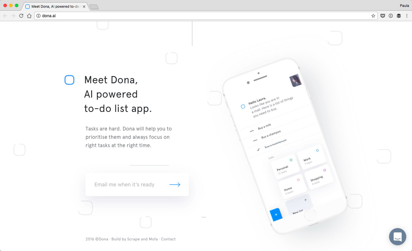
The first example is the landing page for Dona, an AI-powered do-to app. Here is the thing, though, this design doesn’t lack color completely.
There are some pieces of blue on the landing page. Additionally, the screenshot in the iPhone has tiny bits of other colors as well. The idea here isn’t to remove color but to use its absence to an advantage.
The second example is a portfolio for the Logo Shop. The website is made up of a washed out pink background and everything else is a dark gray color. Now, both of these design don’t utilize color in the traditional sense. At the same time, neither one of them is truly grayscale. What both of these design do is level the playing field for the emphasis on the colors.
![]()
Because there isn’t a single color that stands out the most, the visual emphasis then relies on the amount of color used or the size of the elements. In the case of the Logo Shop, the header is the biggest element above the fold. It’s obviously the most important element there, visually speaking. This wouldn’t have been so easy to distinguish if the texts used different colors to create a visual hierarchy.
As you can see, lack of color diversity is a good thing. On Dona’s landing page, the emphasis easily goes to the animated screenshot in the iPhone. If the heading or the email capture were a bright color, the focus would have been taken away from the .
Highlighting bits and pieces
Sometimes using color to draw attention to something is as simple as using it as a highlight. Highlighting is the whole idea behind accent colors anyways. Accent colors are to give attention to less significant information compared to what the main colors are supposed to represent.. So, how can one use color to highlight?
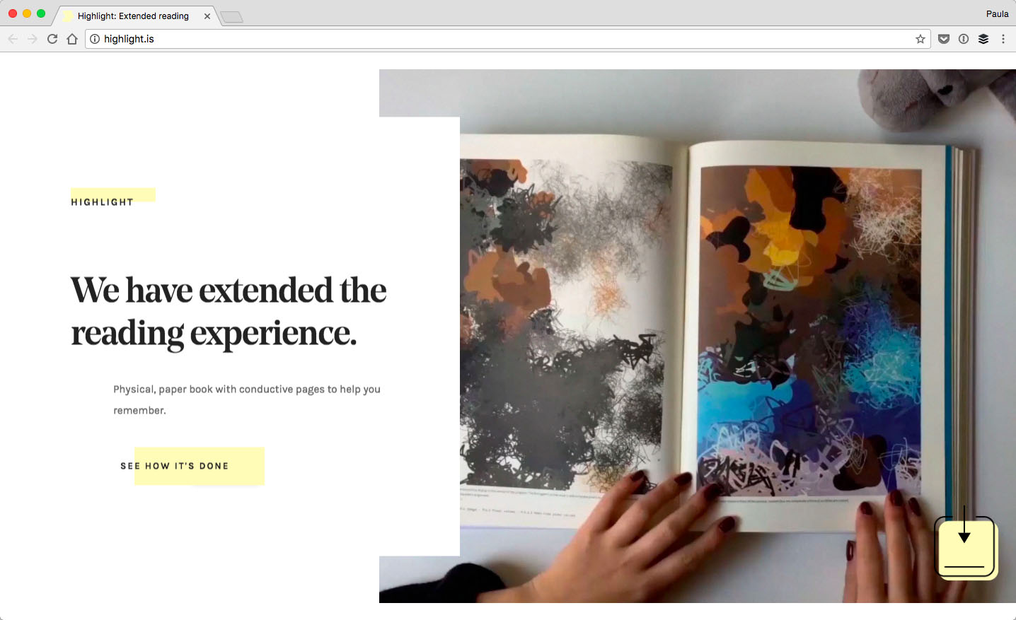
On Highlight’s website, the yellow is used as an accent in two ways. First, to highlight information in each individual section. Second, to highlight the most important section of them all. That’s a nice way to utilize color in a smart manner.
Actually, on Highlight’s landing page, the yellow is the only color besides black, white and some grays. The yellow color isn’t used that often either. It’s used sporadically, in strategic places to highlight important pieces of information in any given section. This way, the visitors know exactly what is of visual significance and what should be looked at first, subconsciously of course.
The yellow highlight is used in a limited fashion in all but one section. The very last section of the landing page is the exact opposite as far as color use goes. The background is yellow with a yellow pattern over it. It denotes the most important section of them all. It’s the only section where a user can take an action by providing an email address.
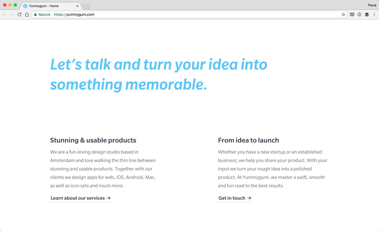
Something similar is happening on Yummygum’s homepage too. This digital agency uses the color blue to make its highlighting. On the top section of its homepage, it uses the color blue to underline and highlight a link. Visually, it’s the most important link in that specific section. As you scroll down the home page, different sections use blue differently. But, they still use the color blue to highlight a single, most important element of that given section, such as a heading or the contact button.
Yummygum’s home page is filled with small highlights. All of those are possible thanks to limited and thought through use of color on the part of the website’s design.
Conclusion
Color is such a fantastic design tool. It helps keep order or invokes chaos – whichever one you need to achieve. In this post, we went over a few various way in which color can be used strategically in order to drive attention to something specific. This post was meant to shed light on how to think about using color in design in a strategic and mindful way.


