The Design Side Of Conversion Rate Optimization
Conversions drive the web but most designers don’t think like this. Whenever you write an article and someone finds it in Google, their click is a conversion onto your site. If they keep reading and sign up for your newsletter that’s another conversion based on different goals.
Web design is about usability but it’s also about KPIs and user engagement.
I’d like to dive into both areas and try merging these two ideas with conversion rate optimization(or CRO). If you can increase conversion rates while also improving usability it’s a win for everyone involved.
Colors For Conversions
One of the first changes you might consider making is a different color scheme. This does make sense because colors have an impact and leave an impression on your visitors.
Typically for higher conversions you want to use colors that are non-dominant on the page. These will drive more attention because they stand out against the layout.
You can see this in a Hubspot case study examining a green vs red button design. The green button performed a bit worse mostly because green is already a dominant color in the page.
With Postcards Email Builder you can create and edit email templates online without any coding skills! Includes more than 100 components to help you create custom emails templates faster than ever before.
Free Email BuilderFree Email Templates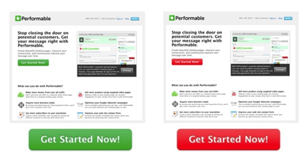
Much like everything else in UI design, contrast brings attention. And to increase conversions you need attention first.
This is why I highly recommend following the contrast no matter what type of layout you have.
And if your conversions relate more to hyperlinks or user signups then use colors to help those elements stand out from the page.
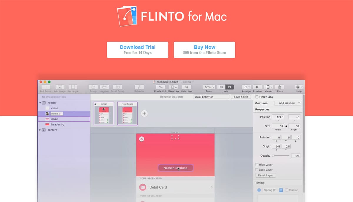
You can see on the Flinto landing page that bright white buttons litter the landscape. These shine brightly off the red background even though both colors are pretty light.
If you really wanna get detailed you could dive into color psychology but this isn’t necessary for basic testing. Instead trust your eye and run a lot of tests to see which colors work best.
For more ideas and UX case studies on color + conversions take a look at these links:
With Startup App and Slides App you can build unlimited websites using the online website editor which includes ready-made designed and coded elements, templates and themes.
Try Startup App Try Slides AppOther Products- How to Use the Psychology of Color to Increase Website Conversions
- Best Colors for Add to Cart/Buy Button
- How to Pick the Perfect Landing Page Colors That Convert
Highlight The Main Action
Conversions happen ultimately by something occurring on the user’s end. Maybe they create a new account, or complete a purchase, or sign up for a newsletter.
You’ll notice all 3 of those examples require some type of button to complete the action. You should do your best to highlight the main goal whether through graphics, colors, borders, textures, typography, or anything else that’ll grab attention.
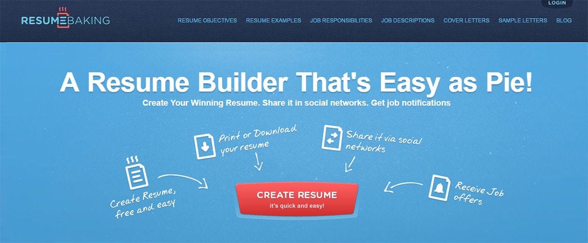
The homepage of ResumeBaking is one of my favorite examples because it’s so overt yet it works incredibly well.
All of those little arrow icons point towards that one CTA button and encourage the user to click. It’s a strong method for onboarding new users and getting past the initial hesitation.
Design around these elements and create a layout that purposefully makes your action item stand out.
Lookback has another nice homepage design but the action element is a signup form. So instead of just pressing a button the user also needs to enter their email address.
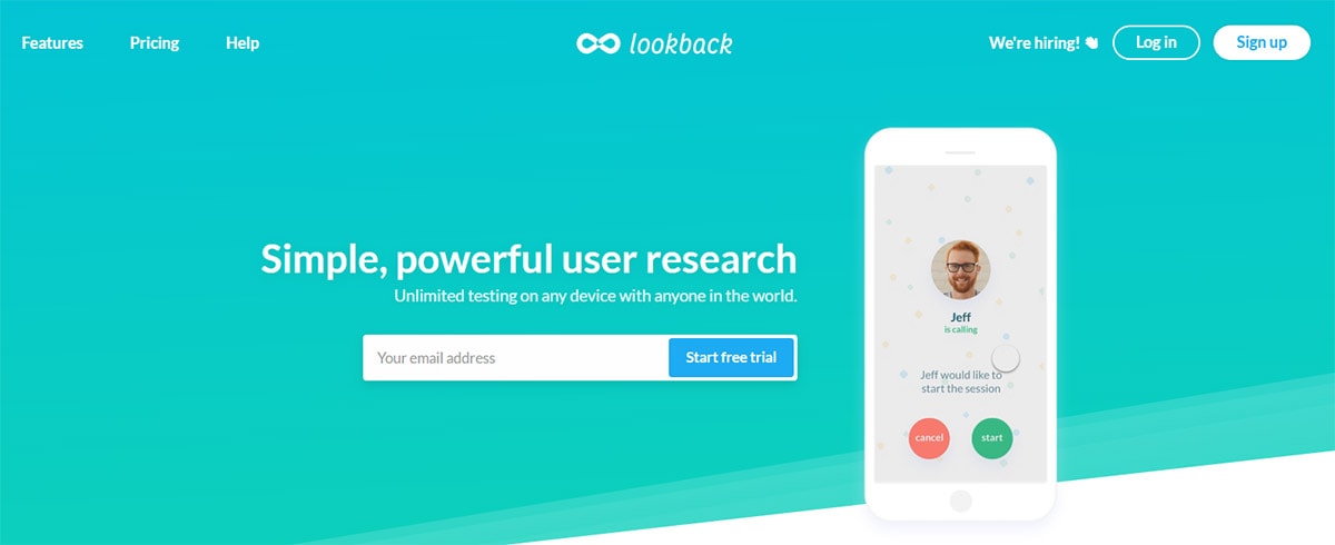
The entire form feels encapsulated by a white boundary that uses high contrast to stand out against the blue-green header. This same design is used in the footer because it probably works better than the input field without a border.
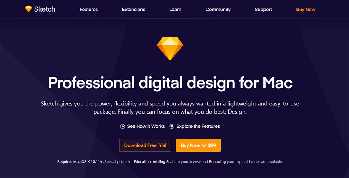
If you have multiple offers you could even try restyling the two buttons to stand out from each other.
This technique is used on the Sketch homepage and I think it works well.
Whatever you can do to highlight the primary action will go a long way towards higher conversions.
Rework Page Copy
You may not think of written content as part of your website’s design. But copy sells and great copy can sell even better.
Look into how your site is designed and what sort of content you have for your CTA. Does it really encourage the user to take an action? Is the text large enough to read? Do you feel inspired after reading it?
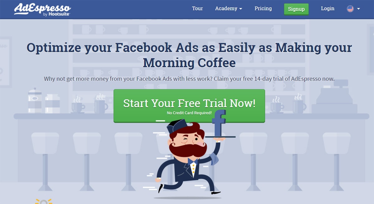
The homepage of AdEspresso is a brilliant example for both header copy and button copy.
Their green button grabs far more attention than the headline, plus it’s bright green and really contrasts against the rest of the layout.
By adding words like “free” you’re telling the user that the action is a lower barrier to entry. And phrases like “get your account” or “start your trial” talk directly to the person behind the mouse & keyboard.
Remember you need to grab attention first before anyone will take action. Great copy that speaks to the user is sure to grab their attention fast.
Web copy may not seem like a part of the visual design but it sure is part of the user experience.
Take for example this case study which simply adds the words “it’s free” near the CTA. These extra words increased conversions by 28% which is a pretty large jump.
Make sure you’re designing around copy because this can have a tremendous effect on your CRO work.
Test Many Styles & Layouts
In the world of design you can never assume anything is accurate without testing alternatives first. Accurate assumptions may come with experience but it’s always good to test more than you assume.
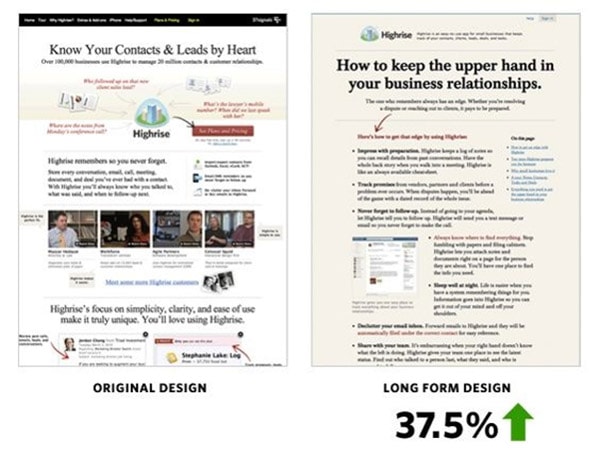
There’s an interesting case study from Highrise where they ran a page full of graphics & arrows compared to a longform write-up. The graphics-heavy page looks a lot nicer, yet the lengthier one increased conversions by 37%!
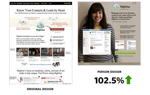
The team also ran A/B tests against a homepage with a picture of a real person in the background. This personal touch increased conversions by over 100%.
To most people the graphic-heavy page would look better. Yet through testing different layouts the team learned a valuable lesson: never assume!
Increasing conversions is a tricky beast since there is no single correct way to do it.
I recommend brainstorming a few different design ideas for your homepage(or landing page) to think what you could change that may increase conversions.
Be willing to completely throw out your current layout and test a radically new design. It may totally flop, but it may also lead to a much higher conversion rate.
If you can get into a CRO framework for testing you’ll have a much easier time gathering results that have impactful changes to your page design.
And if you’re looking for more inspiring A/B case studies on conversion rates & design these are definitely worth reading:
- Conversion Case Study: Kiva.org
- Split Test: Should You Use A Photo For Your Background?
- Mobile Site vs. Responsive Site Test Results