Create a Product Page with Interactive Colors in HTML, CSS3 & jQuery
Difficulty: Intermediate
Estimated Completion Time: 30 minutes
In this tutorial, we are going to create a website product page using HTML, CSS3 and jQuery. You can use it for product presentations on your shop website.
Slides: HTML Static Website Builder
This page can be utilized to present your products on the website for your online business, making it simpler for customers to understand what you have to offer. The webpage’s structure can be created with HTML, and it can be styled and made visually appealing with CSS3. With the help of the JavaScript library jQuery, you can make your website more interactive and animated for your visitors and provide them a more satisfying experience overall. You can make a product page that looks professional and will make your company stand out by following the instructions in this guide.
In this tutorial, we’ll use Google Fonts, specifically Roboto. Make sure to include the typeface before you start.
HTML
The first step is to create an HTML structure. Here’s what we need:
With Postcards Email Builder you can create and edit email templates online without any coding skills! Includes more than 100 components to help you create custom emails templates faster than ever before.
Free Email BuilderFree Email TemplatesTwo columns
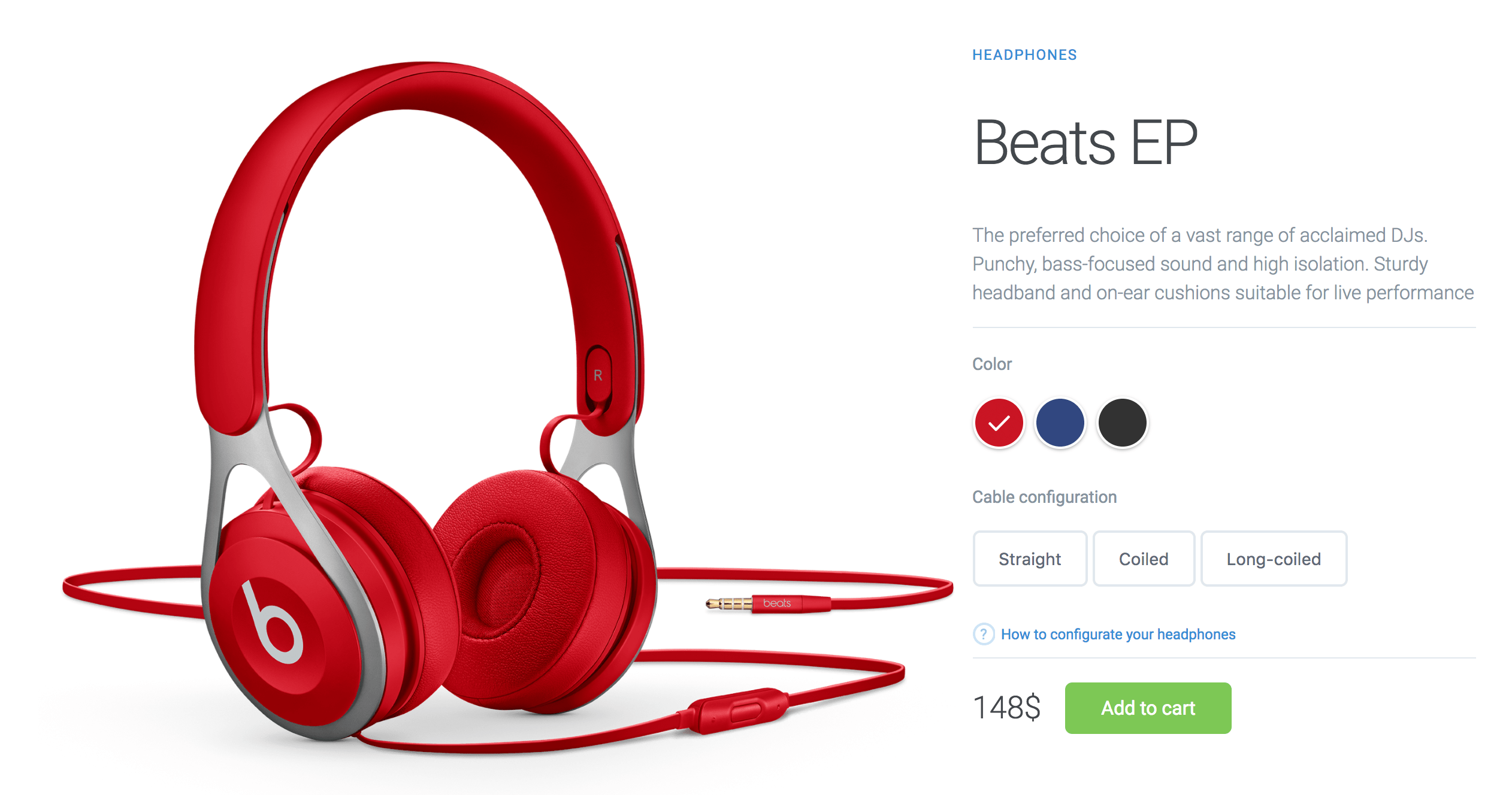
- Headphones images (**on the left**)
- Headphones description and customization (**on the right**)
- In this section, we’ll have more elements (**buttons, radios, links**)
Ok, let’s wrap everything in a `.container` class.
Here’s the markup:
    <main class="container">

      <!-- Left Column / Headphones Image -->
      <div class="left-column">
        <img data-image="black" src="images/black.png" alt="">
        <img data-image="blue" src="images/blue.png" alt="">
        <img data-image="red" class="active" src="images/red.png" alt="">
      </div>


      <!-- Right Column -->
      <div class="right-column">

        <!-- Product Description -->
        <div class="product-description">
          <span>Headphones</span>
          <h1>Beats EP</h1>
          <p>The preferred choice of a vast range of acclaimed DJs. Punchy, bass-focused sound and high isolation. Sturdy headband and on-ear cushions suitable for live performance</p>
        </div>

        <!-- Product Configuration -->
        <div class="product-configuration">

          <!-- Product Color -->
          <div class="product-color">
            <span>Color</span>

            <div class="color-choose">
              <div>
                <input data-image="red" type="radio" id="red" name="color" value="red" checked>
                <label for="red"><span></span></label>
              </div>
              <div>
                <input data-image="blue" type="radio" id="blue" name="color" value="blue">
                <label for="blue"><span></span></label>
              </div>
              <div>
                <input data-image="black" type="radio" id="black" name="color" value="black">
                <label for="black"><span></span></label>
              </div>
            </div>

          </div>

          <!-- Cable Configuration -->
          <div class="cable-config">
            <span>Cable configuration</span>

            <div class="cable-choose">
              <button>Straight</button>
              <button>Coiled</button>
              <button>Long-coiled</button>
            </div>

            <a href="#">How to configurate your headphones</a>
          </div>
        </div>

        <!-- Product Pricing -->
        <div class="product-price">
          <span>148$</span>
          <a href="#" class="cart-btn">Add to cart</a>
        </div>
      </div>
    </main>
Now let’s go to the next step where we’ll make it look awesome.
CSS
Add basic styling to the body.
/* Basic Styling */
html, body {
  height: 100%;
  width: 100%;
  margin: 0;
  font-family: 'Roboto', sans-serif;
}

.container {
  max-width: 1200px;
  margin: 0 auto;
  padding: 15px;
  display: flex;
}
Notice that `.container` has been set to `display: flex` which will align the columns.
Now let’s add some width to columns and `position: relative` the `.left-column`, because we will `position: absolute` the images.
/* Columns */
.left-column {
  width: 65%;
  position: relative;
}

.right-column {
  width: 35%;
  margin-top: 60px;
}
Great! Let’s style the first column, which is `.left-column`. This column has three images, three headphones in different colors. We’ll give them `opacity: 0` and also add a class `.active` on them with `opacity: 1`, which we’ll need it later in this tutorial.
With Pulsetic you’ll be instantly notified the moment your website, API, or server becomes unavailable. Monitor uptime from multiple global locations and respond to incidents before your users are affected.
Create beautiful status pages in minutes to keep customers informed during outages and build trust with transparent communication.
Start Monitoring for Free
/* Left Column */
.left-column img {
  width: 100%;
  position: absolute;
  left: 0;
  top: 0;
  opacity: 0;
  transition: all 0.3s ease;
}

.left-column img.active {
  opacity: 1;
}
Style the `.right-colum` now. Begin with `.product-description` where we describe the product.
/* Product Description */
.product-description {
  border-bottom: 1px solid #E1E8EE;
  margin-bottom: 20px;
}
.product-description span {
  font-size: 12px;
  color: #358ED7;
  letter-spacing: 1px;
  text-transform: uppercase;
  text-decoration: none;
}
.product-description h1 {
  font-weight: 300;
  font-size: 52px;
  color: #43484D;
  letter-spacing: -2px;
}
.product-description p {
  font-size: 16px;
  font-weight: 300;
  color: #86939E;
  line-height: 24px;
}
Now, we need to style the product color configuration.
Here, we have three radio inputs, we’ll style them to look nice. Each input will have a color that pairs with the headphones color. We’re going to use `:checked` to add a checked icon on the checked radio input, `:checked` is an awesome feature which CSS provides.
/* Product Color */
.product-color {
  margin-bottom: 30px;
}

.color-choose div {
  display: inline-block;
}

.color-choose input[type="radio"] {
  display: none;
}

.color-choose input[type="radio"] + label span {
  display: inline-block;
  width: 40px;
  height: 40px;
  margin: -1px 4px 0 0;
  vertical-align: middle;
  cursor: pointer;
  border-radius: 50%;
  border: 2px solid #FFFFFF;
  box-shadow: 0 1px 3px 0 rgba(0,0,0,0.33);
}

.color-choose input[type="radio"]#red + label span {
  background-color: #C91524;
}
.color-choose input[type="radio"]#blue + label span {
  background-color: #314780;
}
.color-choose input[type="radio"]#black + label span {
  background-color: #323232;
}

.color-choose input[type="radio"]:checked + label span {
  background-image: url(images/check-icn.svg);
  background-repeat: no-repeat;
  background-position: center;
}
Good! Now let’s style the `.cable-configuration` section. We have three buttons and a link. Let’s style their states and make them look nice.
/* Cable Configuration */
.cable-choose {
  margin-bottom: 20px;
}

.cable-choose button {
  border: 2px solid #E1E8EE;
  border-radius: 6px;
  padding: 13px 20px;
  font-size: 14px;
  color: #5E6977;
  background-color: #fff;
  cursor: pointer;
  transition: all .5s;
}

.cable-choose button:hover,
.cable-choose button:active,
.cable-choose button:focus {
  border: 2px solid #86939E;
  outline: none;
}

.cable-config {
  border-bottom: 1px solid #E1E8EE;
  margin-bottom: 20px;
}

.cable-config a {
  color: #358ED7;
  text-decoration: none;
  font-size: 12px;
  position: relative;
  margin: 10px 0;
  display: inline-block;
}

.cable-config a:before {
  content: "?";
  height: 15px;
  width: 15px;
  border-radius: 50%;
  border: 2px solid rgba(53, 142, 215, 0.5);
  display: inline-block;
  text-align: center;
  line-height: 16px;
  opacity: 0.5;
  margin-right: 5px;
}
One last thing to do is to style the last section of this column, which is `.product-price`.
/* Product Price */
.product-price {
  display: flex;
  align-items: center;
}

.product-price span {
  font-size: 26px;
  font-weight: 300;
  color: #43474D;
  margin-right: 20px;
}

.cart-btn {
  display: inline-block;
  background-color: #7DC855;
  border-radius: 6px;
  font-size: 16px;
  color: #FFFFFF;
  text-decoration: none;
  padding: 12px 30px;
  transition: all .5s;
}
.cart-btn:hover {
  background-color: #64af3d;
}
Awesome! Here’s what we’ve accomplished so far:
Let’s add responsiveness, too.
/* Responsive */
@media (max-width: 940px) {
  .container {
    flex-direction: column;
    margin-top: 60px;
  }

  .left-column,
  .right-column {
    width: 100%;
  }

  .left-column img {
    width: 300px;
    right: 0;
    top: -65px;
    left: initial;
  }
}

@media (max-width: 535px) {
  .left-column img {
    width: 220px;
    top: -85px;
  }
}
JS
The last thing we need to do is to make the images change when we click on a color, so that the checked radio input color matches with headphones color. This uses jQuery, so make sure to include it in your project. We’ll use data attributes to work with.
Notice that we add the class `.active`. I mentioned earlier everytime we click on the matched color.
$(document).ready(function() {

  $('.color-choose input').on('click', function() {
      var headphonesColor = $(this).attr('data-image');

      $('.active').removeClass('active');
      $('.left-column img[data-image = ' + headphonesColor + ']').addClass('active');
      $(this).addClass('active');
  });

});

Download Website Product Page

Awesome! We’re done here! Feel free to use this in your projects. Take a look at the demo and let me know what you think in the comments.


