How to Create Featured Images That Draw More Readers to Your Blog
You’re familiar with how valuable images are on a website. They can:
- Break up otherwise long stretches of text.
- Visually complement the content on a page.
- Reinforce a brand’s visual identity and style.
- Simplify how many words are used to tell a story.
- Evoke a desired emotional response from visitors.
But those aren’t the only images you should be concerned with.
Featured images, also known as post thumbnails, provide a visual summary of each page on your website. And while they can be found on your site, they represent your content on other platforms as well.
If you don’t choose or edit your featured images wisely, it’s no different than using an ugly or boring cover for your book. If your images can’t capture anyone’s attention or, worse, they leave them with a bad impression, how do you expect anyone to ever read your content?
Today, we’re going to briefly look at how featured images represent your blog content outside of the blog as well as 5 tips for creating more attractive and engaging featured images:
Why Do Featured Images Even Matter?
Technically, featured images can be attached to any page on your site — web pages, product pages, and blog pages. However, because blog content is such a huge driver of traffic (and leads), we’re going to focus strictly on that segment for today.
With Postcards Email Builder you can create and edit email templates online without any coding skills! Includes more than 100 components to help you create custom emails templates faster than ever before.
Free Email BuilderFree Email TemplatesLet’s have a look at an example you’re already familiar with.
In case you didn’t notice it when you got here, Designmodo includes a featured image atop each blog post’s description in the latest articles blog feed:
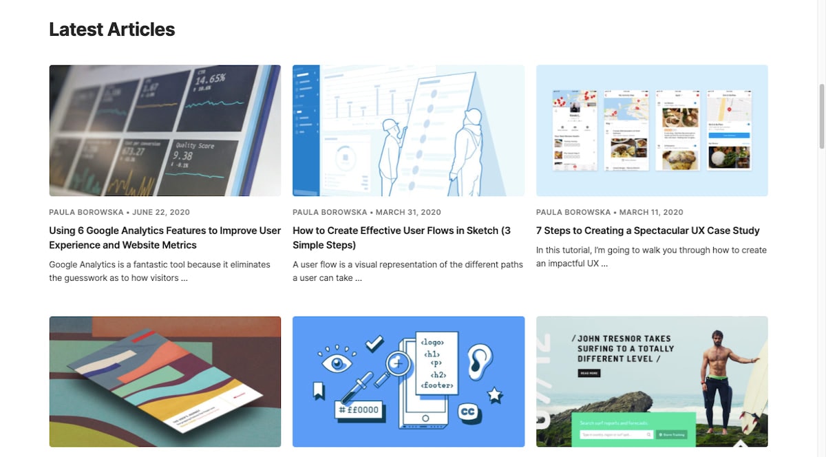
Notice how each image perfectly sums up what each post is about. Readers wouldn’t even need to read the title and description snippet if they didn’t want to.
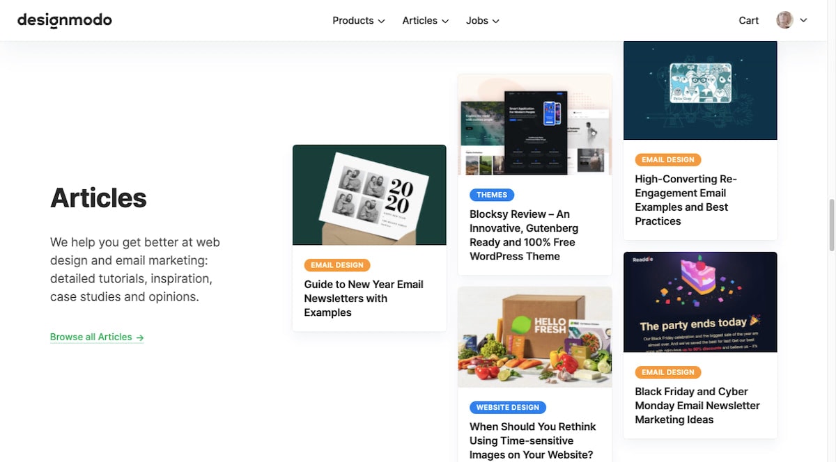
Designmodo then takes the same photo that captured readers’ attention in the blog feed and places it at the top of the blog post as it does for this Google Analytics post:

This is great because it establishes a consistent and clear visual identity for the blog post regardless of which page of the site or external channel someone encounters it on.
As for where else the featured image will appear on a website, there’s usually a spot on the home page that promotes the latest blog posts. So, it’ll show up there:
It’s just as important to think about where your featured images will appear elsewhere on the web. Because when your content has to compete against other blog content for attention, that image is going to help lure readers to your site instead of someone else’s.
For instance, featured images show up when your blog content appears in RSS feed aggregators like Feedly:
With Pulsetic you’ll be instantly notified the moment your website, API, or server becomes unavailable. Monitor uptime from multiple global locations and respond to incidents before your users are affected.
Create beautiful status pages in minutes to keep customers informed during outages and build trust with transparent communication.
Start Monitoring for Free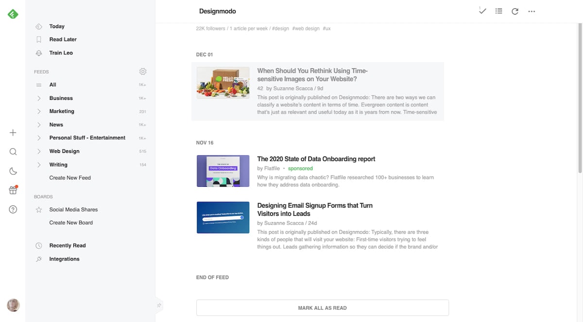
Of course, featured images can also appear on social media platforms like Twitter:
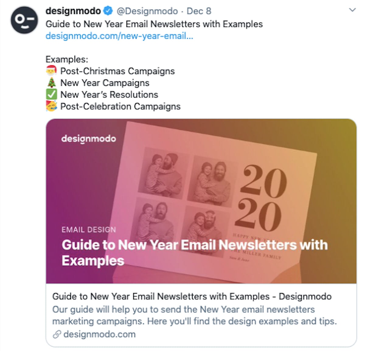
They’re actually a very important part of social media marketing as featured images increase views, clicks, and shares of posts.
Your newsletter designs should also include featured images when promoting your blog content:
Featured images in newsletters work just as well as they do on social to grab a reader’s attention and inspire them to take action.
How to Design Featured Images That Capture People’s Attention
Besides using the right size and resolution for your featured images, what else do you have to consider when choosing and designing featured images for your blog?
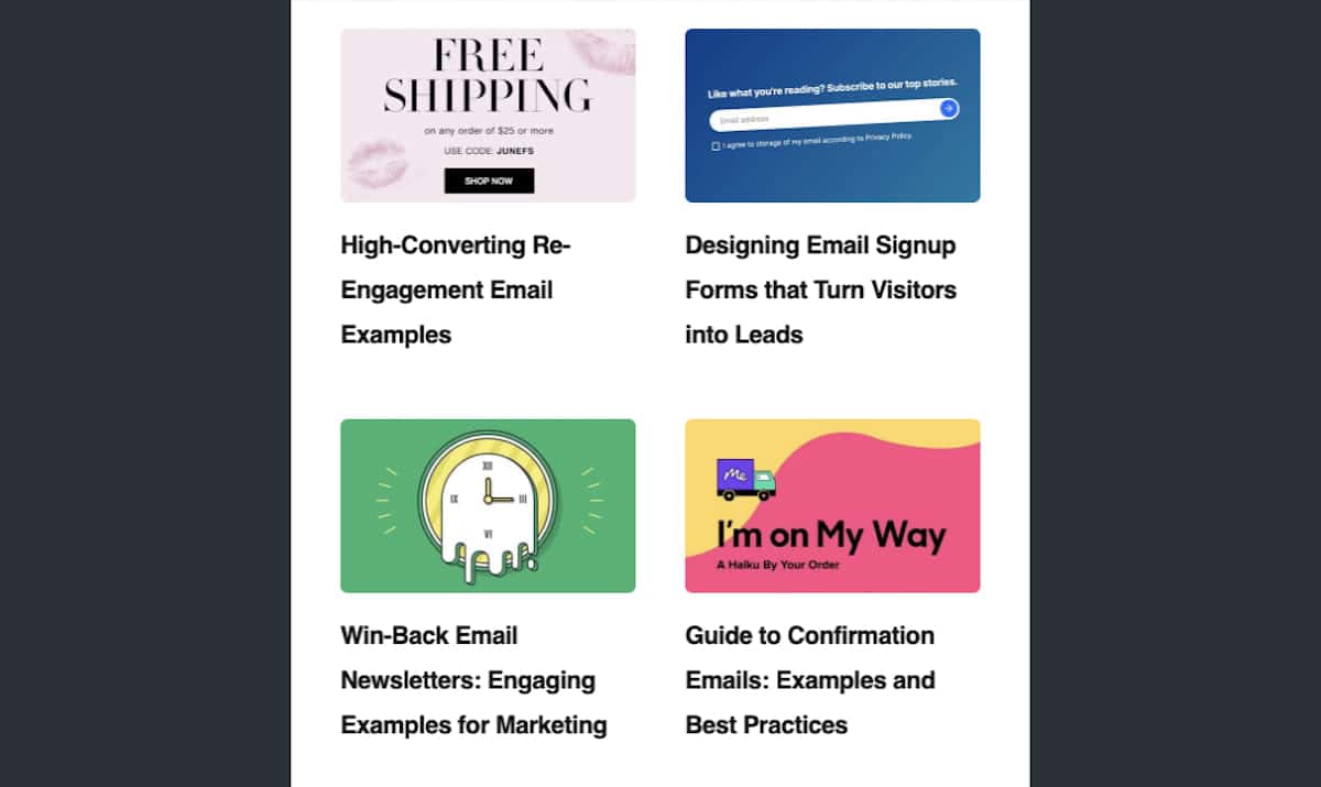
1. Use a Consistent Style for Each Major Blog Category
While it’s possible for all your featured images to have the same style, giving a distinct look to certain types or categories of content could improve the blog’s appearance and navigability.
Let’s look at an example from the BigCommerce blog.
Executive’s Corner posts from Make It Big conference speakers have featured images that look like this:

They all use the same design and text: a big black banner that promotes the 2020 event.
Any posts having to do with holiday ideas, strategies, or data will use this featured image layout:
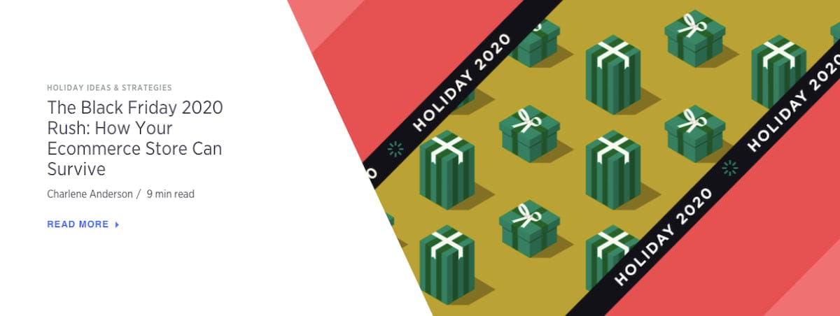
The outside color and interior image differ, but the “Holiday 2020” stripes and the positioning of the are always the same.
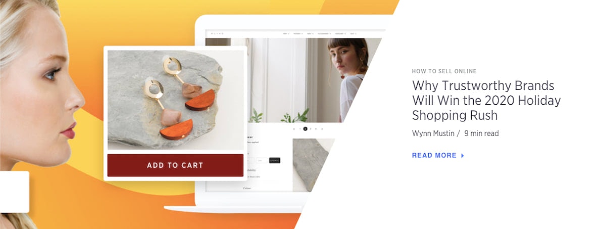
How to Sell Online tutorials always include an image of an ecommerce website, mobile app, or social media platform. Like this:
And, for the most part, the remaining images that cover general ecommerce tips, technologies, and news have illustrated techy banners in blue and purple shades:

By giving each of its major content types a distinct look, BigCommerce readers can quickly find the kind of content that interests them.
On the main blog feed that might not matter. However, in spots where they can’t sort by category — like on social, in an RSS feed, or in their weekly newsletter — it does matter.
2. Simplify the Layout By Focusing on the Subject
One way to help readers quickly comprehend what your posts are about is to make the subject the main (if not only) focus of the image.
Let’s look at this example from the L’Oreal Paris beauty blog:
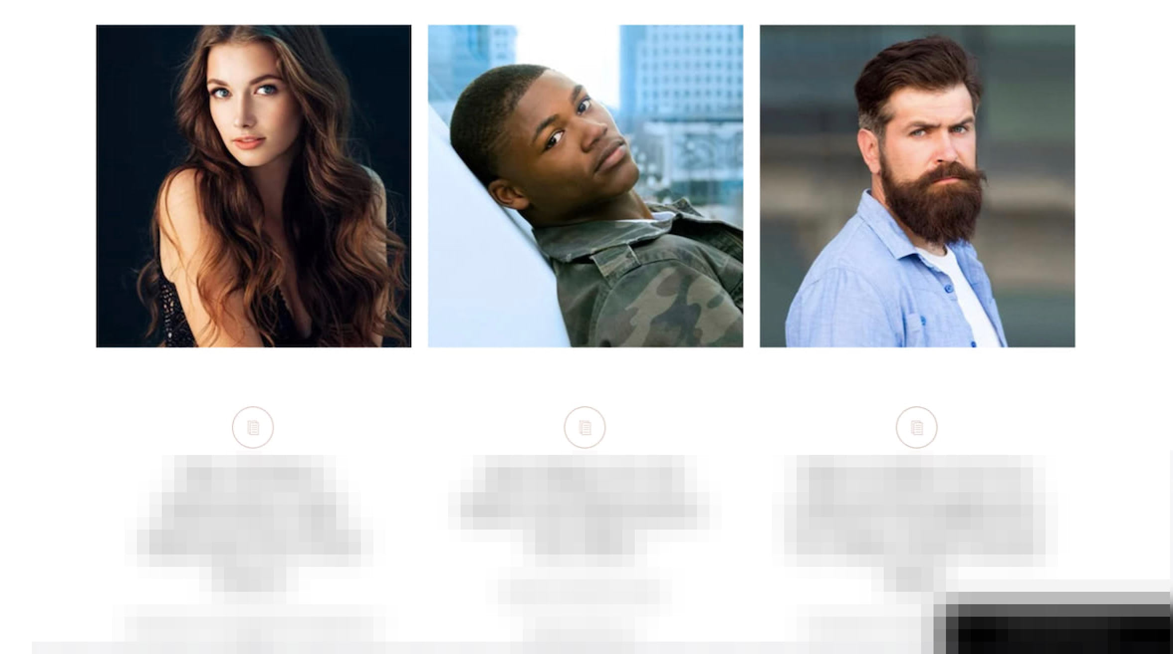
Have a look at these three featured images. Without the context of the titles beneath them, can you tell me what the category of this page is?
Knowing that this is a beauty blog and that each of these people has a distinguished looking hairstyle, you’d be right to guess that this is under the “Hair” section of the blog.
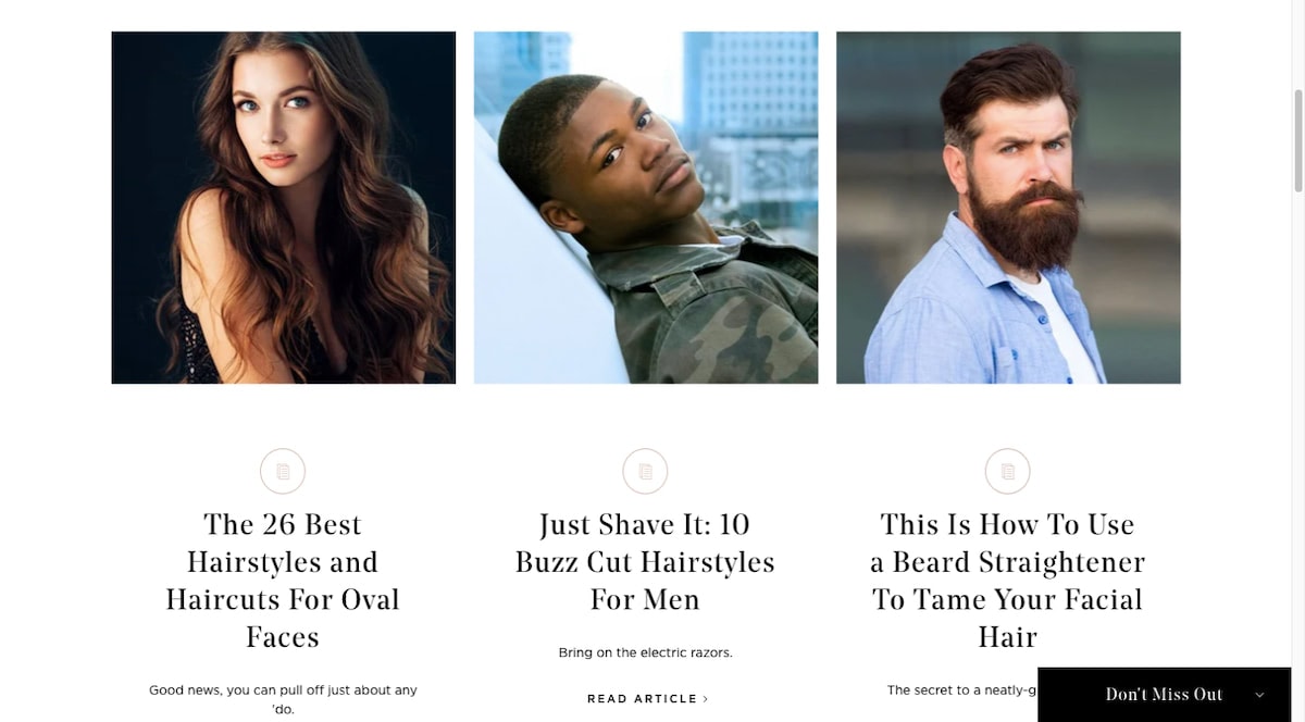
Now, look closer at each image. With the exception of the middle one, you really can’t see much of the background at all. Even then, the city is blurred enough to the point where it really can’t be recognized and become a distraction.
Centering the subjects and fading out the background (if you have any at all) is a good way to lay out your featured images. It’ll free your readers up to focus on the subject and not on the surrounding details that would otherwise get in the way of its message.
This doesn’t mean that backgrounds in featured images are off limits. It just means that the focus of the post needs to be front, center, and larger than everything else.
The second the surrounding elements distract from that, it’s time to find a new photo.
3. Stay Away from White Backgrounds
Now, it is possible to go in the wrong direction with your image backgrounds if they’re devoid of color or subject matter altogether.
Unless your website uses a different background color or your featured images automatically come with a dark border, they may get lost within the white space of the page.
You want readers to be able to identify where each of your blog posts starts and stops. You also want to keep surrounding distractions (whether they’re your posts or other people’s content on other sites) from getting in the way.
A clear delineation between featured images and everything else will help with this.
Let’s look at the Engadget blog for an example:
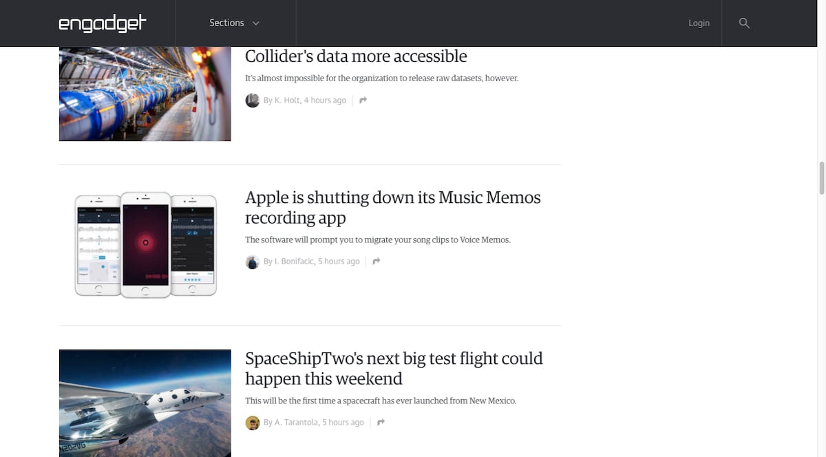
For the most part, every featured image is a complete image with a clear rectangular border. This brings a consistent look and flow to the blog.
However, if someone were to scroll through the feed, they’d likely pause here because of the free-floating smartphones in the middle. While this might work well when framing product photos on an ecommerce site, it’s just too disruptive for a blog.
Lifehacker, for instance, has product-centric posts just as Engadget does. However, here’s how it handles those featured images:
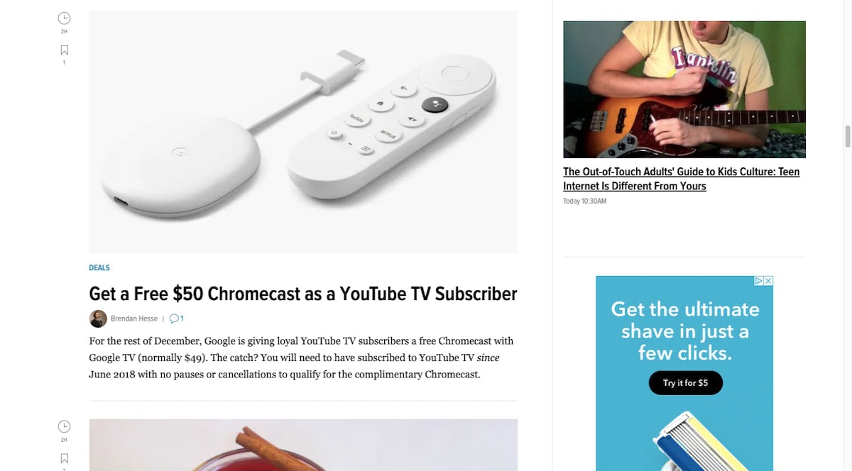
Rather than leave the Chromecast device and remote hanging out there, the softly colored background allows it to seamlessly flow along with the rest of the blog content.
4. Make the Images As Authentic As You Can
When choosing or creating a featured image for your blog post, you want to accomplish a number of things:
- Make it eye-catching.
- Make it descriptive.
- Make it authentic.
The first two are obvious. If your images aren’t attractive and don’t clearly describe what the post is about, you either won’t draw in any readers… or you run the risk of drawing in the wrong readers.
As for the third goal, this has more to do with the state of the consumer-business relationship these days. Without other consumers vouching on behalf of a brand, it’s not always easy to trust what they’re putting out there. This includes the blog.
So, you really want to be careful about what signals your featured images send.
Vague and abstract images might leave readers wondering if the content will have any value. And heavily staged stock photos may cause them to wonder how genuine the content will end up being.
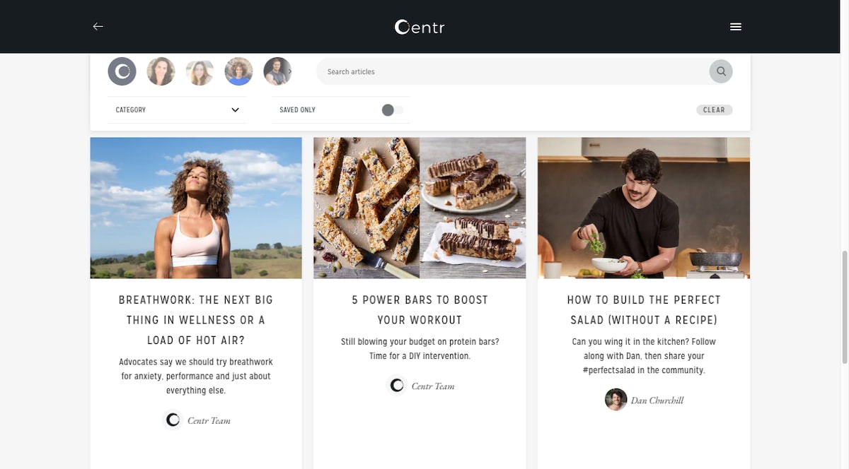
Let’s look at a good example of how to strike the right balance in your featured images. This is from the Centr blog:
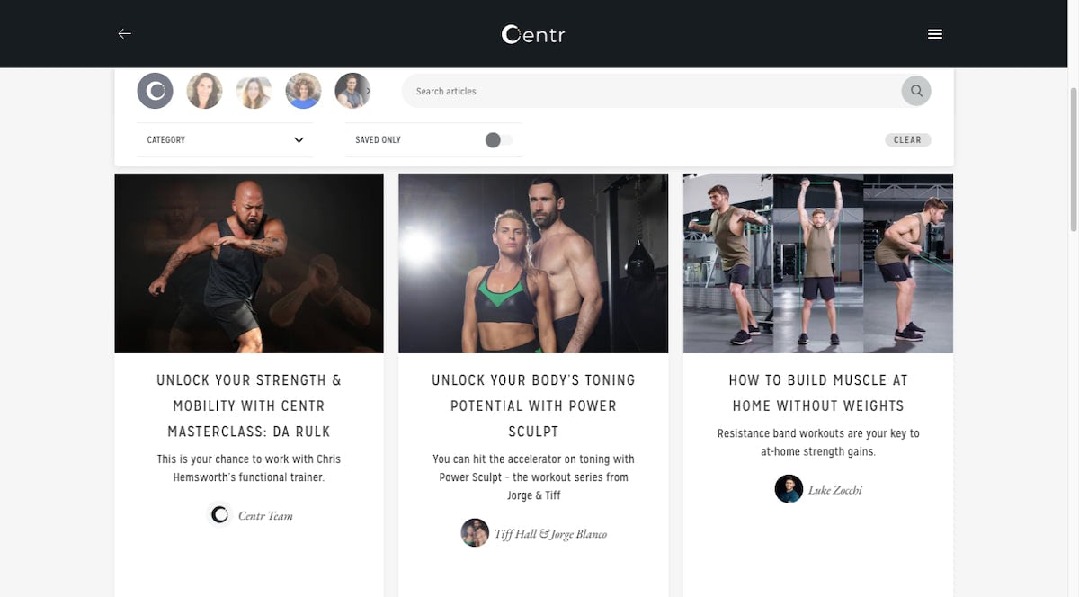
The blog contains three kinds of content: Eat, Live, and Train.
The three examples above are from the “Train” category. The first two definitely have a certain polish to them (probably because they’re part of the promotional images/videos for the app).
However, the third one shows one of the trainers actually going through one of the workouts. It might not be a close-up of him sweating and straining to work out, but who really wants to see that? Centr readers and users want guidance and results — and this photo promises both.
In this next screenshot, we can see some of the “Live” and “Eat” posts:
Typically, the “Live” posts (like the breathwork one above) use inspirational/aspirational thumbnail. They show the actual trainers that create content for the app, but they’re most definitely staged.
In this case, it’s okay. That’s what people expect to see from a wellness blog. So long as the content can help readers actually achieve balance, calm, and other wellness benefits, the idealized photos are okay.
There are also two examples of “Eat” posts above. One features protein bars for a recipe post. The other shows one of the team members preparing one of Centr’s recipes in the kitchen.
These are both authentic photos. Sure, they’re well-framed, but they come from actual video tutorials and recipes found in the app.
It’s a delicate balance obviously. Because while you don’t want your featured images to lie, you also don’t want people to be bored to death or turned off by too-real photos. So, you need to find a good balance.
5. Keep Your Headline Out of the Image
I recognize that there are still some blogs that hold onto the old way of designing a featured image (i.e. with a headline and overlay built into it).
Let’s look at an example of why that’s not such a great idea anymore. This is the blog for Gary Vaynerchuk:
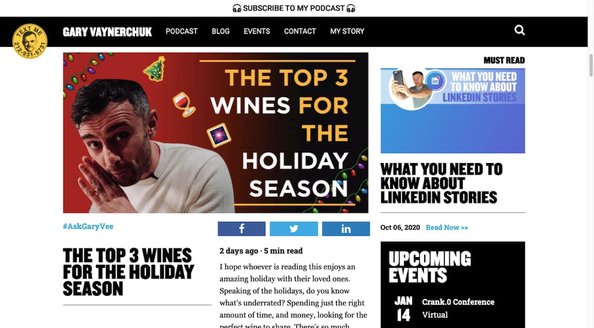
Look at the screengrab above. “The Top 3 Wines for the Holiday Season” (like all the other posts on this page) gets repeated twice.
The image is 788 x 412 pixels, making the headline within it roughly 394 x 412. If you were to stack the plain text headline beneath the image headline, they’d take up nearly all the space in the middle column of the page. All to say the same thing twice.
When the post gets shared on a social media platform like Facebook, the same thing happens:
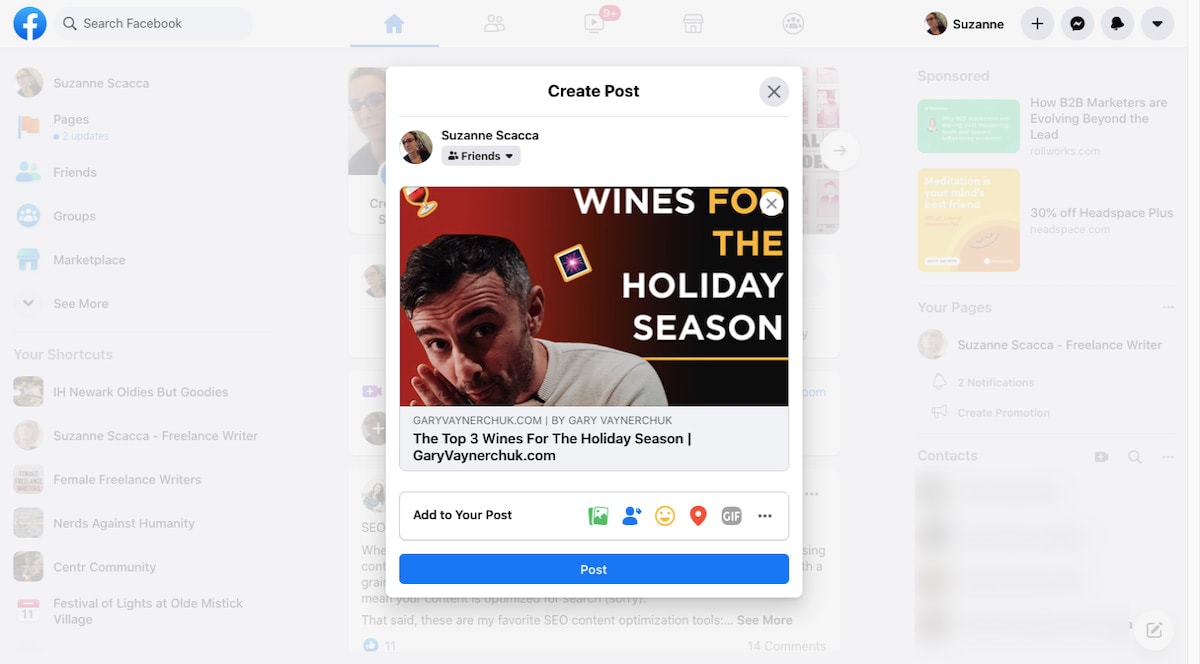
I recognize that this is part of Gary V’s visual style, however, the redundancy of information is a waste of space and time. And while his readers might not care (since they trust the value of his content), other blogs might not get so lucky.
That’s why it’s best to use an image with a visual subject that’s crystal-clear. That way, there’s no need to clutter up the design with repetitive words.
Here’s what the Martha Stewart blog has done when choosing images for its holiday wine-related content:
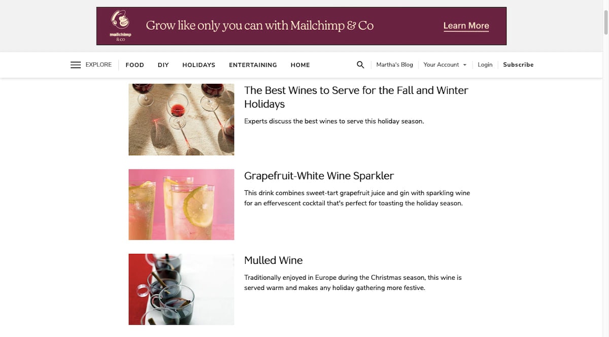
Now, I get that there’s not a whole lot of personality in these photos. There’s a simplicity and elegance to them, though, and that’s what this brand in particular is about.
If you want to bring a little more fun or emotion to your featured images, you can certainly do that. Just do it without the headline.
Keep in mind that this only pertains to the headline. Country Living, for example, has two posts related to “holiday wine”:
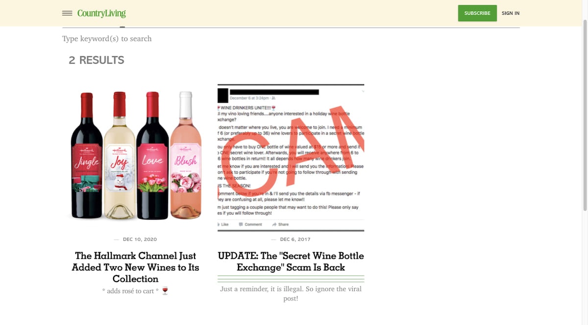
One is an attractive image of wine bottles and the other is an email with a giant “SCAM” written across it.
It’s okay to use featured images like this with words in them so long as your blog doesn’t place a headline atop it. Text on text will always cause readability problems.
Wrap-Up
Imagine if your blog didn’t have any featured images and all these areas on your website and marketing channels only used plain text and links to promote your blog posts?
Your brand would have to be super trustworthy in order to keep its blog’s click-through and read rates high.
The featured image plays a big part in grabbing readers’ attention and convincing them that the content is worth investing time in. What’s more, a post with an attractive and descriptive image attached to it is much more likely to get shared with others.
If you want to ensure that your featured images are done right, Designmodo’s website and email products come with a vast array of templates — many of which will help you lay the right groundwork for your featured images.


