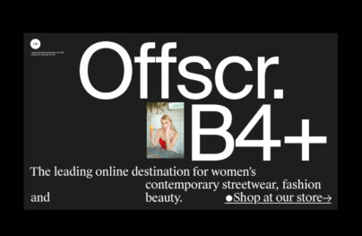
Headline and Title Fonts: Most Popular Typefaces, Best for Webfonts
Headline fonts have to set the tone of the entire document. Magazines, spreadsheets, tabloids, and even blogs use headlines to create intrigue and to appeal to the reader about the content. The use of proper headline fonts can make the content looking more urgent, relevant, essential and worth reading.
While fonts only are canisters for fonts, they must be able to create the necessary image, evoke emotions or express urgency to the reader. A headline is limited to a short phrase, so the impact is supplemented by using a good typeface. Headline fonts do that task. They are not excessively special but when used properly, they can shock, inform, or create sensation.
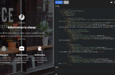
Export Figma Designs to Live Website – No-Code
One of the most important factors in producing aesthetically appealing and engaging content is the typeface you select for the title. The effective communication of the intended message depends greatly on the choice of typeface in attracting the reader’s attention.
With Postcards Email Builder you can create and edit email templates online without any coding skills! Includes more than 100 components to help you create custom emails templates faster than ever before.
Free Email BuilderFree Email TemplatesAlthough there are many font choices, not all of them are created equal. It’s crucial to pick a typeface that is readable, simple to read, and matches the content’s overall style and tone. Some of the top headline fonts to help your content stand out are listed below:
- Serif fonts are a common option for classic and traditional designs since they contain little lines or flourishes at the ends of the letters. They are ideal for formal or serious content since they are great at projecting a sense of authority and professionalism.
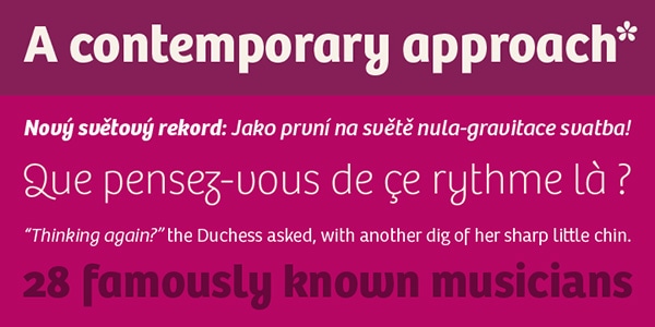
- Sans-Serif Fonts: Used for modern designs, these fonts have a crisp, contemporary appearance. They are ideal for informal or casual material since they are great at conveying a sense of simplicity and minimalism.
- Display fonts: These fonts are made to draw the reader’s attention and are therefore perfect for headlines and titles. They can be used to convey a variety of moods and tones and available in a variety of styles, from bold and dramatic to playful and whimsical.
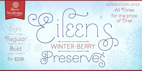
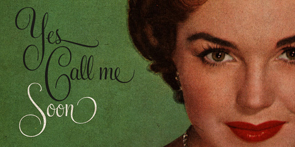
- Script typefaces are a common option for attractive and sophisticated designs since they closely resemble handwriting and calligraphy. They are ideal for special occasions or high-end products since they are great at evoking feelings of romance, creativity, or luxury.
The typeface you select must reflect the overall tone and purpose of your text. A serif font can be the greatest option if you’re crafting a serious or professional work. A display or script font can be better suited if you’re crafting a lighthearted and entertaining work. Make sure the font you chose is readable and easy to read across all platforms and devices.
It has to catch the eye of the reader
While headlines may be just one line of text, it has to be properly formatted for the eyes to catch the news. Eye-catching could mean anything, but it has to serve a purpose.
Choose headline font that are designed for their purpose. For headlines, the most common types include Caslon, Mercury Display and Kis. Headlines must be properly spaced and must be legible. Some level of contrast will also help in creating emphasis. Some fonts are thick enough to be used as is but depending on your choice of font, you could also use the bold format to create more emphasis.
A certain conviction should be present with the font choice
When you make the choice earlier on for a publication or maybe certain themes, it will help create a consistent image for the magazine or any other project you are doing. For blogs, this could be the selection of fonts for the title page. Making choices will allow you to experiment on different styles. Always make sure that the font will work well with the body copy and if you have a separate font for the name of your project, the headline must be able to stand out, but still look natural with other fonts. Some publications are known to change fonts every now and then and it has become an acceptable method, but at the end of the day, it would be good to have a go-to font for much of your content.
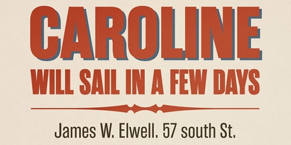
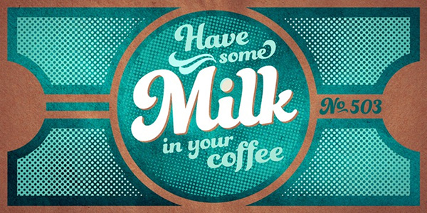
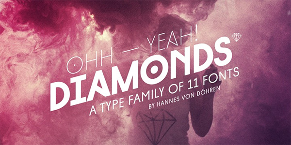
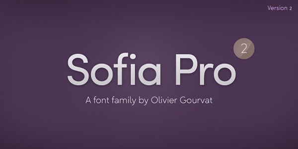
Most Usable Headline Fonts for Titles
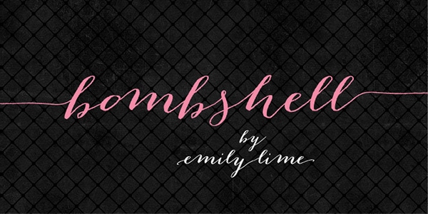
Bombshell Pro
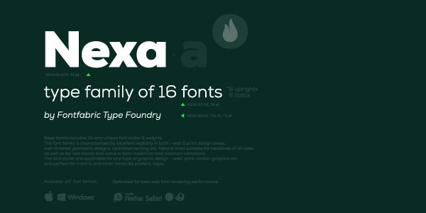
Nexa
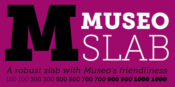
Museo Slab
With Pulsetic you’ll be instantly notified the moment your website, API, or server becomes unavailable. Monitor uptime from multiple global locations and respond to incidents before your users are affected.
Create beautiful status pages in minutes to keep customers informed during outages and build trust with transparent communication.
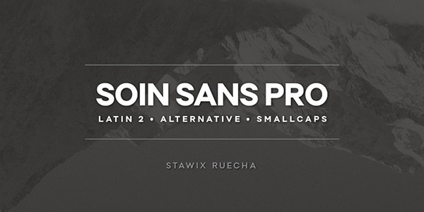
Start Monitoring for FreeSoin Sans Pro
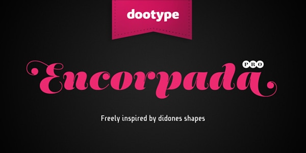
Encorpada Pro
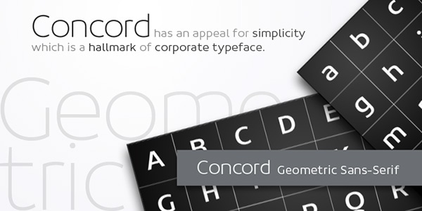
Concord
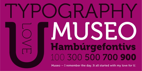
Museo
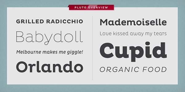
Pluto
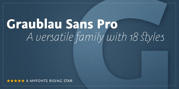
Graublau Sans Pro
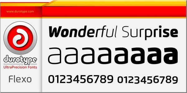
Flexo
Rama Gothic
Funkydori
Diamonds
Sofia Pro
Mandevilla
Bree
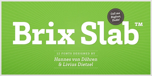
Brix Slab
Feel Script
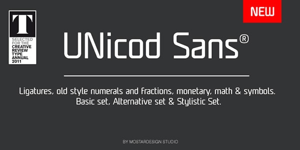
Unicod Sans
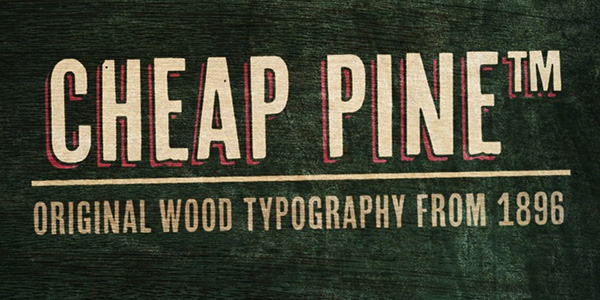
Cheap Pine
Cpl Kirkwood
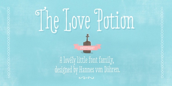
Love Potion
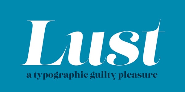
Lust
Core Sans N
Reznik

Schwager

Ambassador Plus

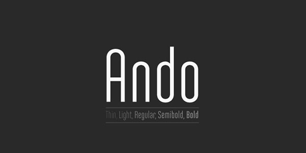
Ando
Abril

Some tips in choosing good typefaces and fonts for titles
- Appropriateness of a font will really vary depending on the personal taste of the creative director, blogger or other person who might be in charge of the project. First, it is necessary to have an understanding of your intention. It pays to study about popular funny fonts and know where they are used and how they are perceived. With so much information available, it would be unwise not to make informed decisions on fonts. Some people will feel strongly about certain types or favor serifs over sans serifs. It really has to flow well with the intention or the overall project.
- The typeface also represents different segments of society. If you are making a blog about typography and you want a standout headline all the time, it would be unwise to go for a random font for kicks. For a serious headline, calligraphic or casual script fonts might not appeal to the serious mood of readers. For someone reading an article on luxury products, the headline must be able to evoke that glamour and appeal. Some fonts are neutral in nature and are ideal form general topics. Financial news or articles might benefit from the esteemed and disciplined look of the Bembo.
- What is the headline all about? Does it say something funny? Does it want to relax you? Does the headline want to share something dramatic? Is it a horrifying story? Depending on the slant you want to make with the article, the font can reinforce a certain emotion that could complement or contradict the text. You might want to be sarcastic about a certain headline, so instead of being obvious, you can use the font so more intuitive readers could get the point. If you want to evoke drama, bolder, and thicker strokes can make imposing statements. Creating the right impression should be based on your intent and how you want people to react.
The right typeface for headlines is not just about its form, but how it is used and how it is laid on to the paper. While the right choice can surely improve the message, it is also necessary to be observant on the natural flow of the page, the presence of white space, the hierarchy of the fonts and how they are distinguished from each other.
One can use almost similar fonts, but the format will definitely determine what is important and what should be emphasized. If you want a groundbreaking headline all the time, mastering typography can help you become better as a communicator by playing with the eyes and appealing to the emotions with the help of a good font style.
You may also want to read:
- Elegant Fonts: Most Popular Typefaces, Best for Webfonts
- Six Great Alternatives to Helvetica
- Script Fonts: Most Popular Typefaces, Best for Webfonts