Design Trends For Modal Windows On The Web
Modal windows are those popup windows that appear over the screen rather than opening a new tab/window. They usually darken the background to bring attention to the popup.
Most websites running modal windows add some type of call to action whether it’s a button or a form or something. But it can also be a simple message about browser features like disabled JavaScript or an adblock extension.
Everything in the window takes precedence over the page so these modals are meant to draw attention. They can be annoying and outright infuriating but numbers don’t lie: they work.
Let’s delve a bit into current trends of modal windows to see how they work and why you’d use them.
Dark Backgrounds & Clickable Areas
Modal windows follow a similar design strategy and they’re not very complicated.
They mostly all use a darkened background on the page to bring attention to the modal content. This shouldn’t be a pitch black background because that can feel intimidating.
With Postcards Email Builder you can create and edit email templates online without any coding skills! Includes more than 100 components to help you create custom emails templates faster than ever before.
Free Email BuilderFree Email TemplatesInstead the user should see a touch of the page behind the background, but it should have a reduced opacity. This could be 90% or 50% depending on how much you want to hide the page.
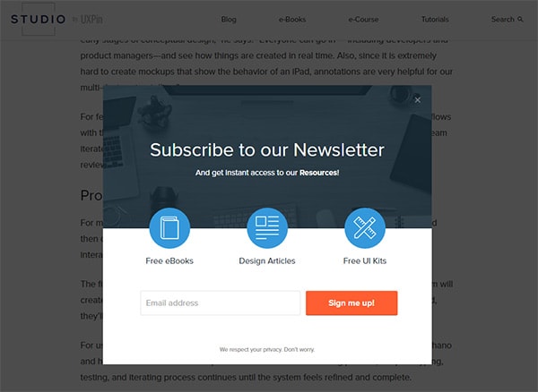
Also the user should be able to click on the background to hide the modal.
This isn’t universal but I hate when designers remove or ignore this feature. Yes there’s usually an X button or close button, however it takes more effort to move the mouse onto that button.
It should be possible to just click the background and hide the message right away.
Some modals use fancy animations to appear on the screen. This is usually preferred because it reduces the harshness of a random popup.
Having the modal window slide, fade, or bounce into view makes it a touch easier on the eyes. But don’t drag out the animation either!
With Pulsetic you’ll be instantly notified the moment your website, API, or server becomes unavailable. Monitor uptime from multiple global locations and respond to incidents before your users are affected.
Create beautiful status pages in minutes to keep customers informed during outages and build trust with transparent communication.
Start Monitoring for FreeMost users will ignore the modal so they don’t want to watch a full 3 second animation. Get to the modal quickly and let the user either read or close the window.
Designs vary from site to site but most of them use a white modal background with dark text. It’s the simplest way to design a high-contrast message that can blend with any website.
Overall these are some basic trends so they’re not absolute. But keep your eyes open as you browse the Internet because you may be surprised how many different styles are out there.
Display Techniques
There are some popular trends used by marketers who want to display modal windows for certain visitors.
The vast majority of modal popups happen a few seconds after the pageload. Most visitors haven’t even had time to read through the site to understand what it’s about. This seems like the worst way to do modals unless they’re informational for things like cookies or adblock settings.
Other display styles typically work better since they’re geared towards user behaviors. Here are the three most common techniques:
- Exit modals appear when the user’s mouse leaves the page
- Timed modals run after X seconds/minutes
- Location modals appear when the user scrolls down a certain amount
Each scenario is different and should be used based on the audience.
If you run a blog with lengthy content like Smashing Magazine then you might do a scroll-based popup. Other blogs like WPBeginner actually did the exit modal strategy and saw a huge increase in daily email signups.
There’s no denying that this stuff works. It’s just a matter of how you’re willing to run modals and what the end goal is.
Popover Marketing Messages
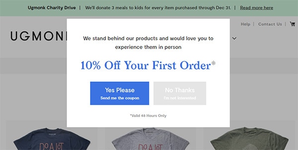
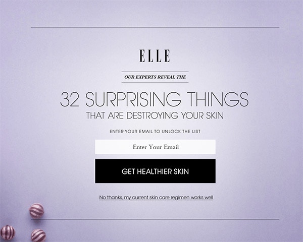
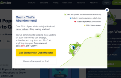
Modals are primarily used for marketing so the copy should prey on ideas and emotions. Recently modal windows have taken a turn towards the guilt trip approach for their buttons.
Instead of just having buttons that say “yes” and “no” they instead go so far as you make you feel bad or guilty for closing the window.
It seems like this would just make people angry but it really does increase conversions. Check out this Conversion XL post to see a few examples.
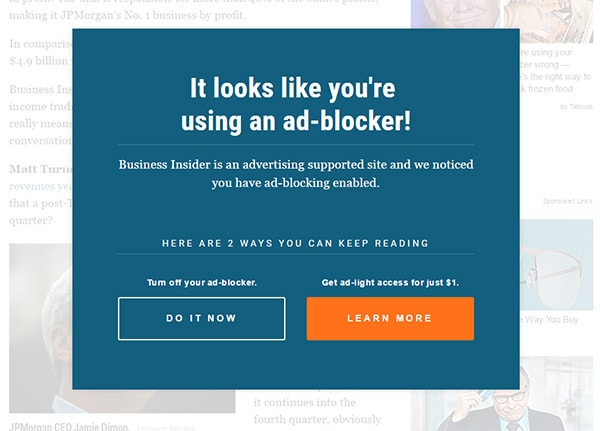
Beyond the typical yes/no signup modal you can also find guilt trips in the marketing for adblock messages. These appear on some larger sites that now want to ban adblock users.
Business Insider is one example that displays a popup modal for every adblock user. It does not let you close the modal without disabling adblock or paying for a subscription to the site.
The goal of any modal window should be persuasion to take action. This could relate to a sign up form or it could be about disabling adblock, or basically anything else you want the user to do.
The best success comes from excellent copy and a short but sweet message.
Pure CSS vs. JS
It’s never a great idea to completely reinvent the wheel so modal window plugins are basically the norm. But which one you pick can be a very complex process.
JavaScript plugins offer the most style and control. I prefer these because almost every user will have JavaScript enabled, so they’re a pretty safe bet. However pure CSS can be more compatible so there are two sides.
Here are my preferred JS modal window plugins(all free).
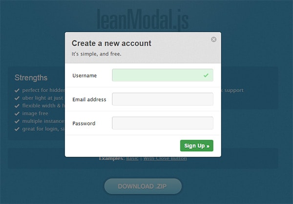
leanModal
leanModal is a simple jQuery plugin and super easy to customize. It has a pretty small library so it’s perfect for almost everything. However it doesn’t support embedded content or slideshows so it’s not great for dynamic content.
Still if you just need an e-mail signup or an adblock message then this plugin can do no wrong.
Remodal
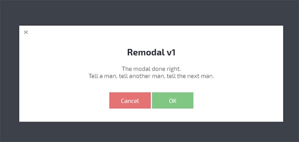
The Remodal plugin goes a step further including custom CSS3 animations. The design style is incredibly simple and pretty easy to customize too. It’s actually one of the easiest plugins to get working right out of the box.
And it runs on jQuery/Zepto so you have your choice of dependencies.
SimpleModal
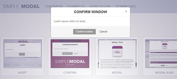
If you’re looking for unique and well-designed check out SimpleModal. This is yet another free plugin but it has a candy coating with some brilliant theming.
I don’t like how the background doesn’t darken as much but you can tweak the code to customize that. What I do like is the variety of content you can run. SimpleModal can work with embedded content, iframes, Ajax requests and pretty much anything you need.
All of these are fantastic choices and many have vanilla JS + jQuery options.
If you prefer the CSS route here are some nice alternatives.
- CSS Modal
- Basic Modal
- Modal Pure CSS
My favorite from this list is this CSS Modal created by Hans Christian Reinl. It’s hosted on GitHub for free and it has all the typical modal window features.
It darkens the background, lets you style the window and close button, plus it’ll close if the user clicks/taps anywhere outside the window box.
That’s the most important feature for me because I hate when modal windows force you to click the X to close. Most users expect modals to close if they just click elsewhere on the screen. This is almost impossible with pure CSS and that’s why CSS Modal is a great pure CSS solution.
Now Get Building!
Whether you go with a JS modal or pure CSS modal the effects should be very similar. Users react to modals in different ways so make sure your modal text really draws attention without overselling.
If you’re not sure about your content you can always run A/B testing to compare different copy or images. This is also true for modals that have signup/login forms or anything tied to the interface rather than just a marketing message.
By following the trends in this guide and sticking to open source projects you can build incredible modals with ease that never go out of style.
