Design Websites with a Goal in Mind
Designing an eye-catching website that looks good is great. However, it must do more than look good.
Compare a business website to the first thirty seconds meeting someone in person. That’s when their initial impression of you is formed. Your website may get even less time unless, as an interface, it communicates function with these elements:
- Ease of use so simple they’re not distracted by the mechanics.
- Draw positive feeling and emotion about business from the visitor.
- Present an attractive and professional appearance;
- Offer an impressively easy format at first glance;
- Clearly, label important information;
- Make a positive first impression of your company business practices in text and graphics.
These elements of strategic design will guide you in identifying your goals and use them as guides to meet the business objectives that drive your website design.
Implementing Strategic Design Applications
Consider these steps to think through a strategically designed website project.
Define your Clients Goals
You must clearly define the client’s goals and understand exactly what you are expected to achieve designing or redesigning their website.
With Postcards Email Builder you can create and edit email templates online without any coding skills! Includes more than 100 components to help you create custom emails templates faster than ever before.
Free Email BuilderFree Email TemplatesJust asking the client what their website goals are may give you enough information. However, it is common for the client to be unable to put into words the company’s objectives.
Spend the time needed discussing the options. Get to know their style and website goals. Then come to an agreement on a clear direction and purpose.
Web designers often struggle to put function above art. You want a visually attractive and well-balanced layout but web design is functional art.
The function of selling products, imparting information, giving access to services, entertainment and more must be fulfilled on your website design or redesign. The goals should be clear to everyone, especially when redesigning.
Know Your Audience
How your website looks and functions will depend on for whom and what purpose it is being designed. The demographics of the profession, technology, gender, age, common interest and more will influence your choice of aesthetics and usability.
An early learning website for preschoolers will be very different from a forum on aging. Usability for technologically savvy game playing websites will differ from an e-commerce site.
Audience influences other details such as font size and style, use of graphics and even color choices. Be conscientious about identifying with your audience.
With Startup App and Slides App you can build unlimited websites using the online website editor which includes ready-made designed and coded elements, templates and themes.
Try Startup App Try Slides AppOther ProductsBrand Image Drives Design
Designers love new trends and ideas and it’s easy to get carried away.
Adding flash and sizzle is great for some websites but not all. Your design projects an image; be sure the image represents the brand.
Goals Drive the Design Direction
You have taken the right steps and set achievable goals, established demographics of your audience and have a clear vision of the brand image. Now it’s time to sync design strategy with design decisions.
Where to start? Focus on the main objective of creating or recreating the website. This example of the first 3 steps uses “increased registration numbers” as the goal.
- The “About Us” text on the “Home” page must be clear, concise, and free of trade jargon. Describe the function so there is no confusion.
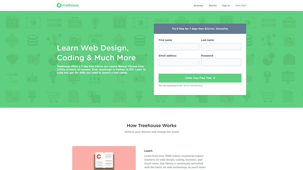
- You want to draw the eye of the website visitor to the registration button or link. If you use brand appropriate color and contrast the button or link will be instantly visible. Visitors to websites are not likely to take time looking for the place to sign up. Use your design skills so their attention zero’s in with no confusion.
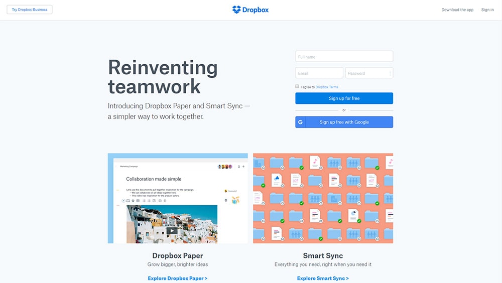
- The registration process should be as simple as name and contact information. Don’t make it a questionnaire, survey, or financial inquiry. Keep it short and simple because people may be put off by the sight of a long drawn out form. That information can be collected on an as needed and when needed basis.
These steps will direct your design toward the set goal of increasing sign-ups. This strategy of directing the focus of design elements toward the goal is the same regardless of the goal You want the aesthetics and focus that best suits the brand and audience.
If the brand is entertainment then focus on creating an emotional experience using shape, imagery, and sound.
If the website is meant to inform then make sure it’s easy to use and read. You want to create an interface that doesn’t distract the user from the content.
Design for the Right Audience
Everyone may be a potential customer but there is one right audience that stands apart. That audience is the most likely to be influenced by the products or services your website promotes. Focus on attracting that right audience.
Everything about the website including periodic advertising or promotions, product design, overall look, and feel are for one target group of people.
A website for motorcycles may target adults over the age of 20-45 earning $50,000 and up per year. That’s a huge group and yes others outside that demographic buy motorcycles.
However, that group is your target. Alternatively, a quilting website has a smaller target audience of all women with a broad age range.
Barriers to Sign-up are Counter-Productive
If you think customers are impressed with the need to provide a complete financial and personal profile to be registered users of your website then your own poverty is within sight.
The paying customers like to give as little information as possible until they’ve had time to research your products and services. The more barriers you erect to sign up the quicker they will click out and look elsewhere.
There is evidence that shows the fewer fields on a sign-up form the more likely people are to sign up.
Why wouldn’t you make it easy?
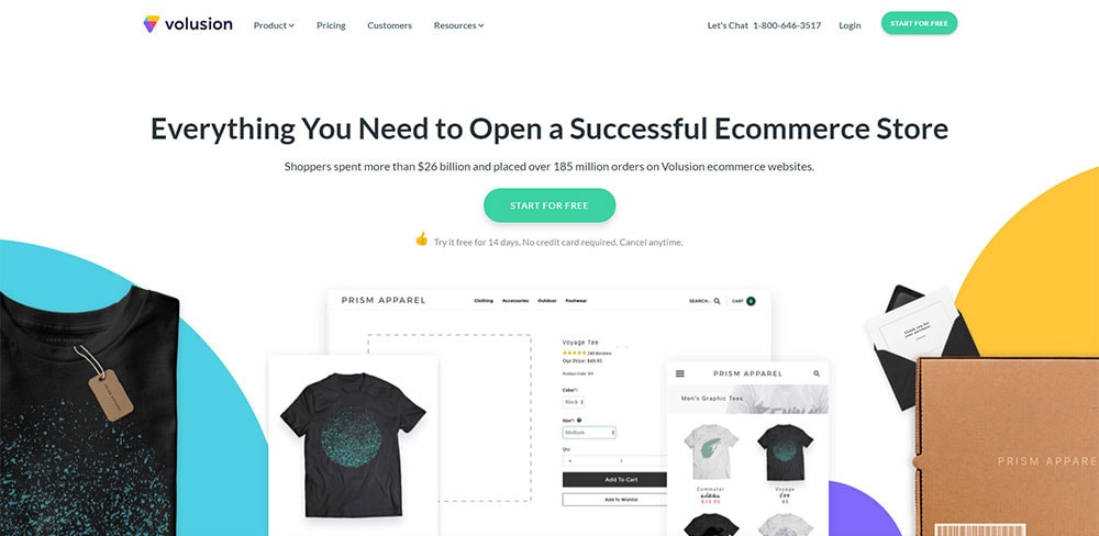
If you are offering a free trial, customers are more likely to accept that promotion if they don’t have to give you their credit card. If the service is web-based or the product is downloadable, then you don’t even need their address yet.
You need the information you need to provide a product or service but don’t ask for more than is necessary and even that should be kept brief. Try it for yourself and adjust your own sign-up forms.
Simplify them to the essentials and if some information can wait until a later time, don’t include it in the initial sign up. Monitor to see if you notice increased traffic on your sign-up page.
Marketing Drives Engagement and Investment
Before sign-up comes marketing. Marketing tells the potential customer about the nuts and bolts of the product or service. It answers important questions; What is it? What does it do? Why do I want it? Why yours?
You make this information clearly available. Don’t make customers go digging through your website to find the details.
Put them right out there in easy to find and understand text and graphics. Include the real cost along with how and when you will be billed.
People are more likely to sign-up if they are clear about what you are selling and the term under which you operate.
Remove Barricades to Buying
So often a Free Trial makes it is easier to give in to a feature request than it is to buy. You would begin to wonder if the SaaS provider really wants your money.
There was a time when the sales process was separate from the application. No longer. The two are the same and the app must sell itself as much as your sales associates and marketing site.
Conversion must be engineered into each app with the ability to ask for and complete the sale anytime during the free trial.
The bonus is internal and external expansion loops that reach social networks, colleagues, distributors, trading partners; in short, your whole sphere of influence where the app can sell itself.
Ending thoughts
Strategic design is common sense. You design a product or service to meet a specific need and the product fulfills its purpose.
It is just that simple if you avoid the traps of losing sight of your goals, choosing new design trends that are inappropriate to the purpose, shaping a section of the website to your liking instead of to the job it’s supposed to do.
You can avoid these design traps by applying “Why” to each element of the design.
- Why did you choose tabs here, buttons there?
- What was my reasoning when I chose that font?
- Why did I decide on icons on this page?
- These colors work perfectly because?
- Who will this website represent?
- What is the target audience?
- Is the context appropriate to the brand?
- Does this website fulfill the intended purpose at a high level?
Review your reasoning each step of the way and your website will fulfill its purpose and still be beautiful.
