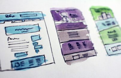
Desktop-First Design Tips for Responsive Websites
Most web designers know about mobile-first design and how it has dramatically affected responsive design. But there is another technique that may be less popular but can solve problems in a clearer fashion.
With a desktop-first approach you can build all the features you want and create them to the highest specs. Then as you test on smaller devices you’ll focus on keeping the interface light while supporting as many “high-end” features as possible.
This workflow is quite different but starting from the desktop can be better for web designers who create feature-rich designs.
The Benefits of Desktop-First
Technically “desktop-first” was the traditional way that everyone made websites up until the responsive era.
Nowadays many people talk about mobile first but there are good reasons to stick with the desktop approach. I often prefer starting with the desktop design when I know my site will have tons of detailed features on larger screens.
Here are some benefits of the desktop-first ideologies.
With Postcards Email Builder you can create and edit email templates online without any coding skills! Includes more than 100 components to help you create custom emails templates faster than ever before.
Free Email BuilderFree Email Templates- You get to see all major features at once
- It lets you imagine all the largest possibilities for your design first
- It’s the best strategy if your audience mostly uses desktops/laptops
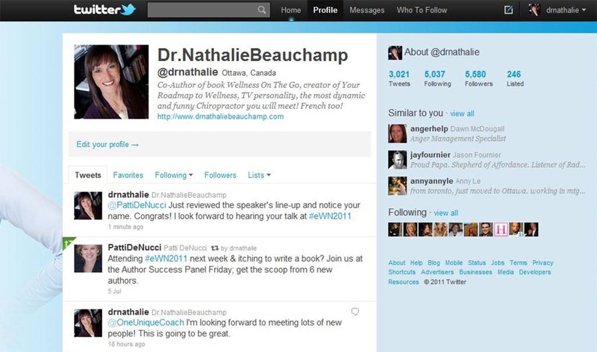
When you think of modern websites like Twitter you think mobile. But they do have lots of extra features that come along with the desktop experience. These desktop users clearly get a heightened UX which is just as important as any other device.
Granted there’s no denying that mobile is important. Just recently mobile use surpassed desktop so it’s definitely here to stay.
But feature-rich websites often depend on a strong desktop design.
This is perhaps the biggest benefit of a desktop-first layout. You get to see the site as it should look with all the bells & whistles. These extras can(and should) be removed for smaller screens as you test and find certain features just don’t carry over well.
Another way to look at this is through the simplicity of mobile-first design. When you create with mobile first you’re inherently starting with the simplest features, then adding extras for larger screens. But it’s real easy to forget features or just lack proper planning to decide where they should go or how they should function.
With a mobile-first approach it’s easy to consider dynamic features more like an afterthought. But with a desktop-first approach you’re treating these features as the primary display method, then choosing to remove them as needed.
With Pulsetic you’ll be instantly notified the moment your website, API, or server becomes unavailable. Monitor uptime from multiple global locations and respond to incidents before your users are affected.
Create beautiful status pages in minutes to keep customers informed during outages and build trust with transparent communication.
Start Monitoring for FreeThere is no perfect choice so I recommend trying both to see what you prefer. If you’re like me and really adore the rich desktop experience then you’ll probably prefer starting there and working smaller.
Supporting All Browsers
The trickiest part of desktop-first design is handling browser support.
Just a decade or two ago the only market was desktops & laptops. The smartphone revolution changed all of that with tons of mobile browsers for iOS, Android, and other proprietary devices like Blackberry.
Most older browsers lacked support for modern desktop elements like canvas, audio/video, and dynamic inputs. But a lot has changed in recent years.
Nowadays it’s reasonable for all mobile browsers to basically support the same features as desktop browsers. Modern browsers also render most elements the same way so you won’t deal with rendering issues of the past.
The biggest differences are not in HTML/CSS support, but rather in touch-based support.
Mobile screens are much smaller and they also need to be tapped with a finger. Computer mice are more precise compared to a human finger, not to mention desktop screens are far more spacious and easier to look at.
When moving from desktop to mobile it’s crucial to consider how the different browsers work, what they support, and how to handle the user’s touch-based input.
A few good rules to consider while scaling down your desktop-first design:
- Make tappable elements larger
- Increase body text size so links are easier to tap
- Add JavaScript libraries that support swipe motions
You can always check HTML5 specs for all browsers to see which elements are supported on which browsers. But for the most part touch inputs are a universal thing, so desktop-first is a great solution if you pay attention to the mobile experience too.
And you can find tons of free resources like TouchSwipe that add support for touch & swipe gestures to all websites.
You can use JavaScript to check the browser’s dimensions or the operating system like iOS or Win Mobile. With this info you can load extra stylesheets and create a totally different experience with touch/swipe events that only apply to mobile users.
Start with a list of features you know you’ll want on your website. Organize all the newer CSS3 properties, the newer HTML5 elements, and anything that might be iffy with browser support.
Then look up all the browsers you want to support to consider how you can handle fallbacks and polyfills. As time passes older browsers will phase out and browser support will get easier. This makes an even stronger case for desktop-first design because the rendering engines will be close to identical across the board.
To learn more and dig deeper into mobile interactions check out these related guides:
- Multi-touch Web Development
- Support Comparisons Between All Mobile Browsers
- How to deal with :hover on touch screen devices
Graceful Degradation (And Why It Matters)
The process of graceful degradation looks at higher-level technology first. This means you build all your website’s top features with everything you want on the site, then if other browsers can’t support them you revert to fallback methods.
A common example of this tactic is the removal of dropdown sliding menus for mobile. Since smartphone users can’t hover menu links it makes sense to hide the hoverable menus and instead create a toggle switch or a hidden hamburger menu.
However this isn’t strictly graceful degradation, rather a change in user experience. Instead you’re looking for JS functions or CSS3 properties that literally cannot be supported in a certain browser.
For these you’ll need to find a polyfill or fallback that creates a less glamorous experience, but one that still works for the user.
Check out this list of examples created by the W3C. It covers graceful degradation in detail and it may help you move on the right track.
Thankfully since most modern browsers support JavaScript, HTML5 video, and canvas elements so you really have no limitations. The trickiest part is legacy support for outdated browsers. Yet this market is shrinking rapidly and you can gauge this by studying market share.
If you run Google Analytics you can study all browsers and OS’ from your audience to see which are the most popular. If nobody uses IE7 to browse your site then why support it?
Every problem you solve will be different so take it one at a time. Rely on sites like Can I Use to gauge what type of support you’ll need to deal with.
When Desktop Takes Priority
You may be wondering when desktop-first is appropriate. Should this be your default strategy for every project?
Maybe. But I think it ultimately works best when you’re designing a site where desktop takes priority over mobile.
If the mobile experience can be incredibly simple but the desktop experience needs to be detailed and dynamic, I say start with the desktop and work smaller.
If you always prefer working from desktop and moving smaller then you’ll get a knack for the process and it may become your default. And that’s totally fine because it’ll still lead to great results.
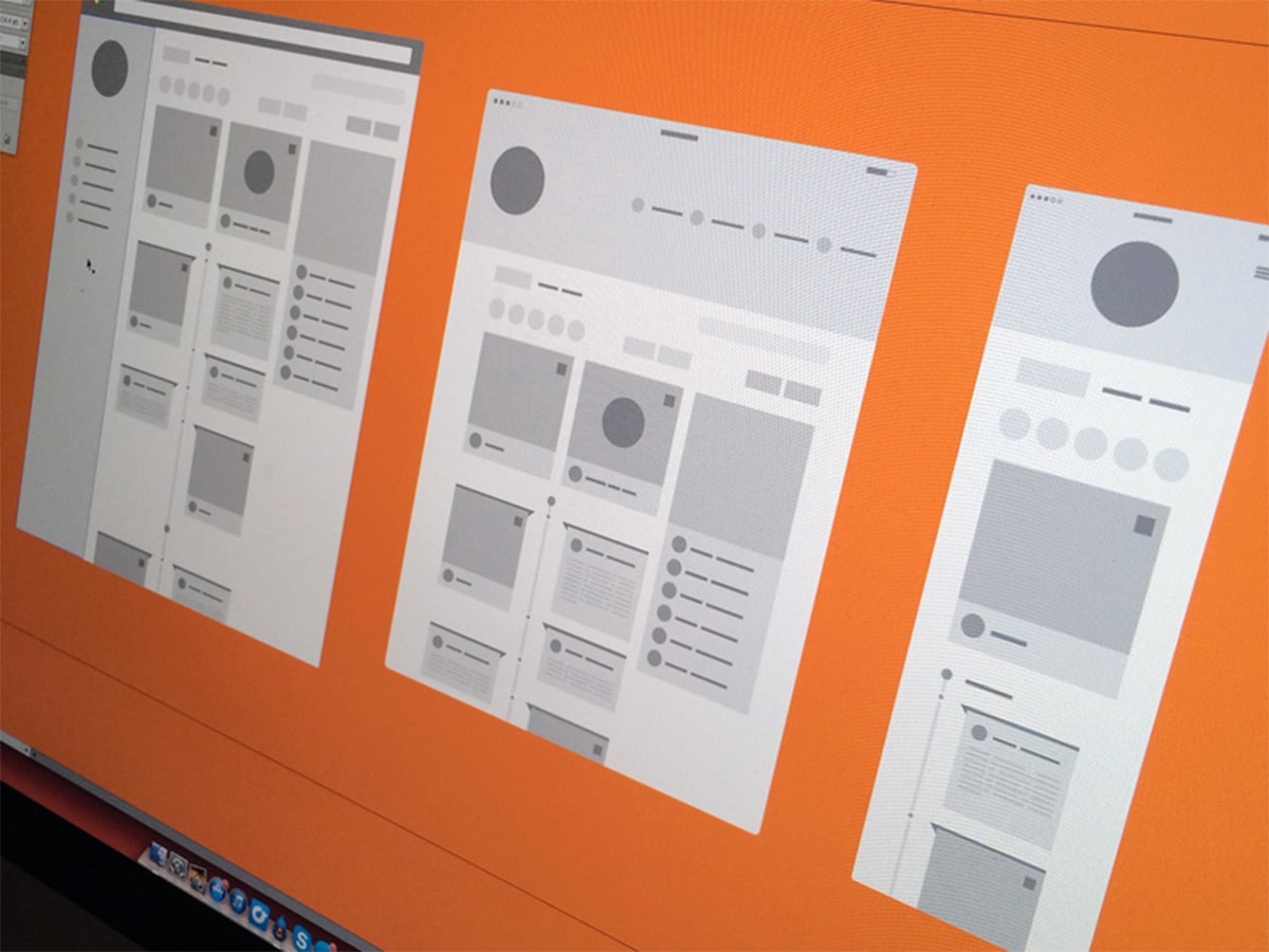
Just make sure you have a plan for the mobile site with at least a vague idea in mind of how it’ll look. Draft some wireframes for both views just to give yourself a starting point.
One great example of a strong desktop approach is Mashable. Their fullsize website spans 1440px wide and contains 3 columns of news with a huge mega navigation menu.
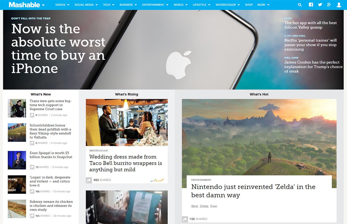
Mashable looks awesome on mobile too, but you can tell the desktop version was not an afterthought.
Same goes for major sites like YouTube where the user experience needs to work for both audiences. And in the responsive era it’s not just “desktop” or “smartphone”.
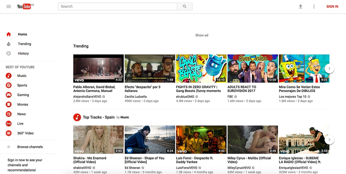
You also need to consider tablets, smaller netbooks, and laptops that all have varying screen sizes. Desktop-first helps you build an experience that works on larger screens first by focusing on every possible feature.
Then you can whittle down the details to refine your interface so it works everywhere.
Wrapping Up
I typically build my projects from a desktop-first perspective because it helps define limits. You can choose how wide to make the site, what sort of grid system to use, and what sort of features you’ll need.
But if you prefer the mobile-first approach that’s completely valid as well.
The idea of debating one approach is tough because everyone has different workflows and they all have pros & cons. Find whatever feels right for you and make that work in your favor.