How to Create a CSS3 Mega Menu
Difficulty: Intermediate
Estimated Completion Time: 1 hour
In this tutorial I will teach you how to create a pure CSS3 Mega Menu. Mega Menus are usually used on corporate/e-commerce websites, but they become more popular because they are a great way to display/organize content. The design of this mega menu can be found on the The Bricks UI. Let’s start with the HTML markup.
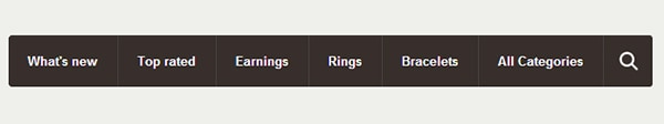
Create an unordered list with the class “nav” (<ul>), then for each menu item we will add a new list item (<li>) with an anchor tag (<a>) inside. If you want the menu item to be a mega menu just add a <div> inside of the <li>.
<ul class="nav">
    <li>
        <a href="#">What's new</a>
        <div>
            <div class="nav-column">
                <h3>Home</h3>
                <ul>
                    <li><a href="#">Pampers Diapers</a></li>
                    <li><a href="#">Huggies Diapers</a></li>
                    <li><a href="#">Seventh Generation</a></li>
                    <li><a href="#">Diapers</a></li>
                    <li><a href="#">Derbies</a></li>
                    <li><a href="#">Driving shoes</a></li>
                    <li><a href="#">Espadrilles</a></li>
                    <li><a href="#">Loafers</a></li>
                </ul>
            </div>
            <div class="nav-column">
                <h3>Home</h3>
                <ul>
                    <li><a href="#">Driving shoes</a></li>
                    <li><a href="#">Espadrilles</a></li>
                    <li><a href="#">Loafers</a></li>
                </ul>
                <h3>Home</h3>
                <ul>
                    <li><a href="#">Driving shoes</a></li>
                    <li><a href="#">Espadrilles</a></li>
                    <li><a href="#">Loafers</a></li>
                </ul>
            </div>
            <div class="nav-column">
                <h3>Home</h3>
                <ul>
                    <li><a href="#">Pampers Diapers</a></li>
                    <li><a href="#">Huggies Diapers</a></li>
                    <li><a href="#">Seventh Generation</a></li>
                    <li><a href="#">Diapers</a></li>
                    <li><a href="#">Derbies</a></li>
                    <li><a href="#">Driving shoes</a></li>
                    <li><a href="#">Espadrilles</a></li>
                    <li><a href="#">Loafers</a></li>
                </ul>
            </div>
            <div class="nav-column">
                <h3 class="orange">Related Categories</h3>
                <ul>
                    <li><a href="#">Pampers Diapers</a></li>
                    <li><a href="#">Huggies Diapers</a></li>
                    <li><a href="#">Diapers</a></li>
                </ul>
                <h3 class="orange">Brands</h3>
                <ul>
                    <li><a href="#">Driving shoes</a></li>
                    <li><a href="#">Espadrilles</a></li>
                </ul>
            </div>
        </div>
    </li>
    <li><a href="#">Top rated</a></li>
    <li>
        <a href="#">Earnings</a>
        <div>
            <div class="nav-column">
                <h3 class="orange">Related Categories</h3>
                <ul>
                    <li><a href="#">Pampers Diapers</a></li>
                    <li><a href="#">Huggies Diapers</a></li>
                    <li><a href="#">Diapers</a></li>
                </ul>
                <h3 class="orange">Brands</h3>
                <ul>
                    <li><a href="#">Driving shoes</a></li>
                    <li><a href="#">Espadrilles</a></li>
                </ul>
            </div>
            <div class="nav-column">
                <h3>Home</h3>
                <ul>
                    <li><a href="#">Pampers Diapers</a></li>
                    <li><a href="#">Huggies Diapers</a></li>
                    <li><a href="#">Seventh Generation</a></li>
                    <li><a href="#">Diapers</a></li>
                    <li><a href="#">Derbies</a></li>
                    <li><a href="#">Driving shoes</a></li>
                    <li><a href="#">Espadrilles</a></li>
                    <li><a href="#">Loafers</a></li>
                </ul>
            </div>
            <div class="nav-column">
                <h3>Home</h3>
                <ul>
                    <li><a href="#">Driving shoes</a></li>
                    <li><a href="#">Espadrilles</a></li>
                    <li><a href="#">Loafers</a></li>
                </ul>
                <h3>Home</h3>
                <ul>
                    <li><a href="#">Driving shoes</a></li>
                    <li><a href="#">Espadrilles</a></li>
                    <li><a href="#">Loafers</a></li>
                </ul>
            </div>
            <div class="nav-column">
                <h3>Home</h3>
                <ul>
                    <li><a href="#">Pampers Diapers</a></li>
                    <li><a href="#">Huggies Diapers</a></li>
                    <li><a href="#">Seventh Generation</a></li>
                    <li><a href="#">Diapers</a></li>
                    <li><a href="#">Derbies</a></li>
                    <li><a href="#">Driving shoes</a></li>
                    <li><a href="#">Espadrilles</a></li>
                    <li><a href="#">Loafers</a></li>
                </ul>
            </div>
        </div>
    </li>
    <li><a href="#">Rings</a></li>
    <li><a href="#">Bracelets</a></li>
    <li><a href="#">All Categories</a></li>
    <li class="nav-search">
        <form action="#">
            <input type="text" placeholder="Search...">
            <input type="submit" value="">
        </form>
    </li>
</ul>
Reset and Container Basic Styles
As the default styles of the browsers differ from each other, we’ll add some reset styles to keep consistency between them and avoid future issues.
/* Reset */
.nav,
.nav a,
.nav ul,
.nav li,
.nav div,
.nav form,
.nav input {
	margin: 0;
	padding: 0;
	border: none;
	outline: none;
}

.nav a { text-decoration: none; }

.nav li { list-style: none; }
Then we will add some basic styles to the menu container and float the list items to the left in order to show them on the same line.
/* Menu Container */
.nav {
	display: inline-block;
	position: relative;
	cursor: default;
	z-index: 500;
}

/* Menu List */
.nav > li {
	display: block;
	float: left;
}
We will start with the common styles like padding, height, position, etc. Then we’ll set the typography styles such as font size, color, text shadow, etc. We’ll also set a background color and a left and right border. To keep the styles transitions smooth we’ll add a CSS3 transition. Note that we set the same property five times, this is required because this property is not fully implemented in all browsers yet, and as this property is on testing, all the different browsers use a prefix before the property. So if you want to support some current and older browsers use this prefixes.
With Postcards Email Builder you can create and edit email templates online without any coding skills! Includes more than 100 components to help you create custom emails templates faster than ever before.
Free Email BuilderFree Email Templates
/* Menu Links */
.nav > li > a {
	position: relative;
	display: block;
	z-index: 510;
	height: 54px;
	padding: 0 20px;
	line-height: 54px;

	font-family: Helvetica, Arial, sans-serif;
	font-weight: bold;
	font-size: 13px;
	color: #fcfcfc;
	text-shadow: 0 0 1px rgba(0,0,0,.35);

	background: #372f2b;
	border-left: 1px solid #4b4441;
	border-right: 1px solid #312a27;

	-webkit-transition: all .3s ease;
	-moz-transition: all .3s ease;
	-o-transition: all .3s ease;
	-ms-transition: all .3s ease;
	transition: all .3s ease;
}
For the hover state we will only change the background color. To finish the menu links styling we will add rounded corners to the first link using the :first-child pseudo selector and remove the left border.
.nav > li:hover > a { background: #4b4441; }

.nav > li:first-child > a {
	border-radius: 3px 0 0 3px;
	border-left: none;
}
Styling the Search Form
We’ll start with the form container: set the position to relative, add a left border like we have on the menu links and set the width to inherit. By setting the width to inherit it will use the width from the child inputs.
/* Search Form */
.nav > li.nav-search > form {
	position: relative;
	width: inherit;
	height: 54px;
	z-index: 510;
	border-left: 1px solid #4b4441;
}
Then we will style the text input: float it to the left, set the height, padding, etc. To hide the text input we will set the width to 1px and remove the left and right padding. On the :hover and :focus state we will update the width and padding values.
.nav > li.nav-search input[type="text"] {
	display: block;
	float: left;
	width: 1px;
	height: 24px;
	padding: 15px 0;
	line-height: 24px;

	font-family: Helvetica, Arial, sans-serif;
	font-weight: bold;
	font-size: 13px;
	color: #999999;
	text-shadow: 0 0 1px rgba(0,0,0,.35);

	background: #372f2b;

	-webkit-transition: all .3s ease 1s;
	-moz-transition: all .3s ease 1s;
	-o-transition: all .3s ease 1s;
	-ms-transition: all .3s ease 1s;
	transition: all .3s ease 1s;
}

.nav > li.nav-search input[type="text"]:focus { color: #fcfcfc; }

.nav > li.nav-search input[type="text"]:focus,
.nav > li.nav-search:hover input[type="text"] {
	width: 110px;
	padding: 15px 20px;

	-webkit-transition: all .3s ease .1s;
	-moz-transition: all .3s ease .1s;
	-o-transition: all .3s ease .1s;
	-ms-transition: all .3s ease .1s;
	transition: all .3s ease .1s;
}
The styles for the submit input are similar to the text input, we’ll only set a fixed width and height, add a background icon and rounded corners using the border-radius property. We have also set transitions for both inputs in order to have some smooth and nice animations.
.nav > li.nav-search input[type="submit"] {
	display: block;
	float: left;
	width: 20px;
	height: 54px;
	padding: 0 25px;
	cursor: pointer;
	background: #372f2b url(../img/search-icon.png) no-repeat center center;
	border-radius: 0 3px 3px 0;
	-webkit-transition: all .3s ease;
	-moz-transition: all .3s ease;
	-o-transition: all .3s ease;
	-ms-transition: all .3s ease;
	transition: all .3s ease;
}
}

.nav > li.nav-search input[type="submit"]:hover {
    background-color: #4b4441;
}
The Mega Dropdowns
This is one of the most important parts. We will start by setting the position to absolute, width to 100%, display to block and the top and left values. Then we will hide the dropdowns using the opacity, visibility and overflow properties. After that we will add a background color, rounded corners and some transitions. The reason we will be using this three properties to hide de dropdowns and not the display: none; is because if we use display: none; the transitions won’t work.
/* Menu Dropdown */
.nav > li > div {
	position: absolute;
	display: block;
	width: 100%;
	top: 50px;
	left: 0;

	opacity: 0;
	visibility: hidden;
	overflow: hidden;

	background: #ffffff;
	border-radius: 0 0 3px 3px;

	-webkit-transition: all .3s ease .15s;
	-moz-transition: all .3s ease .15s;
	-o-transition: all .3s ease .15s;
	-ms-transition: all .3s ease .15s;
	transition: all .3s ease .15s;
}
To show the dropdowns on hover we need to set the opacity to 1 and the visibility and overflow properties to visible.
.nav > li:hover > div {
	opacity: 1;
	visibility: visible;
	overflow: visible;
}
Some Content
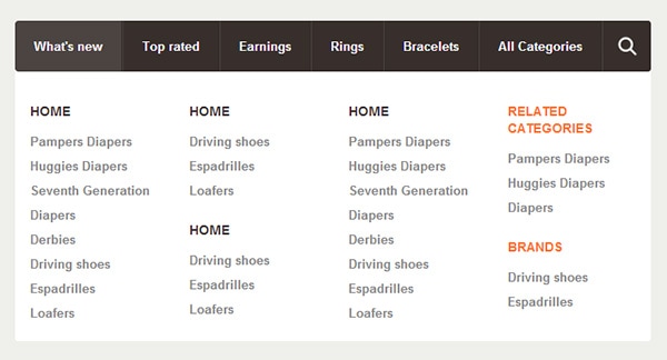
As it’s now the menu supports any content in any language (html, php, js, etc.). For this example we will create a columns based layout with some link lists inside. Add the following html code inside of the mega dropdown (<div>).
With Pulsetic you’ll be instantly notified the moment your website, API, or server becomes unavailable. Monitor uptime from multiple global locations and respond to incidents before your users are affected.
Create beautiful status pages in minutes to keep customers informed during outages and build trust with transparent communication.
Start Monitoring for Free
<div class="nav-column">
    <h3>Home</h3>
    <ul>
        <li><a href="#">Pampers Diapers</a></li>
        <li><a href="#">Huggies Diapers</a></li>
        <li><a href="#">Seventh Generation</a></li>
        <li><a href="#">Diapers</a></li>
        <li><a href="#">Derbies</a></li>
        <li><a href="#">Driving shoes</a></li>
        <li><a href="#">Espadrilles</a></li>
        <li><a href="#">Loafers</a></li>
    </ul>
</div>

<div class="nav-column">
    <h3>Home</h3>
    <ul>
        <li><a href="#">Driving shoes</a></li>
        <li><a href="#">Espadrilles</a></li>
        <li><a href="#">Loafers</a></li>
    </ul>

    <h3>Home</h3>
    <ul>
        <li><a href="#">Driving shoes</a></li>
        <li><a href="#">Espadrilles</a></li>
        <li><a href="#">Loafers</a></li>
    </ul>
</div>

<div class="nav-column">
    <h3>Home</h3>
    <ul>
        <li><a href="#">Pampers Diapers</a></li>
        <li><a href="#">Huggies Diapers</a></li>
        <li><a href="#">Seventh Generation</a></li>
        <li><a href="#">Diapers</a></li>
        <li><a href="#">Derbies</a></li>
        <li><a href="#">Driving shoes</a></li>
        <li><a href="#">Espadrilles</a></li>
        <li><a href="#">Loafers</a></li>
    </ul>
</div>
Then we will add some basic styles for this content. We’ll set the width of each column to be 20%, the padding 2.5% and float the columns to the left. To finish we will add some typography styles for the heading and links.
/* Menu Content Styles */
.nav .nav-column {
	float: left;
	width: 20%;
	padding: 2.5%;
}

.nav .nav-column h3 {
	margin: 20px 0 10px 0;
	line-height: 18px;

	font-family: Helvetica, Arial, sans-serif;
	font-weight: bold;
	font-size: 14px;
	color: #372f2b;
	text-transform: uppercase;
}

.nav .nav-column h3.orange { color: #ff722b; }

.nav .nav-column li a {
	display: block;
	line-height: 26px;

	font-family: Helvetica, Arial, sans-serif;
	font-weight: bold;
	font-size: 13px;
	color: #888888;
}

.nav .nav-column li a:hover { color: #666666; }

Download Files


