Best Practices for Line Icons in Website Design
With highly popular flat and solid icons, line style glyphs rule the roost this year. They have found their place not only in traditional control centers, navigation bars, social media widgets or pagination but also in an inner structure such as service sections or feature lists.
From tiny intuitive vigilantly crafted variants to enormous and bold responsive versions, from one-tone realization to lavish solution, they are optimal and viable instruments for enriching design aesthetics, highlighting key points, supporting important text blocks, reinforcing navigation through the project and simply enhancing the user experience. Its delicate nature and a ton of personality can add subtle sprucing up to any integral part of the website.
Today, we have collected different examples where this type of refined line icons fits snugly to the composition, is in conformity with the general formatting style and benefits the project in its graceful way.
Line Icon Examples in Web Design
Sliceberry
![]()
Sliceberry mastered the art of quality. Join us and enjoy all our favorite, and best-designed icons and illustrations.
Anchour
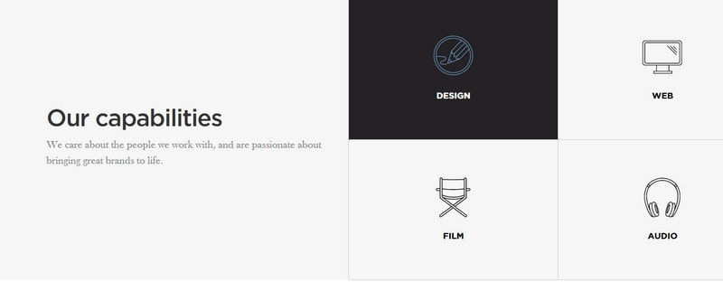
With Postcards Email Builder you can create and edit email templates online without any coding skills! Includes more than 100 components to help you create custom emails templates faster than ever before.
Free Email BuilderFree Email TemplatesAnchour leverages only four huge double-line icons that are used as visual cues for supporting the section of agency’s sphere of expertise. They go well with the entire theme and are well-suited to the elegant and sleek environment.
Uniqlo Airism
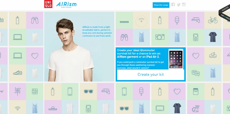
Uniqlo Airism’s front page has a busy appearance supplemented by strong dynamic feel that is produced by animated icons. Grid structure teamed up with gorgeous pastel coloring holds the design together and distinguishes each cell from the rest. Icons are aimed to indicate items from the survival kit.
UXB
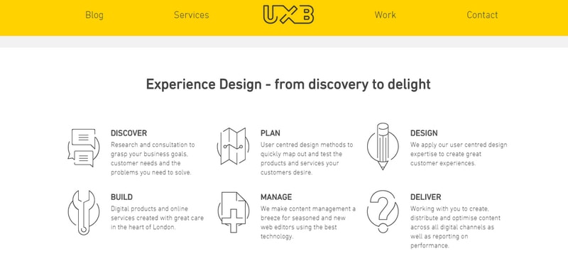
UXB has a clean and crisp appearance spiced up with lots of white space. Oversimplified line icons have an inviting and intuitive nature that enhances the aesthetics and improves the experience. The realization wonderfully echoes with the logotype style.
Brianza Chenutre
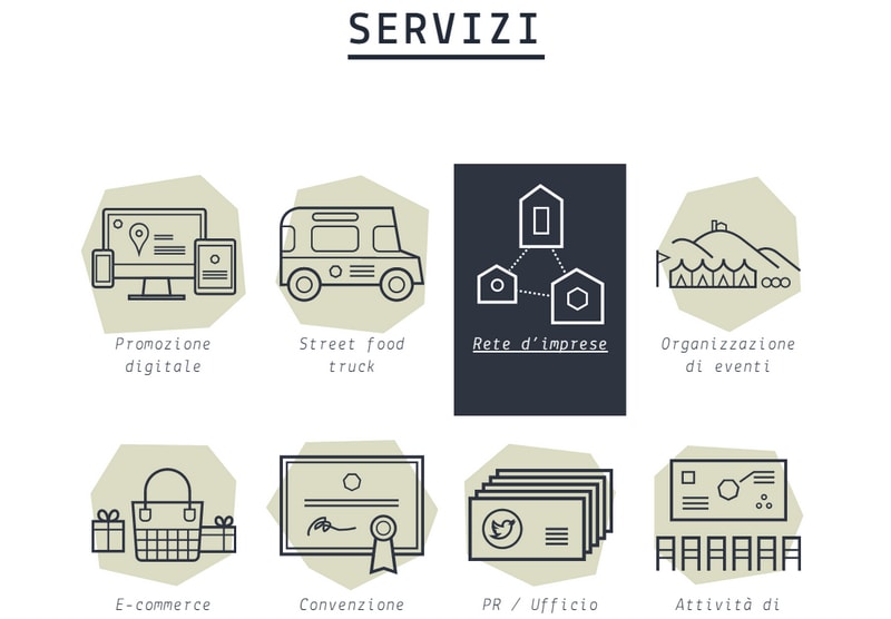
Brianza Chenutre features a set of splendid, oversized icons that feel sophisticated and approachable. They to accompany each service type and make it look more vivid and intelligible. A smooth solid geometric pastel backdrop reinforces the effect.
Sponge
With Pulsetic you’ll be instantly notified the moment your website, API, or server becomes unavailable. Monitor uptime from multiple global locations and respond to incidents before your users are affected.
Create beautiful status pages in minutes to keep customers informed during outages and build trust with transparent communication.
Start Monitoring for FreeSponge’s service section is marked by a set of carefully executed refined line icons. They add visual interest to the dark monotone section and demonstrate a high level of personality and charisma that are inherent to the agency.
RDT54
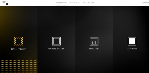
Unlike the majority cases, this one offers a stack-inspired version of navigation menu that takes up the whole browser screen. Four wide vertical stripes maintain coherency in style by following the overall aesthetics. Boxy contour icons that have two different color options give off a little charm.
Pixelneat
![]()
Pixelneat incorporated stroke icons to visually support and clearly point out features. Thus, each item has an accompanying brownish glyph that helps to transmit the message more effectively.
Postbox Inc.
Postbox Inc. goes for a more quirky icon realization that adds fun and enjoy to the page design. The pleasant and soft color scheme, beautiful glyphs and some extra twists that enrich the backdrop of each icon enable graphics to burst with flair and charisma.
Social Blue is powered by geometric forms that give the design a refined and exquisite appeal. Here the rhombus shapes are used for primary navigation, diagonal blocks prettying the background, outline boxes for displaying content, and last but not least, a series of intuitive contour icons is involved for indicating and describing each menu item.
Oubly
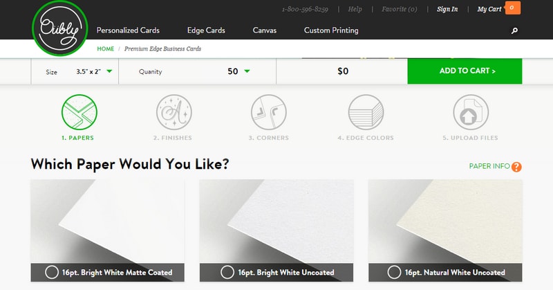
Oubly tries to omit excessive language for interacting with customers. The website is populated with smart and visceral icons that clearly define each stage of a process. Each item has a circular form and sleek line style execution that suits to the brand identity.
MyAlbum
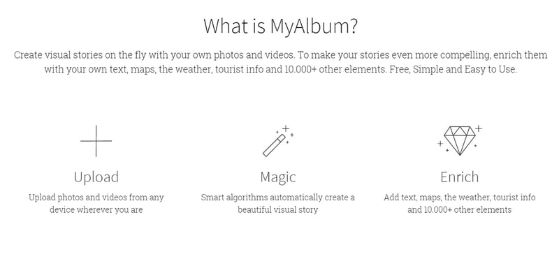
MyAlbum has a clean, almost pure appearance that is achieved because of monochrome color palette and a generous amount of white space. Neat and delicate line icons bring fun and playfulness to the project, slightly brightening the atmosphere.
o2Source
o2Source employs quirky sketchy contour icons for simplifying primary navigation menu. Solid soften duplicates of the graphics are placed on the background in order to add depth to each item and make it look more complex and unique. The solution is simple, yet interesting.
Yama
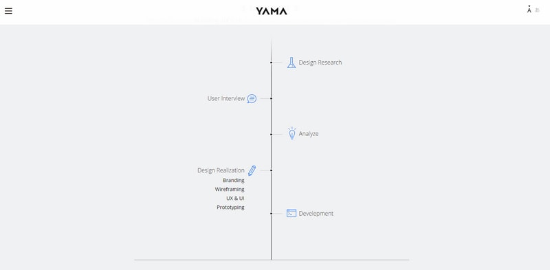
Yama has a delicate and gentle timeline-inspired service section that breaks from traditional solutions. Polished and sleek line icons and the overall design play wonderfully together, producing a subtle touch of elegance.
Winston Retail
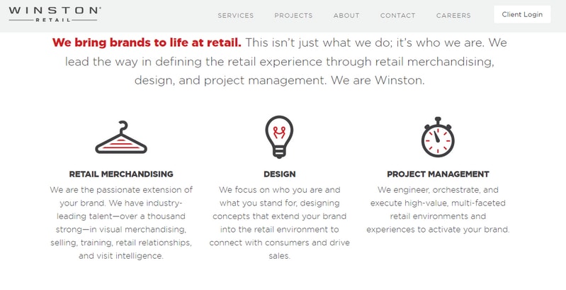
The key feature of this small set of stroke icons lies in two-tone coloring and relatively bold lines. The first mimics the primary color scheme, letting the glyphs ideally fit into the composition, and the second one gives them a visual weight, easily setting apart from the rest of the content.
DWP
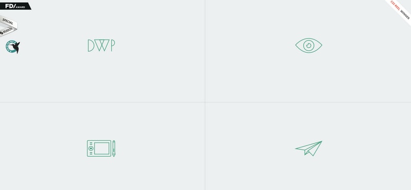
The beauty of the website lies in its functionality and excellent user experience rather than on aesthetics. A clean grid style structure perfectly lays out the navigation menu making it a centerpiece. Subtle contour icons that accompany each section serve as visual hints.
GoodPatch

GoodPatch has lots of room to breathe and eye-pleasing and smooth color palette that contributes to the businesslike atmosphere. Circular icons with two-tone coloring and the interesting idea hit right to the point, saving users from possible misunderstandings.
Praktiker
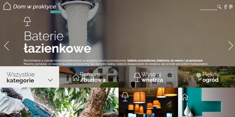
Praktiker has a content-intensive homepage with a plenty of visuals that can be a bit overwhelming. While the grid layout slightly sorts out the chaos, the contour graphics that mark each block reinforce the navigation.
Your Farm
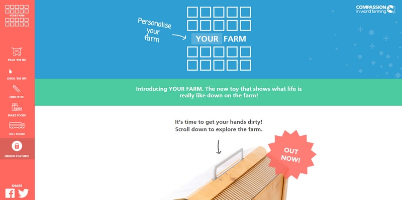
Your Farm has a bright and vibrant nature with a powerful character. Although it seems that subtle line icons can get lost in all this mess, yet they have successfully carved out a quite niche for themselves on the left sidebar.
MotoCMS
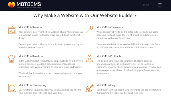
MotoCMS offers focal points for users when they scan the list of benefits. Using sleek and vigilantly crafted icons the team is managed to liven up each”plus,” and at the same time, enrich the design.
Fineocar
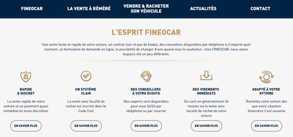
A series of tiny polished circular contour icons perfectly suited to the ghost buttons and smooth and bold typography. Thanks to vibrant accent color they naturally excel from the content flow.
Conclusion
Line icons are reflection of the delicate and exquisite nature of the agency behind the website. They perfectly illustrate the point and add freshness and crispness to a design. Line icons require a specific environment that should not overpower them with lushness, brutality or rawness, and in an era of non-skeuomorphic design this can be easily achieved.


